CSS特效
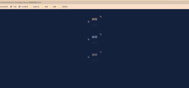
1.图标按钮
这个按钮特效比较简单,通过伪类选择器before和after,通过绝对定位,定位在按钮的两端。
然后通过hover属性,划上时添加动画和阴影,就有了视觉上的特效。
1 body { 2 display: flex; 3 /*弹性布局*/ 4 flex-direction: column; 5 /* 灵活的项目将垂直显示,正如一个列一样。 竖直布局 */ 6 align-items: center; 7 /* 元素位于容器的中心。 8 弹性盒子元素在该行的侧轴(纵轴)上居中放置。 9 (如果该行的尺寸小于弹性盒子元素的尺寸,则会向两个方向溢出相同的长度)。 10 =》居中对其弹性盒子的各个元素 11 */ 12 background: #142130; 13 min-height: 100vh; 14 /* 设置最小的高度 */ 15 } 16 17 a { 18 position: relative; 19 /* 相对定位 */ 20 padding: 10px 30px; 21 /* =>内边距 22 上内边距和下内边距是 10px 23 右内边距和左内边距是 30px 24 25 四个则是: 26 上 ,右 ,下 , 左 27 28 三个则是: 29 上 ,右 and 左 ,下 30 */ 31 32 margin: 45px 0; 33 /* 外边距 所有规则和内边距一样 */ 34 color: #B7A3E0; 35 /* 框内的字体颜色 */ 36 text-decoration: none; 37 /*删除链接下划线*/ 38 font-size: 20px; 39 /* 框内字体的大小 */ 40 transition: 0.5s; 41 /* 定义过渡时间 */ 42 overflow: hidden; 43 /* 隐藏溢出的线条 */ 44 -webkit-box-reflect: below 1px linear-gradient(transparent, #0003); 45 /* 倒影在文字下方 ,线性渐变创建遮罩图像 */ 46 /* 倒影效果: 47 none:无倒影 48 above:指定倒影在对象的上边 49 below:指定倒影在对象的下边 50 left:指定倒影在对象的左边 51 right:指定倒影在对象的右边 52 <length>:用长度值来定义倒影与对象之间的间隔。可以为负值 53 <percentage>:用百分比来定义倒影与对象之间的间隔。可以为负值 54 none:无遮罩图像 55 <url>:使用绝对或相对地址指定遮罩图像。 56 <linear-gradient>:使用线性渐变创建遮罩图像。 57 <radial-gradient>:使用径向(放射性)渐变创建遮罩图像。 58 <repeating-linear-gradient>:使用重复的线性渐变创建背遮罩像。 59 <repeating-radial-gradient>:使用重复的径向(放射性)渐变创建遮罩图像。 60 */ 61 } 62 63 /* hover:鼠标移到框上的悬停效果 */ 64 65 a:hover { 66 background: #B7A3E0; 67 color: #111; 68 box-shadow: 0 0 50px #B7A3E0; 69 /* 添加阴影效果 70 box-shadow: h-shadow v-shadow spread color ; 71 h-shadow 必需的。水平阴影的位置。允许负值 72 v-shadow 必需的。垂直阴影的位置。允许负值 73 spread 可选。阴影的大小 74 color 可选。阴影的颜色 75 */ 76 transition-delay: 0.5s; 77 /* 在过渡效果开始前等待 0.5 秒: */ 78 } 79 80 /* 81 :before 选择器在被选元素的内容前面插入内容。 82 请使用 content 属性来指定要插入的内容。 83 */ 84 a::before { 85 content: ''; 86 position: absolute; 87 /* 启动绝对定位 */ 88 top: 0; 89 right: 0; 90 /* 设置开始的位置圆点 */ 91 width: 10px; 92 height: 10px; 93 /* 设置开始大小 */ 94 border-top: 2px solid #B7A3E0; 95 border-right: 2px solid #B7A3E0; 96 /* 设置效果 */ 97 transition: 0.5s; 98 transition-delay: 0.25s; 99 /* 在过渡效果开始前等待 0.25s 秒 */ 100 } 101 102 a:hover::before { 103 /* 设置悬停后的前面插入效果 */ 104 width: 100%; 105 height: 100%; 106 transition-delay: 0s; 107 } 108 109 /* 110 :after 选择器在被选元素的内容后面插入内容。 111 请使用 content 属性来指定要插入的内容。 112 */ 113 a::after { 114 content: ''; 115 position: absolute; 116 bottom: 0; 117 left: 0; 118 width: 10px; 119 height: 10px; 120 border-bottom: 2px solid #B7A3E0; 121 border-left: 2px solid #B7A3E0; 122 transition: 0.5s; 123 transition-delay: 0.25s; 124 } 125 126 a:hover::after { 127 width: 100%; 128 height: 100%; 129 transition-delay: 0s; 130 } 131 132 a:nth-child(1) { 133 filter: hue-rotate(100deg); 134 /* css滤镜 */ 135 } 136 137 a:nth-child(3) { 138 filter: hue-rotate(200deg); 139 } 140
html:
1 <body>
2 <a href="#">按钮</a>
3 <a href="#">按钮</a>
4 <a href="#">按钮</a>
5 </body>
效果图片:
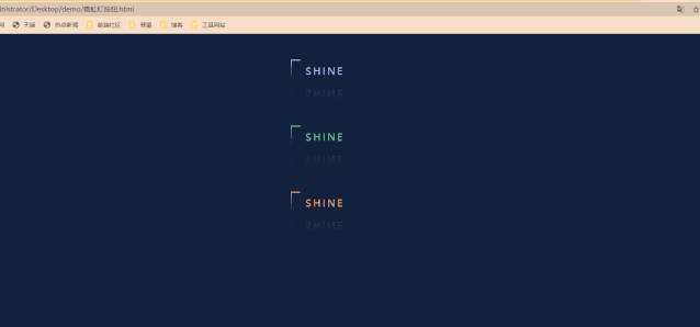
2.跑马灯按钮
基本与上面的按钮类似
只是每个按钮的四个角是用四个span来定位,每个span加上各自的动画,就形成了跑马灯效果
1 body { 2 display: flex; 3 flex-direction: column; 4 align-items: center; 5 background: #14213D; 6 min-height: 100vh; 7 } 8 9 a { 10 position: relative; 11 display: inline-block; 12 /* 行内块元素。 */ 13 margin: 45px 0; 14 color: #6ECF81; 15 text-decoration: none; 16 font-size: 20px; 17 text-transform: uppercase; 18 transition: 0.5s; 19 overflow: hidden; 20 letter-spacing: 4px; 21 -webkit-box-reflect: below 1px linear-gradient(transparent, #0003); 22 } 23 24 a span { 25 position: absolute; 26 display: block; 27 } 28 29 a:hover { 30 background: #6ECF81; 31 color: #111; 32 box-shadow: 0 0 5px #6ECF81, 33 0 0 25px #6ECF81, 34 0 0 50px #6ECF81, 35 0 0 100px #6ECF81 36 } 37 38 a span:nth-child(1) { 39 top: 0; 40 left: -100%; 41 width: 100%; 42 height: 2px; 43 background: linear-gradient(90deg, transparent, #6ECF81); 44 animation: animate1 0.5s linear infinite; 45 } 46 47 @keyframes animate1 { 48 0% { 49 left: -100%; 50 } 51 52 50%, 53 100% { 54 left: 100%; 55 } 56 } 57 58 a span:nth-child(2) { 59 top: 0; 60 right: 0; 61 width: 2px; 62 height: 100%; 63 background: linear-gradient(180deg, transparent, #6ECF81); 64 animation: animate2 0.5s linear infinite; 65 animation-delay: 0.125s; 66 } 67 68 @keyframes animate2 { 69 0% { 70 top: -100%; 71 } 72 73 50%, 74 100% { 75 top: 100%; 76 } 77 } 78 79 a span:nth-child(3) { 80 bottom: 0; 81 right: 0; 82 width: 100%; 83 height: 2px; 84 background: linear-gradient(270deg, transparent, #6ECF81); 85 animation: animate3 0.5s linear infinite; 86 animation-delay: 0.25s; 87 } 88 89 @keyframes animate3 { 90 0% { 91 right: -100%; 92 } 93 94 50%, 95 100% { 96 right: 100%; 97 } 98 } 99 100 a span:nth-child(4) { 101 bottom: -100%; 102 left: 0; 103 width: 2px; 104 height: 100%; 105 background: linear-gradient(360deg, transparent, #6ECF81); 106 animation: animate4 0.5s linear infinite; 107 animation-delay: 0.375s; 108 } 109 110 @keyframes animate4 { 111 0% { 112 bottom: -100%; 113 } 114 115 50%, 116 100% { 117 bottom: 100%; 118 } 119 } 120 121 a:nth-child(1) { 122 filter: hue-rotate(120deg); 123 } 124 125 a:nth-child(3) { 126 filter: hue-rotate(270deg); 127 }
html:
 1  <body>
 2      <a href="#">
 3          <span></span>
 4          <span></span>
 5          <span></span>
 6          <span></span>
 7          SHINE
 8      </a>
 9      <a href="#">
10          <span></span>
11          <span></span>
12          <span></span>
13          <span></span>
14          SHINE
15      </a>
16      <a href="#">
17          <span></span>
18          <span></span>
19          <span></span>
20          <span></span>
21          SHINE
22      </a>
23  </body>
效果图片:
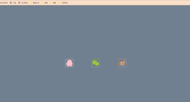
3.图标旋转
用几个i标签来代表边框,设置不同的透明度,制造重影效果。
1 body { 2 min-height: 100vh; 3 margin: 0; 4 padding: 0; 5 justify-content: center; 6 align-items: center; 7 background: slategray; 8 } 9 10 /* 图标基本样式 */ 11 a { 12 display: block; 13 text-align: center; 14 text-decoration: none; 15 margin: 0 50px; 16 padding: 0 20px; 17 color: seagreen; 18 } 19 20 .container { 21 width: 60px; 22 height: 60px; 23 position: relative; 24 transition: all .3s; 25 26 } 27 28 /* 移入旋转 shew 扭曲 斜切变换 */ 29 a:hover .container { 30 transform: rotate(-35deg) skew(10deg); 31 } 32 33 .iconfont { 34 font-size: 50px; 35 line-height: 60px; 36 text-align: center; 37 } 38 39 i { 40 position: absolute; 41 top: 0; 42 left: 0; 43 width: 100%; 44 height: 100%; 45 border: 1px solid #fff; 46 transition: 0.3s; 47 } 48 49 a:hover i:nth-child(1) { 50 opacity: 0.2; 51 52 } 53 54 a:hover i:nth-child(2) { 55 opacity: 0.4; 56 transform: translate(5px, -5px); 57 } 58 59 a:hover i:nth-child(3) { 60 opacity: 0.6; 61 transform: translate(10px, -10px); 62 } 63 64 a:hover i:nth-child(4) { 65 opacity: 0.8; 66 transform: translate(15px, -15px); 67 } 68 69 a:hover i:nth-child(5) { 70 opacity: 1; 71 transform: translate(20px, -20px); 72 } 73 74 .items:nth-child(2).container i, 75 .items:nth-child(2) a p { 76 border-color: yellowgreen; 77 color: yellowgreen; 78 } 79 80 .items:nth-child(3) .container i, 81 .items:nth-child(3) a p { 82 border-color: sandybrown; 83 color: sandybrown; 84 } 85 86 .items:nth-child(1) a:hover i { 87 box-shadow: -1px 1px 3px pink; 88 } 89 90 .items:nth-child(2) a:hover i { 91 box-shadow: -1px 1px 3px yellowgreen; 92 } 93 94 .items:nth-child(3) a:hover i { 95 box-shadow: -1px 1px 3px sandybrown; 96 } 97 98 p { 99 transform: translateY(-30px); 100 opacity: 0; 101 transition: .3s; 102 font-weight: 700; 103 } 104 105 a:hover p { 106 transform: translateY(0px); 107 opacity: 1; 108 } 109
html:
1 <body> 2 3 <div class="items"> 4 <a href="#"> 5 <div class=" container"> 6 <i></i> 7 <i></i> 8 <i></i> 9 <i></i> 10 <i class="iconfont icon-qq"></i> 11 </div> 12 <p>QQ</p> 13 </a> 14 </div> 15 16 <div class="items"> 17 <a href="#"> 18 <div class=" container"> 19 <i></i> 20 <i></i> 21 <i></i> 22 <i></i> 23 <i class="iconfont icon-weixin"></i> 24 </div> 25 <p>WeChat</p> 26 </a> 27 </div> 28 29 <div class="items"> 30 <a href="#"> 31 <div class=" container"> 32 <i></i> 33 <i></i> 34 <i></i> 35 <i></i> 36 <i class="iconfont icon-tubiaozhizuo-"></i> 37 </div> 38 <p>WeiBo</p> 39 </a> 40 </div> 41 </body>
效果图片:
4.点击页面出现爱心
window.requestAnimationFrame() 告诉浏览器——你希望执行一个动画,并且要求浏览器在下次重绘之前调用指定的回调函数更新动画。该方法需要传入一个回调函数作为参数,该回调函数会在浏览器下一次重绘之前执行
1 <script> 2 (function (window, document, undefined) { 3 var hearts = []; 4 window.requestAnimationFrame = (function () { 5 return window.requestAnimationFrame || 6 window.webkitRequestAnimationFrame || 7 window.mozRequestAnimationFrame || 8 window.oRequestAnimationFrame || 9 window.msRequestAnimationFrame || 10 function (callback) { 11 setTimeout(callback, 1000 / 60); 12 } 13 })(); 14 init(); 15 16 function init() { //初始化爱心 17 css( 18 ".heart{ 10px;height: 10px; 19 position: fixed;background: #f00;transform: rotate(45deg); 20 -webkit-transform: rotate(45deg); 21 -moz-transform: rotate(45deg);}.heart:after,.heart:before{content: ''; 22 inherit;height: inherit;background: inherit;border-radius: 50%; 23 -webkit-border-radius: 50%;-moz-border-radius: 50%; 24 position: absolute;}.heart:after{top: -5px;}.heart:before{left: -5px;}" 25 ); 26 attachEvent(); 27 gameloop(); 28 } 29 30 function gameloop() { 31 for (var i = 0; i < hearts.length; i++) { 32 if (hearts[i].alpha <= 0) { 33 document.body.removeChild(hearts[i].el); 34 hearts.splice(i, 1); 35 continue; 36 } 37 hearts[i].y--; 38 hearts[i].scale += 0.004; 39 hearts[i].alpha -= 0.013; 40 hearts[i].el.style.cssText = "left:" + hearts[i].x + "px;top:" + hearts[i].y + "px;opacity:" + 41 hearts[i].alpha + ";transform:scale(" + hearts[i].scale + "," + hearts[i].scale + 42 ") rotate(45deg);background:" + hearts[i].color; 43 } 44 requestAnimationFrame(gameloop); 45 } 46 47 function attachEvent() { //监听鼠标单击事件 48 var old = typeof window.onclick === "function" && window.onclick; 49 window.onclick = function (event) { 50 old && old(); 51 createHeart(event); 52 } 53 } 54 55 function createHeart(event) {//创建div存放爱心 56 var d = document.createElement("div"); 57 d.className = "heart"; 58 hearts.push({ 59 el: d, 60 x: event.clientX - 5, 61 y: event.clientY - 5, 62 scale: 1, 63 alpha: 1, 64 color: randomColor() 65 }); 66 document.body.appendChild(d); 67 } 68 69 function css(css) { 70 var style = document.createElement("style"); 71 style.type = "text/css"; 72 try { 73 style.appendChild(document.createTextNode(css)); 74 } catch (ex) { 75 style.styleSheet.cssText = css; 76 } 77 document.getElementsByTagName('head')[0].appendChild(style); 78 } 79 80 function randomColor() { //随机函数 81 return "rgb(" + (~~(Math.random() * 255)) + "," + (~~(Math.random() * 255)) + "," + (~~(Math 82 .random() * 83 255)) + ")"; 84 } 85 })(window, document); 86 </script>
原文采用