Html+Css网页设计(二)
目录
本章概要
- 学习双栏布局
- 使用媒体查询
@media实现响应式布局 - 要在手机中浏览,字体自动变大,得添加 meta viewport
<html lang="zh-Hant">
 <head>
   ...
   <meta name="viewport" content="width=device-width, initial-scale=1">
 </head>
</html>
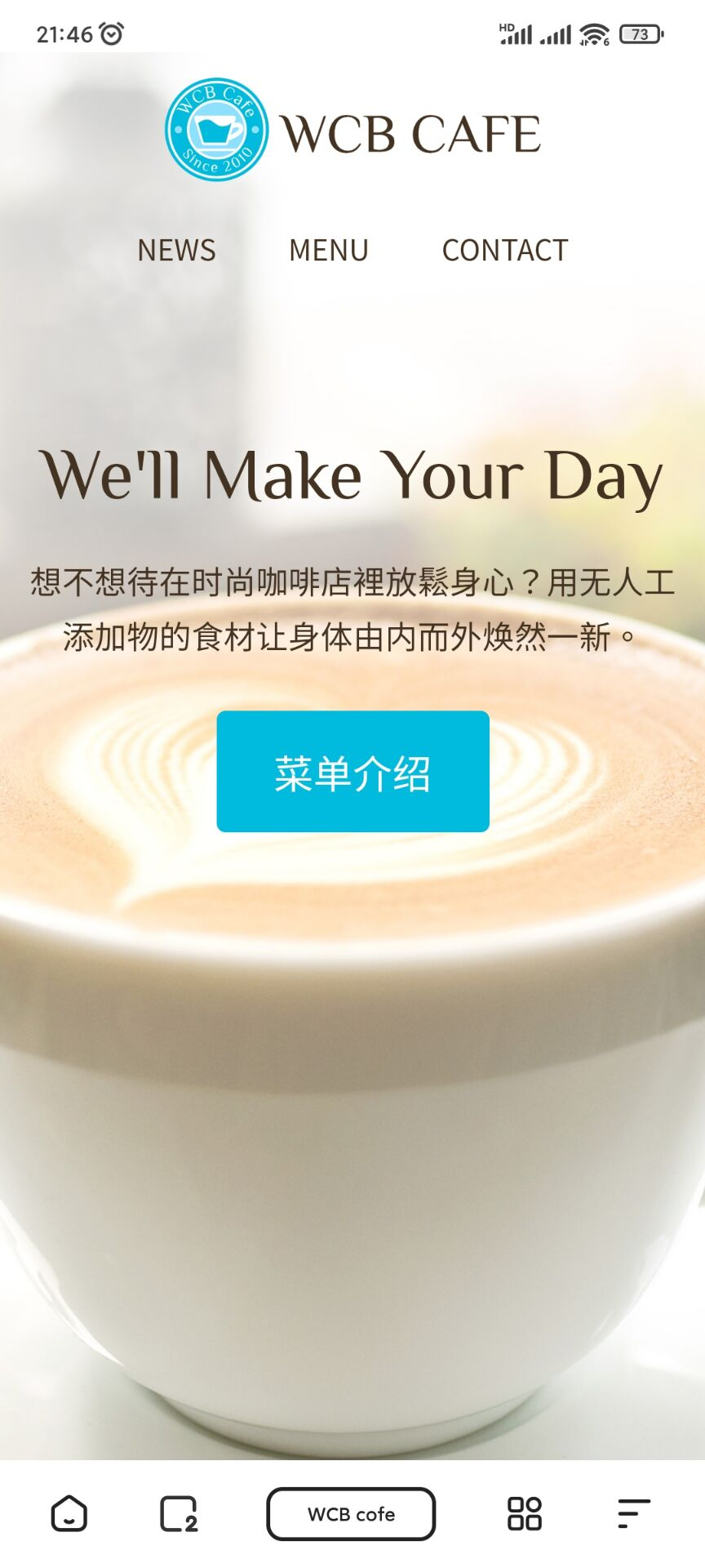
效果
PC端
首页

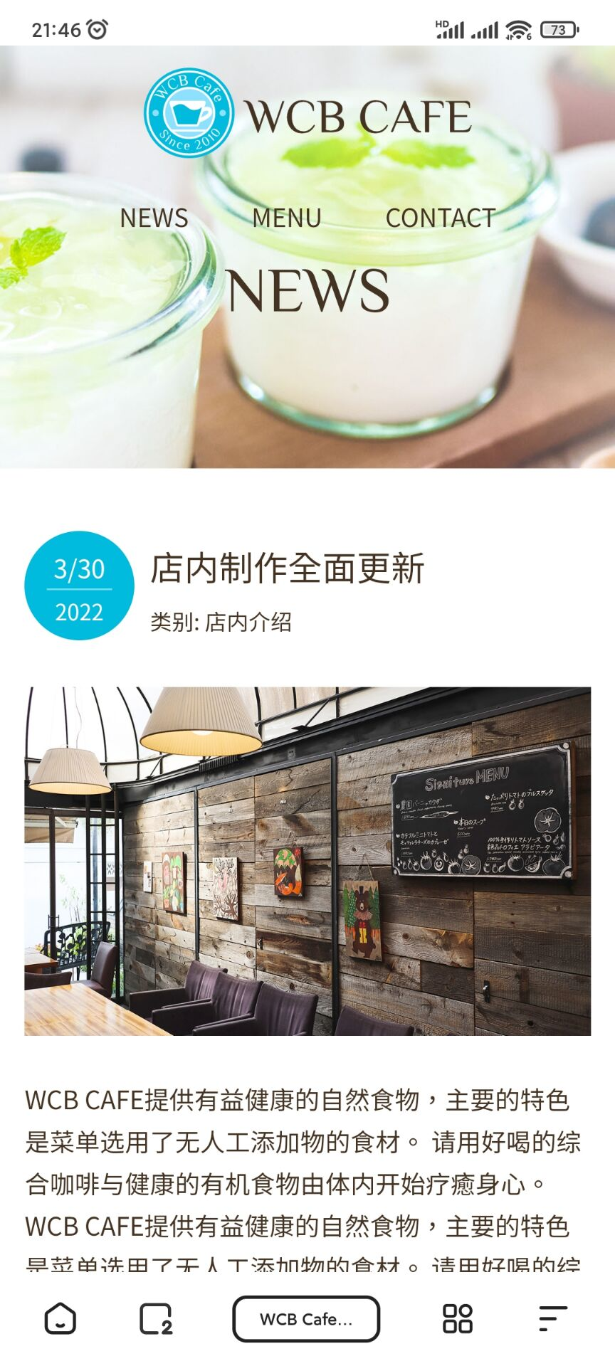
News

手机端
要在手机中查看效果,可以在 Visual Code 中安装插件 Live Server (如何安装和操作见上一章),
只要手机和电脑在同一个局域网内就能用手机插件效果了。
首页
News
继续往下拉,侧边栏被移动到了下面
项目结构
首页
index.html
没做修改,与上一章一样
<!DOCTYPE html>
<html lang="zh-Hant">

<head>
    <meta charset="UTF-8" />
    <title>WCB cofe</title>
    <meta name="description" content="提供综合咖啡与健康有机食物的咖啡店" />
    <link rel="icon" type="image/png" href="images/favicon.png"/>
    <meta name="viewport" content="width=device-width, initial-scale=1">

    <link href="https://unpkg.com/ress/dist/ress.min.css" rel="stylesheet" />
    <link href="https://fonts.googleapis.com/css?family=Philosopher" rel="stylesheet" />
    <link href="css/style.css" rel="stylesheet" />
    <link href="css/index.css" rel="stylesheet" />
</head>

<body>
    <div id="home" class="big-bg">
        <header class="page-header wrapper">
            <h1>
                <a href="index.html"><img src="images/logo.svg" alt="WCB cafe 首页" class="logo" /></a>
            </h1>
            <nav>
                <ul class="main-nav">
                    <li><a href="news.html">News</a></li>
                    <li><a href="menu.html">Menu</a></li>
                    <li><a href="contact.html">Contact</a></li>
                </ul>
            </nav>
        </header>

        <div class="home-content wrapper">
            <h2 class="page-title">We'll Make Your Day</h2>
            <p>想不想待在时尚咖啡店裡放鬆身心?用无人工添加物的食材让身体由内而外焕然一新。</p>
            <a class="button" href="menu.html">菜单介绍</a>
        </div><!-- /.home-content -->
    </div> <!-- / #home -->
</body>

</html>
index.css
新增 index.css,把index.html的css分离出来
#home {
    background-image: url(../images/main-bg.jpg);
    min-height: 100vh;
    /* background-image: linear-gradient(#c9ffbf,#ffafbd);
    background-color: #0bd;
    background-blend-mode: hard-light; */
}

.home-content {
    text-align: center;
    margin-top: 10%;
}

.home-content p {
    font-size: 1.125rem;
    margin: 10px 0 42px;
}

#home .page-title {
    text-transform: none;
}


/* 媒体查询:手机版本
--------------------------------------------------*/
 /*600px 及其以下的界面使用的样式*/
 @media (max- 600px) {
    /* HOME */
    .home-content {
        margin-top: 20%;
    }
}
News
news.html
<!DOCTYPE html>
<html lang="zh-Hant">
<head>
<meta charset="UTF-8">
<title>WCB Cafe - NEWS</title>
<meta name="description" content="提供综合咖啡与健康有机食物的咖啡店">
<link rel="icon" href="images/favicon.png">
<meta name="viewport" content="width=device-width, initial-scale=1">
<link href="https://unpkg.com/ress/dist/ress.min.css" rel="stylesheet" />
<link href="https://fonts.googleapis.com/css?family=Philosopher" rel="stylesheet" />
<link href="css/style.css" rel="stylesheet" />
<link href="css/news.css" rel="stylesheet" />
</head>
<body>
<div id="news" class="big-bg">
<header class="page-header wrapper">
<h1>
<a href="index.html"><img src="images/logo.svg" alt="WCB cafe - NEWS" class="logo" /></a>
</h1>
<nav>
<ul class="main-nav">
<li><a href="news.html">News</a></li>
<li><a href="menu.html">Menu</a></li>
<li><a href="contact.html">Contact</a></li>
</ul>
</nav>
</header>
<div class="wrapper">
<h2 class="page-title">News</h2>
</div>
</div><!-- /#news -->
<div class="news-contents wrapper">
<article>
<header class="post-info">
<h2 class="post-title">店内制作全面更新</h2>
<p class="post-date">3/30 <span>2022</span></p>
<p class="post-cat">类别: 店内介绍</p>
</header>
<img src="images/wall.jpg" alt="站内图片">
<p>
WCB CAFE提供有益健康的自然食物,主要的特色是菜单选用了无人工添加物的食材。
请用好喝的综合咖啡与健康的有机食物由体内开始疗癒身心。
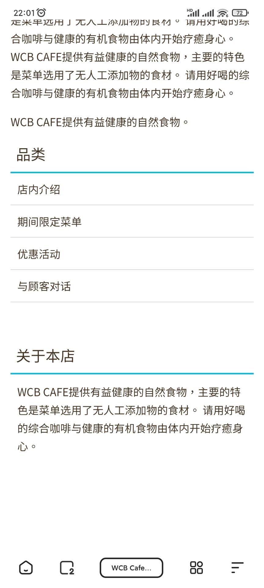
WCB CAFE提供有益健康的自然食物,主要的特色是菜单选用了无人工添加物的食材。
请用好喝的综合咖啡与健康的有机食物由体内开始疗癒身心。
</p>
<p>
WCB CAFE提供有益健康的自然食物,主要的特色是菜单选用了无人工添加物的食材。
请用好喝的综合咖啡与健康的有机食物由体内开始疗癒身心。
WCB CAFE提供有益健康的自然食物,主要的特色是菜单选用了无人工添加物的食材。
请用好喝的综合咖啡与健康的有机食物由体内开始疗癒身心。
WCB CAFE提供有益健康的自然食物,主要的特色是菜单选用了无人工添加物的食材。
请用好喝的综合咖啡与健康的有机食物由体内开始疗癒身心。
</p>
<p>WCB CAFE提供有益健康的自然食物。</p>
</article>
<aside>
<h3 class="sub-title">品类</h3>
<ul class="sub-menu">
<li><a href="#">店内介绍</a></li>
<li><a href="#">期间限定菜单</a></li>
<li><a href="#">优惠活动</a></li>
<li><a href="#">与顾客对话</a></li>
</ul>
<h3 class="sub-title">关于本店</h3>
<p>
WCB CAFE提供有益健康的自然食物,主要的特色是菜单选用了无人工添加物的食材。
请用好喝的综合咖啡与健康的有机食物由体内开始疗癒身心。
</p>
</aside>
</div>
<!--news.contents-->
<footer>
<div class="wrapper">
<div class="copyright">
<p><small> © 2022 WCB Cafe</small> </p>
</div>
</div>
</footer>
</body>
</html>
news.css
#news {
    background-image: url(../images/news-bg.jpg);
    height: 270px;
    margin-bottom: 40px;
}

#news .page-title {
    text-align: center;
}


/* news contents
-----------------------------------------------------*/
.news-contents {
    display: flex;
    justify-content: space-between;
    margin-bottom: 50px;

}

/* 报道部分
-----------------------------------------------------*/
article {
     74%;
}

.post-info {
    position: relative; /*为了给 .post-date 在配置位置时有个的定位点*/
    padding-top: 4px;
    margin-bottom: 40px;
}

.post-date {
    background: #0bd;
    border-radius: 50%;
    color: #fff;
     100px;
    height: 100px;
    font-size: 1.625rem;
    text-align: center;
    position: absolute; /*设置基于.post-info的位置*/
    top: 0;
    padding-top: 10px;
}

.post-date span {
    font-size: 1rem;
    border-top: 1px rgba(255, 255, 255, .5) solid;
    padding-top: 6px;
    display: block;
     60%;
    margin: 0 auto;
}

.post-title {
    font-family: "Yu Mincho", "YuMincho", serif;
    font-size: 2rem;
    font-weight: normal;

}

.post-title, .post-cat {
    margin-left: 120px;
}

article img {
   margin-bottom: 20px;
}

article p {
    margin-bottom: 1rem;
}

/* 边栏
-----------------------------------------------------*/
aside {
     22%;
}

.sub-title {
    font-size: 1.375rem;
    padding: 0 8px 8px;
    border-bottom: 2px #0bd solid;
    font-weight: normal;
}

.sub-menu {
    margin-bottom: 60px;
    list-style: none;
}

.sub-menu li {
    border-bottom: 1px #ddd solid;
}

.sub-menu a {
    color: #432;
    padding: 10px;
    display: block;
}

.sub-menu a:hover {
    color: #0bd;
}

aside p {
    padding: 12px 10px;
}


/* 媒体查询:手机版本
--------------------------------------------------*/
 /*600px 及其以下的界面使用的样式*/
 @media (max- 600px) {
    /* NEWS */
    .news-contents {
        flex-direction: column;
    }

    article, aside {
         100%;
    }

    .post-info {
        margin-bottom: 30px;
    }

    .post-date {
         70px;
        height: 70px;
        font-size: 1rem;
    }
    .post-date span {
        font-size: 0.875rem;
        padding-top: 2px;
    }

    .post-title {
        font-size: 1.375rem;
    }

    .post-cat {
        font-size: 0.875rem;
        margin-top: 5px;
    }

    .post-title, .post-cat {
        margin-left: 80px;
    }
}
style.css
@charset "UTF-8";

/* 公共部分
---------------------------------------*/
html {
    font-size: 100%;  /* 根据浏览器预设的文字大小,设置相对值*/

}

body {
    font-family: "Yu Gothic Medium", YuGothic, sans-serif;
    line-height: 1.7;  /* 行高 */
    color: #432;
}

a {
    text-decoration: none;  /* 去掉底部的下划线 */
}

img {
    max- 100%;  /* 宽度为父元素的100% */
}

/* HEADER
------------------------------- */
.logo {
     210px;
    margin-top: 14px;
}

.main-nav {
    display: flex;
    font-size: 1.25rem;
    text-transform: uppercase; /* 英文字母全部大写*/
    margin-top: 36px;
    list-style: none;  /* 无列表图标*/
}

.main-nav li {
    margin-left: 36px;
}

.main-nav a {
    color: #432;
}

.page-header {
    display: flex;
    justify-content: space-between; /* 水平对齐方式:左右对齐 */
}

.wrapper {
    max- 1100px; /* 设定最大宽度 */
    margin: 0 auto; /* 居中对齐 */
    padding: 0 4%; /* 设定内侧留白空间,以配合窄界面*/
}

/*标题*/
.page-title {
    font-size: 5rem;
    font-family: 'Philosopher', serif;
    text-transform: uppercase;
    font-weight: normal;
}

/* 按钮 */
.button {
    font-size: 1.375rem;
    background: #0bd;
    color: #fff;
    border-radius: 5px;
    padding: 18px 32px;
}
.button:hover {
    background: #0090aa;
}


.big-bg {
    background-size: cover; /* 图片铺面界面 */
    background-position: center top;
    background-repeat: no-repeat;
}

/* 尾部
-----------------------------------------------------*/
footer {
    background: #432;
    text-align: center;
    padding: 26px 0;
}

footer p {
    color: #fff;
    font-size: 0.875rem;
}

/* 媒体查询:手机版本
--------------------------------------------------*/
 /*600px 及其以下的界面使用的样式*/
@media (max- 600px) {
    .page-title {
        font-size: 2.5rem;
    }

    /* Header */
    .main-nav {
        font-size: 1rem;
        margin-top: 10px;
    }
    .main-nav li {
        margin: 0 20px;
    }

    .page-header {
        flex-direction: column;
        align-items: center;
    }
}
资源文件
News页面: news-bg.jpg
文章中的图片:wall.jpg

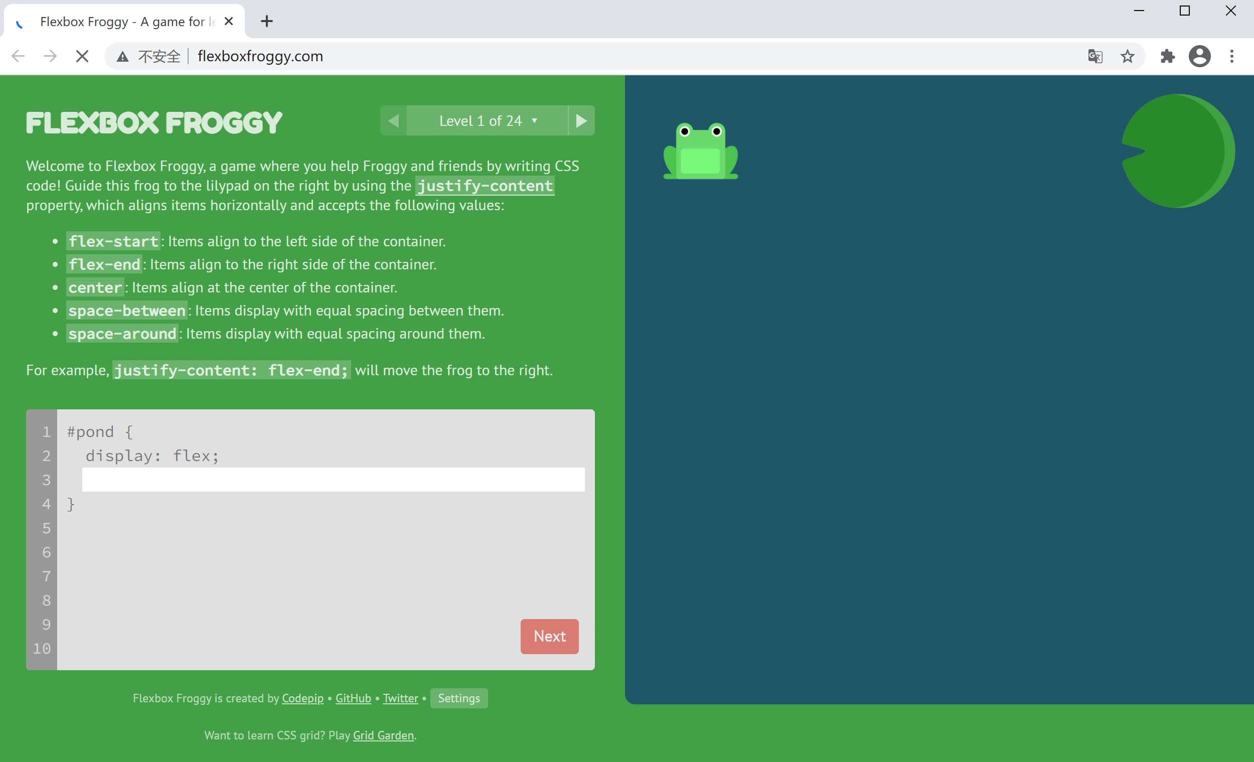
FlexBox 布局
有一个FlexBxo布局很好玩的网站:
http://flexboxfroggy.com/
帮助青蛙站到对应颜色的荷叶上