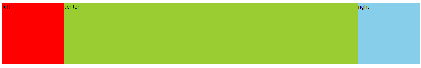
1.浮动实现圣杯布局
html代码:
 <div class="demo">
        <div class="center same">
            <div class="inner">center</div>
        </div>
        <div class="left same">left</div>
         <div class="right same">right</div>
 </div>
css代码:
    <style>
        .demo {
            width: 100%;
            height: 200px;
            margin: 100px auto;
            min-width: 1000px;
            background-color: wheat;
        }
        .same {
            float: left;
            height: 100%;
        }
        .left {
            width: 200px; /*左边宽度固定*/
            background-color: red;
            margin-left: -100%;  /*设置子元素的左边框距离父盒子右边框的距离*/
        }
        .right {
            width: 200px;/*右边宽度固定*/
            background-color: skyblue;
            margin-left: -200px;
        }
        .center {
            width: 100%;/*中间宽度由子盒子自由分配空间*/
            /* 如果left的盒子在center盒子的前面,设置center盒子margin-left: -200px;
            若center盒子有背景颜色 则会将left盒子覆盖*/
            /* margin-left: -200px;  */
            /* background-color: rgb(90, 65, 19); */
        }
        .center .inner {
            /*  100%; */ /*inner盒子宽度不能设置100% 不然在设置margin-left 和 margin-right时会出问题*/
            height: 100%;
            margin: 0 200px 0 200px;
            background-color: yellowgreen;
        }
    </style>
效果图:
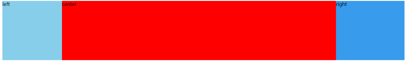
2.flex实现圣杯布局
html代码:
 <div class="box">
        <div class="left">left</div>
        <div class="center">center</div>
        <div class="right">right</div>
    </div>
css代码:
 <style>
        .box{
            display: flex;
            -webkit-display:flex;
            height: 200px;
            width: 100%;
            min-width: 800px;
        }
        .left{
            width: 200px; /*左边宽度固定*/
            height: 100%;
            background: skyblue;
        }
        .right{
            width: 230px; /*右边宽度固定*/
            height: 100%;
            background: rgb(57, 155, 235);
        }
        .center{
            flex:1;
            /* flex:1;代表是这个子盒子去自由分配剩余的空间 */
            height: 100%;
            background: red;
        }
    </style>
效果图: