1.大体布局
这个组件分为两部分:第一个是组件的外层容器,第二个是组件的子容器item,子组件里面又分为图片和文字组合。子组件有2个状态,一个默认灰色的状态,一个选中状态,我们来实现一下这个组件的布局
Index.vue
<template>
  <div class="m-tabbar">
    <a class="m-tabbar-item is-active">
      <span class="m-tabbar-item-icon">
        <img src="../assets/images/ic_tab_home_normal.png" alt="">
      </span>
      <span class="m-tabbar-item-text">
        首页
      </span>
    </a>
    <a class="m-tabbar-item">
      <span class="m-tabbar-item-icon">
        <img src="../assets/images/ic_tab_subject_normal.png" alt="">
      </span>
      <span class="m-tabbar-item-text">
        书影音
      </span>
    </a>
    <a class="m-tabbar-item">
      <span class="m-tabbar-item-icon">
        <img src="../assets/images/ic_tab_status_normal.png" alt="">
      </span>
      <span class="m-tabbar-item-text">
        广播
      </span>
    </a>
    <a class="m-tabbar-item">
      <span class="m-tabbar-item-icon">
        <img src="../assets/images/ic_tab_group_normal.png" alt="">
      </span>
      <span class="m-tabbar-item-text">
        小组
      </span>
    </a>
    <a class="m-tabbar-item">
      <span class="m-tabbar-item-icon">
        <img src="../assets/images/ic_tab_profile_normal.png" alt="">
      </span>
      <span class="m-tabbar-item-text">
        我的
      </span>
    </a>
  </div>
</template>

<script>
export default {

}
</script>

<style lang="less">
.m-tabbar{
    display: flex;
    flex-direction: row;
    position: fixed;
    bottom: 0;
    left: 0;
    right: 0;
     100%;
    overflow: hidden;
    height: 50px;
    background: #fff;
    border-top: 1px solid #e4e4e4;

    .m-tabbar-item{
      flex: 1;
      text-align: center;
      .m-tabbar-item-icon{
          display: block;
          padding-top: 2px;
          img{
               28px;
              height: 28px;
          }
      }
      .m-tabbar-item-text{
          display: block;
          font-size: 10px;
          color:#949494;
      }
      &.is-active{
          .m-tabbar-item-text{
              color: #42bd56;
          }
      }
  }
}
</style>
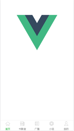
效果图:
2.组件化
先在components文件夹下面,新建两个组件,通过这两个组件来组合实现我们底部的tab组件:
(一)一个是tabbar-item.vue,实现子组件的item项
tabbar-item.vue
<template>
  <a class="m-tabbar-item" >
    <span class="m-tabbar-item-icon"><slot name="icon-normal"></slot></span>
    <span class="m-tabbar-item-text"><slot></slot></span>
  </a>
</template>

<style lang="less">
.m-tabbar-item{
  flex: 1;
  text-align: center;
  .m-tabbar-item-icon{
    display: block;
    padding-top: 2px;
    img{
       28px;
      height: 28px;
    }

  }
  .m-tabbar-item-text{
    display: block;
    font-size: 10px;
    color:#949494;
  }
  &.is-active{
    .m-tabbar-item-text{
      color: #42bd56;
    }
  }
}
</style>
(二)一个是tabbar.vue,实现tab的外层容器
tabbar.vue
<template>
  <div class="m-tabbar">
    <slot></slot>
  </div>
</template>
<style lang="less">
.m-tabbar{
  display: flex;
  flex-direction: row;
  position: fixed;
  bottom: 0;
  left: 0;
  right: 0;
   100%;
  overflow: hidden;
  height: 50px;
  background: #fff;
  border-top: 1px solid #e4e4e4;
}
</style>
在Index.vue中组合这两个组件,实现tab组件效果
Index.vue
<template>
  <div>
    <m-tabbar>
      <m-tabbar-item id='tab1'>
        <img src="../assets/images/ic_tab_home_normal.png" alt="" slot="icon-normal">
        首页
      </m-tabbar-item>
      <m-tabbar-item id='tab2'>
        <img src="../assets/images/ic_tab_subject_normal.png" alt="" slot="icon-normal">
        书影音
      </m-tabbar-item>
      <m-tabbar-item id='tab3'>
        <img src="../assets/images/ic_tab_status_normal.png" alt="" slot="icon-normal">
        广播
      </m-tabbar-item>
      <m-tabbar-item id='tab4'>
        <img src="../assets/images/ic_tab_group_normal.png" alt="" slot="icon-normal">
        小组
      </m-tabbar-item>
       <m-tabbar-item id='tab5'>
        <img src="../assets/images/ic_tab_profile_normal.png" alt="" slot="icon-normal">
        我的
      </m-tabbar-item>
    </m-tabbar>
  </div>
</template>

<script>
  import mTabbar from '../components/tabbar'
  import mTabbarItem from '../components/tabbar-item'
  export default {
    name: 'index',
    components: {
      mTabbar,
      mTabbarItem
    }
  }
</script>
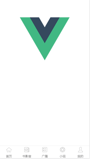
效果图:
3.实现点击切换的效果
步骤一:
先给Index.vue里面的tab组件加上v-model 来进行数据双向绑定,通过select来达到选择item,在item里面再添加一个选中的active图片
Index.vue
<template>
  <div>
    <m-tabbar v-model="select">
      <m-tabbar-item id='tab1'>
        <img src="../assets/images/ic_tab_home_normal.png" alt="" slot="icon-normal">
        <img src="../assets/images/ic_tab_home_active.png" alt="" slot="icon-active">
        首页
      </m-tabbar-item>
      <m-tabbar-item id='tab2'>
        <img src="../assets/images/ic_tab_subject_normal.png" alt="" slot="icon-normal">
        <img src="../assets/images/ic_tab_subject_active.png" alt="" slot="icon-active">
        书影音
      </m-tabbar-item>
      <m-tabbar-item id='tab3'>
        <img src="../assets/images/ic_tab_status_normal.png" alt="" slot="icon-normal">
        <img src="../assets/images/ic_tab_status_active.png" alt="" slot="icon-active">
        广播
      </m-tabbar-item>
      <m-tabbar-item id='tab4'>
        <img src="../assets/images/ic_tab_group_normal.png" alt="" slot="icon-normal">
        <img src="../assets/images/ic_tab_group_active.png" alt="" slot="icon-active">
        小组
      </m-tabbar-item>
      <m-tabbar-item id='tab5'>
        <img src="../assets/images/ic_tab_profile_normal.png" alt="" slot="icon-normal">
        <img src="../assets/images/ic_tab_profile_active.png" alt="" slot="icon-active">
        我的
      </m-tabbar-item>
    </m-tabbar>
  </div>
</template>

<script>
  import mTabbar from '../components/tabbar'
  import mTabbarItem from '../components/tabbar-item'
  export default {
    name: 'index',
    components: {
      mTabbar,
      mTabbarItem
    },
    data() {
      return {
        select:"tab1"
      }
    }
  }
</script>
步骤二:
tabbar.vue里面通过props来传递数据vaule
tabbar.vue
<template>
  <div class="m-tabbar">
    <slot></slot>
  </div>
</template>
<script>
  import mTabbarItem from './tabbar-item';
  export default {
    props: ['value']
  }
</script>
<style lang="less">
.m-tabbar{
  display: flex;
  flex-direction: row;
  position: fixed;
  bottom: 0;
  left: 0;
  right: 0;
   100%;
  overflow: hidden;
  height: 50px;
  background: #fff;
  border-top: 1px solid #e4e4e4;
}
</style>
步骤三:
tabbar-item.vue组件:根据父组件的value和当前组件的id判断是否为选中状态,通过 $parent.$emit('input',id) - 触发父组件的自定义事件,添加选中的图片,根据isActive来显示隐藏
tabbar-item.vue
<template>
    <a class="m-tabbar-item" :class="{'is-active':isActive}" @click="$parent.$emit('input',id)">
        <span class="m-tabbar-item-icon" v-show="!isActive"><slot name="icon-normal"></slot></span>
        <span class="m-tabbar-item-icon" v-show="isActive"><slot name="icon-active"></slot></span>
        <span class="m-tabbar-item-text"><slot></slot></span>
    </a>
</template>

<script>
    export default{
        props: ['id'],
        computed: {
            isActive(){
               if(this.$parent.value===this.id){
                   return true;
               }
            }
        }
    }
</script>

<style lang="less">
.m-tabbar-item{
    flex: 1;
    text-align: center;
    .m-tabbar-item-icon{
        display: block;
        padding-top: 2px;
        img{
             28px;
            height: 28px;
        }

    }
    .m-tabbar-item-text{
        display: block;
        font-size: 10px;
        color:#949494;
    }
    &.is-active{
        .m-tabbar-item-text{
            color: #42bd56;
        }
    }
}
</style>
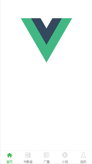
效果图:
.