box-sizing + margin负值 升级双飞翼布局
一、box-sizing属性
.content-size, .border-size{
    width: 200px;
    height: 100px;
    padding: 10px;
    border: 5px solid red;
    margin: 20px;
}
.content-size{
    box-sizing: content-box;
}
.border-size{
    box-sizing: border-box;
}
- context-size、border-size两个类的的width、height、padding、border、margin值都是一致。
- box-sizing: content-box时,div的宽度和高度为width和height的值
- box-sizing:border-box时,div的宽度和高度为 padding + border + width(内容高度)
二、border-box属性的应用
对双飞翼布局的改造,传统的双飞高度是自适应的。本次通过box-sizing属性的border-box值对双飞翼布局的高度进行定高,从而实现head与footer固定,而中间内容部分自动出现滚动条的能力。
代码如下:
<html>
<head>
    <meta charset="UTF-8">
    <title>Document</title>
    <style>
        div, body{
            margin: 0px;
        }
      .head{
          height: 60px;
          background: red;
      }
      .main {
          height: 100%;
          clear: both;
          box-sizing: border-box;
          padding: 60px 0px 100px 0px;
          margin: -60px 0px -100px 0px;
      }
      .main-main{
          clear: both;
      }
      .main-main:after{
          content: '';
          display: block;
          overflow: hidden;
          clear: both;
      }
      .cont-main{
          margin: 0px 300px 0px 200px;
          overflow: hidden;
          overflow-y: auto;
          height: inherit;
      }
      .main .cont, .main .left, .main .right{
          float: left;
          height: 100%;
      }
      .main .cont{
          width: 100%;
      }
      .main .left{
        width: 200px;
        margin-left: -100%;
      }
      .main .right{
        width: 300px;
        margin-left: -300px;
      }
      .footer{
          height: 100px;
          background: gray;
      }
    </style>
</head>
<body>
    <div class="head">head</div>
    <div class="main">
        <div class="main-main">
            <div class="cont">
                <div class="cont-main">
                    cont<br/>
                    cont<br/>
                    cont<br/>
                    cont<br/>
                    cont<br/>
                    cont<br/>
                    cont<br/>
                    cont<br/>
                    cont<br/>
                    cont<br/>
                    cont<br/>
                    cont<br/>
                    cont<br/>
                    cont最后一条<br/>
                </div>
            </div>
            <div class="left">left</div>
            <div class="right">right</div>
        </div>
    </div>
    <div class="footer">footer</div>
</body>
</html>
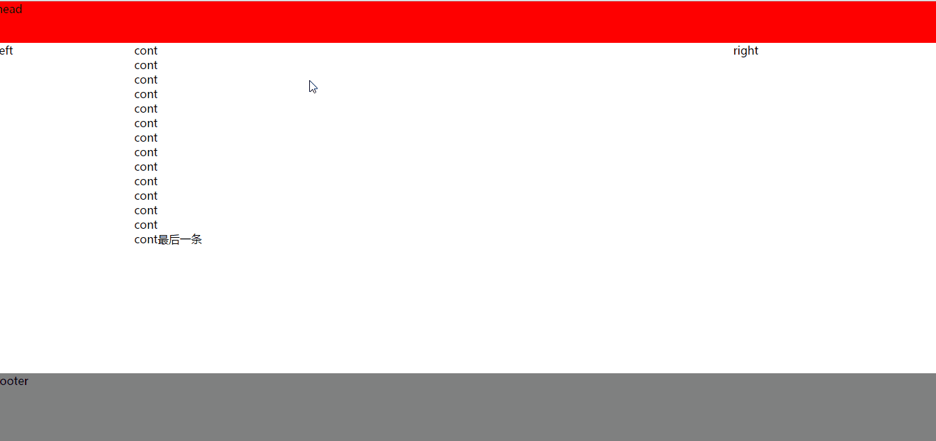
效果图:
重点代码解析
- 实现传统的双飞翼布局,此处不在赘述。
- 根据box-sizing属性的介绍,可以知道设置为border-box时,他的高度=padding + border的值,其中还需要利用margin的负值。
- padding缩小内容本身的高度
- margin负值拉近head、footer与内容的距离
.main {
      height: 100%;
      clear: both;
      box-sizing: border-box;
      padding: 60px 0px 100px 0px;
      margin: -60px 0px -100px 0px;
  }
- 内容部分滚动条的实现 由于我们的main(中间部分的最外层div,如.main)必须要设置height:100%,让其高度满屏。所以内容布局外层还需要增加一个div(如.main-main)。此时.main-main的高度就是我们想要的了。如下中间主体部分了css代码:
.cont-main{
  margin: 0px 300px 0px 200px;
  overflow: hidden;
  overflow-y: auto;
  height: inherit;
}