一列布局
1.一列布局
不是自适应
<!DOCTYPE html>
<html>
<head>
    <meta charset="UTF-8">
    <title>一列布局</title>
    <style>
        *{margin:0;padding:0;}
        #header{
            height:50px;
            background:blue;
        }
        #main{
            960px;
            height:800px; /* 在实际开发中不设置列的高度,让高度自适应。 */
            background:green;
            margin:0 auto;// 设置对象上下间距为0,左右自动,也就是水平居中
        }
        #footer{
            960px;
            height:100px;
            background:gray;
            margin:0 auto;
        }
    </style>
</head>
<body>
<div id="header">页头</div>
<div id="main">主体内容</div>
<div id="footer">页脚</div>
</body>
</html>
2.一列宽度自适应布局
要想宽度自适应,只需要按照百分比来设置宽度,内容就可以根据浏览器窗口自动调节大小。
下例中宽度是自适应的,而高度不是自适应的。
<!DOCTYPE html>
<html>
<head>
    <meta charset="UTF-8">
    <title>一列自适应布局</title>
<style>
*{margin:0;padding:0;}
#header{
    height:50px;
    background:blue;
}
#main{
    80%;
    height:800px; /* 在实际开发中不设置列的高度,让高度自适应。 */
    background:green;
    margin:0 auto;
}
#footer{
    80%;
    height:50px;
    background:gray;
    margin:0 auto;
}
</style>
</head>
<body>
<div id="header">页头</div>
<div id="main">主体内容</div>
<div id="footer">页脚</div>
</body>
</html>
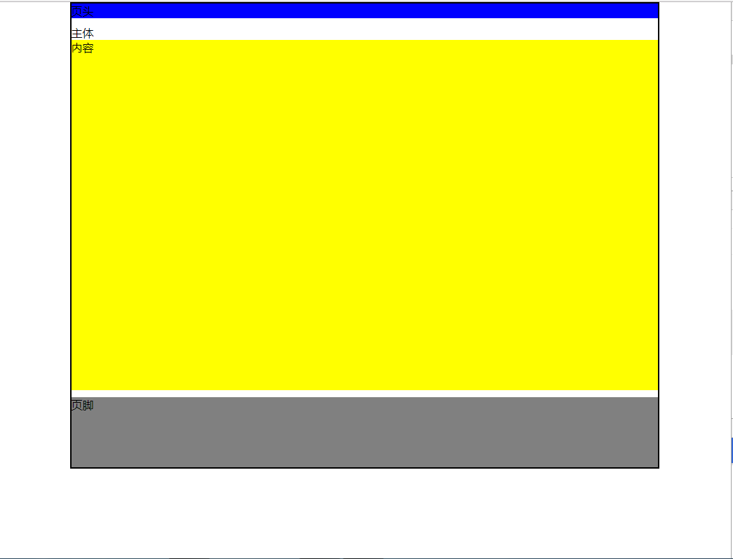
3.单列经典布局
<!DOCTYPE HTML>
<html>
<head>
    <meta charset="UTF-8" />
    <title>单列布局</title>
    <style>
        *{margin:0;padding:0;}
        #wrap{
            80%;
            margin:0 auto;
            border:2px solid black;
        }
        #header{
            100%;//百分比都是根据父元素的
            height:100px;
            background:blue;
            margin-bottom:10px;
        }
        #main{
            100%;
            margin-bottom:10px;
        }
        #main .content{
            height:500px; /* 在实际开发中不设置列的高度,让高度自适应。 */
            background:yellow;
        }
        #footer{
            100%;
            height:100px;
            background:gray;
        }
    </style>
<body>
<div id="wrap">
    <div id="header">页头</div>
    <div id="main">主体
        <div class="content">内容</div>
    </div>
    <div id="footer">页脚</div>
</div>
</body>
</html>
两列布局
1、宽度自适应两列布局
两列布局可以使用浮动来完成,左列设置左浮动,右列设置右浮动,这样就省的再设置外边距了。
当元素使用了浮动之后,会对周围的元素造成影响,那么就需要清除浮动,通常使用两种方法。可以给受到影响的元素设置 clear:both,即清除元素两侧的浮动,也可以设置具体清除哪一侧的浮动:clear:left 或 clear:right,但必须清楚的知道到底是哪一侧需要清除浮动的影响。也可以给浮动的父容器设置宽度,或者为 100%,同时设置 overflow:hidden,溢出隐藏也可以达到清除浮动的效果。
同理,两列宽度自适应,只需要将宽度按照百分比来设置,这样当浏览器窗口调整时,内容会根据窗口的大小,按照百分比来自动调节内容的大小。
<!DOCTYPE html>
<html>
<head>
    <meta charset="UTF-8">
    <title>宽度自适应两列布局</title>
<style>
*{margin:0;padding:0;}
#herder{
    height:50px;
    background:blue;
}
.main-left{
    30%;
    height:800px;
    background:red;
    float:left;
}
.main-right{
    70%;
    height:800px;
    background:pink;
    float:right;
}
#footer{
    clear:both;
    height:50px;
    background:gray;
}
</style>
</head>
<body>
<div id="herder">页头</div>
<div class="main-left">左列</div>
<div class="main-right">右列</div>
<div id="footer">页脚</div>
</body>
</html>
2、固定宽度两列布局
宽度自适应两列布局在网站中一般很少使用,最常使用的是固定宽度的两列布局。
要实现固定宽度的两列布局,也很简单,只需要把左右两列包裹起来,也就是给他们增加一个父容器,然后固定父容器的宽度,父容器的宽度固定了,那么这两列就可以设置具体的像素宽度了,这样就实现了固定宽度的两列布局。
<!DOCTYPE html>
<html>
<head>
    <meta charset="UTF-8">
    <title>固定宽度两列布局</title>
<style>
*{margin:0;padding:0;}
#herder{
    height:50px;
    background:blue;
}
#main{
    960px;
    margin:0 auto;
    overflow:hidden;
}
#main .main-left{
    288px;
    height:800px;
    background:red;
    float:left;
}
#main .main-right{
    672px;
    height:800px;
    background:pink;
    float:right;
}
#footer{
    960px;
    height:50px;
    background:gray;
    margin:0 auto;
}
</style>
</head>
<body>
<div id="herder">页头</div>
<div id="main">
    <div class="main-left">左列</div>
    <div class="main-right">右列</div>
</div>
<div id="footer">页脚</div>
</body>
</html>
3、两列居中自适应布局
同理,只需要给定父容器的宽度,然后让父容器水平居中。
<!DOCTYPE html>
<html>
<head>
    <meta charset="UTF-8">
    <title>两列居中自适应布局</title>
<style>
*{margin:0;padding:0;}
#herder{
    height:50px;
    background:blue;
}
#main{
    80%;
    margin:0 auto;
    overflow:hidden;
}
#main .main-left{
    20%;
    height:800px;
    background:red;
    float:left;
}
#main .main-right{
    80%;
    height:800px;
    background:pink;
    float:right;
}
#footer{
    80%;
    height:50px;
    background:gray;
    margin:0 auto;
}
</style>
</head>
<body>
<div id="herder">页头</div>
<div id="main">
    <div class="main-left">左列</div>
    <div class="main-right">右列</div>
</div>
<div id="footer">页脚</div>
</body>
</html>
4、固定宽度横向两列布局
和单列布局相同,可以把所有块包含在一个容器中,这样做方便设置,但增加了无意义的代码,固定宽度就是给定父容器的宽度,然后中间主体使用浮动。
<!DOCTYPE html>
<html>
<head>
    <meta charset="UTF-8">
    <title>横向两列布局</title>
<style>
*{margin:0;padding:0;}
#warp{
    960px;
    margin:0 auto;
    margin-top:10px;
}
#herder{
    height:50px;
    background:blue;
}
#nav{
    height:30px;
    background:orange;
    margin:10px 0;
}
#main{
    100%;
    margin-bottom:10px;
    overflow:hidden;
}
#main .main-left{
    640px;
    height:200px;
    background:yellow;
    float:left;
}
#main .main-right{
    300px;
    height:200px;
    background:pink;
    float:right;
}
#content{
    100%;
    overflow:hidden;
}
#content .content-left{
    640px;
    height:800px;
    background:lightgreen;
    float:left;
}
#content .content-right-sup{
    300px;
    height:500px;
    background:lightblue;
    float:right;
}
#content .content-right-sub{
    300px;
    height:240px;
    background:purple;
    margin-top:20px;
    float:right;
}
#footer{
    height:50px;
    background:gray;
    margin-top:10px;
}
</style>
</head>
<body>
<div id="warp">
    <div id="herder">页头</div>
    <div id="nav">导航</div>
    <div id="main">
        <div class="main-left">左-上</div>
        <div class="main-right">右-上</div>
    </div>
    <div id="content">
        <div class="content-left">左-下</div>
        <div class="content-right-sup">右-上</div>
        <div class="content-right-sub">右-下</div>
    </div>
    <div id="footer">页脚</div>
</div>
</body>
</html>
三列布局
1、宽度自适应三列布局
三列布局的原理和两列布局的原理是一样的,只不过多了一列,只需给宽度自适应两列布局中间再加一列,然后重新计算三列的宽度,就实现了宽度自适应的三列布局。
同样的道理,更多列的布局,其实和两列、三列的布局模式是一样的。
<!DOCTYPE html>
<html>
<head>
    <meta charset="UTF-8">
    <title>三列布局</title>
<style>
*{margin:0;padding:0;}
#herder{
    height:50px;
    background:blue;
}
#main{
    100%;
    overflow:hidden;
}
#main .main-left{
    25%;
    height:800px;
    background:red;
    float:left;
}
#main .main-center{
    50%;
    height:800px;
    background:lightgreen;
    float:left;
}
#main .main-right{
    25%;
    height:800px;
    background:pink;
    float:right;
}
#footer{
    height:50px;
    background:gray;
}
</style>
</head>
<body>
<div id="herder">页头</div>
<div id="main">
    <div class="main-left">左列</div>
    <div class="main-center">中间</div>
    <div class="main-right">右列</div>
</div>
<div id="footer">页脚</div>
</body>
</html>
2、左右两列固定宽度,中间内容宽度自适应
要想实现左右两列固定宽度,中间宽度自适应的布局,那么使用浮动就做不到了,使用浮动之后页面就乱了,必须使用绝对定位来将三列固定在一行。
<!DOCTYPE html>
<html>
<head>
    <meta charset="UTF-8">
    <title>两边固定中间自适应布局</title>
<style>
*{margin:0;padding:0;}
#herder{
    height:50px;
    background:blue;
}
#main{
    100%;
    position:relative;
}
#main .main-left{
    200px;
    height:800px;
    background:red;
    position:absolute;
    left:0;
    top:0;
}
#main .main-center{
    height:800px;
    background:lightgreen;
    margin:0 310px 0 210px;
}
#main .main-right{
    300px;
    height:800px;
    background:pink;
    position:absolute;
    right:0;
    top:0;
}
#footer{
    height:50px;
    background:gray;
}
</style>
</head>
<body>
<div id="herder">页头</div>
<div id="main">
    <div class="main-left">左列</div>
    <div class="main-center">设计网页的第一步就是设计版面布局,搭建网站结构,网页排版的合理性,在一定程度上也影响着网站整体的布局以及后期的优化。一个好的网站形象能更容易地吸引用户、留住用户。因此,网站首页第一屏的排版非常重要,很多时候能决定用户的去与留。</div>
    <div class="main-right">右列</div>
</div>
<div id="footer">页脚</div>
</body>
</html>