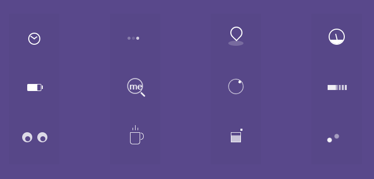
• 【小记】-005--纯CSS实现的小玩意儿


    效果图奉上

    代码奉上

    <!DOCTYPE html>
    <html lang="zh">
        <head>
            <meta charset="UTF-8">
            <meta name="viewport" content="width=device-width, initial-scale=1.0">
            <meta http-equiv="X-UA-Compatible" content="ie=edge">
            <title></title>
            <style type="text/css">
                * {
                    -webkit-box-sizing: border-box;
                    -moz-box-sizing: border-box;
                    box-sizing: border-box;
                }
    
                html {
                    color: #fff;
                    font-family: 'Source Sans Pro', sans-serif;
                    background-color: #59488b;
                }
    
                h1,
                h2 {
                    color: rgba(255, 255, 255, 0.5);
                    font-size: 40px;
                    font-weight: 200;
                    text-align: center;
                    margin: 40px 0 0 0;
                }
    
                h2 {
                    font-size: 18px;
                    margin: 0;
                    padding: 0;
                    margin: 10px 0;
                }
    
                h1 span {
                    font-size: 30px;
                }
    
                a {
                    text-decoration: none;
                }
    
                a:hover {
                    transition: all linear 0.2s;
                }
    
                ::-moz-selection {
                    background: #b3d4fc;
                    text-shadow: none;
                }
    
                ::selection {
                    background: #b3d4fc;
                    text-shadow: none;
                }
    
    
                .wrapper {
                    width: 700px;
                    margin: 0 auto;
                }
    
                .row {
                    text-align: center;
                    padding: 50px 0;
                }
    
                .span,
                .span_large {
                    float: left;
                    width: 100px;
                    background-color: rgba(0, 0, 0, 0.02);
                    height: 100px;
                    vertical-align: middle;
                    border-radius: 1px;
                    margin-right: 100px;
                }
    
                .span:last-child {
                    margin-right: 0px;
                }
    
                /* Timer*/
                .timer {
                    width: 24px;
                    height: 24px;
                    background-color: transparent;
                    box-shadow: inset 0px 0px 0px 2px #fff;
                    border-radius: 50%;
                    position: relative;
                    margin: 38px auto;
                    /* Not necessary- its only for layouting*/
                }
    
                .timer:after,
                .timer:before {
                    position: absolute;
                    content: "";
                    background-color: #fff;
                }
    
                .timer:after {
                    width: 10px;
                    height: 2px;
                    top: 11px;
                    left: 11px;
                    -webkit-transform-origin: 1px 1px;
                    -moz-transform-origin: 1px 1px;
                    transform-origin: 1px 1px;
                    -webkit-animation: minhand 2s linear infinite;
                    -moz-animation: minhand 2s linear infinite;
                    animation: minhand 2s linear infinite;
                }
    
                .timer:before {
                    width: 8px;
                    height: 2px;
                    top: 11px;
                    left: 11px;
                    -webkit-transform-origin: 1px 1px;
                    -moz-transform-origin: 1px 1px;
                    transform-origin: 1px 1px;
                    -webkit-animation: hrhand 8s linear infinite;
                    -moz-animation: hrhand 8s linear infinite;
                    animation: hrhand 8s linear infinite;
                }
    
                @-webkit-keyframes minhand {
                    0% {
                        -webkit-transform: rotate(0deg)
                    }
    
                    100% {
                        -webkit-transform: rotate(360deg)
                    }
                }
    
                @-moz-keyframes minhand {
                    0% {
                        -moz-transform: rotate(0deg)
                    }
    
                    100% {
                        -moz-transform: rotate(360deg)
                    }
                }
    
                @keyframes minhand {
                    0% {
                        transform: rotate(0deg)
                    }
    
                    100% {
                        transform: rotate(360deg)
                    }
                }
    
                @-webkit-keyframes hrhand {
                    0% {
                        -webkit-transform: rotate(0deg)
                    }
    
                    100% {
                        -webkit-transform: rotate(360deg)
                    }
                }
    
                @-moz-keyframes hrhand {
                    0% {
                        -moz-transform: rotate(0deg)
                    }
    
                    100% {
                        -moz-transform: rotate(360deg)
                    }
                }
    
                @keyframes hrhand {
                    0% {
                        transform: rotate(0deg)
                    }
    
                    100% {
                        transform: rotate(360deg)
                    }
                }
    
                /*Typing Loader*/
                .typing_loader {
                    width: 6px;
                    height: 6px;
                    border-radius: 50%;
                    -webkit-animation: typing 1s linear infinite alternate;
                    -moz-animation: Typing 1s linear infinite alternate;
                    animation: typing 1s linear infinite alternate;
                    margin: 46px auto;
                    /* Not necessary- its only for layouting*/
                    position: relative;
                    left: -12px;
                }
    
                @-webkit-keyframes typing {
                    0% {
                        background-color: rgba(255, 255, 255, 1);
                        box-shadow: 12px 0px 0px 0px rgba(255, 255, 255, 0.2),
                            24px 0px 0px 0px rgba(255, 255, 255, 0.2);
                    }
    
                    25% {
                        background-color: rgba(255, 255, 255, 0.4);
                        box-shadow: 12px 0px 0px 0px rgba(255, 255, 255, 2),
                            24px 0px 0px 0px rgba(255, 255, 255, 0.2);
                    }
    
                    75% {
                        background-color: rgba(255, 255, 255, 0.4);
                        box-shadow: 12px 0px 0px 0px rgba(255, 255, 255, 0.2),
                            24px 0px 0px 0px rgba(255, 255, 255, 1);
                    }
                }
    
                @-moz-keyframes typing {
                    0% {
                        background-color: rgba(255, 255, 255, 1);
                        box-shadow: 12px 0px 0px 0px rgba(255, 255, 255, 0.2),
                            24px 0px 0px 0px rgba(255, 255, 255, 0.2);
                    }
    
                    25% {
                        background-color: rgba(255, 255, 255, 0.4);
                        box-shadow: 12px 0px 0px 0px rgba(255, 255, 255, 2),
                            24px 0px 0px 0px rgba(255, 255, 255, 0.2);
                    }
    
                    75% {
                        background-color: rgba(255, 255, 255, 0.4);
                        box-shadow: 12px 0px 0px 0px rgba(255, 255, 255, 0.2),
                            24px 0px 0px 0px rgba(255, 255, 255, 1);
                    }
                }
    
                @keyframes typing {
                    0% {
                        background-color: rgba(255, 255, 255, 1);
                        box-shadow: 12px 0px 0px 0px rgba(255, 255, 255, 0.2),
                            24px 0px 0px 0px rgba(255, 255, 255, 0.2);
                    }
    
                    25% {
                        background-color: rgba(255, 255, 255, 0.4);
                        box-shadow: 12px 0px 0px 0px rgba(255, 255, 255, 2),
                            24px 0px 0px 0px rgba(255, 255, 255, 0.2);
                    }
    
                    75% {
                        background-color: rgba(255, 255, 255, 0.4);
                        box-shadow: 12px 0px 0px 0px rgba(255, 255, 255, 0.2),
                            24px 0px 0px 0px rgba(255, 255, 255, 1);
                    }
                }
    
                /*Location indicator */
                .location_indicator {
                    margin: 30px auto;
                    position: relative;
                    left: -9px;
                }
    
                .location_indicator:before,
                .location_indicator:after {
                    position: absolute;
                    content: "";
                }
    
                .location_indicator:before {
                    width: 20px;
                    height: 20px;
                    border-radius: 100% 100% 100% 0;
                    box-shadow: 0px 0px 0px 2px rgba(255, 255, 255, 1);
                    -webkit-animation: mapping 1s linear infinite;
                    -moz-animation: mapping 1s linear infinite;
                    animation: mapping 1s linear infinite;
                    -webkit-transform: rotate(-46deg);
                    -moz-transform: rotate(-46deg);
                    transform: rotate(-46deg);
    
                }
    
                .location_indicator:after {
                    width: 30px;
                    height: 10px;
                    border-radius: 100%;
                    left: 44px;
                    background-color: rgba(255, 255, 255, 0.2);
                    top: 24px;
                    z-index: -1;
                }
    
                @-webkit-keyframes mapping {
                    0% {
                        top: 0;
                    }
    
                    50% {
                        top: -5px;
                    }
    
                    100% {
                        top: 0;
                    }
                }
    
                @-moz-keyframes mapping {
                    0% {
                        top: 0;
                    }
    
                    50% {
                        top: -5px;
                    }
    
                    100% {
                        top: 0;
                    }
                }
    
                @-keyframes mapping {
                    0% {
                        top: 0;
                    }
    
                    50% {
                        top: -5px;
                    }
    
                    100% {
                        top: 0;
                    }
                }
    
                /* go in*/
                .dashboard {
                    width: 32px;
                    height: 32px;
                    margin: 30px auto;
                    border: 2px rgba(255, 255, 255, 1) solid;
                    border-radius: 100%;
                    position: relative;
                    overflow: hidden;
                    z-index: 1;
                }
    
                .dashboard:after,
                .dashboard:before {
                    position: absolute;
                    content: "";
                }
    
                .dashboard:after {
                    width: 14px;
                    height: 2px;
                    top: 20px;
                    -webkit-transform-origin: 1px 1px;
                    -moz-transform-origin: 1px 1px;
                    transform-origin: 1px 1px;
                    background-color: rgba(255, 255, 255, 1);
                    -webkit-animation: dashboard_hand 2s linear infinite alternate;
                    -moz-animation: dashboard_hand 2s linear infinite alternate;
                    animation: dashboard_hand 2s linear infinite alternate;
                }
    
                .dashboard:before {
                    width: 32px;
                    height: 10px;
                    background-color: rgba(255, 255, 255, 1);
                    top: 20px;
                    left: -2px;
                }
    
                @-webkit-keyframes dashboard_hand {
                    0% {
                        -webkit-transform: rotate(-160deg);
                    }
    
                    100% {
                        -webkit-transform: rotate(-20deg);
                    }
                }
    
                @-moz-keyframes dashboard_hand {
                    0% {
                        -moz-transform: rotate(-160deg);
                    }
    
                    100% {
                        -moz-transform: rotate(-20deg);
                    }
                }
    
                @keyframes dashboard_hand {
                    0% {
                        transform: rotate(-160deg);
                    }
    
                    100% {
                        transform: rotate(-20deg);
                    }
                }
    
                /*Battery*/
                .battery {
                    width: 28px;
                    height: 14px;
                    border: 1px #fff solid;
                    border-radius: 2px;
                    position: relative;
                    -webkit-animation: charge 5s linear infinite;
                    -moz-animation: charge 5s linear infinite;
                    animation: charge 5s linear infinite;
                    top: 40px;
                    margin: 0 auto;
                }
    
                .battery:after {
                    width: 2px;
                    height: 7px;
                    background-color: #fff;
                    border-radius: 0px 1px 1px 0px;
                    position: absolute;
                    content: "";
                    top: 2px;
                    right: -4px;
                }
    
                @-webkit-keyframes charge {
                    0% {
                        box-shadow: inset 0px 0px 0px #fff;
                    }
    
                    100% {
                        box-shadow: inset 30px 0px 0px #fff;
                    }
                }
    
                @-moz-keyframes charge {
                    0% {
                        box-shadow: inset 0px 0px 0px #fff;
                    }
    
                    100% {
                        box-shadow: inset 30px 0px 0px #fff;
                    }
                }
    
                @keyframes charge {
                    0% {
                        box-shadow: inset 0px 0px 0px #fff;
                    }
    
                    100% {
                        box-shadow: inset 30px 0px 0px #fff;
                    }
                }
    
                .magnifier {
                    width: 20px;
                    height: 20px;
                    box-shadow: 0px 0px 0px 1px #fff;
                    border-radius: 50%;
                    position: relative;
                    margin: 34px auto;
                    -webkit-animation: magnify 1s linear infinite alternate;
                    -moz-animation: magnify 1s linear infinite alternate;
                    animation: magnify 1s linear infinite alternate;
                }
    
                .magnifier:after,
                .magnifier:before {
                    position: absolute;
                    content: "";
                }
    
                .magnifier:before {
                    content: "me";
                    font-size: 12px;
                    left: 2px;
                    text-align: center;
                    top: 2px;
                }
    
                .magnifier:after {
                    width: 2px;
                    height: 8px;
                    background-color: #fff;
                    bottom: -6px;
                    left: 20px;
                    border-radius: 2px;
                    -webkit-transform: rotate(-45deg);
                    -moz-transform: rotate(-45deg);
                    transform: rotate(-45deg);
                }
    
                @-webkit-keyframes magnify {
                    0% {
                        -webkit-transform: scale(1);
                    }
    
                    100% {
                        -webkit-transform: scale(1.5);
                    }
                }
    
                @-moz-keyframes magnify {
                    0% {
                        -moz-transform: scale(1);
                    }
    
                    100% {
                        -moz-transform: scale(1.5);
                    }
                }
    
                @keyframes magnify {
                    0% {
                        transform: scale(1);
                    }
    
                    100% {
                        transform: scale(1.5);
                    }
                }
    
                /*help ´óÍ·Íø www.datouwang.com */
                .help {
                    width: 30px;
                    height: 30px;
                    border: 1px #fff solid;
                    border-radius: 50%;
                    -webkit-animation: rotation 1s ease-in-out infinite;
                    -moz-animation: rotation 1s ease-in-out infinite;
                    animation: rotation 1s ease-in-out infinite;
                    margin: 30px auto;
                }
    
                .help:after {
                    width: 5px;
                    height: 5px;
                    background-color: rgba(255, 255, 255, 1);
                    border-radius: 100%;
                    position: absolute;
                    content: "";
                }
    
                @-webkit-keyframes rotation {
                    0% {
                        -webkit-transform: rotate(0deg);
                    }
    
                    100% {
                        -webkit-transform: rotate(360deg);
                    }
                }
    
                @-moz-keyframes rotation {
                    0% {
                        -moz-transform: rotate(0deg);
                    }
    
                    100% {
                        -moz-transform: rotate(360deg);
                    }
                }
    
                @keyframes rotation {
                    0% {
                        transform: rotate(0deg);
                    }
    
                    100% {
                        transform: rotate(360deg);
                    }
                }
    
                /*eye ball*/
                .eye {
                    width: 20px;
                    height: 20px;
                    background-color: rgba(255, 255, 255, 0.8);
                    border-radius: 50%;
                    box-shadow: 30px 0px 0px 0px rgba(255, 255, 255, 0.8);
                    position: relative;
                    margin: 36px 26px;
                }
    
                .eye:after {
                    background-color: #59488b;
                    width: 10px;
                    height: 10px;
                    box-shadow: 30px 0px 0px 0px #59488b;
                    border-radius: 50%;
                    left: 9px;
                    top: 8px;
                    position: absolute;
                    content: "";
                    -webkit-animation: eyeball 2s linear infinite alternate;
                    -moz-animation: eyeball 2s linear infinite alternate;
                    animation: eyeball 2s linear infinite alternate;
                }
    
                @-webkit-keyframes eyeball {
                    0% {
                        left: 9px;
                    }
    
                    100% {
                        left: 1px;
                    }
                }
    
                @-moz-keyframes eyeball {
                    0% {
                        left: 9px;
                    }
    
                    100% {
                        left: 1px;
                    }
                }
    
                @keyframes eyeball {
                    0% {
                        left: 9px;
                    }
    
                    100% {
                        left: 1px;
                    }
                }
    
                /*coffee cup*/
                .coffee_cup {
                    width: 20px;
                    height: 24px;
                    border: 1px rgba(255, 255, 255, 1) solid;
                    border-radius: 0px 0px 5px 5px;
                    position: relative;
                    margin: 36px auto;
                }
    
                .coffee_cup:after,
                .coffee_cup:before {
                    position: absolute;
                    content: "";
                }
    
                .coffee_cup:after {
                    width: 5px;
                    height: 12px;
                    border: 1px #fff solid;
                    border-left: none;
                    border-radius: 0px 20px 20px 0px;
                    left: 20px;
                }
    
                .coffee_cup:before {
                    width: 1px;
                    height: 6px;
                    background-color: rgba(255, 255, 255, 1);
                    top: -10px;
                    left: 4px;
                    box-shadow: 5px 0px 0px 0px rgba(255, 255, 255, 1),
                        5px -5px 0px 0px rgba(255, 255, 255, 1),
                        10px 0px 0px 0px rgba(255, 255, 255, 1);
                    -webkit-animation: steam 1s linear infinite alternate;
                    -moz-animation: steam 1s linear infinite alternate;
                    animation: steam 1s linear infinite alternate;
                }
    
                @-webkit-keyframes steam {
                    0% {
                        height: 0px;
                    }
    
                    100% {
                        height: 6px;
                    }
                }
    
                @-moz-keyframes steam {
                    0% {
                        height: 0px
                    }
    
                    100% {
                        height: 6px;
                    }
                }
    
                @keyframes steam {
                    0% {
                        height: 0px
                    }
    
                    100% {
                        height: 6px;
                    }
                }
    
                /*square*/
                .square {
                    width: 20px;
                    height: 20px;
                    border: 1px rgba(255, 255, 255, 1) solid;
                    margin: 36px auto;
                    position: relative;
                    -webkit-animation: fill_color 5s linear infinite;
                    -moz-animation: fill_color 5s linear infinite;
                    animation: fill_color 5s linear infinite;
                }
    
                .square:after {
                    width: 4px;
                    height: 4px;
                    position: absolute;
                    content: "";
                    background-color: rgba(255, 255, 255, 1);
                    top: -8px;
                    left: 0px;
                    -webkit-animation: square_check 1s ease-in-out infinite;
                    -moz-animation: square_check 1s ease-in-out infinite;
                    animation: square_check 1s ease-in-out infinite;
                }
    
                @-webkit-keyframes square_check {
                    25% {
                        left: 22px;
                        top: -8px;
                    }
    
                    50% {
                        left: 22px;
                        top: 22px;
                    }
    
                    75% {
                        left: -9px;
                        top: 22px;
                    }
    
                    100% {
                        left: -9px;
                        top: -7px;
                    }
                }
    
                @-moz-keyframes square_check {
                    25% {
                        left: 22px;
                        top: -8px;
                    }
    
                    50% {
                        left: 22px;
                        top: 22px;
                    }
    
                    75% {
                        left: -9px;
                        top: 22px;
                    }
    
                    100% {
                        left: -9px;
                        top: -7px;
                    }
                }
    
                @keyframes square_check {
                    25% {
                        left: 22px;
                        top: -8px;
                    }
    
                    50% {
                        left: 22px;
                        top: 22px;
                    }
    
                    75% {
                        left: -9px;
                        top: 22px;
                    }
    
                    100% {
                        left: -9px;
                        top: -7px;
                    }
                }
    
                @-webkit-keyframes fill_color {
                    0% {
                        box-shadow: inset 0px 0px 0px 0px rgba(255, 255, 255, 0.1);
                    }
    
                    100% {
                        box-shadow: inset 0px -20px 0px 0px rgba(255, 255, 255, 1);
                    }
                }
    
                @-moz-keyframes fill_color {
                    0% {
                        box-shadow: inset 0px 0px 0px 0px rgba(255, 255, 255, 0.1);
                    }
    
                    100% {
                        box-shadow: inset 0px -20px 0px 0px rgba(255, 255, 255, 1);
                    }
                }
    
                @keyframes fill_color {
                    0% {
                        box-shadow: inset 0px 0px 0px 0px rgba(255, 255, 255, 0.1);
                    }
    
                    100% {
                        box-shadow: inset 0px -20px 0px 0px rgba(255, 255, 255, 1);
                    }
                }
    
                /*circle classick*/
                .circle {
                    margin: 40px auto;
                    position: relative;
                    width: 8px;
                    height: 8px;
                    background-color: rgba(255, 255, 255, .5);
                    ;
                    box-shadow: -14px 0px 0px rgba(255, 255, 255, 1);
                    border-radius: 50%;
                    -webkit-animation: circle_classic 1s ease-in-out infinite alternate;
                    -moz-animation: circle_classic 1s ease-in-out infinite alternate;
                    animation: circle_classic 1s ease-in-out infinite alternate;
                }
    
                @-webkit-keyframes circle_classic {
                    0% {
                        opacity: 0.1;
                        -webkit-transform: rotate(0deg) scale(0.5);
                    }
    
                    100% {
                        opacity: 1;
                        -webkit-transform: rotate(360deg) scale(1.2);
                    }
                }
    
                @-moz-keyframes circle_classic {
                    0% {
                        opacity: 0.1;
                        -moz-transform: rotate(0deg) scale(0.5);
                    }
    
                    100% {
                        opacity: 1;
                        -moz-transform: rotate(360deg) scale(1.2);
                    }
                }
    
                @keyframes circle_classic {
                    0% {
                        opacity: 0.1;
                        transform: rotate(0deg) scale(0.5);
                    }
    
                    100% {
                        opacity: 1;
                        transform: rotate(360deg) scale(1.2);
                    }
                }
    
                /*cloud*/
    
                .cloud {
                    margin: 42px 30px;
                    width: 4px;
                    height: 10px;
                    opacity: 0.5;
                    position: relative;
                    box-shadow: 6px 0px 0px 0px rgba(255, 255, 255, 1),
                        12px 0px 0px 0px rgba(255, 255, 255, 1),
                        18px 0px 0px 0px rgba(255, 255, 255, 1),
                        24px 0px 0px 0px rgba(255, 255, 255, 1),
                        30px 0px 0px 0px rgba(255, 255, 255, 1),
                        36px 0px 0px 0px rgba(255, 255, 255, 1);
    
                    -webkit-animation: rain 1s linear infinite alternate;
                    -moz-animation: rain 1s linear infinite alternate;
                    animation: rain 1s linear infinite alternate;
                }
    
                .cloud:after {
                    width: 40px;
                    height: 10px;
                    position: absolute;
                    content: "";
                    background-color: rgba(255, 255, 255, 1);
                    top: 0px;
                    opacity: 1;
                    -webkit-animation: line_flow 2s linear infinite reverse;
                    -moz-animation: line_flow 2s linear infinite reverse;
                    animation: line_flow 2s linear infinite reverse;
                }
    
                @-webkit-keyframes rain {
                    0% {
                        box-shadow: 6px 0px 0px 0px rgba(255, 255, 255, 1),
                            12px 0px 0px 0px rgba(255, 255, 255, 0.9),
                            18px 0px 0px 0px rgba(255, 255, 255, 0.7),
                            24px 0px 0px 0px rgba(255, 255, 255, 0.6),
                            30px 0px 0px 0px rgba(255, 255, 255, 0.3),
                            36px 0px 0px 0px rgba(255, 255, 255, 0.2);
                    }
    
                    100% {
                        box-shadow: 6px 0px 0px 0px rgba(255, 255, 255, 0.2),
                            12px 0px 0px 0px rgba(255, 255, 255, 0.3),
                            18px 0px 0px 0px rgba(255, 255, 255, 0.6),
                            24px 0px 0px 0px rgba(255, 255, 255, 0.7),
                            30px 0px 0px 0px rgba(255, 255, 255, 0.9),
                            36px 0px 0px 0px rgba(255, 255, 255, 1);
                        opacity: 1;
                    }
                }
    
                @-moz-keyframes rain {
                    0% {
                        box-shadow: 6px 0px 0px 0px rgba(255, 255, 255, 1),
                            12px 0px 0px 0px rgba(255, 255, 255, 0.9),
                            18px 0px 0px 0px rgba(255, 255, 255, 0.7),
                            24px 0px 0px 0px rgba(255, 255, 255, 0.6),
                            30px 0px 0px 0px rgba(255, 255, 255, 0.3),
                            36px 0px 0px 0px rgba(255, 255, 255, 0.2);
                    }
    
                    100% {
                        box-shadow: 6px 0px 0px 0px rgba(255, 255, 255, 0.2),
                            12px 0px 0px 0px rgba(255, 255, 255, 0.3),
                            18px 0px 0px 0px rgba(255, 255, 255, 0.6),
                            24px 0px 0px 0px rgba(255, 255, 255, 0.7),
                            30px 0px 0px 0px rgba(255, 255, 255, 0.9),
                            36px 0px 0px 0px rgba(255, 255, 255, 1);
                        opacity: 1;
                    }
                }
    
                @keyframes rain {
                    0% {
                        box-shadow: 6px 0px 0px 0px rgba(255, 255, 255, 1),
                            12px 0px 0px 0px rgba(255, 255, 255, 0.9),
                            18px 0px 0px 0px rgba(255, 255, 255, 0.7),
                            24px 0px 0px 0px rgba(255, 255, 255, 0.6),
                            30px 0px 0px 0px rgba(255, 255, 255, 0.3),
                            36px 0px 0px 0px rgba(255, 255, 255, 0.2);
                    }
    
                    100% {
                        box-shadow: 6px 0px 0px 0px rgba(255, 255, 255, 0.2),
                            12px 0px 0px 0px rgba(255, 255, 255, 0.3),
                            18px 0px 0px 0px rgba(255, 255, 255, 0.6),
                            24px 0px 0px 0px rgba(255, 255, 255, 0.7),
                            30px 0px 0px 0px rgba(255, 255, 255, 0.9),
                            36px 0px 0px 0px rgba(255, 255, 255, 1);
                        opacity: 1;
                    }
                }
    
                @-webkit-keyframes line_flow {
                    0% {
                        width: 0px;
                    }
    
                    100% {
                        width: 40px;
                    }
                }
    
                @-moz-keyframes line_flow {
                    0% {
                        width: 0px;
                    }
    
                    100% {
                        width: 40px;
                    }
                }
    
                @keyframes line_flow {
                    0% {
                        width: 0px;
                    }
    
                    100% {
                        width: 40px;
                    }
                }
    
                /* Me */
    
                .aboutme {
                    width: 700px;
                    padding: 50px 0;
                    border-top: 2px rgba(255, 255, 255, 0.03) solid;
                }
    
                .viduthalai {
                    background: url(../img/viduthalai.png) no-repeat;
                    width: 100px;
                    height: 100px;
                    border-radius: 0 2px 2px 0;
                    float: left;
                    opacity: 0.5;
                }
    
                .viduthalai:hover {
                    opacity: 1;
                }
    
                .intro {
                    float: left;
                    width: 400px;
                    padding-left: 20px;
                    color: rgba(255, 255, 255, 0.5);
                }
    
                .intro a {
                    color: rgba(255, 255, 255, 0.5);
                }
    
                .intro a:hover {
                    color: rgba(255, 255, 255, 1);
                }
    
                .intro span,
                p {
                    font-size: 15px;
                    font-weight: 200;
                }
    
                .intro h3 {
                    font-size: 20px;
                    font-weight: 200;
                    margin: 0px;
                }
    
                .git {
                    color: rgba(255, 255, 255, 0.5);
                    float: right;
                    text-align: right;
                    padding: 10px 20px;
                    border-radius: 2px;
                    background-color: rgba(0, 0, 0, 0.3);
                    font-weight: 200;
                }
    
                .git:hover {
                    background-color: rgba(0, 0, 0, 0.2);
                }
            </style>
        </head>
        <body>
    
            <div style="text-align:center;clear:both">
                <script src="/gg_bd_ad_720x90.js" type="text/javascript"></script>
                <script src="/follow.js" type="text/javascript"></script>
            </div>
            <!-- 代码 开始 -->
            <div class="wrapper">
                <div class="row cf">
                    <div class="span">
                        <div class="timer"></div>
                    </div>
                    <div class="span">
                        <div class="typing_loader"></div>
                    </div>
                    <div class="span">
                        <div class="location_indicator"></div>
                    </div>
                    <div class="span">
                        <div class="dashboard"></div>
                    </div>
                </div>
    
                <div class="row cf">
                    <div class="span">
                        <div class="battery"></div>
                    </div>
                    <div class="span">
                        <div class="magnifier"></div>
                    </div>
                    <div class="span">
                        <div class="help"></div>
                    </div>
                    <div class="span">
                        <div class="cloud"></div>
                    </div>
                </div>
    
                <div class="row cf">
                    <div class="span">
                        <div class="eye"></div>
                    </div>
                    <div class="span">
                        <div class="coffee_cup"></div>
                    </div>
                    <div class="span">
                        <div class="square"></div>
                    </div>
                    <div class="span">
                        <div class="circle"></div>
                    </div>
                </div>
            </div>
            <!-- 代码 结束 -->
            <div style="text-align:center;clear:both">
                <script src="/gg_bd_ad_720x90-2.js" type="text/javascript"></script>
            </div>
    
        </body>
    </html>

    这个忘记是哪位博主的了,就不贴链接了,看到请联系

    另外还看到比较漂亮的Loading图

    https://blog.csdn.net/qingfeidie/article/details/79976151

    https://www.cnblogs.com/lhb25/p/loading-spinners-animated-with-css3.html

  • 相关阅读:
    《C语言笔记:linux下C程序的内存映像》
    《C语言笔记:结构体内存对齐》
    《C语言笔记:一些自实现的字符串函数》
    《C语言笔记:大小端模式》
    《将博客搬至CSDN》
    《C语言笔记:三种内存来源》
    使用vue-cli3的方式创建项目并引入vant
    tomcat部署多个项目
    jenkins构建项目失败
    tomcat安装
  • 原文地址:https://www.cnblogs.com/asenper/p/10732026.html
Copyright © 2020-2023  润新知