实现思路
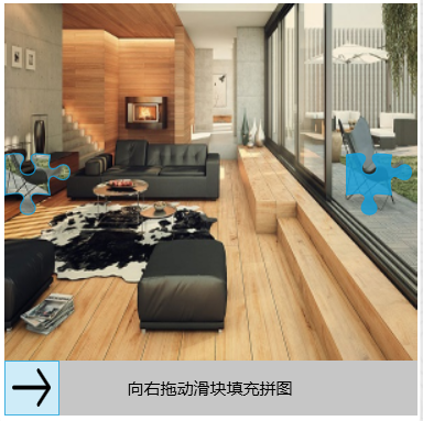
1:一个背景图
2:一个拼图路径(里面用实色填充)覆盖在背景图上,偏移x。
3:另一个可以移动的拼图路径,初始偏移为0,里面用背景图片的偏移x填充。
4.一个滑动块,他的值变化与3中的路径偏移同步变化。
非常简单,对不对。
截图如下:
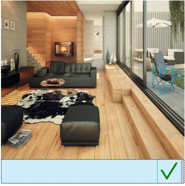
移动滑块后
好了,现在上代码
控件SliderVerify的XAML代码如下
<UserControl x:Class="Util.Controls.SliderVerify"
             xmlns="http://schemas.microsoft.com/winfx/2006/xaml/presentation"
             xmlns:x="http://schemas.microsoft.com/winfx/2006/xaml"
             xmlns:mc="http://schemas.openxmlformats.org/markup-compatibility/2006"
             xmlns:d="http://schemas.microsoft.com/expression/blend/2008"
             xmlns:controls="clr-namespace:Util.Controls"
             mc:Ignorable="d"
             d:DesignHeight="450" d:DesignWidth="800">
    <UserControl.Resources>

        <Style x:Key="SliderButtonStyle" TargetType="{x:Type RepeatButton}">
            <Setter Property="Focusable" Value="false" />
            <Setter Property="IsTabStop" Value="false" />
            <Setter Property="OverridesDefaultStyle" Value="true" />
            <Setter Property="SnapsToDevicePixels" Value="true" />
            <Setter Property="Template">
                <Setter.Value>
                    <ControlTemplate TargetType="{x:Type RepeatButton}">
                        <Border BorderBrush="{TemplateBinding BorderBrush}" BorderThickness="{TemplateBinding BorderThickness}">
                            <Grid Background="{TemplateBinding Background}" />
                        </Border>
                    </ControlTemplate>
                </Setter.Value>
            </Setter>
        </Style>

        <Style x:Key="SliderThumbStyle" TargetType="{x:Type Thumb}">
            <Setter Property="OverridesDefaultStyle" Value="true" />
            <Setter Property="SnapsToDevicePixels" Value="true" />
            <Setter Property="Template">
                <Setter.Value>
                    <ControlTemplate TargetType="{x:Type Thumb}">
                        <Border BorderThickness="1" BorderBrush="{DynamicResource AccentColorBrush}">
                            <Grid x:Name="grid" Background="{TemplateBinding Background}" >
                                <Path x:Name="icon" HorizontalAlignment="Center" VerticalAlignment="Center" Stretch="Fill" Fill="{DynamicResource TextBrush}" Width="28" Height="28" Data="M1.125 -7.875A0.5625 0.5625 0 0 0 1.6875 -7.3125H14.954625L11.41425 -3.77325A0.5625 0.5625 0 0 0 12.21075 -2.97675L16.71075 -7.47675A0.5625 0.5625 0 0 0 16.71075 -8.27325L12.21075 -12.77325A0.5625 0.5625 0 0 0 11.41425 -11.97675L14.954625 -8.4375H1.6875A0.5625 0.5625 0 0 0 1.125 -7.875z"/>
                            </Grid>
                        </Border>
                        <ControlTemplate.Triggers>
                            <Trigger Property="IsMouseOver" Value="True">
                                <Setter TargetName="grid" Property="Background" Value="{DynamicResource AccentColorBrush}"/>
                                <Setter TargetName="icon" Property="Fill" Value="{DynamicResource WhiteBrush}"/>
                            </Trigger>
                        </ControlTemplate.Triggers>
                    </ControlTemplate>
                </Setter.Value>
            </Setter>
        </Style>

        <Style x:Key="SliderTickBarStyle" TargetType="TickBar">
            <Setter Property="Fill" Value="{DynamicResource SliderThumbDisabled}" />
            <Setter Property="Visibility" Value="Collapsed" />
            <Style.Triggers>
                <Trigger Property="Placement" Value="Top">
                    <Setter Property="Height" Value="6" />
                    <Setter Property="Margin" Value="0 0 0 3" />
                </Trigger>
                <Trigger Property="Placement" Value="Bottom">
                    <Setter Property="Grid.Row" Value="2" />
                    <Setter Property="Height" Value="6" />
                    <Setter Property="Margin" Value="0 3 0 0" />
                </Trigger>

                <Trigger Property="Placement" Value="Left">
                    <Setter Property="Margin" Value="0 0 3 0" />
                    <Setter Property="Width" Value="6" />
                </Trigger>
                <Trigger Property="Placement" Value="Right">
                    <Setter Property="Grid.Column" Value="2" />
                    <Setter Property="Margin" Value="3 0 0 0" />
                    <Setter Property="Width" Value="6" />
                </Trigger>
            </Style.Triggers>
        </Style>

        <ControlTemplate x:Key="HorizontalSlider" TargetType="{x:Type Slider}">
            <Grid>
                <Grid.RowDefinitions>
                    <RowDefinition Height="Auto" />
                    <RowDefinition Height="Auto" MinHeight="{TemplateBinding Slider.MinHeight}" />
                    <RowDefinition Height="Auto" />
                </Grid.RowDefinitions>
                <TickBar x:Name="TopTick"
                     Style="{StaticResource SliderTickBarStyle}"
                     Placement="Top" />
                <Track x:Name="PART_Track" Grid.Row="1">
                    <Track.DecreaseRepeatButton>
                        <RepeatButton Height="{TemplateBinding Slider.Height}"
                                  Style="{StaticResource SliderButtonStyle}"
                                  BorderBrush="{TemplateBinding Slider.BorderBrush}"
                                  BorderThickness="1,1,0,1"
                                  Background="{TemplateBinding Slider.Foreground}"
                                  Command="Slider.DecreaseLarge" />
                    </Track.DecreaseRepeatButton>
                    <Track.Thumb>
                        <controls:MetroThumb x:Name="thumb" Width="{TemplateBinding Slider.Height}"
                                         Height="{TemplateBinding Slider.Height}"
                                         Style="{StaticResource SliderThumbStyle}"
                                         Background="{TemplateBinding Slider.Foreground}" />
                    </Track.Thumb>
                    <Track.IncreaseRepeatButton>
                        <RepeatButton Height="{TemplateBinding Slider.Height}"
                                  Style="{StaticResource SliderButtonStyle}"
                                  Background="{TemplateBinding Slider.Background}"
                                  Command="Slider.IncreaseLarge" />
                    </Track.IncreaseRepeatButton>
                </Track>
                <TickBar x:Name="BottomTick"
                     Style="{StaticResource SliderTickBarStyle}"
                     Placement="Bottom" />
                <TextBlock x:Name="TxtTip" Text="向右拖动滑块填充拼图" Foreground="{DynamicResource TextBrush}" Grid.RowSpan="3" VerticalAlignment="Center" HorizontalAlignment="Center" Visibility="Collapsed"/>
            </Grid>
            <ControlTemplate.Triggers>
                <Trigger Property="TickPlacement" Value="TopLeft">
                    <Setter TargetName="TopTick" Property="Visibility" Value="Visible" />
                </Trigger>
                <Trigger Property="TickPlacement" Value="BottomRight">
                    <Setter TargetName="BottomTick" Property="Visibility" Value="Visible" />
                </Trigger>
                <Trigger Property="TickPlacement" Value="Both">
                    <Setter TargetName="BottomTick" Property="Visibility" Value="Visible" />
                    <Setter TargetName="TopTick" Property="Visibility" Value="Visible" />
                </Trigger>
                <Trigger Property="Slider.Value" Value="0">
                    <Setter TargetName="TxtTip" Property="Visibility" Value="Visible" />
                </Trigger>
            </ControlTemplate.Triggers>
        </ControlTemplate>

        <Style x:Key="VerifySlider" TargetType="{x:Type Slider}">
            <Setter Property="Foreground" Value="{DynamicResource AccentColorBrush4}" />
            <Setter Property="Background" Value="{DynamicResource SliderTrackNormal}" />
            <Setter Property="BorderBrush" Value="{DynamicResource AccentColorBrush}" />
            <Setter Property="Maximum" Value="100" />
            <Setter Property="Minimum" Value="0" />
            <Setter Property="Orientation" Value="Horizontal" />
            <Setter Property="OverridesDefaultStyle" Value="true" />
            <Setter Property="SnapsToDevicePixels" Value="true" />
            <Setter Property="Value" Value="0" />
            <Setter Property="Height" Value="12" />
            <Setter Property="MinHeight" Value="12" />
            <Setter Property="Template" Value="{StaticResource HorizontalSlider}" />
            <Style.Triggers>
                <Trigger Property="IsEnabled" Value="False">
                    <Setter Property="Background" Value="{DynamicResource SliderTrackDisabled}" />
                    <Setter Property="BorderBrush" Value="{DynamicResource SliderThumbDisabled}" />
                    <Setter Property="Foreground" Value="{DynamicResource SliderValueDisabled}" />
                </Trigger>
            </Style.Triggers>
        </Style>

    </UserControl.Resources>
    <Grid>
        <Grid.RowDefinitions>
            <RowDefinition Height="*"/>
            <RowDefinition Height="Auto"/>
        </Grid.RowDefinitions>
        <Canvas x:Name="myCanvas">
            <Path x:Name="pathfix" Data="{StaticResource PuzzlePieceGeometry}" Fill="{DynamicResource AccentColorBrush}" Stroke="{DynamicResource AccentColorBrush}" SnapsToDevicePixels="True" Stretch="Uniform" Width="48" Height="48" HorizontalAlignment="Center" VerticalAlignment="Center"/>
            <Path x:Name="path" Data="{StaticResource PuzzlePieceGeometry}" Stroke="{DynamicResource AccentColorBrush}" SnapsToDevicePixels="True" Stretch="Uniform" Width="48" Height="48" HorizontalAlignment="Center" VerticalAlignment="Center"/>
        </Canvas>
        <Slider x:Name="slider" Height="40" Grid.Row="1" Style="{StaticResource VerifySlider}" Thumb.DragCompleted="Slider_DragCompleted"></Slider>

    </Grid>
</UserControl>
cs代码如下:
using System;
using System.Collections.Generic;
using System.ComponentModel;
using System.Linq;
using System.Text;
using System.Threading;
using System.Threading.Tasks;
using System.Windows;
using System.Windows.Controls;
using System.Windows.Controls.Primitives;
using System.Windows.Data;
using System.Windows.Documents;
using System.Windows.Input;
using System.Windows.Media;
using System.Windows.Media.Imaging;
using System.Windows.Navigation;
using System.Windows.Shapes;

namespace Util.Controls
{
    public delegate void ResultChangedEventHandler(object sender, RoutedEventArgs e);

    /// <summary>
    /// SliderVerify.xaml 的交互逻辑
    /// </summary>
    public partial class SliderVerify : UserControl
    {
        public SliderVerify()
        {
            InitializeComponent();

            this.Loaded += SliderVerify_Loaded;

        }

        public string ImageUri
        {
            get { return (string)GetValue(ImageUriProperty); }
            set { SetValue(ImageUriProperty, value); }
        }

        public static readonly DependencyProperty ImageUriProperty =
            DependencyProperty.Register("ImageUri", typeof(string), typeof(SliderVerify), new PropertyMetadata(null, (p, d) =>
            {
                (p as SliderVerify).Restart();
            }));

        public bool Result
        {
            get { return (bool)GetValue(ResultProperty); }
            set { SetValue(ResultProperty, value); }
        }

        public static readonly DependencyProperty ResultProperty =
            DependencyProperty.Register("Result", typeof(bool), typeof(SliderVerify), new PropertyMetadata(false));

        #region Routed Event
        public static readonly RoutedEvent ResultChangedEvent = EventManager.RegisterRoutedEvent("ResultChanged", RoutingStrategy.Bubble, typeof(ResultChangedEventHandler), typeof(SliderVerify));
        public event ResultChangedEventHandler ResultChanged
        {
            add { AddHandler(ResultChangedEvent, value); }
            remove { RemoveHandler(ResultChangedEvent, value); }
        }
        void RaiseResultChanged(bool result)
        {
            var arg = new RoutedEventArgs(ResultChangedEvent, result);
            RaiseEvent(arg);
        }
        #endregion

        private double _width = 48;

        private async void Slider_DragCompleted(object sender, System.Windows.Controls.Primitives.DragCompletedEventArgs e)
        {
            var thumb = slider.Template.FindName("thumb", this.slider) as Thumb;
            Path icon = thumb.Template.FindName("icon", thumb) as Path;
            var data = icon.Data;
            var fill = icon.Fill;

            if (Math.Abs(Canvas.GetLeft(path) - Canvas.GetLeft(pathfix)) <= 1)
            {
                icon.Fill = Brushes.Green;
                string sData = "M912 190h-69.9c-9.8 0-19.1 4.5-25.1 12.2L404.7 724.5 207 474a32 32 0 0 0-25.1-12.2H112c-6.7 0-10.4 7.7-6.3 12.9l273.9 347c12.8 16.2 37.4 16.2 50.3 0l488.4-618.9c4.1-5.1.4-12.8-6.3-12.8z";
                var converter = TypeDescriptor.GetConverter(typeof(Geometry));
                icon.Data = (Geometry)converter.ConvertFrom(sData);
                Result = true;
                RaiseResultChanged(Result);
            }
            else
            {
                icon.Fill = Brushes.Red;

                string sData = "M5.22675 -4.10175A0.5625 0.5625 0 0 0 6.02325 -4.10175L9 -7.079625L11.97675 -4.10175A0.5625 0.5625 0 0 0 12.77325 -4.89825L9.795375 -7.875L12.77325 -10.85175A0.5625 0.5625 0 0 0 11.97675 -11.64825L9 -8.670375L6.02325 -11.64825A0.5625 0.5625 0 0 0 5.22675 -10.85175L8.204625 -7.875L5.22675 -4.89825A0.5625 0.5625 0 0 0 5.22675 -4.10175z";
                var converter = TypeDescriptor.GetConverter(typeof(Geometry));
                icon.Data = (Geometry)converter.ConvertFrom(sData);
                RaiseResultChanged(Result);
            }

            await Task.Delay(2000);
            icon.Fill = fill;
            icon.Data = data;
            Restart();
        }

        private void SliderVerify_Loaded(object sender, RoutedEventArgs e)
        {
            Restart();
        }

        private void Restart()
        {
            Result = false;

            Random ran = new Random();
            double value = ran.Next((int)(myCanvas.ActualWidth - _width) / 3, (int)(myCanvas.ActualWidth - _width));
            SetVerCenter(pathfix);
            SetHorLeft(pathfix, value);

            BitmapImage image = GetBitmapImage();
            SetBackground(image);

            SetVerCenter(path);
            SetFill(path, image, value);

            slider.Value = 0;
            slider.Maximum = this.myCanvas.ActualWidth - _width;
            slider.ValueChanged -= Slider_ValueChanged;
            slider.ValueChanged += Slider_ValueChanged;
        }


        private void Slider_ValueChanged(object sender, RoutedPropertyChangedEventArgs<double> e)
        {
            SetHorLeft(path, slider.Value);
        }

        private BitmapImage GetBitmapImage()
        {
            //BitmapImage image = new BitmapImage(new Uri("pack://application:,,,/Util.Controls;component/Resources/1.jpg"));

            Random ran = new Random();
            int value = ran.Next(1, 3);

            // Create source.
            BitmapImage image = new BitmapImage();
            // BitmapImage.UriSource must be in a BeginInit/EndInit block.
            image.BeginInit();
            image.UriSource = new Uri(ImageUri ?? $"pack://application:,,,/Util.Controls;component/Resources/{value}.jpg");
            image.DecodePixelWidth = (int)myCanvas.ActualWidth;
            image.DecodePixelHeight = (int)myCanvas.ActualHeight;
            image.EndInit();

            return image;
        }

        private void SetBackground(BitmapImage image)
        {
            ImageBrush ib = new ImageBrush();
            ib.ImageSource = image;

            myCanvas.Background = ib;
        }

        private void SetFill(Shape element, BitmapImage image, double value)
        {
            ImageBrush ib = new ImageBrush();
            ib.AlignmentX = AlignmentX.Left;
            ib.AlignmentY = AlignmentY.Top;
            ib.ImageSource = image;
            ib.Viewbox = new Rect(value, (myCanvas.ActualHeight - path.ActualHeight) / 2, myCanvas.ActualWidth, path.ActualHeight);
            ib.ViewboxUnits = BrushMappingMode.Absolute; //按百分比设置宽高
            ib.TileMode = TileMode.None; //按百分比应该不会出现 image小于要切的值的情况
            ib.Stretch = Stretch.None;

            element.Fill = ib;
        }

        private void SetVerCenter(FrameworkElement element)
        {
            double top = (myCanvas.ActualHeight - element.ActualHeight) / 2;
            Canvas.SetTop(element, top);
        }

        private void SetHorLeft(FrameworkElement element, double left)
        {
            Canvas.SetLeft(element, left);
        }


    }
}
使用起来也非常方便
<util:SliderVerify x:Name="verify" Width="300" Height="300">
                        <i:Interaction.Triggers>
                            <i:EventTrigger EventName="ResultChanged">
                                <i:InvokeCommandAction Command="{Binding ResultChangedComamnd}" CommandParameter="{Binding Path=Result,ElementName=verify}"/>
                            </i:EventTrigger>
                        </i:Interaction.Triggers>
</util:SliderVerify>
暂时没有上传源码地址,有需要我再上传。
接下来我们还可以做文字点选,图标点选,敬请期待。