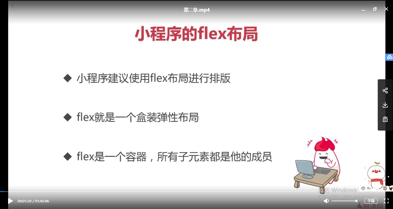
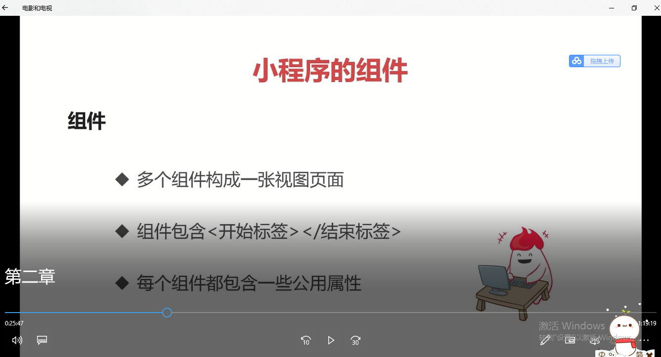
小程序也可以用div+css进行排版。


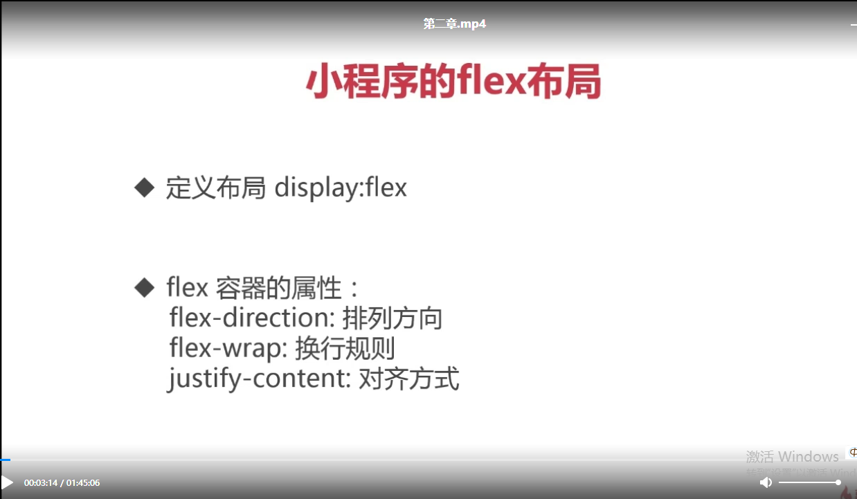
flex-direction排列方向,可以控制内部的成员的顺序,比如从左到右、从右到左、上下,纵向和横向。
flex-wrap可以控制换行是如何去换行的,控制它不换行或者控制它换行都可以。
justify-content:中间是否有一些空格啊等等都可以去控制。
flex-direction:
row: 进行行级横向的排序 从左到右 row-reverse: 从右到左 column: 从上到下进行列状的顺序排序 column-reverse:从下到上
app.wxss 全局的样式
/**app.wxss**/
/*.container {
  height: 100%;
  display: flex;
  flex-direction: column;
  align-items: center;
  justify-content: space-between;
  padding: 200rpx 0;
  box-sizing: border-box;
}
*/
//app.js
App({

})
<!--index.wxml-->
<view class="container">

</view>
{
  "pages":[
    //"pages/form/buttons/buttons",
    "pages/index/index"//,
    //"pages/logs/logs"
  ],
  "window":{
    "backgroundTextStyle":"light",
    "navigationBarBackgroundColor": "#fff",
    "navigationBarTitleText": "WeChat",
    "navigationBarTextStyle":"black"
  }
}
//index.js
//获取应用实例
Page({

})
{
  "pages":[
    "pages/index/index"
  ],
  "window":{
    "backgroundTextStyle":"light",
    "navigationBarBackgroundColor": "#fff",
    "navigationBarTitleText": "WeChat",
    "navigationBarTextStyle":"black"
  }
}
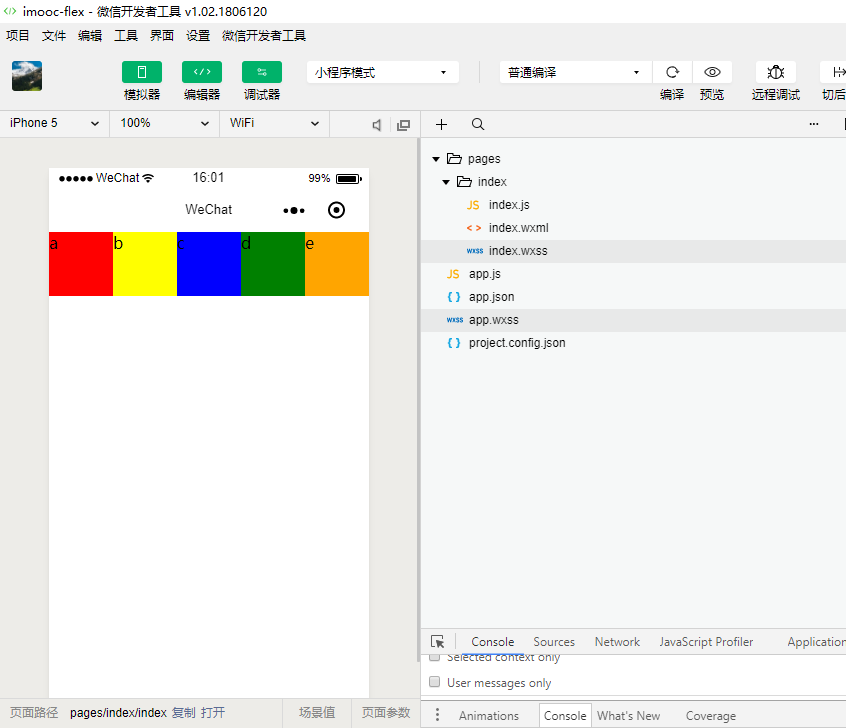
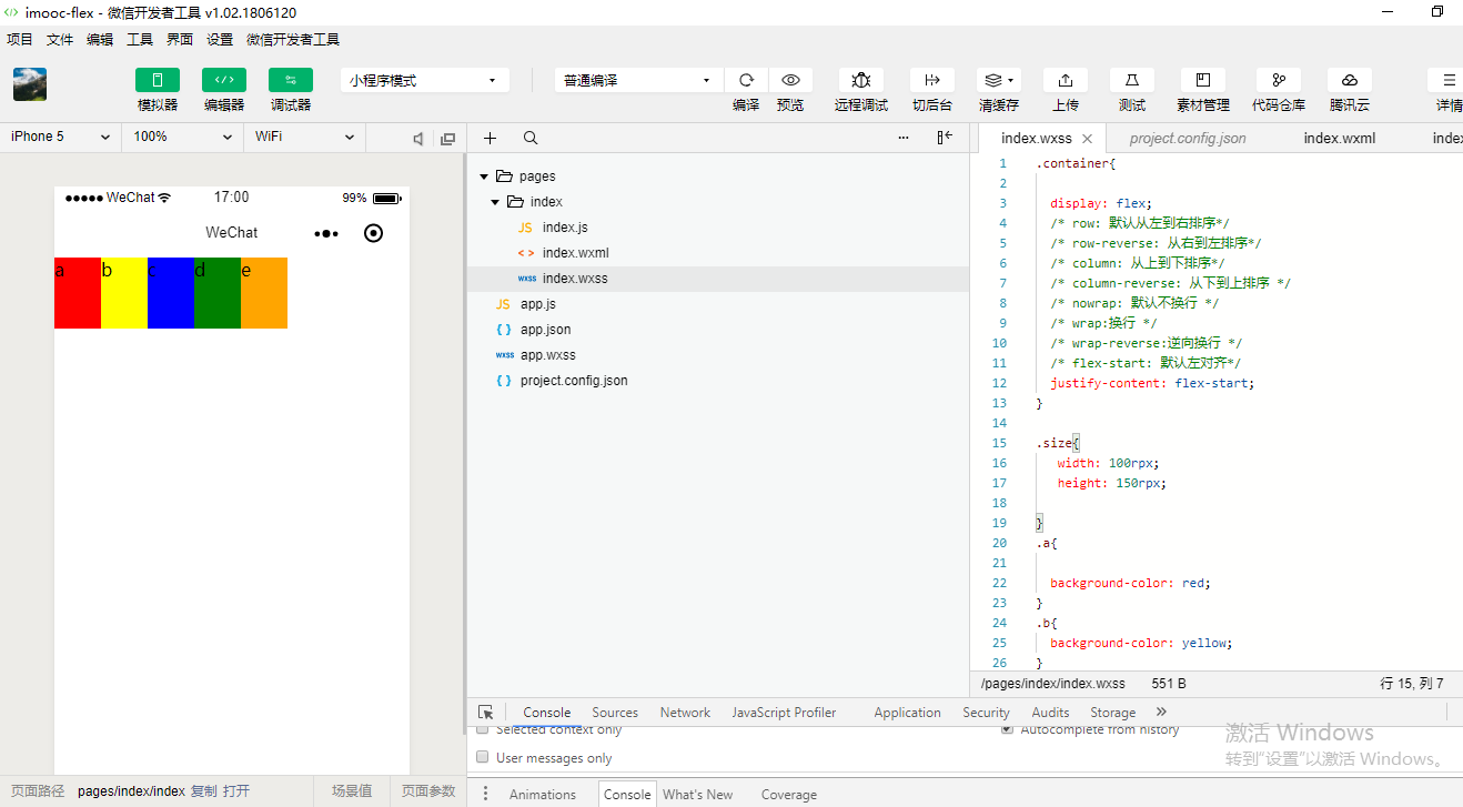
.container{

  display: flex;
}

.size{
   width: 150rpx;
   height: 150rpx;

}
<!--index.wxml-->
<view class="container">
    <view class='size'>a</view>
    <view class='size'>b</view>
    <view class='size'>c</view>
    <view class='size'>d</view>
    <view class='size'>e</view>
</view>
.container{

  display: flex;
}

.size{
   width: 150rpx;
   height: 150rpx;

}
.a{

  background-color: red;
}
<!--index.wxml-->
<view class="container">
    <view class='a size'>a</view>
    <view class='a size'>b</view>
    <view class='a size'>c</view>
    <view class='a size'>d</view>
    <view class='a size'>e</view>
</view>

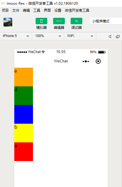
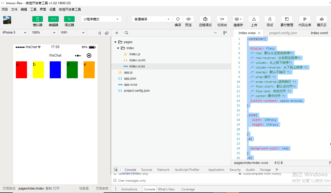
.container{

  display: flex;
}

.size{
   width: 150rpx;
   height: 150rpx;

}
.a{

  background-color: red;
}
.b{
  background-color: yellow;
}
.c{

  background-color: blue;
}
.d{
  background-color: green;
}
.e{
  background-color: orange;
}
<!--index.wxml-->
<view class="container">
    <view class='a size'>a</view>
    <view class='b size'>b</view>
    <view class='c size'>c</view>
    <view class='d size'>d</view>
    <view class='e size'>e</view>
</view>
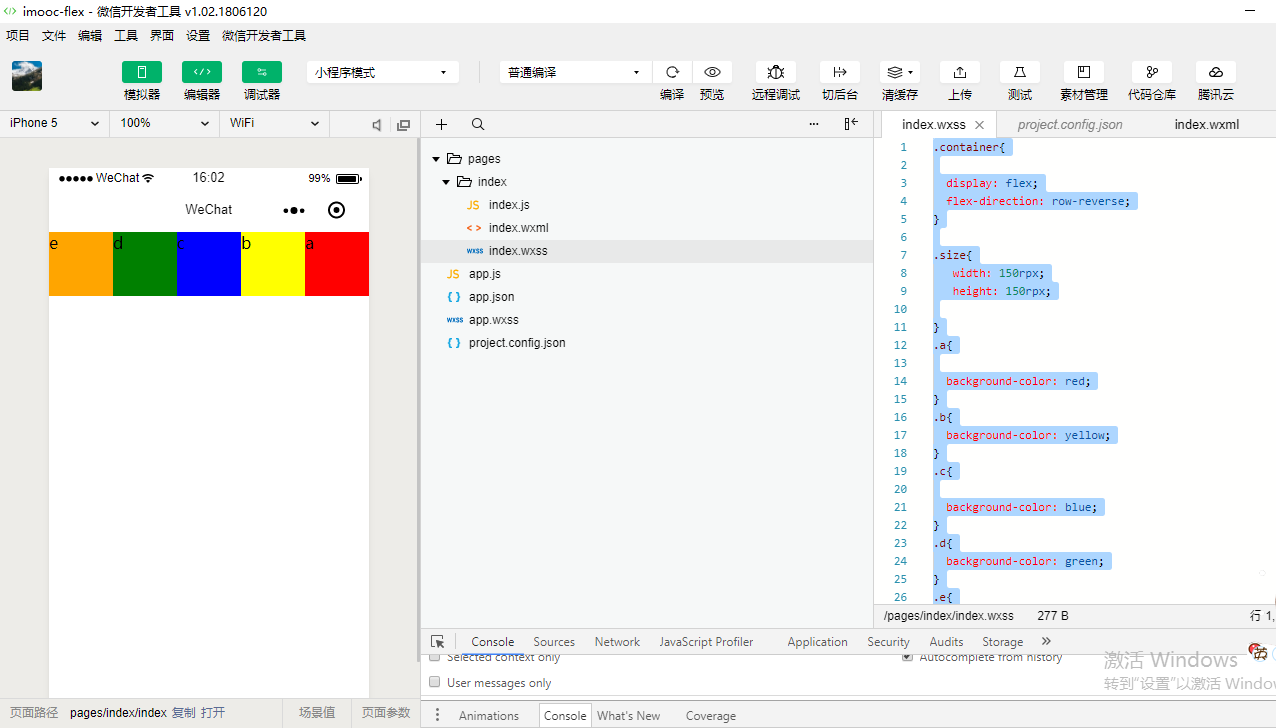
.container{

  display: flex;
  flex-direction: row;
}

.size{
   width: 150rpx;
   height: 150rpx;

}
.a{

  background-color: red;
}
.b{
  background-color: yellow;
}
.c{

  background-color: blue;
}
.d{
  background-color: green;
}
.e{
  background-color: orange;
}
.container{

  display: flex;
  flex-direction: row-reverse;
}

.size{
   width: 150rpx;
   height: 150rpx;

}
.a{

  background-color: red;
}
.b{
  background-color: yellow;
}
.c{

  background-color: blue;
}
.d{
  background-color: green;
}
.e{
  background-color: orange;
}
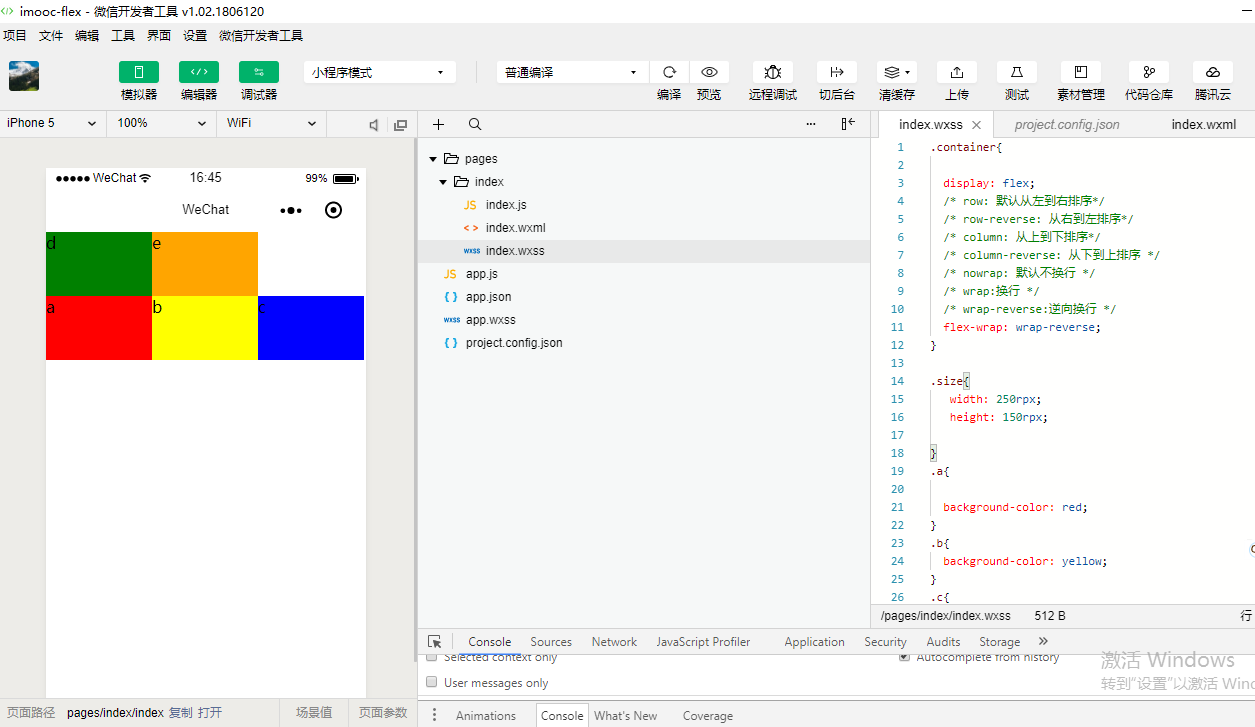
.container{

  display: flex;
  /* row: 默认从左到右排序*/
  /* row-reverse: 从右到左排序*/
  flex-direction: column;
}

.size{
   width: 150rpx;
   height: 150rpx;

}
.a{

  background-color: red;
}
.b{
  background-color: yellow;
}
.c{

  background-color: blue;
}
.d{
  background-color: green;
}
.e{
  background-color: orange;
}

.container{

  display: flex;
  /* row: 默认从左到右排序*/
  /* row-reverse: 从右到左排序*/
  flex-direction: column-reverse;
}

.size{
   width: 150rpx;
   height: 150rpx;

}
.a{

  background-color: red;
}
.b{
  background-color: yellow;
}
.c{

  background-color: blue;
}
.d{
  background-color: green;
}
.e{
  background-color: orange;
}
.container{

  display: flex;
  /* row: 默认从左到右排序*/
  /* row-reverse: 从右到左排序*/
  /* column: 从上到下排序*/
  /* column-reverse: 从下到上排序 */
  flex-direction: column-reverse;
}

.size{
   width: 150rpx;
   height: 150rpx;

}
.a{

  background-color: red;
}
.b{
  background-color: yellow;
}
.c{

  background-color: blue;
}
.d{
  background-color: green;
}
.e{
  background-color: orange;
}

.container{

  display: flex;
  /* row: 默认从左到右排序*/
  /* row-reverse: 从右到左排序*/
  /* column: 从上到下排序*/
  /* column-reverse: 从下到上排序 */
  /* nowrap: 默认不换行 */
  flex-wrap: nowrap;
}

.size{
   /* 500rpx;*/
   height: 150rpx;

}
.a{

  background-color: red;
}
.b{
  background-color: yellow;
}
.c{

  background-color: blue;
}
.d{
  background-color: green;
}
.e{
  background-color: orange;
}

.container{

  display: flex;
  /* row: 默认从左到右排序*/
  /* row-reverse: 从右到左排序*/
  /* column: 从上到下排序*/
  /* column-reverse: 从下到上排序 */
  /* nowrap: 默认不换行 */
  flex-wrap: nowrap;
}

.size{
   width: 500rpx;
   height: 150rpx;

}
.a{

  background-color: red;
}
.b{
  background-color: yellow;
}
.c{

  background-color: blue;
}
.d{
  background-color: green;
}
.e{
  background-color: orange;
}
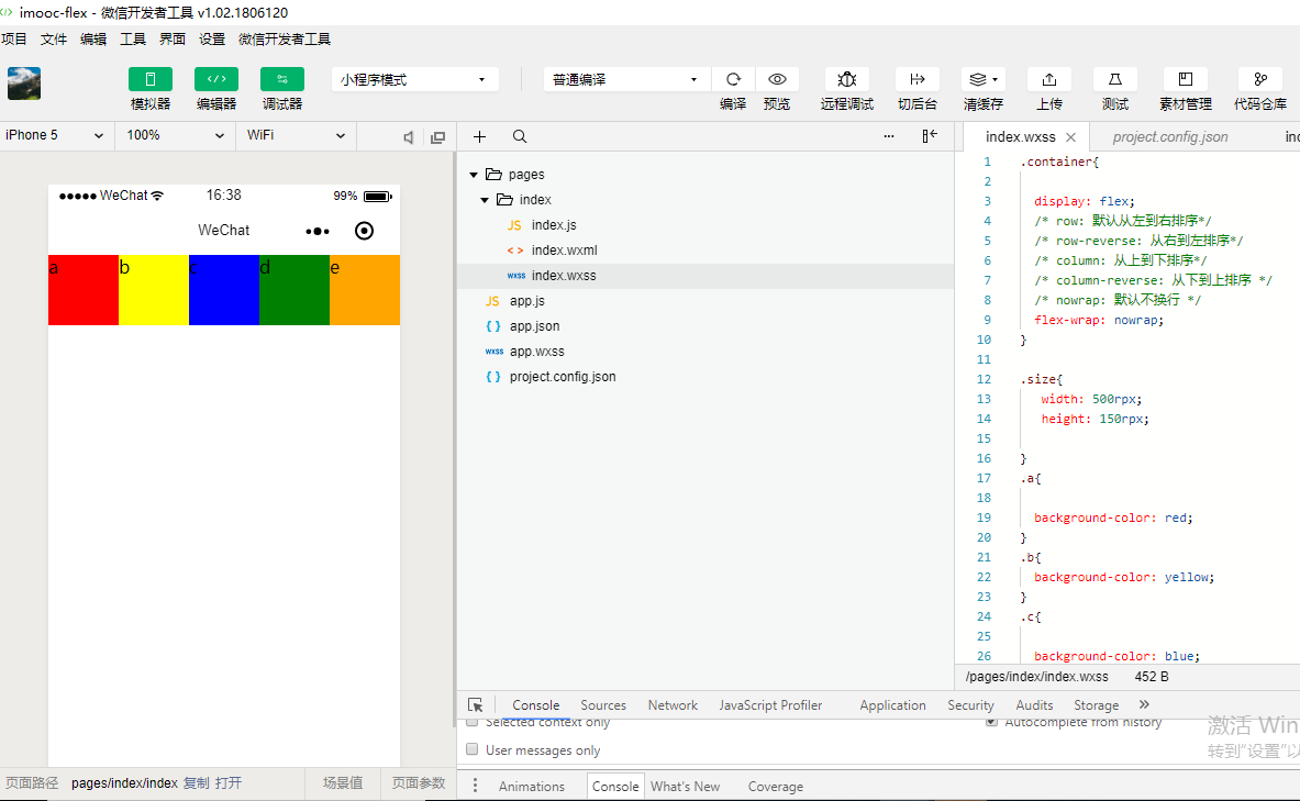
.container{

  display: flex;
  /* row: 默认从左到右排序*/
  /* row-reverse: 从右到左排序*/
  /* column: 从上到下排序*/
  /* column-reverse: 从下到上排序 */
  /* nowrap: 默认不换行 */
  /* wrap:换行 */
  flex-wrap: wrap;
}

.size{
   width: 250rpx;
   height: 150rpx;

}
.a{

  background-color: red;
}
.b{
  background-color: yellow;
}
.c{

  background-color: blue;
}
.d{
  background-color: green;
}
.e{
  background-color: orange;
}
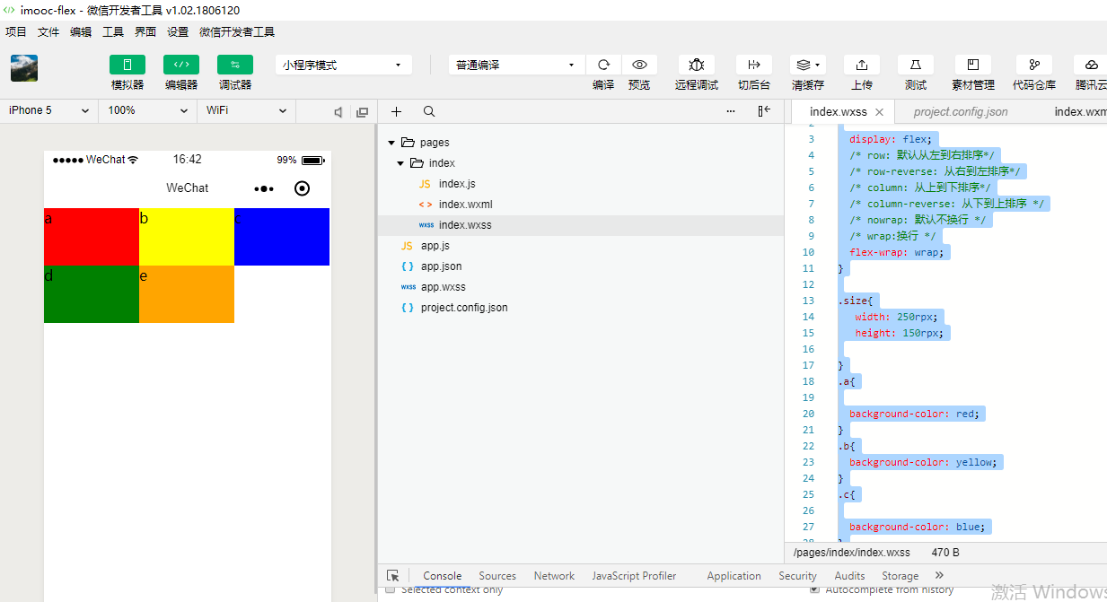
.container{

  display: flex;
  /* row: 默认从左到右排序*/
  /* row-reverse: 从右到左排序*/
  /* column: 从上到下排序*/
  /* column-reverse: 从下到上排序 */
  /* nowrap: 默认不换行 */
  /* wrap:换行 */
  /* wrap-reverse:逆向换行 */
  flex-wrap: wrap-reverse;
}

.size{
   width: 250rpx;
   height: 150rpx;

}
.a{

  background-color: red;
}
.b{
  background-color: yellow;
}
.c{

  background-color: blue;
}
.d{
  background-color: green;
}
.e{
  background-color: orange;
}
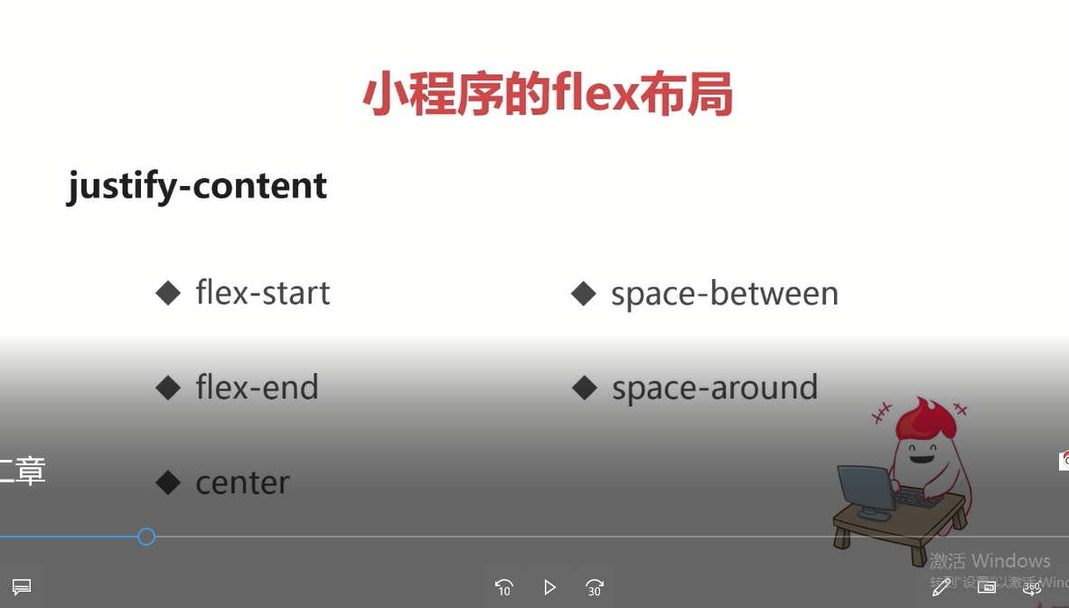
justify-content 内容的对齐方式
flex-start 向左对齐 space-between 空格在中间,让块级元素(成员)中间会有空格/间隔
flex-end 向右对齐 space-around 空格围绕在成员的周围
center 居中对齐
.container{

  display: flex;
  /* row: 默认从左到右排序*/
  /* row-reverse: 从右到左排序*/
  /* column: 从上到下排序*/
  /* column-reverse: 从下到上排序 */
  /* nowrap: 默认不换行 */
  /* wrap:换行 */
  /* wrap-reverse:逆向换行 */
  /* flex-start: 默认左对齐*/
  justify-content: flex-start;
}

.size{
   width: 100rpx;
   height: 150rpx;

}
.a{

  background-color: red;
}
.b{
  background-color: yellow;
}
.c{

  background-color: blue;
}
.d{
  background-color: green;
}
.e{
  background-color: orange;
}
.container{

  display: flex;
  /* row: 默认从左到右排序*/
  /* row-reverse: 从右到左排序*/
  /* column: 从上到下排序*/
  /* column-reverse: 从下到上排序 */
  /* nowrap: 默认不换行 */
  /* wrap:换行 */
  /* wrap-reverse:逆向换行 */
  /* flex-start: 默认左对齐*/
  justify-content: flex-end;
}

.size{
   width: 100rpx;
   height: 150rpx;

}
.a{

  background-color: red;
}
.b{
  background-color: yellow;
}
.c{

  background-color: blue;
}
.d{
  background-color: green;
}
.e{
  background-color: orange;
}

.container{

  display: flex;
  /* row: 默认从左到右排序*/
  /* row-reverse: 从右到左排序*/
  /* column: 从上到下排序*/
  /* column-reverse: 从下到上排序 */
  /* nowrap: 默认不换行 */
  /* wrap:换行 */
  /* wrap-reverse:逆向换行 */
  /* flex-start: 默认左对齐*/
  /* flex-end: 向右对齐 */
  /* center:居中对齐 */
  justify-content: center;
}

.size{
   width: 100rpx;
   height: 150rpx;

}
.a{

  background-color: red;
}
.b{
  background-color: yellow;
}
.c{

  background-color: blue;
}
.d{
  background-color: green;
}
.e{
  background-color: orange;
}

.container{

  display: flex;
  /* row: 默认从左到右排序*/
  /* row-reverse: 从右到左排序*/
  /* column: 从上到下排序*/
  /* column-reverse: 从下到上排序 */
  /* nowrap: 默认不换行 */
  /* wrap:换行 */
  /* wrap-reverse:逆向换行 */
  /* flex-start: 默认左对齐*/
  /* flex-end: 向右对齐 */
  /* center:居中对齐 */
  /* space-around: 在成员元素周围包裹空白 */
  justify-content: space-around;
}

.size{
   width: 100rpx;
   height: 150rpx;

}
.a{

  background-color: red;
}
.b{
  background-color: yellow;
}
.c{

  background-color: blue;
}
.d{
  background-color: green;
}
.e{
  background-color: orange;
}
.container{

  display: flex;
  /* row: 默认从左到右排序*/
  /* row-reverse: 从右到左排序*/
  /* column: 从上到下排序*/
  /* column-reverse: 从下到上排序 */
  /* nowrap: 默认不换行 */
  /* wrap:换行 */
  /* wrap-reverse:逆向换行 */
  /* flex-start: 默认左对齐*/
  /* flex-end: 向右对齐 */
  /* center:居中对齐 */
  /* space-around: 在成员元素周围包裹 */
  /* space-between: 在成员元素之间留空白 */
  justify-content: space-between;
}

.size{
   width: 100rpx;
   height: 150rpx;

}
.a{

  background-color: red;
}
.b{
  background-color: yellow;
}
.c{

  background-color: blue;
}
.d{
  background-color: green;
}
.e{
  background-color: orange;
}

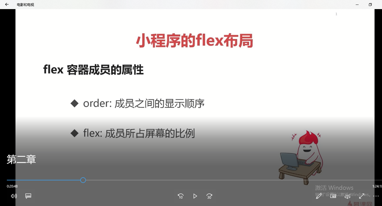
flex:1,目前我们这个屏幕被我们这五块平均给分配了,然后呢每一块它的长度都是一模一样的。当我们使用flex的时候,我们起初给它设置的这个width就已经失效了。

.container{

  display: flex;
  /* row: 默认从左到右排序*/
  /* row-reverse: 从右到左排序*/
  /* column: 从上到下排序*/
  /* column-reverse: 从下到上排序 */
  /* nowrap: 默认不换行 */
  /* wrap:换行 */
  /* wrap-reverse:逆向换行 */
  /* flex-start: 默认左对齐*/
  /* flex-end: 向右对齐 */
  /* center:居中对齐 */
  /* space-around: 在成员元素周围包裹 */
  /* space-between: 在成员元素之间留空白 */
  /* justify-content: space-between;*/

}

.size{
   width: 100rpx;
   height: 150rpx;

}
.a{
  background-color:red;
  /* order: 通过数字对flex容器内部的成员设置显示顺序 */
  order:1;
  /* flex: 配置每个成员元素所占行级的显示比例 */
  flex:3;
}
.b{
  background-color:yellow;
  order:2;
  flex:2;
}
.c{

  background-color:blue;
  order:5;
  flex:1;
}
.d{
  background-color:green;
  order:3;
  flex:1;
}
.e{
  background-color:orange;
  order:4;
  flex:1;
}
容器里面的样式和成员的样式都需要进行练习。
id、class、style、hidden这些属性每一个组件它都会有。
属性是用于修饰组件的。它是一个没有懒加载的一个属性的,你只要设置了那么我们的页面都会进行一个render,都会去展示出来。data-*,这是一个数据值,我们可以自定义一些数据。通过组件上触发的事件并且在函数里面去获得,获得完之后就可以把里面的数据进行相关的操作。
<!--index.wxml-->
<view class="container">
    <view class='a size' hover-class='d' hover-start-time='1000' hover-stay-time='2000'>a</view>
    <!--
    <view class='b size'>b</view>
    <view class='c size'>c</view>
    <view class='d size'>d</view>
    <view class='e size'>e</view>
    -->
</view>

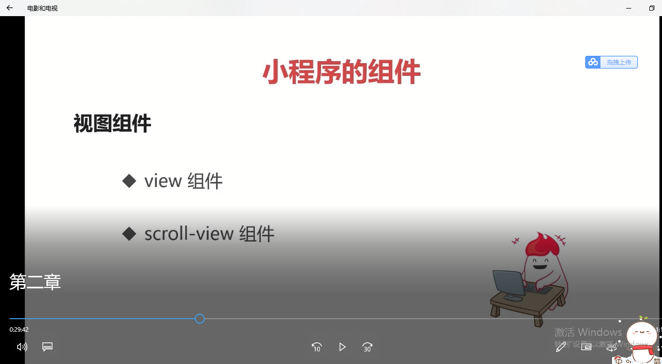
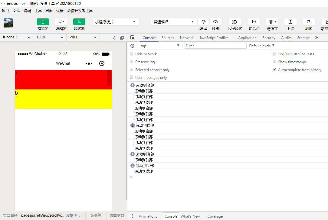
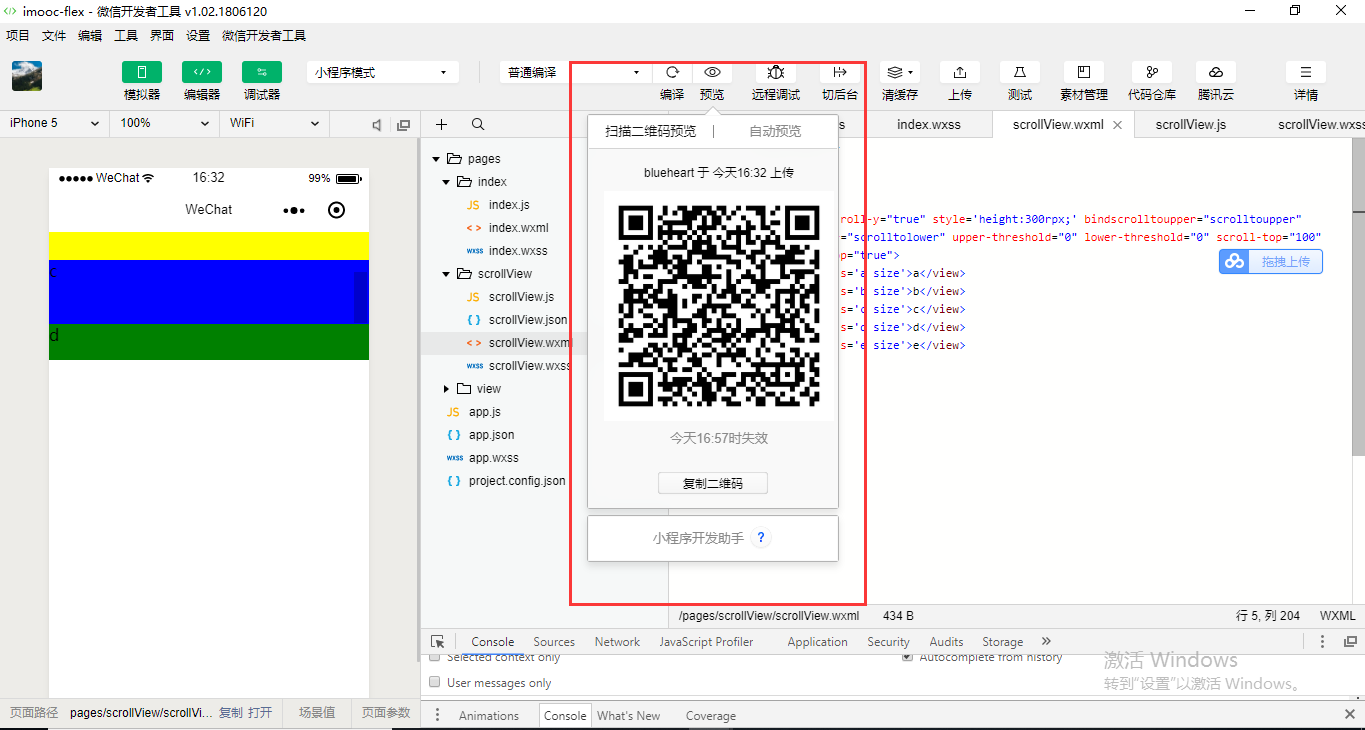
scroll-view就是滚动的意思。

{
  "pages":[
    "pages/scrollView/scrollView",
    "pages/view/view",
    "pages/index/index"
  ],
  "window":{
    "backgroundTextStyle":"light",
    "navigationBarBackgroundColor": "#fff",
    "navigationBarTitleText": "WeChat",
    "navigationBarTextStyle":"black"
  }
}
scrollView.wxss
.container{

  display: flex;
  /* row: 默认从左到右排序*/
  /* row-reverse: 从右到左排序*/
  /* column: 从上到下排序*/
  /* column-reverse: 从下到上排序 */
  /* nowrap: 默认不换行 */
  /* wrap:换行 */
  /* wrap-reverse:逆向换行 */
  /* flex-start: 默认左对齐*/
  /* flex-end: 向右对齐 */
  /* center:居中对齐 */
  /* space-around: 在成员元素周围包裹 */
  /* space-between: 在成员元素之间留空白 */
  /* justify-content: space-between;*/

}

.size{
   /* 100rpx;*/
   width: 100%;

   height: 150rpx;

}
.a{
  background-color:red;
  /* order: 通过数字对flex容器内部的成员设置显示顺序 */
  order:1;
  /* flex: 配置每个成员元素所占行级的显示比例 */
  flex:3;
}
.b{
  background-color:yellow;
  order:2;
  flex:2;
}
.c{

  background-color:blue;
  order:5;
  flex:1;
}
.d{
  background-color:green;
  order:3;
  flex:1;
}
.e{
  background-color:orange;
  order:4;
  flex:1;
}
scrollView.wxml
<!--index.wxml-->
<!--
<view class="container">
-->
<!--
<view>
-->
    <!--
    <view class='a size' hover-class='d' hover-start-time='1000' hover-stay-time='2000'>a</view>
    -->
    <scroll-view>
    <view class='a size'>a</view>
    <view class='b size'>b</view>
    <view class='c size'>c</view>
    <view class='d size'>d</view>
    <view class='e size'>e</view>
    </scroll-view>
<!--
</view>
-->
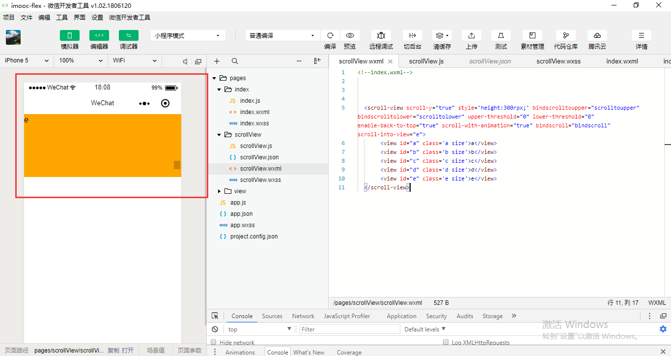
<!--index.wxml-->


  <scroll-view scroll-y="true">
       <view class='a size'>a</view>
       <view class='b size'>b</view>
       <view class='c size'>c</view>
       <view class='d size'>d</view>
       <view class='e size'>e</view>
  </scroll-view>
<!--index.wxml-->


  <scroll-view scroll-y="true" style='height:300rpx;'>
       <view class='a size'>a</view>
       <view class='b size'>b</view>
       <view class='c size'>c</view>
       <view class='d size'>d</view>
       <view class='e size'>e</view>
  </scroll-view>

//index.js
//获取应用实例
Page({

    data:{


    },
    scrolltoupper:function() {
        console.log("滚动到顶部");

    },

    scrolltolower: function() {
        console.log("滚动到底部");
    }

})
<!--index.wxml-->


  <scroll-view scroll-y="true" style='height:300rpx;' bindscrolltoupper="scrolltoupper" bindscrolltolower="scrolltolower">
       <view class='a size'>a</view>
       <view class='b size'>b</view>
       <view class='c size'>c</view>
       <view class='d size'>d</view>
       <view class='e size'>e</view>
  </scroll-view>
<!--index.wxml-->


  <scroll-view scroll-y="true" style='height:300rpx;' bindscrolltoupper="scrolltoupper" bindscrolltolower="scrolltolower" upper-threshold="0" lower-threshold="0">
       <view class='a size'>a</view>
       <view class='b size'>b</view>
       <view class='c size'>c</view>
       <view class='d size'>d</view>
       <view class='e size'>e</view>
  </scroll-view>

<!--index.wxml-->


  <scroll-view scroll-y="true" style='height:300rpx;' bindscrolltoupper="scrolltoupper" bindscrolltolower="scrolltolower" upper-threshold="0" lower-threshold="0" scroll-top="100" >
       <view class='a size'>a</view>
       <view class='b size'>b</view>
       <view class='c size'>c</view>
       <view class='d size'>d</view>
       <view class='e size'>e</view>
  </scroll-view>
Web环境是触发不了手机上的一些相关的API的。所以我们需要在手机上测试一下。
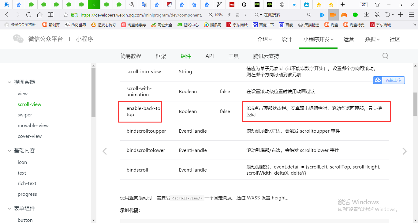


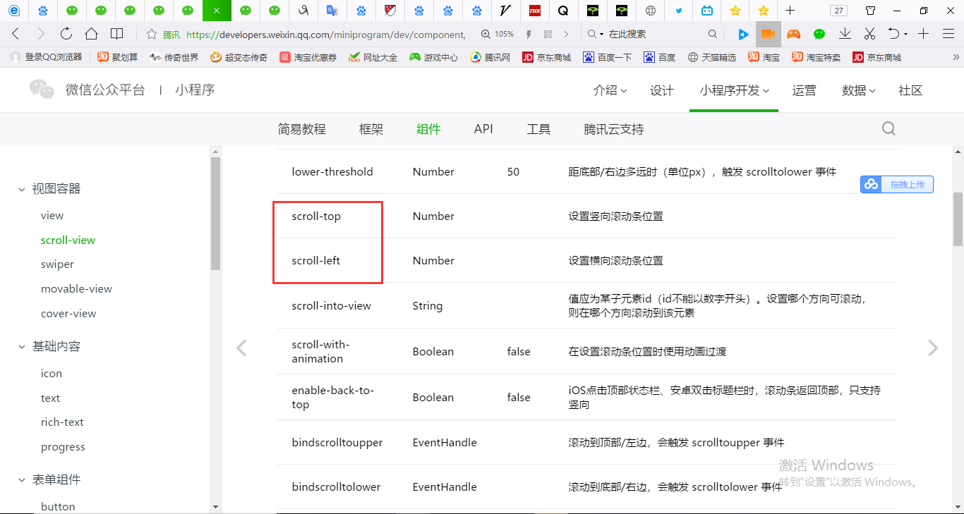
enable-back-to-top iOS点击顶部状态栏、安卓双击标题栏时,滚动条返回顶部,只支持竖向
<!--index.wxml-->


  <scroll-view scroll-y="true" style='height:300rpx;' bindscrolltoupper="scrolltoupper" bindscrolltolower="scrolltolower" upper-threshold="0" lower-threshold="0" scroll-top="100" enable-back-to-top="true">
       <view class='a size'>a</view>
       <view class='b size'>b</view>
       <view class='c size'>c</view>
       <view class='d size'>d</view>
       <view class='e size'>e</view>
  </scroll-view>
| scroll-with-animation | Boolean | false | 在设置滚动条位置时使用动画过渡 |
<!--index.wxml-->


  <scroll-view scroll-y="true" style='height:300rpx;' bindscrolltoupper="scrolltoupper" bindscrolltolower="scrolltolower" upper-threshold="0" lower-threshold="0" scroll-top="100" enable-back-to-top="true" scroll-with-animation="true">
       <view class='a size'>a</view>
       <view class='b size'>b</view>
       <view class='c size'>c</view>
       <view class='d size'>d</view>
       <view class='e size'>e</view>
  </scroll-view>
| bindscroll | EventHandle | 滚动时触发,event.detail = {scrollLeft, scrollTop, scrollHeight, scrollWidth, deltaX, deltaY} |
//index.js
//获取应用实例
Page({

    data:{


    },
    scrolltoupper:function() {
        console.log("滚动到顶部");

    },

    scrolltolower: function() {
        console.log("滚动到底部");
    },
    bindscroll: function() {
        console.log("滚....");
    }
})
<!--index.wxml-->


  <scroll-view scroll-y="true" style='height:300rpx;' bindscrolltoupper="scrolltoupper" bindscrolltolower="scrolltolower" upper-threshold="0" lower-threshold="0" scroll-top="100" enable-back-to-top="true" scroll-with-animation="true" bindscroll="bindscroll">
       <view class='a size'>a</view>
       <view class='b size'>b</view>
       <view class='c size'>c</view>
       <view class='d size'>d</view>
       <view class='e size'>e</view>
  </scroll-view>
| scroll-into-view | String | 值应为某子元素id(id不能以数字开头)。设置哪个方向可滚动,则在哪个方向滚动到该元素 |
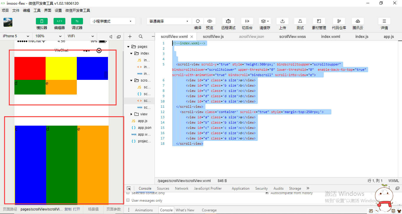
scroll-into-view可以让我们自动的定位到某一个块,某一个成员元素那个地方去。设置必须要指定成员的id,成员的id必须也是要保证是唯一的。id它本来就可以当做是唯一的主键。
<!--index.wxml-->


  <scroll-view scroll-y="true" style='height:300rpx;' bindscrolltoupper="scrolltoupper" bindscrolltolower="scrolltolower" upper-threshold="0" lower-threshold="0" scroll-top="100" enable-back-to-top="true" scroll-with-animation="true" bindscroll="bindscroll" scroll-into-view="a">
       <view class='a size'>a</view>
       <view class='b size'>b</view>
       <view class='c size'>c</view>
       <view class='d size'>d</view>
       <view class='e size'>e</view>
  </scroll-view>
<!--index.wxml-->


  <scroll-view scroll-y="true" style='height:300rpx;' bindscrolltoupper="scrolltoupper" bindscrolltolower="scrolltolower" upper-threshold="0" lower-threshold="0" scroll-top="100" enable-back-to-top="true" scroll-with-animation="true" bindscroll="bindscroll" scroll-into-view="a">
       <view id="a" class='a size'>a</view>
       <view id="b" class='b size'>b</view>
       <view id="c" class='c size'>c</view>
       <view id="d" class='d size'>d</view>
       <view id="e" class='e size'>e</view>
  </scroll-view>
<!--index.wxml-->


  <scroll-view scroll-y="true" style='height:300rpx;' bindscrolltoupper="scrolltoupper" bindscrolltolower="scrolltolower" upper-threshold="0" lower-threshold="0"  enable-back-to-top="true" scroll-with-animation="true" bindscroll="bindscroll" scroll-into-view="b">
       <view id="a" class='a size'>a</view>
       <view id="b" class='b size'>b</view>
       <view id="c" class='c size'>c</view>
       <view id="d" class='d size'>d</view>
       <view id="e" class='e size'>e</view>
  </scroll-view>
a、b、c、d、e的高度不够大,所以滚动条没有下去。设置它的高度就可以了。

.container{

  display: flex;
  /* row: 默认从左到右排序*/
  /* row-reverse: 从右到左排序*/
  /* column: 从上到下排序*/
  /* column-reverse: 从下到上排序 */
  /* nowrap: 默认不换行 */
  /* wrap:换行 */
  /* wrap-reverse:逆向换行 */
  /* flex-start: 默认左对齐*/
  /* flex-end: 向右对齐 */
  /* center:居中对齐 */
  /* space-around: 在成员元素周围包裹 */
  /* space-between: 在成员元素之间留空白 */
  /* justify-content: space-between;*/

}

.size{
   /* 100rpx;*/
   width: 100%;

   /* height: 150rpx; */
   height: 350px;

}
.a{
  background-color:red;
  /* order: 通过数字对flex容器内部的成员设置显示顺序 */
  order:1;
  /* flex: 配置每个成员元素所占行级的显示比例 */
  flex:3;
}
.b{
  background-color:yellow;
  order:2;
  flex:2;
}
.c{

  background-color:blue;
  order:5;
  flex:1;
}
.d{
  background-color:green;
  order:3;
  flex:1;
}
.e{
  background-color:orange;
  order:4;
  flex:1;
}
<!--index.wxml-->


  <scroll-view scroll-y="true" style='height:300rpx;' bindscrolltoupper="scrolltoupper" bindscrolltolower="scrolltolower" upper-threshold="0" lower-threshold="0"  enable-back-to-top="true" scroll-with-animation="true" bindscroll="bindscroll" scroll-into-view="e">
       <view id="a" class='a size'>a</view>
       <view id="b" class='b size'>b</view>
       <view id="c" class='c size'>c</view>
       <view id="d" class='d size'>d</view>
       <view id="e" class='e size'>e</view>
  </scroll-view>
这就是可滚动视图区域的演示。
| scroll-x | Boolean | false | 允许横向滚动 |
<!--index.wxml-->


  <scroll-view scroll-y="true" style='height:300rpx;' bindscrolltoupper="scrolltoupper" bindscrolltolower="scrolltolower" upper-threshold="0" lower-threshold="0"  enable-back-to-top="true" scroll-with-animation="true" bindscroll="bindscroll" scroll-into-view="e">
       <view id="a" class='a size'>a</view>
       <view id="b" class='b size'>b</view>
       <view id="c" class='c size'>c</view>
       <view id="d" class='d size'>d</view>
       <view id="e" class='e size'>e</view>
  </scroll-view>
    <scroll-view scroll-x="true" style='height:300rpx;'>
       <view id="a" class='a size'>a</view>
       <view id="b" class='b size'>b</view>
       <view id="c" class='c size'>c</view>
       <view id="d" class='d size'>d</view>
       <view id="e" class='e size'>e</view>
  </scroll-view>

<!--index.wxml-->


  <scroll-view scroll-y="true" style='height:300rpx;' bindscrolltoupper="scrolltoupper" bindscrolltolower="scrolltolower" upper-threshold="0" lower-threshold="0"  enable-back-to-top="true" scroll-with-animation="true" bindscroll="bindscroll" scroll-into-view="e">
       <view id="a" class='a size'>a</view>
       <view id="b" class='b size'>b</view>
       <view id="c" class='c size'>c</view>
       <view id="d" class='d size'>d</view>
       <view id="e" class='e size'>e</view>
  </scroll-view>
    <scroll-view scroll-x="true" style='margin-top:300rpx;'>
       <view id="a" class='a size'>a</view>
       <view id="b" class='b size'>b</view>
       <view id="c" class='c size'>c</view>
       <view id="d" class='d size'>d</view>
       <view id="e" class='e size'>e</view>
  </scroll-view>
margin-top

要用到布局上的一些相关的知识。还需要给它一个布局的一个控制,就是让它不换行。
.container{

  display: flex;
  white-space: nowrap;

  /* row: 默认从左到右排序*/
  /* row-reverse: 从右到左排序*/
  /* column: 从上到下排序*/
  /* column-reverse: 从下到上排序 */
  /* nowrap: 默认不换行 */
  /* wrap:换行 */
  /* wrap-reverse:逆向换行 */
  /* flex-start: 默认左对齐*/
  /* flex-end: 向右对齐 */
  /* center:居中对齐 */
  /* space-around: 在成员元素周围包裹 */
  /* space-between: 在成员元素之间留空白 */
  /* justify-content: space-between;*/

}

.size{
   /*  100rpx; */
   /*  100%; */
   width: 250rpx;
   /* height: 150rpx; */
   height: 350px;

}
.a{
  background-color:red;
  /* order: 通过数字对flex容器内部的成员设置显示顺序 */
  order:1;
  /* flex: 配置每个成员元素所占行级的显示比例 */
  flex:3;
}
.b{
  background-color:yellow;
  order:2;
  flex:2;
}
.c{

  background-color:blue;
  order:5;
  flex:1;
}
.d{
  background-color:green;
  order:3;
  flex:1;
}
.e{
  background-color:orange;
  order:4;
  flex:1;
}
<!--index.wxml-->


  <scroll-view scroll-y="true" style='height:300rpx;' bindscrolltoupper="scrolltoupper" bindscrolltolower="scrolltolower" upper-threshold="0" lower-threshold="0"  enable-back-to-top="true" scroll-with-animation="true" bindscroll="bindscroll" scroll-into-view="e">
       <view id="a" class='a size'>a</view>
       <view id="b" class='b size'>b</view>
       <view id="c" class='c size'>c</view>
       <view id="d" class='d size'>d</view>
       <view id="e" class='e size'>e</view>
  </scroll-view>
    <scroll-view class='container' scroll-x="true" style='margin-top:250rpx;'>
       <view id="a" class='a size'>a</view>
       <view id="b" class='b size'>b</view>
       <view id="c" class='c size'>c</view>
       <view id="d" class='d size'>d</view>
       <view id="e" class='e size'>e</view>
  </scroll-view>
.container{

  display: flex;
  white-space: nowrap;

  /* row: 默认从左到右排序*/
  /* row-reverse: 从右到左排序*/
  /* column: 从上到下排序*/
  /* column-reverse: 从下到上排序 */
  /* nowrap: 默认不换行 */
  /* wrap:换行 */
  /* wrap-reverse:逆向换行 */
  /* flex-start: 默认左对齐*/
  /* flex-end: 向右对齐 */
  /* center:居中对齐 */
  /* space-around: 在成员元素周围包裹 */
  /* space-between: 在成员元素之间留空白 */
  /* justify-content: space-between;*/

}

.size{
   /*  100rpx; */
   /*  100%; */
   width: 250rpx;
   /* height: 150rpx; */
   height: 350px;
    display: inline-block;

}
.a{
  background-color:red;
  /* order: 通过数字对flex容器内部的成员设置显示顺序 */
  order:1;
  /* flex: 配置每个成员元素所占行级的显示比例 */
  flex:3;
}
.b{
  background-color:yellow;
  order:2;
  flex:2;
}
.c{

  background-color:blue;
  order:5;
  flex:1;
}
.d{
  background-color:green;
  order:3;
  flex:1;
}
.e{
  background-color:orange;
  order:4;
  flex:1;
}
<!--index.wxml-->


  <scroll-view scroll-y="true" style='height:300rpx;' bindscrolltoupper="scrolltoupper" bindscrolltolower="scrolltolower" upper-threshold="0" lower-threshold="0"  enable-back-to-top="true" scroll-with-animation="true" bindscroll="bindscroll" scroll-into-view="e">
       <view id="a" class='a size'>a</view>
       <view id="b" class='b size'>b</view>
       <view id="c" class='c size'>c</view>
       <view id="d" class='d size'>d</view>
       <view id="e" class='e size'>e</view>
  </scroll-view>
    <scroll-view class='container' scroll-x="true" style='margin-top:250rpx;'>
       <view id="a" class='a size'>a</view>
       <view id="b" class='b size'>b</view>
       <view id="c" class='c size'>c</view>
       <view id="d" class='d size'>d</view>
       <view id="e" class='e size'>e</view>
  </scroll-view>
| scroll-left | Number | 设置横向滚动条位置 |
<!--index.wxml-->


  <scroll-view scroll-y="true" style='height:300rpx;' bindscrolltoupper="scrolltoupper" bindscrolltolower="scrolltolower" upper-threshold="0" lower-threshold="0"  enable-back-to-top="true" scroll-with-animation="true" bindscroll="bindscroll" scroll-into-view="e">
       <view id="a" class='a size'>a</view>
       <view id="b" class='b size'>b</view>
       <view id="c" class='c size'>c</view>
       <view id="d" class='d size'>d</view>
       <view id="e" class='e size'>e</view>
  </scroll-view>
    <scroll-view class='container' scroll-x="true" scroll-left="150" style='margin-top:250rpx;'>
       <view id="a" class='a size'>a</view>
       <view id="b" class='b size'>b</view>
       <view id="c" class='c size'>c</view>
       <view id="d" class='d size'>d</view>
       <view id="e" class='e size'>e</view>
  </scroll-view>

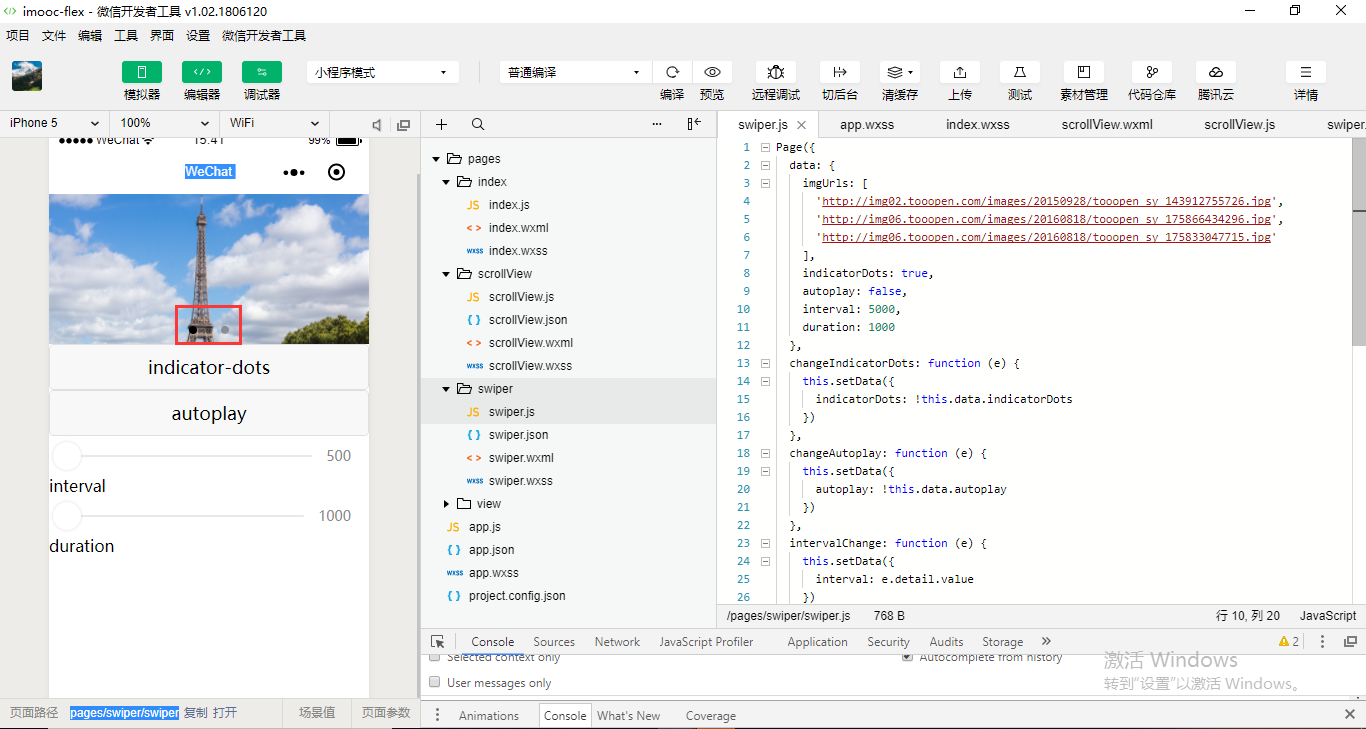
swiper组件,轮播图。
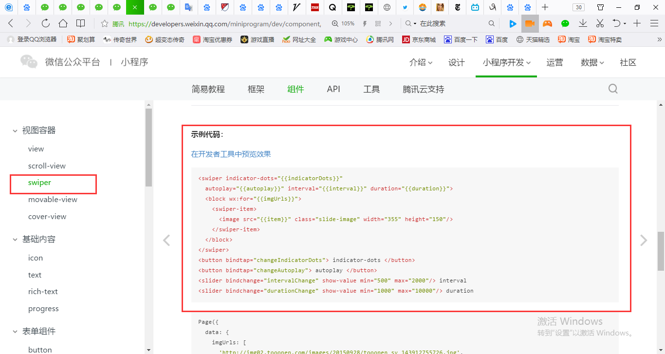
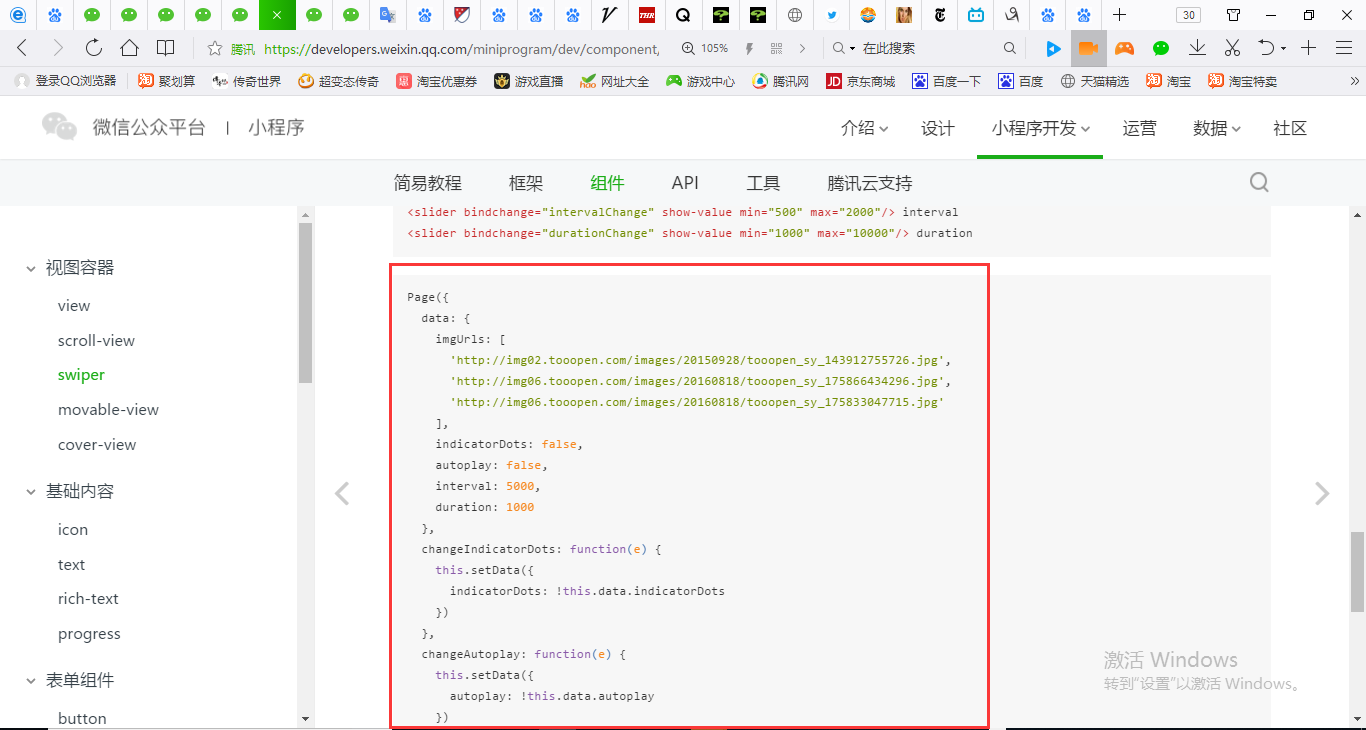
Page({
  data: {
    imgUrls: [
      'http://img02.tooopen.com/images/20150928/tooopen_sy_143912755726.jpg',
      'http://img06.tooopen.com/images/20160818/tooopen_sy_175866434296.jpg',
      'http://img06.tooopen.com/images/20160818/tooopen_sy_175833047715.jpg'
    ],
    indicatorDots: false,
    autoplay: false,
    interval: 5000,
    duration: 1000
  },
  changeIndicatorDots: function (e) {
    this.setData({
      indicatorDots: !this.data.indicatorDots
    })
  },
  changeAutoplay: function (e) {
    this.setData({
      autoplay: !this.data.autoplay
    })
  },
  intervalChange: function (e) {
    this.setData({
      interval: e.detail.value
    })
  },
  durationChange: function (e) {
    this.setData({
      duration: e.detail.value
    })
  }
})
<swiper indicator-dots="{{indicatorDots}}"
  autoplay="{{autoplay}}" interval="{{interval}}" duration="{{duration}}">
  <block wx:for="{{imgUrls}}">
    <swiper-item>
      <image src="{{item}}" class="slide-image" width="355" height="150"/>
    </swiper-item>
  </block>
</swiper>
<button bindtap="changeIndicatorDots"> indicator-dots </button>
<button bindtap="changeAutoplay"> autoplay </button>
<slider bindchange="intervalChange" show-value min="500" max="2000"/> interval
<slider bindchange="durationChange" show-value min="1000" max="10000"/> duration
| indicator-dots | Boolean | false | 是否显示面板指示点 |
Page({
  data: {
    imgUrls: [
      'http://img02.tooopen.com/images/20150928/tooopen_sy_143912755726.jpg',
      'http://img06.tooopen.com/images/20160818/tooopen_sy_175866434296.jpg',
      'http://img06.tooopen.com/images/20160818/tooopen_sy_175833047715.jpg'
    ],
    indicatorDots: true,
    autoplay: false,
    interval: 5000,
    duration: 1000
  },
  changeIndicatorDots: function (e) {
    this.setData({
      indicatorDots: !this.data.indicatorDots
    })
  },
  changeAutoplay: function (e) {
    this.setData({
      autoplay: !this.data.autoplay
    })
  },
  intervalChange: function (e) {
    this.setData({
      interval: e.detail.value
    })
  },
  durationChange: function (e) {
    this.setData({
      duration: e.detail.value
    })
  }
})
<swiper indicator-dots="{{indicatorDots}}"
  autoplay="{{autoplay}}" interval="{{interval}}" duration="{{duration}}">
  <block wx:for="{{imgUrls}}">
    <swiper-item>
      <image src="{{item}}" class="slide-image" width="355" height="150"/>
    </swiper-item>
  </block>
</swiper>
<button bindtap="changeIndicatorDots"> indicator-dots </button>
<button bindtap="changeAutoplay"> autoplay </button>
<slider bindchange="intervalChange" show-value min="500" max="2000"/> interval
<slider bindchange="durationChange" show-value min="1000" max="10000"/> duration
| autoplay | Boolean | false | 是否自动切换 |
Page({
  data: {
    imgUrls: [
      'http://img02.tooopen.com/images/20150928/tooopen_sy_143912755726.jpg',
      'http://img06.tooopen.com/images/20160818/tooopen_sy_175866434296.jpg',
      'http://img06.tooopen.com/images/20160818/tooopen_sy_175833047715.jpg'
    ],
    indicatorDots: true,
    autoplay: true,
    interval: 5000,
    duration: 1000
  },
  changeIndicatorDots: function (e) {
    this.setData({
      indicatorDots: !this.data.indicatorDots
    })
  },
  changeAutoplay: function (e) {
    this.setData({
      autoplay: !this.data.autoplay
    })
  },
  intervalChange: function (e) {
    this.setData({
      interval: e.detail.value
    })
  },
  durationChange: function (e) {
    this.setData({
      duration: e.detail.value
    })
  }
})
<swiper indicator-dots="{{indicatorDots}}"
  autoplay="{{autoplay}}" interval="{{interval}}" duration="{{duration}}">
  <block wx:for="{{imgUrls}}">
    <swiper-item>
      <image src="{{item}}" class="slide-image" width="355" height="150"/>
    </swiper-item>
  </block>
</swiper>
<button bindtap="changeIndicatorDots"> indicator-dots </button>
<button bindtap="changeAutoplay"> autoplay </button>
<slider bindchange="intervalChange" show-value min="500" max="2000"/> interval
<slider bindchange="durationChange" show-value min="1000" max="10000"/> duration

| interval | Number | 5000 | 自动切换时间间隔 |
| duration | Number | 500 | 滑动动画时长 |
示例代码并没有做一个自适应。自适应是需要根据长宽比例进行设置。
  <block wx:for="{{imgUrls}}">
    <swiper-item>
      <image src="{{item}}" class="slide-image" width="355" height="150"/>
    </swiper-item>
  </block>


要根据当前屏幕的大小去进行一个比例的算。
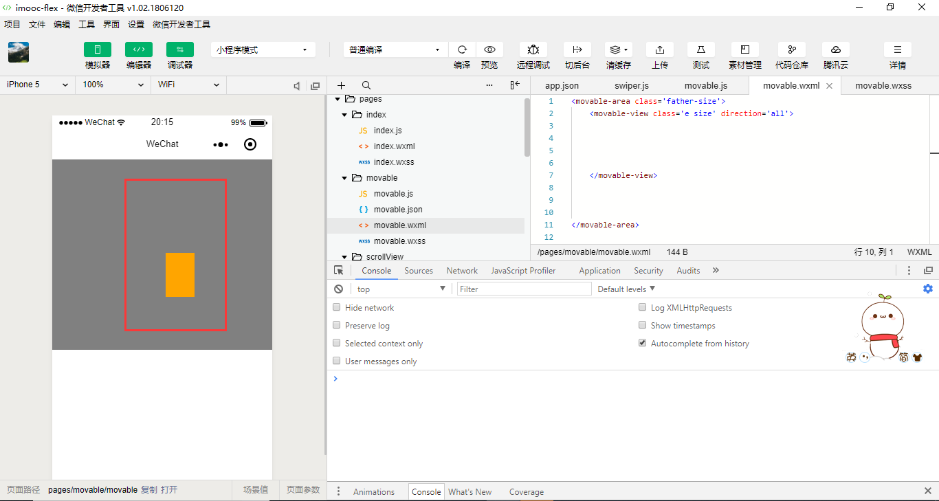
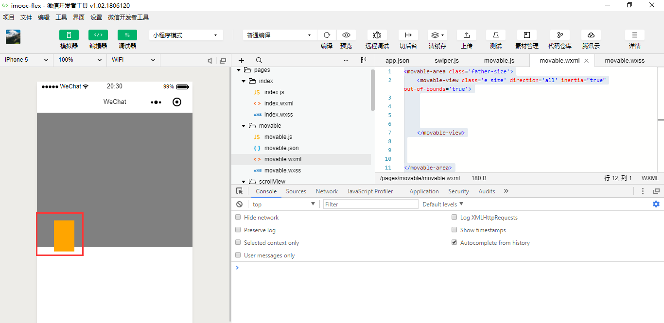
movable-area组件和movable-view组件要捆绑在一起使用,可以使得view移动。
    <movable-view>


    </movable-view>
movable-view是一块元素。为movable-area定义一个class.
.container{

  display: flex;
  /* row: 默认从左到右排序*/
  /* row-reverse: 从右到左排序*/
  /* column: 从上到下排序*/
  /* column-reverse: 从下到上排序 */
  /* nowrap: 默认不换行 */
  /* wrap:换行 */
  /* wrap-reverse:逆向换行 */
  /* flex-start: 默认左对齐*/
  /* flex-end: 向右对齐 */
  /* center:居中对齐 */
  /* space-around: 在成员元素周围包裹 */
  /* space-between: 在成员元素之间留空白 */
  /* justify-content: space-between;*/

}

.size{
   width: 100rpx;
   height: 150rpx;

}
.father-size{
   width: 100%;
   height: 650rpx;
   background-color: grey;
}
.a{
  background-color:red;
  /* order: 通过数字对flex容器内部的成员设置显示顺序 */
  order:1;
  /* flex: 配置每个成员元素所占行级的显示比例 */
  flex:3;
}
.b{
  background-color:yellow;
  order:2;
  flex:2;
}
.c{

  background-color:blue;
  order:5;
  flex:1;
}
.d{
  background-color:green;
  order:3;
  flex:1;
}
.e{
  background-color:orange;
  order:4;
  flex:1;
}
<movable-area class='father-size'>
    <movable-view class='e size'>


    </movable-view>


</movable-area>

点击橙色块并不能够移动,来看看它的属性。
| direction | String | none | movable-view的移动方向,属性值有all、vertical、horizontal、none |
<movable-area class='father-size'>
    <movable-view class='e size' direction='all'>


    </movable-view>


</movable-area>
| inertia | Boolean | false | movable-view是否带有惯性 |
<movable-area class='father-size'>
    <movable-view class='e size' direction='all' inertia="true">


    </movable-view>


</movable-area>
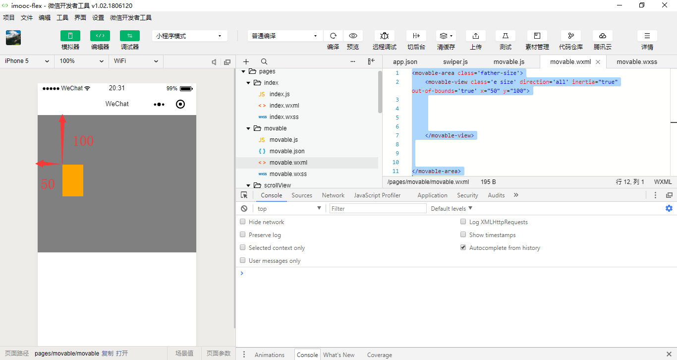
边界下拉的设置
| out-of-bounds | Boolean | false | 超过可移动区域后,movable-view是否还可以移动 |
<movable-area class='father-size'>
    <movable-view class='e size' direction='all' inertia="true" out-of-bounds='true'>


    </movable-view>


</movable-area>
<movable-area class='father-size'>
    <movable-view class='e size' direction='all' inertia="true" out-of-bounds='true' x="50" y="100">


    </movable-view>


</movable-area>
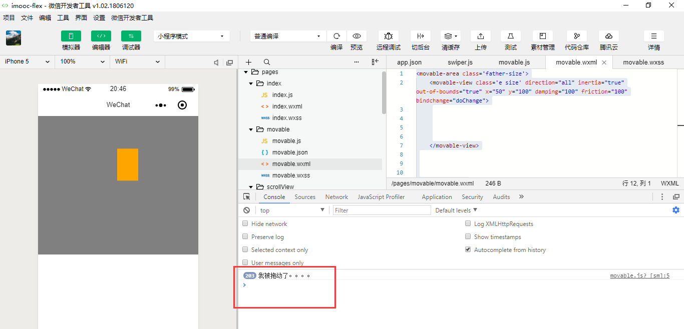
| damping | Number | 20 | 阻尼系数,用于控制x或y改变时的动画和过界回弹的动画,值越大移动越快 | |
| friction | Number | 2 | 摩擦系数,用于控制惯性滑动的动画,值越大摩擦力越大,滑动越快停止;必须大于0,否则会被设置成默认值 |
<movable-area class='father-size'>
    <movable-view class='e size' direction="all" inertia="true" out-of-bounds="true" x="50" y="100" damping="100" friction="100">


    </movable-view>
| disabled | Boolean | false | 是否禁用 |
disabled就是禁用我们的滑块。
<movable-area class='father-size'>
    <movable-view class='e size' direction="all" inertia="true" out-of-bounds="true" x="50" y="100" damping="100" friction="100" disabled="true">


    </movable-view>


</movable-area>
| scale | Boolean | false | 是否支持双指缩放,默认缩放手势生效区域是在movable-view内 | 1.9.90 |
| scale-min | Number | 0.5 | 定义缩放倍数最小值 | 1.9.90 |
| scale-max | Number | 10 | 定义缩放倍数最大值 | 1.9.90 |
| scale-value | Number | 1 | 定义缩放倍数,取值范围为 0.5 - 10 |
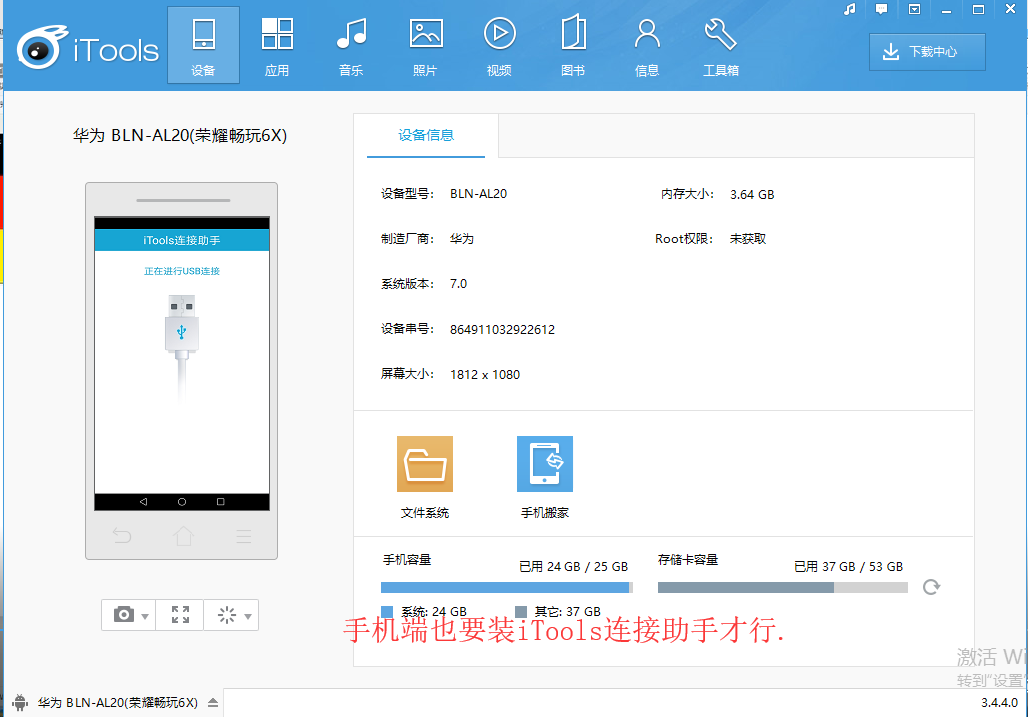
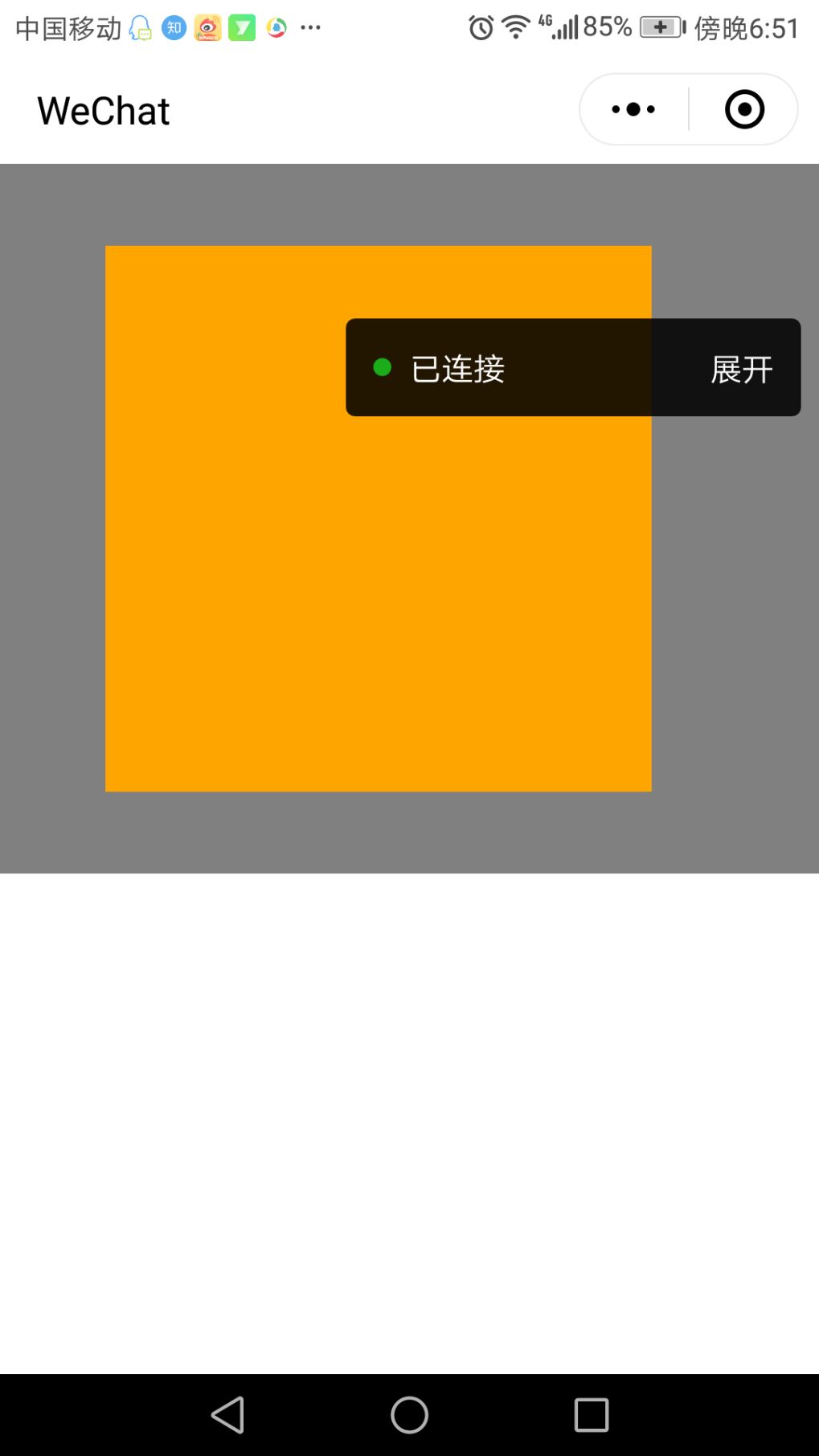
运用手机连接我们的电脑自己去看看。
| bindchange | EventHandle | 拖动过程中触发的事件,event.detail = {x: x, y: y, source: source},其中source表示产生移动的原因,值可为touch(拖动)、touch-out-of-bounds(超出移动范围)、out-of-bounds(超出移动范围后的回弹)、friction(惯性)和空字符串(setData) |
拖动事件。
<movable-area class='father-size'>
    <movable-view class='e size' direction="all" inertia="true" out-of-bounds="true" x="50" y="100" damping="100" friction="100" disabled="false" bindchange="doChange">


    </movable-view>


</movable-area>
// pages/view/view.js
Page({
    doChange:function(){

      console.log("我被拖动了。。。。");
    }
})
<movable-area class='father-size'>
    <movable-view class='e size' direction="all" inertia="true" out-of-bounds="true" x="50" y="100" damping="100" friction="100" bindchange="doChange">


    </movable-view>


</movable-area>
| bindscale | EventHandle | 缩放过程中触发的事件,event.detail = {x: x, y: y, scale: scale},其中x和y字段在2.1.0之后开始支持返回 |
| scale | Boolean | false | 是否支持双指缩放,默认缩放手势生效区域是在movable-view内 |
| scale-min | Number | 0.5 | 定义缩放倍数最小值 |
| scale-max | Number | 10 | 定义缩放倍数最大值 |
| scale-value | Number | 1 | 定义缩放倍数,取值范围为 0.5 - 10 |
| bindscale | EventHandle | 缩放过程中触发的事件,event.detail = {x: x, y: y, scale: scale},其中x和y字段在2.1.0之后开始支持返回 |
scale-min、scale-max、scale-value使用默认值即可。
进行远程调试,让手机去扫一下。
// pages/view/view.js
Page({
    doChange:function(){

       //console.log("我被拖动了。。。。");
    },
    doScale:function () {
       console.log("我被缩放了。。。。");

    }
})
<movable-area class='father-size'>
    <movable-view class='e size' direction="all" inertia="true" out-of-bounds="true" x="50" y="100" damping="100" friction="100" bindchange="doChange" scale="true" bindscale="doScale">


    </movable-view>


</movable-area>
.container{

  display: flex;
  /* row: 默认从左到右排序*/
  /* row-reverse: 从右到左排序*/
  /* column: 从上到下排序*/
  /* column-reverse: 从下到上排序 */
  /* nowrap: 默认不换行 */
  /* wrap:换行 */
  /* wrap-reverse:逆向换行 */
  /* flex-start: 默认左对齐*/
  /* flex-end: 向右对齐 */
  /* center:居中对齐 */
  /* space-around: 在成员元素周围包裹 */
  /* space-between: 在成员元素之间留空白 */
  /* justify-content: space-between;*/

}

.size{
   /* 100rpx;
   height: 150rpx;*/
   width: 250rpx;
   height: 250rpx;

}
.father-size{
   width: 100%;
   height: 650rpx;
   background-color: grey;
}
.a{
  background-color:red;
  /* order: 通过数字对flex容器内部的成员设置显示顺序 */
  order:1;
  /* flex: 配置每个成员元素所占行级的显示比例 */
  flex:3;
}
.b{
  background-color:yellow;
  order:2;
  flex:2;
}
.c{

  background-color:blue;
  order:5;
  flex:1;
}
.d{
  background-color:green;
  order:3;
  flex:1;
}
.e{
  background-color:orange;
  order:4;
  flex:1;
}


| type | String | icon的类型,有效值:success, success_no_circle, info, warn, waiting, cancel, download, search, clear |
| size | Number | 23 | icon的大小,单位px |
| color | Color | icon的颜色,同css的color |
其实它的这种写法跟我们在使用Bootstrap里面其实是类似的,Bootstrap它里面其实自己本身也提供了一些相应的图标、相应的颜色。只不过Bootstrap在使用警告的时候它是橙色。
{
  "pages":[
    "pages/basic/basic",
    "pages/movable/movable",
    "pages/swiper/swiper",
    "pages/scrollView/scrollView",
    "pages/view/view",
    "pages/index/index"

  ],
  "window":{
    "backgroundTextStyle":"light",
    "navigationBarBackgroundColor": "#fff",
    "navigationBarTitleText": "WeChat",
    "navigationBarTextStyle":"black"
  }
}
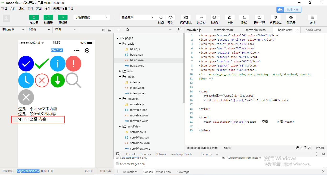
<icon type="success" size="66" color="blue"></icon>
<icon type="success_no_circle" size="66"></icon>
<icon type="info" size="66"></icon>
<icon type="warn" size="66"></icon>
<icon type="waiting" size="66"></icon>
<icon type="cancel" size="66"></icon>
<icon type="download" size="66"></icon>
<icon type="search" size="66"></icon>
<icon type="clear" size="66"></icon>
<!--  success_no_circle, info, warn, waiting, cancel, download, search,
clear -->
.container{

  display: flex;
  /* row: 默认从左到右排序*/
  /* row-reverse: 从右到左排序*/
  /* column: 从上到下排序*/
  /* column-reverse: 从下到上排序 */
  /* nowrap: 默认不换行 */
  /* wrap:换行 */
  /* wrap-reverse:逆向换行 */
  /* flex-start: 默认左对齐*/
  /* flex-end: 向右对齐 */
  /* center:居中对齐 */
  /* space-around: 在成员元素周围包裹 */
  /* space-between: 在成员元素之间留空白 */
  /* justify-content: space-between;*/

}

.size{
   /* 100rpx;
   height: 150rpx;*/
   width: 250rpx;
   height: 250rpx;

}
.father-size{
   width: 100%;
   height: 650rpx;
   background-color: grey;
}
.a{
  background-color:red;
  /* order: 通过数字对flex容器内部的成员设置显示顺序 */
  order:1;
  /* flex: 配置每个成员元素所占行级的显示比例 */
  flex:3;
}
.b{
  background-color:yellow;
  order:2;
  flex:2;
}
.c{

  background-color:blue;
  order:5;
  flex:1;
}
.d{
  background-color:green;
  order:3;
  flex:1;
}
.e{
  background-color:orange;
  order:4;
  flex:1;
}
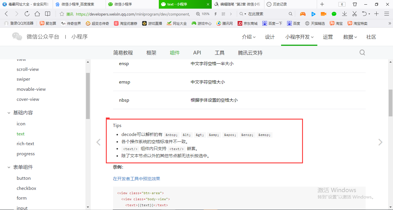
Tips
- decode可以解析的有
<>&'   - 各个操作系统的空格标准并不一致。
<text/>组件内只支持<text/>嵌套。- 除了文本节点以外的其他节点都无法长按选中。
<icon type="success" size="66" color="blue"></icon>
<icon type="success_no_circle" size="66"></icon>
<icon type="info" size="66"></icon>
<icon type="warn" size="66"></icon>
<icon type="waiting" size="66"></icon>
<icon type="cancel" size="66"></icon>
<icon type="download" size="66"></icon>
<icon type="search" size="66"></icon>
<icon type="clear" size="66"></icon>
<!--  success_no_circle, info, warn, waiting, cancel, download, search,
clear -->


<view>
   <view>这是一个view文本内容</view>
   <text selectable='{{true}}'>这是一段text文本内容</text>

</view>
| space | String | false | 显示连续空格 |
<icon type="success" size="66" color="blue"></icon>
<icon type="success_no_circle" size="66"></icon>
<icon type="info" size="66"></icon>
<icon type="warn" size="66"></icon>
<icon type="waiting" size="66"></icon>
<icon type="cancel" size="66"></icon>
<icon type="download" size="66"></icon>
<icon type="search" size="66"></icon>
<icon type="clear" size="66"></icon>
<!--  success_no_circle, info, warn, waiting, cancel, download, search,
clear -->


<view>
   <view>这是一个view文本内容</view>
   <text selectable='{{true}}'>这是一段text文本内容</text>

</view>

<view>
   <text selectable='{{true}}'>space    空格      内容</text>

</view>
<icon type="success" size="66" color="blue"></icon>
<icon type="success_no_circle" size="66"></icon>
<icon type="info" size="66"></icon>
<icon type="warn" size="66"></icon>
<icon type="waiting" size="66"></icon>
<icon type="cancel" size="66"></icon>
<icon type="download" size="66"></icon>
<icon type="search" size="66"></icon>
<icon type="clear" size="66"></icon>
<!--  success_no_circle, info, warn, waiting, cancel, download, search,
clear -->


<view>
   <view>这是一个view文本内容</view>
   <text selectable='{{true}}'>这是一段text文本内容</text>

</view>

<view>
   <text space='{{true}}'>space    空格      内容</text>

</view>
<icon type="success" size="66" color="blue"></icon>
<icon type="success_no_circle" size="66"></icon>
<icon type="info" size="66"></icon>
<icon type="warn" size="66"></icon>
<icon type="waiting" size="66"></icon>
<icon type="cancel" size="66"></icon>
<icon type="download" size="66"></icon>
<icon type="search" size="66"></icon>
<icon type="clear" size="66"></icon>
<!--  success_no_circle, info, warn, waiting, cancel, download, search,
clear -->


<view>
   <view>这是一个view文本内容</view>
   <text selectable='{{true}}'>这是一段text文本内容</text>

</view>

<view>
   <text selectable='{{false}}'>space    空格      内容</text>

</view>
<icon type="success" size="66" color="blue"></icon>
<icon type="success_no_circle" size="66"></icon>
<icon type="info" size="66"></icon>
<icon type="warn" size="66"></icon>
<icon type="waiting" size="66"></icon>
<icon type="cancel" size="66"></icon>
<icon type="download" size="66"></icon>
<icon type="search" size="66"></icon>
<icon type="clear" size="66"></icon>
<!--  success_no_circle, info, warn, waiting, cancel, download, search,
clear -->


<view>
   <view>这是一个view文本内容</view>
   <text selectable='{{true}}'>这是一段text文本内容</text>

</view>

<view>
   <text space='{{false}}'>space    空格      内容</text>

</view>
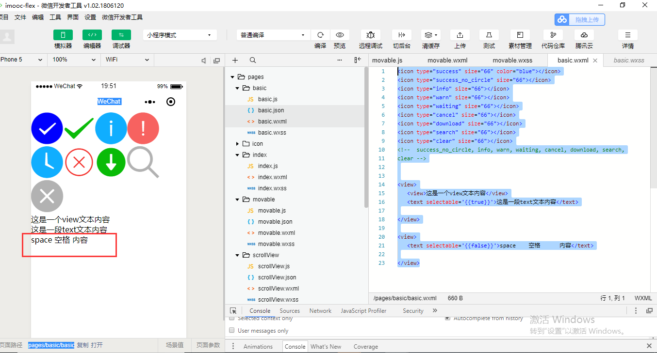
space属性应该是Boolean类型,而且为true的时候它应该是有多少个空格就显示多少个空格。
| decode | Boolean | false | 是否解码 |
<icon type="success" size="66" color="blue"></icon> <icon type="success_no_circle" size="66"></icon> <icon type="info" size="66"></icon> <icon type="warn" size="66"></icon> <icon type="waiting" size="66"></icon> <icon type="cancel" size="66"></icon> <icon type="download" size="66"></icon> <icon type="search" size="66"></icon> <icon type="clear" size="66"></icon> <!-- success_no_circle, info, warn, waiting, cancel, download, search, clear --> <view> <view>这是一个view文本内容</view> <text selectable='{{true}}'>这是一段text文本内容</text> </view> <view> <text space='{{false}}'>space 空格 内容</text> </view> <view> <text space='{{false}}'> < > & '    </text> </view>
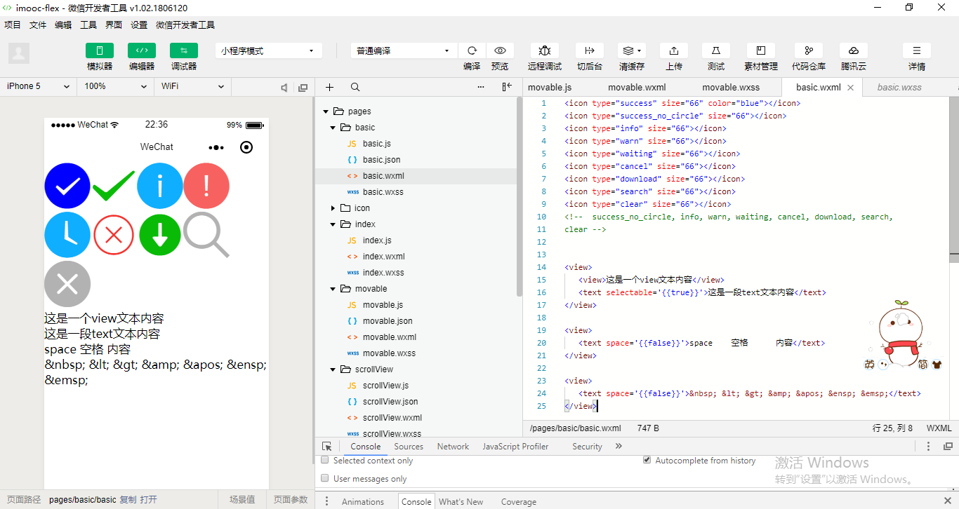
<icon type="success" size="66" color="blue"></icon> <icon type="success_no_circle" size="66"></icon> <icon type="info" size="66"></icon> <icon type="warn" size="66"></icon> <icon type="waiting" size="66"></icon> <icon type="cancel" size="66"></icon> <icon type="download" size="66"></icon> <icon type="search" size="66"></icon> <icon type="clear" size="66"></icon> <!-- success_no_circle, info, warn, waiting, cancel, download, search, clear --> <view> <view>这是一个view文本内容</view> <text selectable='{{true}}'>这是一段text文本内容</text> </view> <view> <text space='{{false}}'>space 空格 内容</text> </view> <view> <text space='{{false}}' decode='{{true}}'> < > & '    </text> </view>

支持转义的, 是换行,我们在代码里面也可以进行展示。
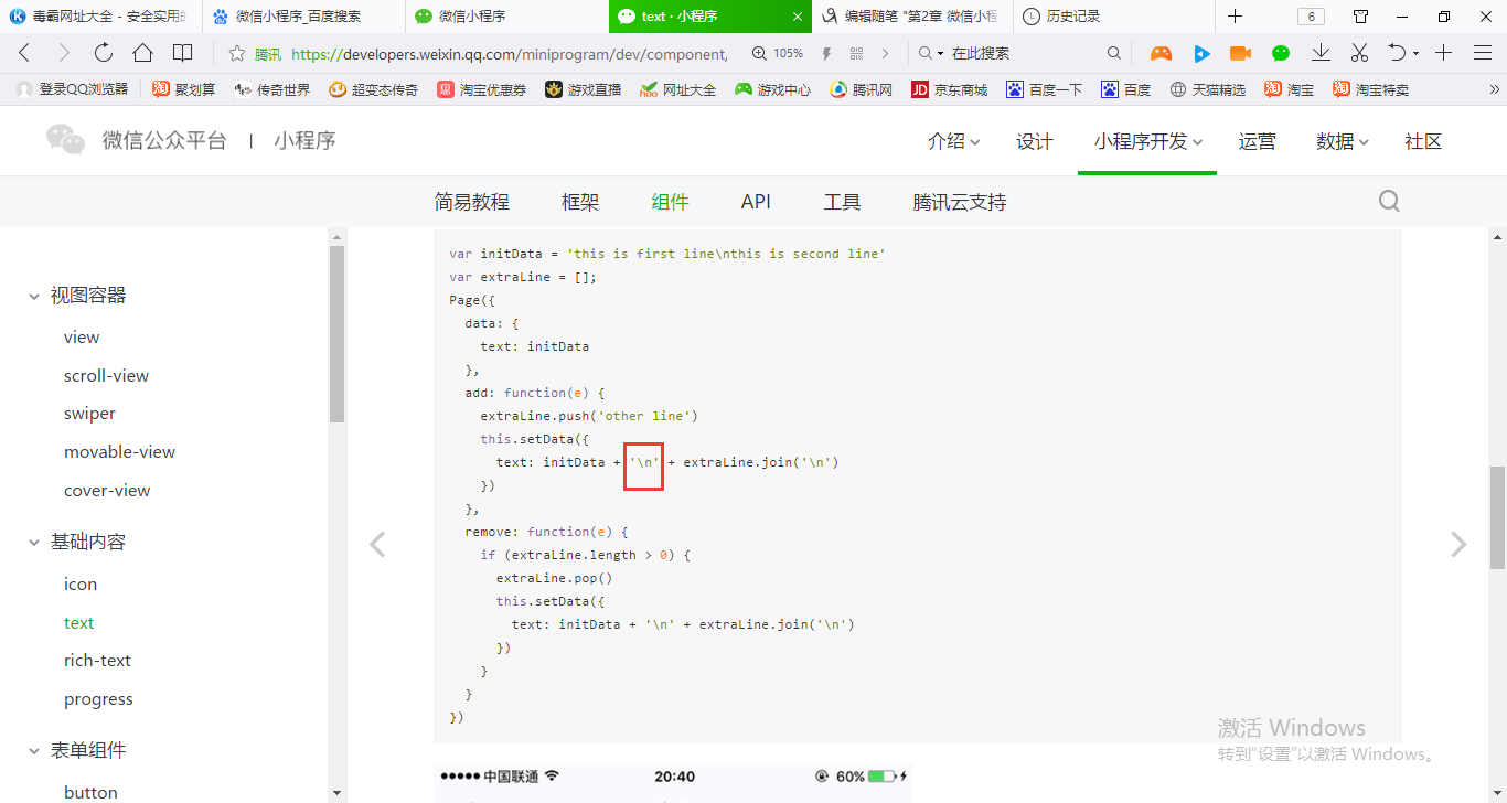
<icon type="success" size="66" color="blue"></icon> <icon type="success_no_circle" size="66"></icon> <icon type="info" size="66"></icon> <icon type="warn" size="66"></icon> <icon type="waiting" size="66"></icon> <icon type="cancel" size="66"></icon> <icon type="download" size="66"></icon> <icon type="search" size="66"></icon> <icon type="clear" size="66"></icon> <!-- success_no_circle, info, warn, waiting, cancel, download, search, clear --> <view> <view>这是一个view文本内容</view> <text selectable='{{true}}'>这是一段 text 文本内容</text> </view> <view> <text space='{{false}}'>space 空格 内容</text> </view> <view> <text space='{{false}}' decode='{{true}}'> < > & '    </text> </view>
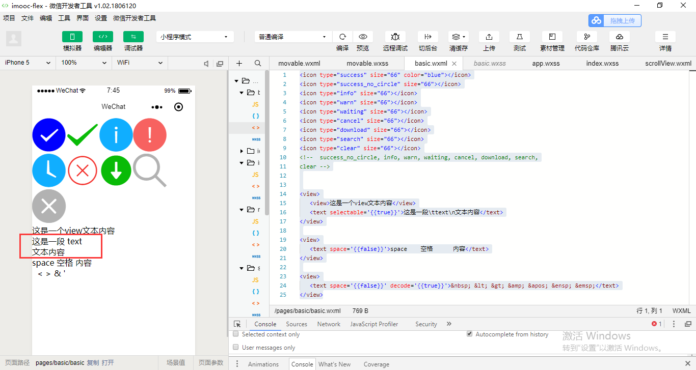
这个就是text组件去进行一个使用的。
有一些tips课后可以关注一下。
rich-text 富文本组件
在html里面使用former编辑框其实也是类似的,一个道理。
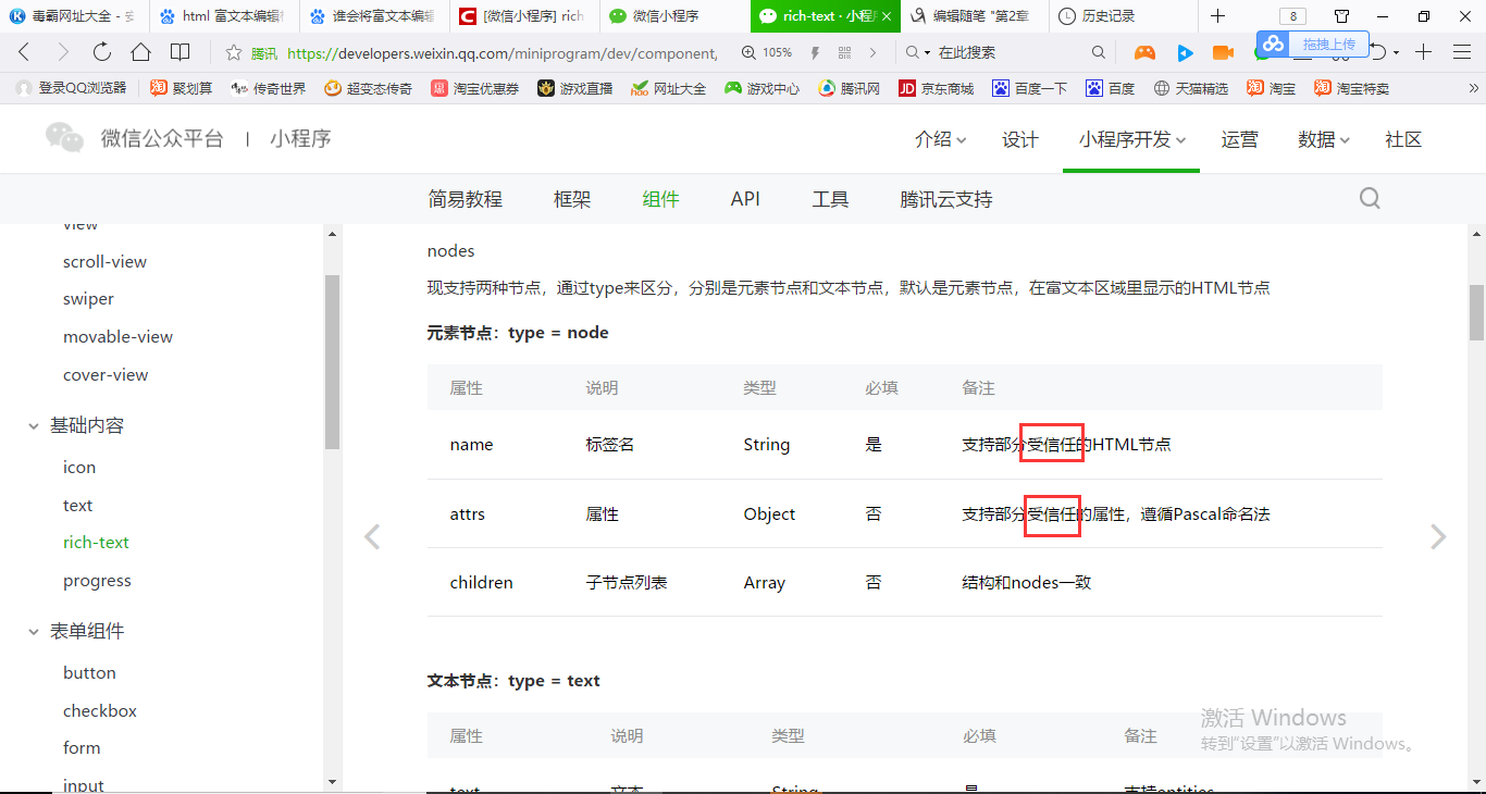
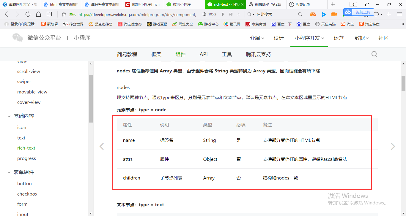
小程序对于rich-text是有一个受信任的html结点,另外还有受信任的属性。
在html会使用font标签,font是不受信任的,不要去写。
我们是使用String,但是官方它也提供了Array类型。nodes可以使用Array对象或者说是一个字符串String,都是可以的。那么为什么要使用Array对象呢?因为如果我们使用String之后它会把我们这一段标签代码转换为Array,然后再进行一个render再显示出来。
tips说了

所以我们就需要对这个String进行一个转换,就是把我们的属性转化成这些
转化成这些代码就可以了。
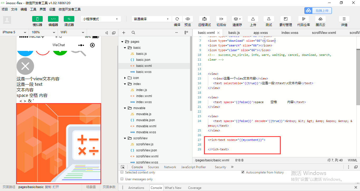
<icon type="success" size="66" color="blue"></icon> <icon type="success_no_circle" size="66"></icon> <icon type="info" size="66"></icon> <icon type="warn" size="66"></icon> <icon type="waiting" size="66"></icon> <icon type="cancel" size="66"></icon> <icon type="download" size="66"></icon> <icon type="search" size="66"></icon> <icon type="clear" size="66"></icon> <!-- success_no_circle, info, warn, waiting, cancel, download, search, clear --> <view> <view>这是一个view文本内容</view> <text selectable='{{true}}'>这是一段 text 文本内容</text> </view> <view> <text space='{{false}}'>space 空格 内容</text> </view> <view> <text space='{{false}}' decode='{{true}}'> < > & '    </text> </view> <rich-text nodes="{{mycontent}}"> </rich-text>
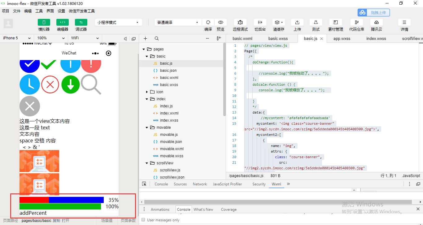
// pages/view/view.js
Page({
  /*
    doChange:function(){

       //console.log("我被拖动了。。。。");
    },
    doScale:function () {
       console.log("我被缩放了。。。。");

    }
    */
    data:{
        //mycontent: 'afafafafafafaadsada'
      mycontent: '<img class="course-banner" src="//img2.sycdn.imooc.com/szimg/5a5ddeda000145b405400300.jpg">'
    }
})
官方不推荐用字符串的方式去进行渲染。
使用数组的形式。
// pages/view/view.js
Page({
  /*
    doChange:function(){

       //console.log("我被拖动了。。。。");
    },
    doScale:function () {
       console.log("我被缩放了。。。。");

    }
    */
    data:{
        //mycontent: 'afafafafafafaadsada'
      mycontent: '<img class="course-banner" src="//img2.sycdn.imooc.com/szimg/5a5ddeda000145b405400300.jpg">',
      mycontent2:[
         {
             name: "img",
             attrs: {
               class: "course-banner",
                 src:                 "//img2.sycdn.imooc.com/szimg/5a5ddeda000145b405400300.jpg"
             }
         }
      ]
    }
})
<icon type="success" size="66" color="blue"></icon> <icon type="success_no_circle" size="66"></icon> <icon type="info" size="66"></icon> <icon type="warn" size="66"></icon> <icon type="waiting" size="66"></icon> <icon type="cancel" size="66"></icon> <icon type="download" size="66"></icon> <icon type="search" size="66"></icon> <icon type="clear" size="66"></icon> <!-- success_no_circle, info, warn, waiting, cancel, download, search, clear --> <view> <view>这是一个view文本内容</view> <text selectable='{{true}}'>这是一段 text 文本内容</text> </view> <view> <text space='{{false}}'>space 空格 内容</text> </view> <view> <text space='{{false}}' decode='{{true}}'> < > & '    </text> </view> <rich-text nodes="{{mycontent}}"> </rich-text> <rich-text nodes="{{mycontent2}}"> </rich-text>

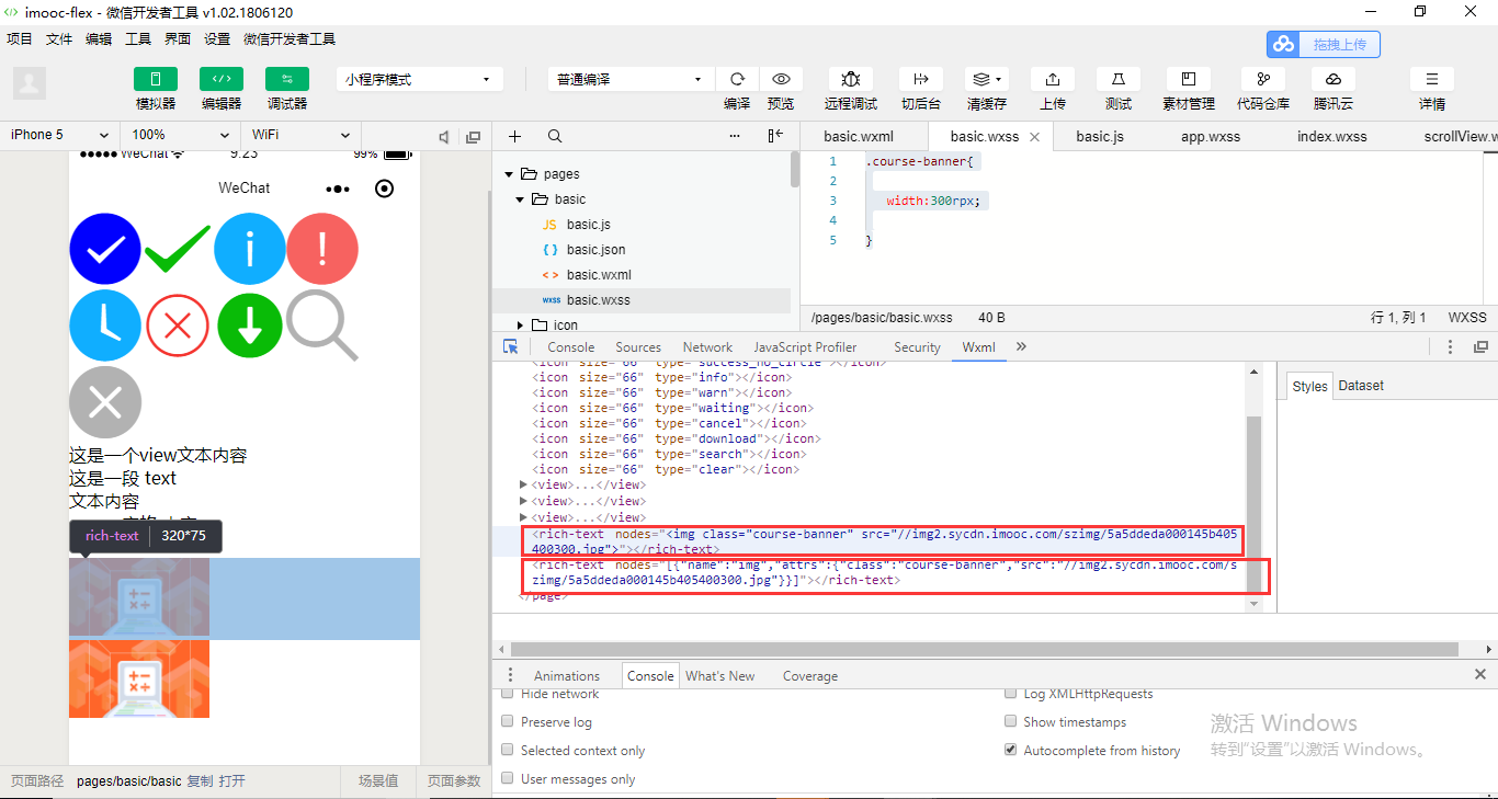
第一个是使用String字符串,所以nodes里面就直接是一个字符串了。第二个是根据data对象把里面的数组对象转义成JSON字符串,JSON对象。
这个就是富文本编辑框的显示。
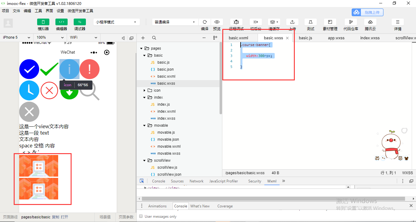
定义class。在私有的basic.wxss里面去定义就可以了。
.course-banner{

   width:300rpx;

}
这个就是通过两种形式去进行富文本框的设置。
rich-text会屏蔽内部的一些节点的事件。
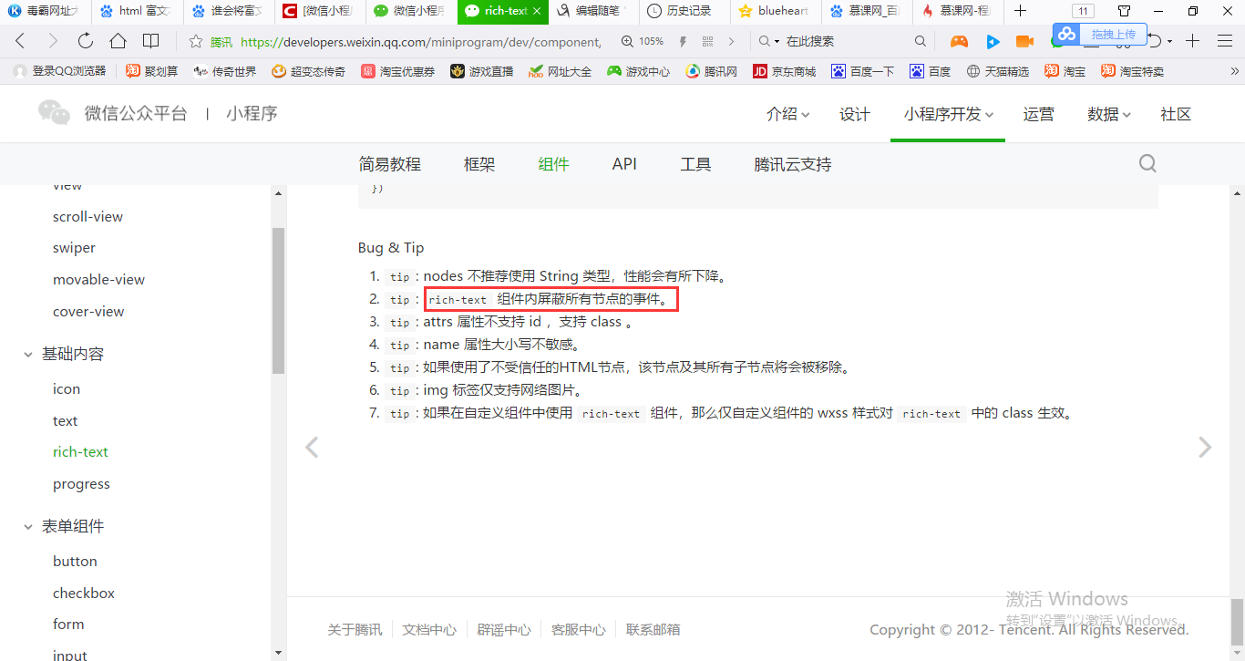
因为我们拷贝过来的那些富文本,它里面的一些代码会带有一些事件,它里面会自动屏蔽的。
progress和我们以前使用Bootstrap也是非常的类似。
<icon type="success" size="66" color="blue"></icon> <icon type="success_no_circle" size="66"></icon> <icon type="info" size="66"></icon> <icon type="warn" size="66"></icon> <icon type="waiting" size="66"></icon> <icon type="cancel" size="66"></icon> <icon type="download" size="66"></icon> <icon type="search" size="66"></icon> <icon type="clear" size="66"></icon> <!-- success_no_circle, info, warn, waiting, cancel, download, search, clear --> <view> <view>这是一个view文本内容</view> <text selectable='{{true}}'>这是一段 text 文本内容</text> </view> <view> <text space='{{false}}'>space 空格 内容</text> </view> <view> <text space='{{false}}' decode='{{true}}'> < > & '    </text> </view> <rich-text nodes="{{mycontent}}"> </rich-text> <rich-text nodes="{{mycontent2}}"> </rich-text> <progress percent='35' show-info='{{true}}' stroke-width='20' activeColor='red' backgroundColor='blue' active='{{true}}'> </progress> <progress percent='{{mypercent}}' show-info='{{true}}' stroke-width='20' active='{{true}}' active-mode='forwards'> </progress> <view bindtap='addPercent'> addPercent </view>
// pages/view/view.js
Page({
  /*
    doChange:function(){

       //console.log("我被拖动了。。。。");
    },
    doScale:function () {
       console.log("我被缩放了。。。。");

    }
    */
    data:{
        //mycontent: 'afafafafafafaadsada'
      mycontent: '<img class="course-banner" src="//img2.sycdn.imooc.com/szimg/5a5ddeda000145b405400300.jpg">',
      mycontent2:[
         {
             name: "img",
             attrs: {
               class: "course-banner",
                 src:                 "//img2.sycdn.imooc.com/szimg/5a5ddeda000145b405400300.jpg"
             }
         }
      ],
      mypercent:15
    },

    addPercent:function(){
      var newPercent = this.data.mypercent + 20;
      this.setData({

        mypercent: newPercent
      })
    }
})
按钮button和视图View它们两个都可以通过点击来触发一些事件。但是button它是跟form进行一个绑定使用,它是用于触发提交我们的数据到我们的后台进行一个交互。View它相当于是一个点击触发一个事件,但是它的事件应该是相对来说可能是比较是偏向于页面上的一些展示或者是页面上的一些导航的一些跳转。

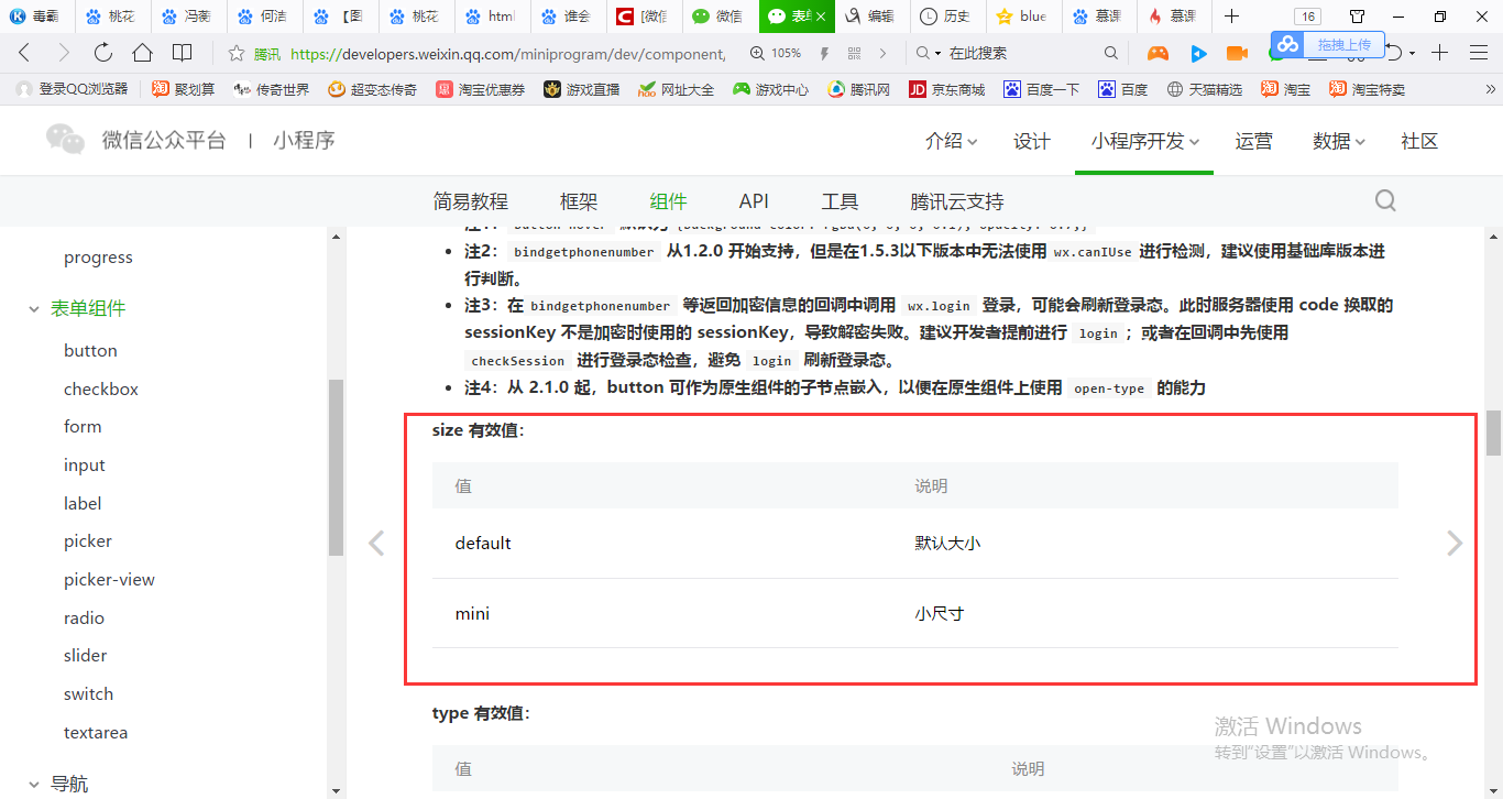
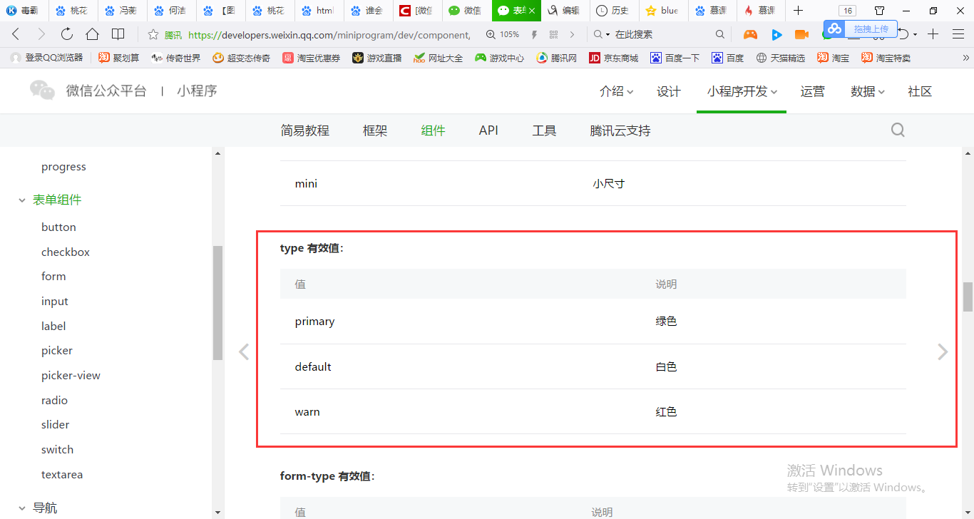
type='primary'小程序官方提供了一个绿色型按钮给我们使用。
按钮大部分是让小程序页面跟后端进行交互。
{
  "pages":[
    "pages/form/buttons/buttons",
    "pages/basic/basic",
    "pages/movable/movable",
    "pages/swiper/swiper",
    "pages/scrollView/scrollView",
    "pages/view/view",
    "pages/index/index"

  ],
  "window":{
    "backgroundTextStyle":"light",
    "navigationBarBackgroundColor": "#fff",
    "navigationBarTitleText": "WeChat",
    "navigationBarTextStyle":"black"
  }
}
<button>按钮</button>
<button size="mini">按钮1</button>

<button size="mini" type='default'>按钮2</button>
<button size="mini" type='primary'>按钮3</button>
<button size="mini" type='warn' plain='{{true}}'>按钮4</button>
<button size="mini" type='warn' disabled='{{true}}'>按钮5</button>
