1. margin负值运用

让右边框是一样的粗细而且鼠标划过盒子的时候边框高亮
1.让每个盒子margin 往左侧移动 -1px 正好压住相邻盒子边框
2.鼠标经过某个盒子的时候,提高当前盒子的层级即可(如果没有有定位,则加相对定位(保留位置),如果有定位,则加z-index)
<!DOCTYPE html>
<html lang="en">

<head>
    <meta charset="UTF-8">
    <meta name="viewport" content="width=device-width, initial-scale=1.0">
    <meta http-equiv="X-UA-Compatible" content="ie=edge">
    <title>margin负值的巧妙运用</title>
    <style>
        ul li {
            position: relative;
            float: left;
            list-style: none;
            width: 150px;
            height: 200px;
            border: 1px solid red;
            margin-left: -1px;
        }

        /* ul li:hover {
           1. 如果盒子没有定位,则鼠标经过添加相对定位即可
        position: relative;
        border: 1px solid blue;

       } */
        ul li:hover {
            /* 2.如果li都有定位,则利用 z-index提高层级 */
            z-index: 1;
            border: 1px solid blue;
        }
    </style>
</head>

<body>
    <ul>
        <li>1</li>
        <li>2</li>
        <li>3</li>
        <li>4</li>
        <li>5</li>
    </ul>
</body>

</html>
2. 文字围绕浮动元素
巧妙运用浮动元素不会压住文字的特性
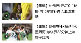
<!DOCTYPE html>
<html lang="en">
<head>
    <meta charset="UTF-8">
    <meta name="viewport" content="width=device-width, initial-scale=1.0">
    <meta http-equiv="X-UA-Compatible" content="ie=edge">
    <title>文字围绕浮动元素的妙用</title>
    <style>
        * {
            margin: 0;
            padding: 0;
        }
        .box {
            width: 300px;
            height: 70px;
            background-color: pink;
            margin: 0 auto;
            padding: 5px;
        }
        .pic {
            float: left;
            width: 120px;
            height: 60px;
            margin-right: 5px;
        }
        .pic img {
            width: 100%;
        }
    </style>
</head>
<body>
    <div class="box">
        <div class="pic">
            <img src="images/img.png" alt="">
        </div>
        <p>【集锦】热身赛-巴西0-1秘鲁 内马尔替补两人血染赛场</p>
    </div>
</body>
</html>
3. 行内块巧妙运用
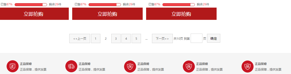
页码在页面中间显示:
1.把这些链接盒子转换为行内块, 之后给父级指定 text-align:center;
2.利用行内块元素中间有缝隙,并且给父级添加 text-align:center; 行内块元素会水平居中
<!DOCTYPE html> <html lang="en"> <head> <meta charset="UTF-8"> <meta name="viewport" content="width=device-width, initial-scale=1.0"> <meta http-equiv="X-UA-Compatible" content="ie=edge"> <title>行内块的巧妙运用</title> <style> * { margin: 0; padding: 0; } .box { text-align: center; } .box a { display: inline-block; width: 36px; height: 36px; background-color: #f7f7f7; border: 1px solid #ccc; text-align: center; line-height: 36px; text-decoration: none; color: #333; font-size: 14px; } .box .prev, .box .next { width: 85px; } .box .current, .box .elp { background-color: #fff; border: none; } .box input { height: 36px; width: 45px; border: 1px solid #ccc; outline: none; } .box button { width: 60px; height: 36px; background-color: #f7f7f7; border: 1px solid #ccc; } </style> </head> <body> <div class="box"> <a href="#" class="prev"><<上一页</a> <a href="#" class="current">2</a> <a href="#">3</a> <a href="#">4</a> <a href="#">5</a> <a href="#">6</a> <a href="#" class="elp">...</a> <a href="#" class="next">>>下一页</a> 到第 <input type="text"> 页 <button>确定</button> </div> </body> </html>
4. CSS 三角强化
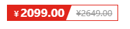
原理:

代码:
0;
height: 0;
border-color: transparent red transparent transparent;
border-style: solid;
border- 22px 8px 0 0;
<!DOCTYPE html>
<html lang="en">
<head>
    <meta charset="UTF-8">
    <meta name="viewport" content="width=device-width, initial-scale=1.0">
    <meta http-equiv="X-UA-Compatible" content="ie=edge">
    <title>CSS三角强化的巧妙运用</title>
    <style>
         .box1 {
            width: 0;
            height: 0;
            /* 把上边框宽度调大 */
            /* border-top: 100px solid transparent;
            border-right: 50px solid skyblue; */
            /* 左边和下边的边框宽度设置为0 */
            /* border-bottom: 0 solid blue;
            border-left: 0 solid green; */
           /* 1.只保留右边的边框有颜色 */
           border-color: transparent red transparent transparent;
            /* 2. 样式都是solid */
            border-style: solid;
            /* 3. 上边框宽度要大, 右边框 宽度稍小, 其余的边框该为 0 */
            border-width: 100px 50px 0 0 ;

        }
        .price {
            width: 160px;
            height: 24px;
            line-height: 24px;
            border: 1px solid red;
            margin: 0 auto;
        }
        .miaosha {
            position: relative;
            float: left;
            width: 90px;
            height: 100%;
            background-color:red;
            text-align: center;
            color: #fff;
            font-weight: 700;
            margin-right: 8px;

        }
        .miaosha i {
            position: absolute;
            right: 0;
            top: 0;
            width: 0;
            height: 0;
            border-color: transparent #fff transparent transparent;
            border-style: solid;
            border-width: 24px 10px 0 0;
        }
        .origin {
            font-size: 12px;
            color: gray;
            text-decoration: line-through;
        }
    </style>
</head>
<body>
        <div class="box1"></div>
        <div class="price">
            <span class="miaosha">
                ¥1650
                <i></i>
            </span>
            <span class="origin">¥5650</span>
        </div>
</body>
</html>