第4章.CSS
CSS简介
Cascading Style Sheet 层叠样式表:定义页面中的表现样式
history:
CSS1(1996)--CSS2(1998)--着手CSS3草案(拆分成很多模块)(2001)--CSS2.1修订(2007)--全面推广on-going(部分属性已经实现)
如何引入CSS?
外部样式表:页面的样式多
<head>
<link rel="stylesheet" href="base.css">
</head>
内部样式表:页面的样式少
<head>
<style>...</style>
</head>
内嵌样式:不利于维护,不建议
<p style="......">...</p>
语法:
selector { // 选择器
property1: value; // 属性名:属性值=属性声明
property2: value;
...
}
注释 /*...*/ (不支持//)
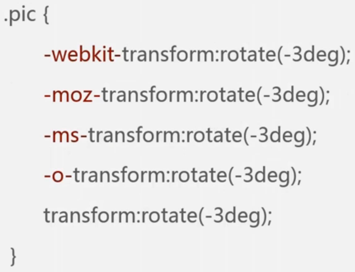
浏览器私有属性:
为了区分,会在之前加上特有的前缀 i.e.
chrome/safari:-webkit-
firefox:-moz-
IE:-ms-
opera:-o-
为了兼容不同浏览器,会将私有属性写在之前,把标准写在最后
i.e.
属性值语法:
margin : [<length>|<percentage>|auto] {1,4}
基本元素:<length><percentage>auto;组合符号:[] | ;数量符号{1,4}
基本元素:
关键字:auto, solid, bold...
类型:
基本类型:<length><percentage><color>...
其他类型:基本类型的组合:<'padding-width'>(padding-width和属性同名,需要加引号)、<color-stop>
符号:/ , 用于分割属性值
inherit/ initial:每个属性都可以取这两个值
inherit:强制继承,继承父元素的值
组合符号:
空格:必须出现,且顺序也必须相同
i.e. <'font-size'><'font-family'> --合法值:12px arial
&&:必须出现(顺序不要求)
i.e. <length>&&<color> --合法值:green 2px/ 1em blue
||:至少出现一个
underline||overline||line-through||blink --合法值:blink underline
|:只能出现一个
<color> | transparent -- 合法值:orange/ transparent
[]:分组作用,括号内看做一个整体
bold [thin || <length>] -- 合法值:bold thin/ blod 2em
数量符号:
无:出现一次
+:出现一次或多次
?:出现0次或一次
{}:出现次数的范围(included)
*:出现0次一次或多次
#:出现1次或多次,中间必须要用,隔开
以上为普通规则的语法,还有一种叫@规则:
@标识符...;
@标识符... {}
i.e.
@media: 设备符合该媒体查询条件,里面的样式才会生效
@keyframes:描述css动画的中间步骤
@font-face:引入web的字体
等等
选择器
简单选择器
标签选择器:p{......} :p即为p标签
类选择器:在标签内加入class属性和对应值(注:class的值可以是多个),.class_value {......}
className: naming convention 字母、数字、中划线、下划线;必须以字母开头,case sensitive
id选择器:在标签内加入id属性和对应值
与类选择器类似,区别:#id_value {......};unique id;
通配符选择器:* 选择页面内所有的元素
属性选择器:
选中具有某个属性的元素 [attribute] {......}
i.e. case 修改密码
<form action="">
    <div>
        <input disabled type="text" value="张三">  // 用户无法修改,css可使用disabled属性选择器
    </div>
    <div>
        <input type="password" placeholder="密码">
    </div>
</form>
[disabled] {...}
选中某个属性为某值的元素 [attribute=value] {......}
i.e. [type=button] {......}
#id即为该类属性选择器的特例
选中某个属性带有某值的元素 [attribute~=value] {......}
i.e. [class~=sports] {......}
.class即为该类属性选择器的特例
选中某个属性以某值开头的元素 [attribute|=value] {......}
i.e. [lang |= en] {......} /*lang属性值为en或值以en开头的元素*/
选中某个属性以某值开头的元素 [attribute^=value] {......}
i.e. [href ^= "#"] {......} /*href属性值以#开头的元素*/ (若属性值是符号或里面包含了空格,需要用到引号)
选中某个属性以某值结尾的元素 [attribute$=value] {......}
i.e. [href $= pdf] {......} /*href属性值以pdf结尾的元素*/
选中某个属性包含了某个属性值的元素 [attribute*=value] {......}
i.e. [href *= "lady.163.com"] {......}
伪类选择器:
a:link{...}:when a got the href property
a:visit{...}:when a link got visited
a:hover{...}:when the hyperlink got hovered
a:active{...}:when the hyperlink got clicked
NB: hover & active can also be used for other resource other than links
其他状态:
:enabled
:disabled
:checked
:first-child:第一个子标签
:last-child:最后一个子标签
:nth-child(even/odd/3n+1):/:nth-last-child(...):选中一系列子标签
:only-child:选中只拥有一个子元素的标签
:first/last-of-type:第一个/最后一个该类型的元素
:nth(-last)-of-type(...): 第../最后..个该类型的元素
:only-of-type:只拥有该类型子标签的元素
不常用:
:empty:选中没有子标签的元素
:root:选中跟标签
:not():不含有某选择器的元素
:target:目标元素
:lang():选中language值匹配的元素
伪元素选择器:::...{...}
::first-letter:第一个字母
::first-line:第一行
::before/after{content:"...";}:在内容之后/之前
::selection:应用于被用户选中的内容
后代选择器和子选择器:
后代选择器:
i.e. .main h2{...}:选中class为main中的所有h2标签
子选择器:>
i.e. .main>h2{...}:选中class为main中的子标签中的所有h2标签
相邻兄弟选择器:+
i.e. h2+p{..}:选中与h2相邻(之后)的p标签
通用兄弟选择器:~
i.e. h2~p{...}:所有与h2相邻(之后)的p标签
选择器分组:,
h1,h2,h3{...}:三种选择器的效果均为...
选择器的继承:
一些属性会自动继承到所有子元素中,如:color, font, text-..., list-style等
其他不能自动继承的属性,如:background, border, position...,需要在属性中写上inherited
CSS优先级:
计算方法:
a=行内样式(style属性)
b=ID选择器的数量
c=类、伪类和属性选择器的数量
d=标签选择器和伪元素选择器的数量
某选择器的value=1000*a+100*b+10*c+1*d
优先级高的样式会覆盖优先级低的样式
若优先级相同,则用到CSS层叠概念
CSS层叠:
相同的属性会覆盖:
优先级高的覆盖优先级低的
后面的覆盖前面的
!important关键字:覆盖掉其他定义的样式
文本
文字的样式:
大小:font-size:<length>|<percentage>|<absolute-size>|<relative-size>
font-size:12px; font-size:2pm; font-size:200%; 2pm & 200%指大小为父元素的两倍
字体:font-family:[<family-name>|<generic-family>]# #:一次或多次,逗号隔开
family-name:具体字体名称
generic-family:通用字体名称,如 serif衬线字体 | sans-serif非衬线字体 | cursive草书 | fantasy幻想体 | monospace等宽字体,系统/浏览器对某类通用字体会有默认字体
i.e. font-family: arial, Verdana, sans-serif; // arial和Verdana均为英文字体,arial在前,Verdana无效,中文字体未被前两者指定,使用sans-serif在浏览器/系统中默认的sans-serif
粗细:font-weight: normal | bold | bolder | lighter (bolder/lighter为相对的)
或 |100|200|300|400(normal)|...|700(bold)|...|900
默认normal,常用normal和bold,其他一般都不用
斜体:font-style: normal | italic | oblique
italic:斜体
oblique:倾斜(字体无斜体时,强制倾斜(效果不好);字体有斜体时,使用italic)
行距:line-height : normal | <number> |<length> | <percentage>
normal:浏览器默认,通常为1.14
number:i.e. line-height:40px;
line-height:300%; line-height:3; line-height:3em;//3倍当前字体大小
Then what is the diff btw 3, 300%, and 3em?
line-height:3 直接继承,再重新计算
line-height:300% 先计算,再继承
综合:font : [ [<font-style> || <font-variant> || <font-weight> || <font-stretch> ]? <font-size> [/<line-height>]? <font-family> ] | caption | icon | menu | message-box | small-caption | status-bar
font-size和font-family是必填项,有line-height时要写在font-size后面用slash隔开
i.e. font:30px/2 "Consolas", monospace;
font:italic bold 20px arial, serif;
颜色:color
color: red;
color: #ff0000;
color: rgb(255, 0, 0);
color: rgba(255, 0, 0, 1); // a: alpha (0-1)
color: transparent:全透明 (invisible)
对齐:text-align: left | right | center | justify(两端对齐)
垂直对齐:vertical-align: baseline(基线) | sub(下标) | super(上标) | top | text-top(文字最高点) |
middle | bottom | text-bottom | <percentage>(参照物line-height) | <length>(参照物baseline往上为正)
首行缩进:text-indent: <length> | <percentage> (百分比参照物为容器的宽度)
(负值为反方向缩进,若text-indent设为一个负极大值,则里面的文字将跑出容器,达到隐藏文字的目的)
是否自动换行,空格是否合并:white-space:
normal (浏览器决定,一般为连续tab或空格会被合并,换行会被合并,自动换行) |
nowrap (合并white-space,但不自动换行--强制限定为一行) |
pre (保留换行、保留space和tab,不自动换行 -- 完整保留在代码中的格式) |
pre-wrap (在pre的基础上允许自动换行,常用) |
pre-line (只保留换行,可自动换行,但合并空格和tab)
| Spaces and Tabs | New Lines | Text Wrapping | |
| normal | Collapse | Collapse | Wrap |
| nowrap | Collapse | Collapse | No wrap |
| pre | Preserve | Preserve | No wrap |
| pre-wrap | Preserve | Preserve | Wrap |
| pre-line | Collapse | Preserve | Wrap |
长单词内部换行:word-wrap: normal | break-word
允许一个长单词在单词内部进行自动换行
单词内部换行:word-break: normal | keep-all | break-all
文字阴影:text-shadow: none | [<length>{2,3} && <color>?]#
i.e. text-shadow:1px 2px 3px red; // x offset, y offset, shadow radius, shadow color
文字标注:text-decoration: none | [underline || overline || line-throught] // 可写多个
文字过长时用...替代:text-overflow: clip(default) | ellipsis
i.e. text-overflow:ellipsis; overflow:hidden; white-space:nowrap; // 需要都写上
鼠标形状:cursor: [<url>,]* [ auto | default | none | help | pointer | zoom-in | zoom-out | move | ...
自定义图片 自动处理 普通不变 消失
i.e. cursor: url(xx.cur), pointer; // 但url失效时,便使用pointer
盒模型
border, padding, content, margin:
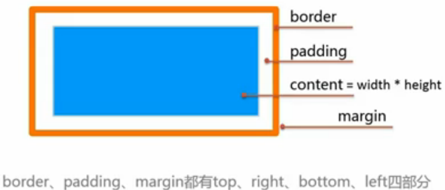
<length> | <percentage>参照物为父元素 | auto(default, 浏览器自动分配)
引申:min-width; max-width;
height: similar with width
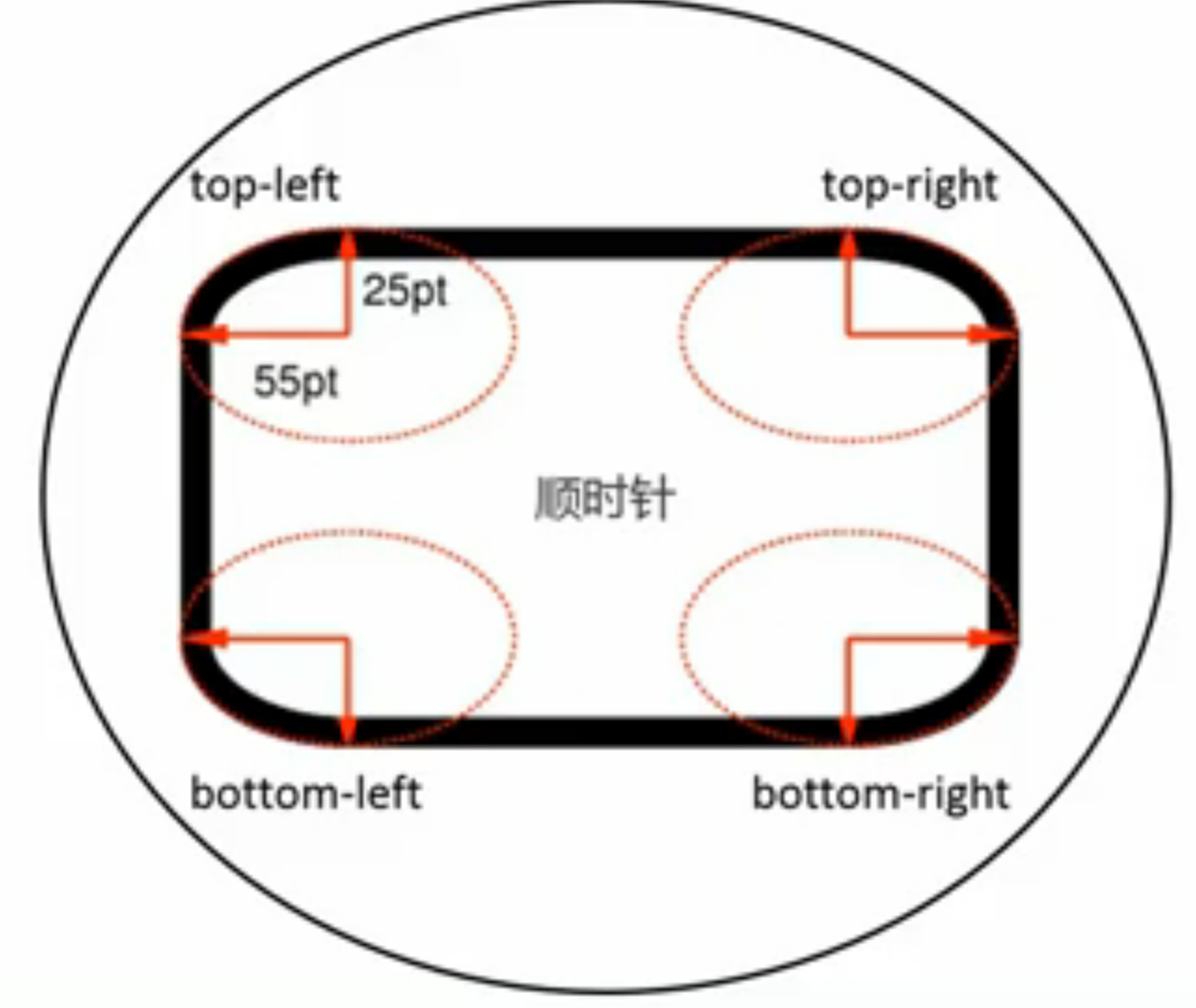
padding: [<length> | <percentage> ] {1,4}
1: 四个方向
2: 上/下;左/右
3: 上;左/右;下
4: TRBL上右下左(从上开始顺时针clock-wise)
-->padding-top:...; padding-right:...; padding-bottom:...; padding-left:...;
(so do margin and border)
--缩写规则:对面相等,后者省略;4面相等,只设一个。
margin: [ <length> | < percentage>参照物为父元素 | auto(浏览器自动分配) ]{1,4}
margin合并:毗邻元素外边距共享,父元素和第一个/最后一个子元素共享边距
margin auto的巧用:margin: 0 auto -- 水平居中
border: [ <border-width> || <border-style> || <border-color> ]
border- [ <length> | thin | medium(default) | think ]{1,4}
border-style: [ solid | dashed | dotted | ...]{1,4}
border-color: [ <color> | transparent ]{1,4} // 默认颜色为字体颜色
other features on border:
圆角:border-radius
border-radius: [ <length> | <percentage> ]{1,4} [/ [ <length> | <percentage> ]{1,4}]?
i.e. 常设 border-radius: 10px; 四个角横纵均相同
border-radius: 0px 5px 10px 15px/20px 15px 10px 5px;
(左上角:0px,20px画不出;右上角:5px,15px;
右下角:10px,10px;左下角:15px,5px)
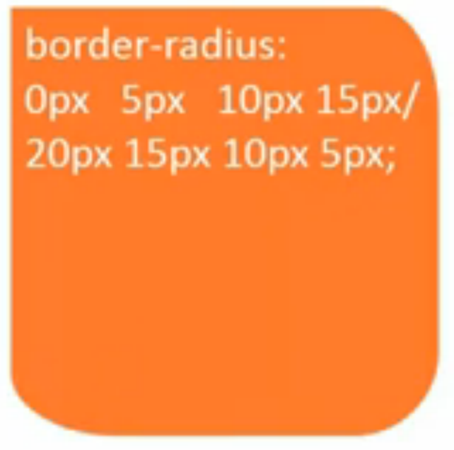
what if we say border-radius:50%;? -- a circle
当内容溢出时:overflow: visible | hidden | scroll | auto
visible(default 超出部分显示)
hidden(超出部分隐藏)
scroll(滚动条一直显示)
auto(内容少时不显示滚动条,内容超出时自动显示滚动条)
引申:overflow-x, overflow-y
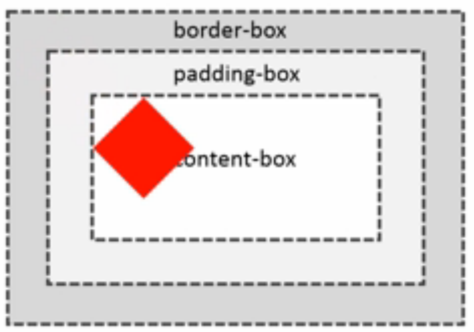
盒子大小:box-sizing: content-box(default) | border-box
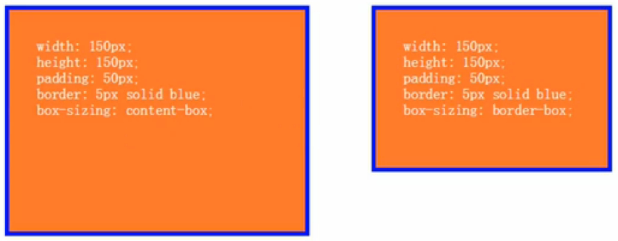
左图 width/height指的是content-box
以宽度为例:蓝线之内是width150px+2*padding50px+2*border5px
右图 width/height指的是border-box
以宽度为例:蓝色区域大小就是width150px,包括2*border5px在内
盒阴影:box-shadow: none | <shadow> [,<shadow>]*
<shadow>: inset? && <length>{2,4} && <color>?
inset指的是内阴影
i.e. box-shadow: 4px 6px 3px 3px red;
x-offset, y-offset, 模糊半径(往外往内各1.5px),阴影大小, 阴影颜色 --x、y偏移必须设置
box-shadow: 3px 3px 5px 2px, inset 0px 0px 5px red; 多阴影
阴影不占空间,只有修饰效果
轮廓:outline: [ <outline-width> || <outline-style> || <outline-color> ]
outlint- <length> | thin | medium | thick
outline-style: solid | dashed | dotted | ...
outline-color: <color> | invert
与border相似,但是outline不占空间,位于border以外
背景
background-color: <color> | transparent(default) 在最底层显示
background-image: <bg-image> [, <bg-image> ]*
<bg-image> = <image> | none
<image> = url();
i.e. background-image: url(aaa.png), url(blue.png); 先引入的图片在上层,叠加显示
background-repeat: <repeat-style> [,<repeat-style> ]* 位置与<bg-image>一一对应
<repeat-style> = repeat-x | repeat-y (只沿单方向平铺) | [ repeat(default) | space图片间有空隙(x轴上等分,y轴上等分,空隙大小由正好容下若干个平铺图片等分) | round图片进行伸缩(不是等比,使容器正好容下若干个平铺图片) | no-repeat]{1,2} 一到两个值:x方向 y方向
当background-repeat后面有缺省值时(少了和多图片的对应值),和前面的值相同
background-attachment: <attachment> [, <attachment> ]* 滚动时背景是否跟着滚动
<attachment> = scroll(default 背景不动) | fixed(滚动参照物为窗口) | local(背景跟着滚动)
background-position: <position> [, <position> ]*
<position> = [ left | center | right | top | bottom |<percentage>|<length> ] |
[left | center | right |<percentage>|<length>] [top | center | bottom |<percentage>|<length>] |
[ center | [ left | right ] [<percentage>|<length>]? ] && [ center | [top | bottom] [<percentage>|<length>]? ]
i.e. background-position: 10px 20px; / 20% 50%; // x-offset, y-offset
background-position: center center; / 50% 50%; // 居中
background-position: right; / 100%; // 一个值时表示x轴,y轴为默认的center
background-position: right 10px top 20px; // 右边距离10px,上面距离20px
实例:
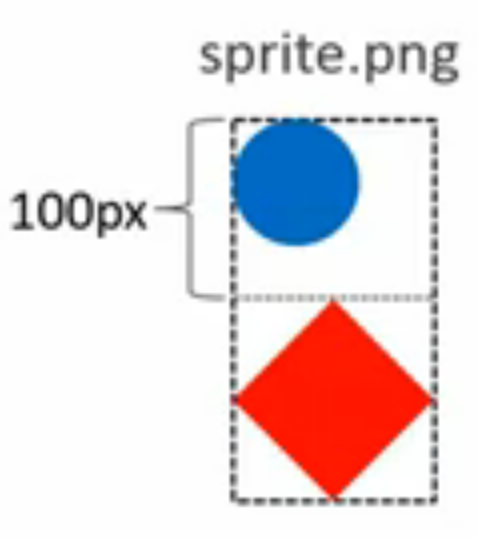
background-image:url(sprite.png);
background-repeat:no-repeat;
background-position:0 -100px;
--正常显示红色菱形
线性渐变背景:linear-gradient( [ [ <angle> | to <side-or-corner> ] ,]? <color-stop> [,<color-stop> ]+ )
<side-or-corner> = [left | right] || [top | bottom(default从上到下)]
<color-stop> = <color> [ <percentage> | <length> ]?
i.e. linear-gradient(red, blue); // 从上往下红变蓝
linear-gradient(to top, red, blue); // 从下往上红变蓝
linear-gradient(to right bottom, red, blue); // 从左上角到右下角
linear-gradient(45deg, red, blue); // 0deg时从下往上,顺时针旋转45度角的方向进行渐变
linear-gradient(red, green, blue); // 红变绿变蓝, color-stop缺省时自动平分空间
linear-gradient(red, green 20%, blue); // 绿色在距顶端20%的位置
径向渐变背景:radial-gradient(...)
[ [ circle || <length> ] [at <position> ]? ,|
[ellipse || [ length>|<percentage> ]{2} ] [at <position> ]?, |
[ [ circle | ellipse ] || <extent-keyword> ] [at <position> ]?, |
]? <color-stop> [,<color-stop>]+
<extent-keyword> = closest-side | farthest-side | closest-corner | farthest-corner(default)
i.e. background-image: radial-gradient(closest-side, red, blue); // 最近两条边,形状默认椭圆
radial-gradient(circle, red, blue); // 默认为farthest-corner
radial-gradient(circle 100px, red, blue); // 给定半径100px
radial-gradient(100px 50px, red, blue); // x, y 半径为100px
radial-gradient(100px, 50px at 0 0, red, blue); // 圆心在0,0
repeating-*-gradient:
repeating-linear-gradient(red, blue 20px, red 40px);
repeating-radial-gradient(red, blue 20px, red 40px);
background-origin: <box> [,<box>]* 确定背景图片0,0 和100%,100%的坐标
<box> = border-box | padding-box(default) | content-box
background-clip: <box> [,<box>]* 裁剪(过大的,或平铺的)背景图片
border-box (default)
background-size: <bg-size> [,<bg-size>]*
<bg-size> = [ <length> | <percentage> | auto ]{1,2} | cover | contain
i.e. background-size: auto; // x为原始大小,y与x相同
background-size: 20px 20px;
background-size: 50% 50%; // 以容器为参照物
background-size: cover; // 图片尽可能小,完全充满容器
background-size: contain; // 图片尽可能大,完全显示在容器中
background: [ <bg-layer> ,]* <final-bg-layer> 综合
<bg-layer> = <bg-image> || <position> [/<bg-size>]? || <repeat-style> || <attachment> || <box> || < box>
第一个box为background-origin,最后一个为background-clip,若只出现一个,则都是。
<final-bg-layer> = <bg-layer> || <'background-color'>
i.e. background: url(red.png) 0 0 /20px 20px no-repeat,
url(blue.png) 50% 50%/contain no-repeat content-box green;
布局
display(水平居中、居中导航)、position(轮播头图、固定顶栏、遮罩、三行自适应布局)、float(两列布局)、flex(三行两列自适应)
布局:将元素以正确的大小摆放在正确的位置上 -- 元素的摆放模式
diplay:设置元素的显示方式
display: block | inline | inline-block | none
block:默认宽度为父元素宽度(充满父元素),可设置宽高,相对于前后元素换行显示(元素摆放位置)
div, p, h1-h6, ul, form, ... 默认为display: block
inline:默认宽度为内容宽度,不可设置宽高,同行显示 (在元素内换行)
span, a, label, cite, em,... 默认为display: inline
inline-block: 默认宽度为内容宽度,可设置宽高,同行显示(可设置宽高的inline--区别,整块换行:若后面元素宽度超过可用空间,会整块换行,而inline可以在元素内换行??)
input, textarea, select, button,... 默认为display:inline-block
NB.
如何实现浏览器兼容版的inline-block显示:display:inline-block;在ie6、ie7下只有设置在默认显示方式为inline的元素上才会生效,请实现兼容ie6、ie7的通用的方式。
三行代码可以解决:
display: inline-block;
*display: inline;
*zoom: 1;
通过 *zoom: 1; 去出发hasLayout的行为,然后通过 *display: inline; 去支持IE7及以下版本(高版本会直接使用display: inline-block;)
当hasLayout和inline在一起的时候,就触发了inline-block的行为在IE7及以下版本
ref:https://stackoverflow.com/questions/6544852/ie7-does-not-understand-display-inline-block
none: 设置元素不显示
区别 visibility: hidden 为显示隐藏,但是占据了位置
实例:
块级元素水平居中:
<div>
<div class="content"> Content Area </div>
</div>
.content {margin:0 auto; 978px;} // 浏览器自动平分水平方向空白
居中导航区:
<ul>
<li><a href="...">推荐</a></li>
<li><a href="...">歌单</a></li>
<li><a href="...">歌手</a></li>
</ul>
ul {text-align:center; height:...; line-height:...;}
li, a{display:inline-block; ..; height:...;} // 同行显示,可设置宽高--inline-block
li {margin:0 10px;}
position--设置定位方式(参照物)
position: static(default无设置) | relative | absolute | fixed
relative:元素仍在文档流中,参照物为元素本身,可改变z轴的层级(覆盖其他元素)
absolute:默认宽度为内容宽度,脱离文档流(不占位置),参照物为第一个定位元素/根元素<html>
fixed:默认宽度为内容宽度,脱离文档流,参照物为视窗(不是<html>)--不随滚动条滚动
top/right/bottom/left, z-index --配合position设置位置,元素边缘和参照物边缘的距离
若同时设置了top/bottom会怎么样呢?同时满足top和bottom,元素的大小改变了
z-index: 设置在z轴上的重叠,默认值为0,可为负值;若相同,则根据元素在文档流的顺序覆盖
z-index栈的概念:以父元素的z-index为主
--两个绝对定位的元素,z-index值大的元素一定在z-index值小的元素的上方。
实例:
轮播头图:
特征:title覆盖在图片之上,右下角按钮覆盖在图片之上,图片轮换
<div class="is">
    <img src="aaa.jpg">
    <p class="title"><a href="...">老徐视线....</a></p>
    <div class="controls">
        <span></span><span class="cur"></span><span></span><span></span><span></span>
    </div>
</div>
一个span代表一个控制按钮
.is{position:relative; width:480px;}  // 将容器作为子元素的参照物
.is .title{position:absolute; bottom:0; width:100%;}
.is .controls{position:absolute; bottom:18px; right:10px;}
.is .controls span{display:inline-block; width:10px; height:10px;}
固定顶栏:
<body>
    <div class="top">top bar</div>
    <div class="main">content area</div>
</body>
body{padding-top:50px;}    // 避免内容区被顶栏覆盖
.top {position:fixed; top:0; width:100%; height:50px;}
遮罩:
<div class="mask"></div>
.mask{position:fixed; top:0; left:0; z-index:999; width:100%; height:100%;}
三行自适应布局:顶栏底栏固定于窗口,中间内容区自适应
<div class="head">head</div>
<div class="body">body</div>
<div class="foot">foot</div>
.head{position:absolute; top:0; left:0; width:100%; height:100px;}
.body{ppsition:absolute; top:100px; left:0; bottom:100px; right:0;}  // 没设长宽时且设置了上下左右--拉伸
.foot{position:absolute; top:0; left:0; width:100%; height:100px;}
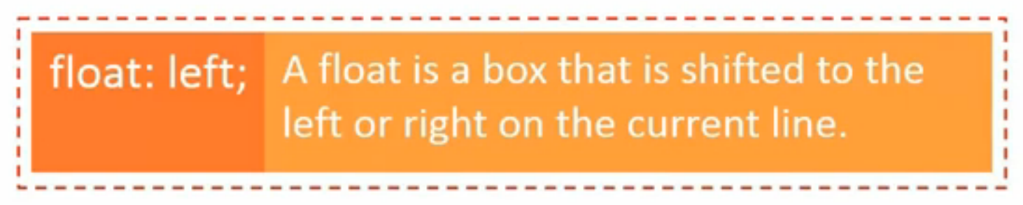
float:
半脱离文档流(float元素在同一文档流内)--对后序元素,脱离文档流,对内容而言,是在文档流内的
默认为内容宽度,向指定方向一直移动(到不能移动为止(父元素边界))
float: left | right | none(default)
半脱离文档流:i.e.
红色虚线框表示后序元素位置,被float覆盖了,但是后序元素中的内容却没有被float元素覆盖
clear属性:both (包含left&right) | left | right | none(default)
应用于后续元素、应用于块级元素
如何使用:
增加空白元素
clearfix
i.e. 清除前
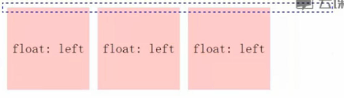
<div class="parent">
    <div class="sample">float: left</div>
    <div class="sample">float: left</div>
    <div class="sample">float: left</div>
</div>

.sample{float:left;}
使用空白元素去除:
在最后一个float:left元素之后加上
<br class="cb">
.cb{clear:both; height:0; overflow:hidden; visibility:hidden;}
或:使用clearfix清除--常用
在父元素的div中加上class="clearfix"
.clearfix:after {content:'.'; display:block; clear:both; height:0; overflow:hidden; visibility:hidden;}
原理:在浮动元素的后续元素加一个内容为点的(块级元素),并将其设置为不可见
在IE低版本不兼容after,则在后面加一句.clearfix{zoom:1;}即可
实例:
两列布局:
<div class="body clearfix">
    <div class="side">side</div>
    <div class="main">main</div>
</div>
.side{float:right; width:200px;}
.main{float:left; width:500px;}
.clearfix:after{content:'.'; display:block; clear:both; height:0; overflow:hidden; visibility:hidden;}
两列自适应布局:

<div class="parent">
<div class="side">侧栏</div>
<div class="main">主栏</div>
</body>
要求如效果图中标注,两栏间距为10px,请写出这个两列布局的CSS。
Flex: 弹性布局
terms:
flex container包含了flex item;
main axis 主轴方向; cross axis 辅轴方向
创建flex container:
display: flex
flex container中在文档流中的直接子元素:flex item 弹性元素
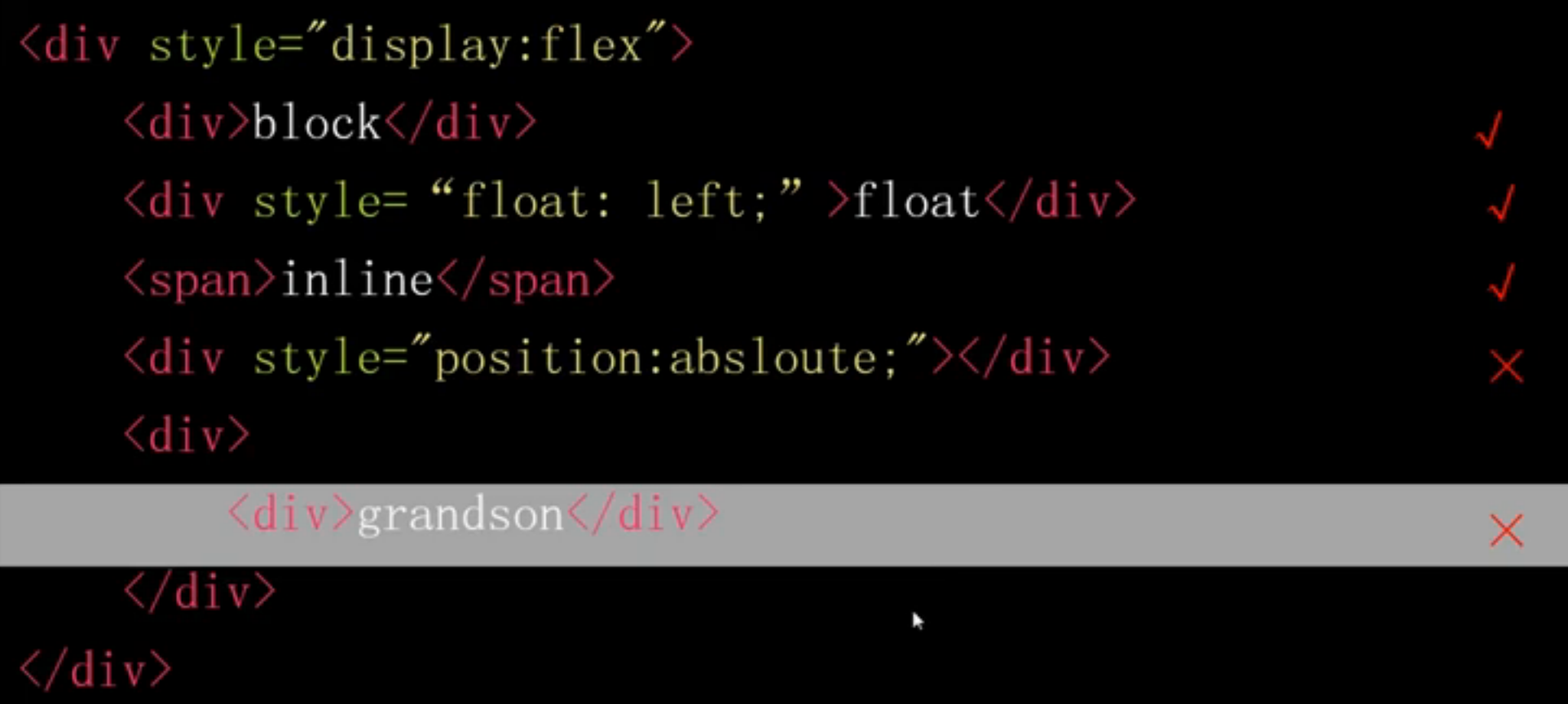
float在文档流中,是flex item;
position:absolute脱离文档流,不是flex item;
<div><div>grandson</div></div>不是直接子元素(是孙元素),不是flex item。
flex的特性:
方向:
flex-direction 排列方向
flex-direction: row (default) | row-reverse | column | column-reverse
flex-wrap 弹性换行 (空间不够元素会进行收缩--称为弹性)
flex-wrap: nowrap (default) | wrap | wrap-reverse (从下往上)
flex-flow 弹性流
flex-flow: <'flex-direction'> || <'flex-wrap'>
order 排列先后顺序
order: <integer> --优先级
default (0), can be negative.
弹性:
flex-grow 元素所能分配到的空余空间比例
flex-grow: <number>
default (0), flex-basis + (flow-grow / Sum(flow-grow)) * remain

巧用:如何使第三个元素的宽度为第二个元素的两倍呢(不是分配剩余空间的2/3)
.item2 {flex-basis:0; flex-grow:1;}
.item3 {flex-basis:0; flex-grow:2;}
flex-shrink 剩余空间为负时,如何分配空间
flex-shrink: <number>
default (1), flex-basis + (flow-grow / Sum(flow-grow)) * remain (remain为负值)
flex-basis 设置flex item的初始宽/高(宽还是高要结合主轴方向(flex-direction)来看)
flex-basis: main-size | <width>
flex: <'flex-grow'> || <'flex-shrink'> || <'flex-basis'>
default: 0 1 main-size
对齐:
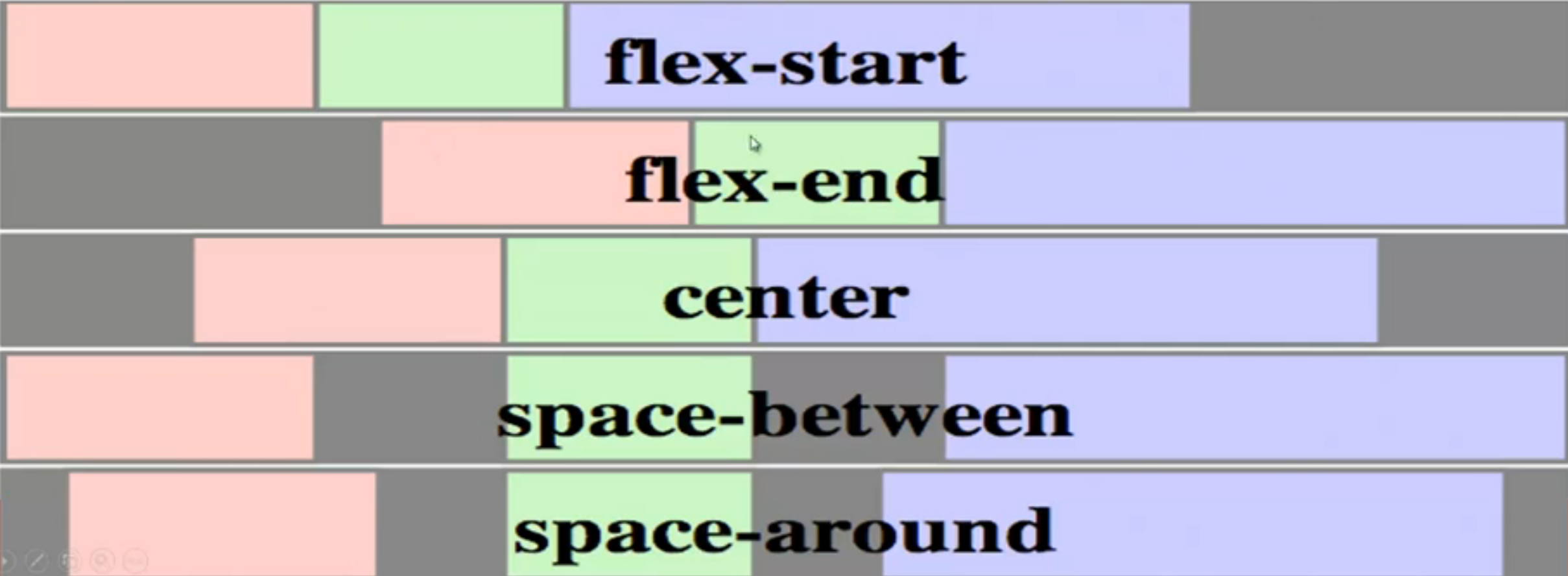
justify-content 设置main axis主轴下的对齐方式
justify-content: flex-start (default) | flex-end | center | space-between | space-around
align-items 设置cross axis辅轴下的对齐方式
align-items: flex-start | flex-end | center | baseline | stretch (default)
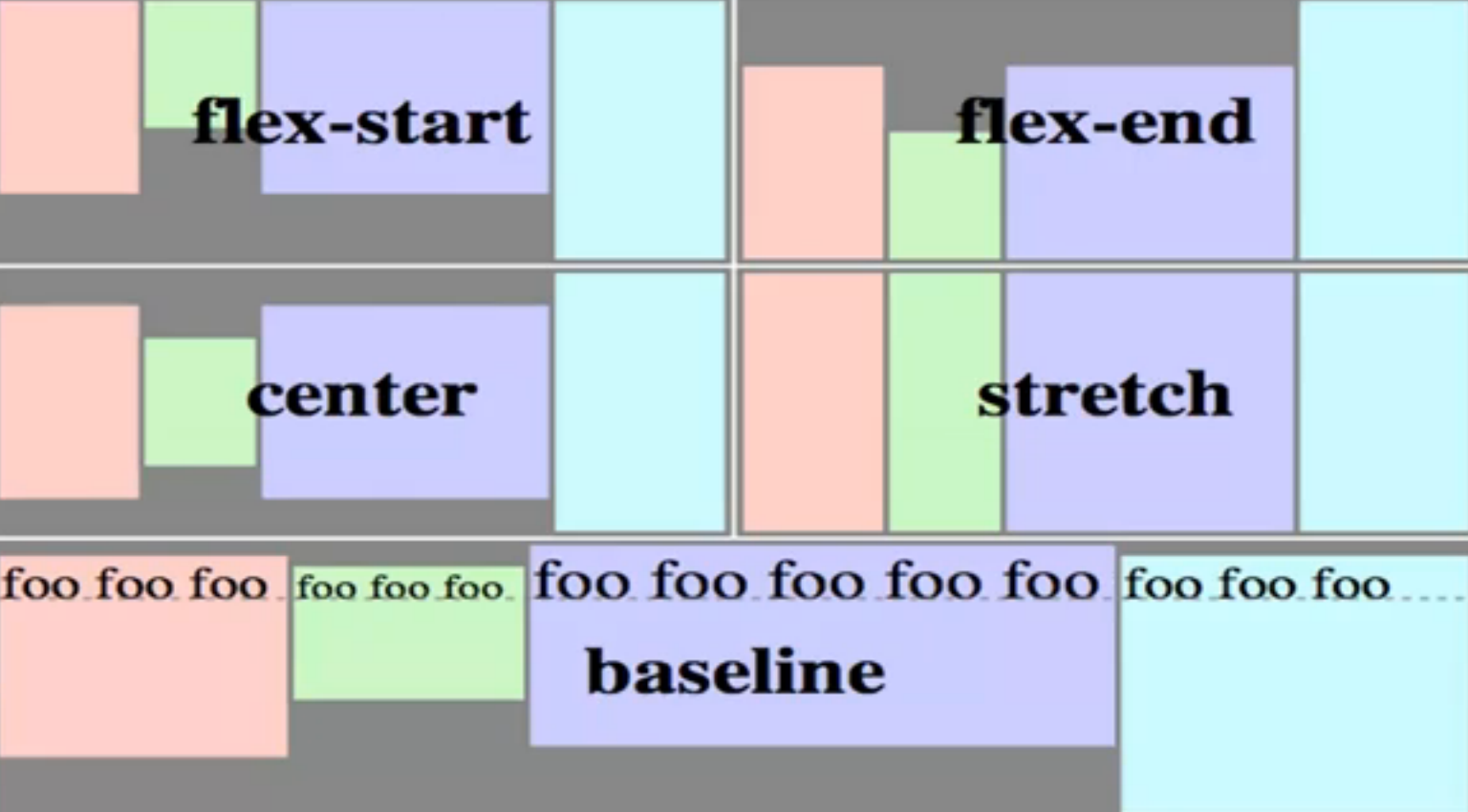
align-self 设置单个flex item在cross axis方向上的对齐方式
align-self: auto (default)即使用容器中align-items的设置 | flex-start | flex-end | center | baseline | stretch
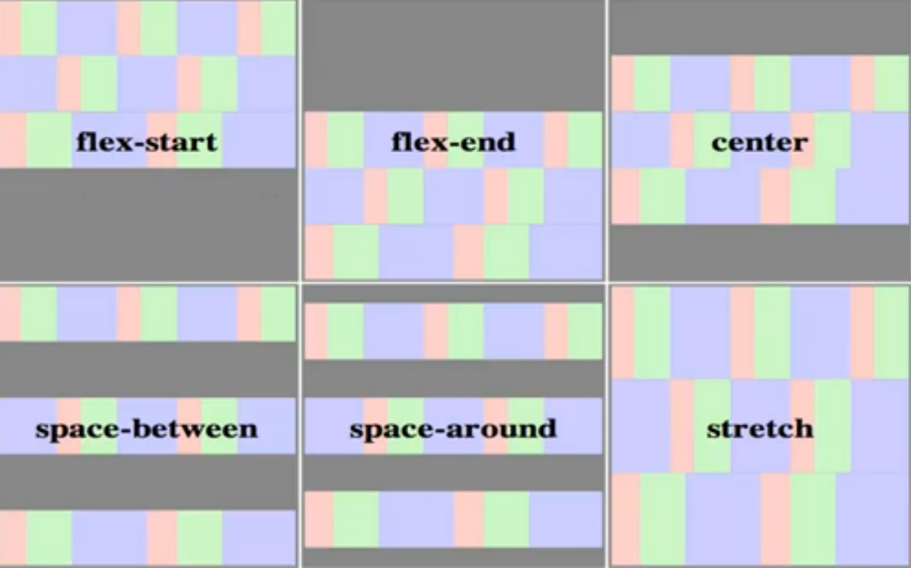
align-content (容器中有多行内容)设置cross axis方向上行的对齐方式
align-content: flex-start | flex-end | center | space-between | space-around | stretch (default)
实例:
三行自适应+两列自适应:
<!DOCTYPE html>
<html lang="en">
<head>
    <meta charset="UTF-8">
    <title>三行自适应+两列自适应</title>
    <style type="text/css">
        html, body {
            margin-left: 0;
            text-align: center;
        }
        .head, .foot {
            line-height: 100px;
            background-color: grey;
        }
        .side {background-color: yellow;}
        .main {background-color: pink;}

        html, body {height:100%;}
        body {
            display: flex;
            flex-flow: column;
        }
        .head, .foot {height: 100px;}
        .body {
            flex-grow: 1;
            display: flex;
            margin: 0 100px;
        }
        .side {flex-grow: 1;}
        .main {flex-grow: 3;}
    </style>
</head>
<body>
    <div class="head">head</div>
    <div class="body">
        <div class="side">side</div>
        <div class="main">main</div>
    </div>
    <div class="foot">foot</div>
</body>
</html>
变形
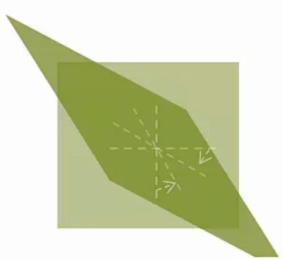
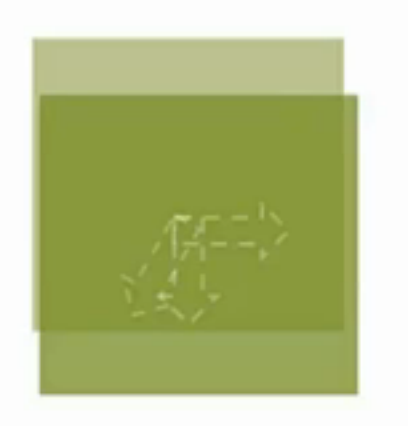
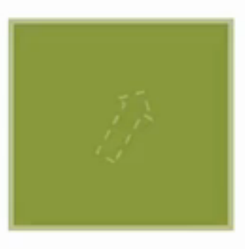
transform:旋转、缩放、移动等--左手坐标系!!!
transform: none | <transform-function>+
rotate( <angle> ):
i.e. transform: rotate(45deg); - positive value: clock-wise
translate:
translate ( <translation-value> [,<translation-value>]?)
translateX( <translation-value> )
translateY( <translation-value> )
i.e. transform: translate(50px); // x:50px; y:0; positive value: right bottom
transform: translate(50px, 20%); // %的参照物为元素本身的宽/高
transform: translateX(-50px);
scale( <number> [, <number>]> ) 第二个值省略时默认与第一个值相同
scaleX ( <number> );
scaleY ( <number> );
i.e. transform: scale(1.5, 2);
skew(<angle> [, <angle>]? ) 第二个值省略时即等价于skewX()
skewX(<angle>); skewY(<angle>);
i.e. transform: skew(30deg); // 元素的y轴向x轴偏移了30° (右下方象限)
transform: skew(30deg, 30deg);
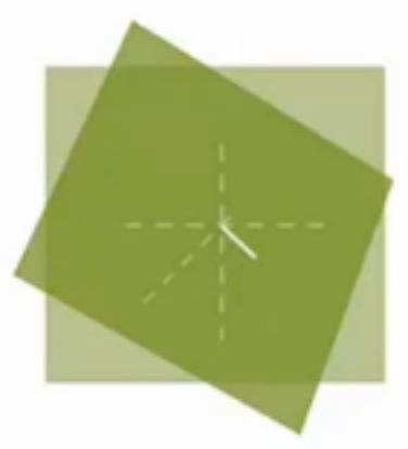
tranform-origin:
[ left|center|right|top|bottom|<percentage>|<length> // one value
| [left|center|right|<percentage>|<length>] [top|center|bottom|<percentage>|<length>] <length>? // 3 values
| [center| [left|right]] && [center| [top|bottom] ] <length>? // 3 values
i.e. transform-origin: 50% 50%; // default
transform-origin: 0 0; // left top corner
transform-origin: 20%; // 20% 50%;
transform-origin: right 50px 20px; // x: right; y: 50px; z: 20px(towards outside of the screen);
transform-origin: top right 20px; // top right corner, z: 20px;
i.e. transform: translate(50%) rotate(45deg); is different from transform: rotate(45deg) translate(50%);
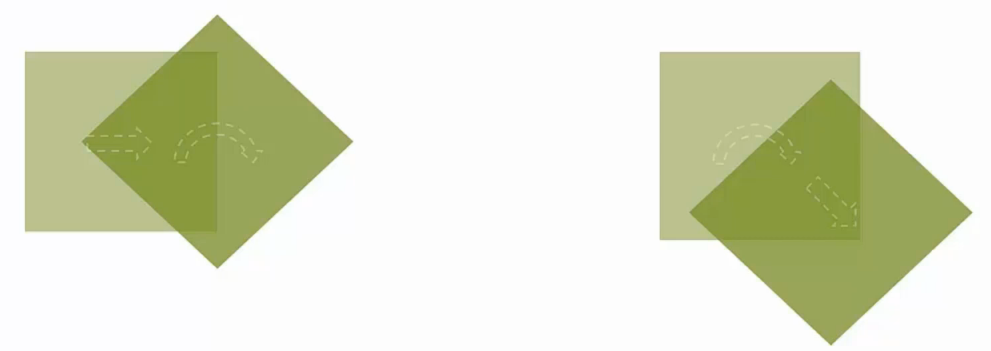
NB: It is the axis that is rotated, not just the shape itself.
3D视图:
perspective: none | <length> 透视
i.e. perspective: none (default);
perspective: 2000px; (the distance between the view point and the object
i.e. perspective: 500px; transform: rotateY(45deg); // rotate along the y axis
perspective-origin:
[ left|center|right|top|bottom|<percentage>|<length> // one value
| [left|center|right|<percentage>|<length>] [top|center|bottom|<percentage>|<length>] // 2 values
| [center| [left|right]] && [center| [top|bottom] ] // 2 values
i.e. perspective-origin: 50% 50%; // default
perspective-origin: left bottom; // the view point is left bottom corner
perspective-origin: 50% -800px; // view from upside -- positive value: bottom
perspective-origin: right; // perspective-origin: right 50%
translate3d( <translate-value>, <translate-value>, <length>)
translateZ(<length>); // 离view point靠近了,会导致size变大一些
i.e. transform: translate3d(10px, 20%, 50px);
transform: translateZ(-100px);
scale3d(<number>, <number>, <number>)
scaleZ(<number>)
i.e. transform: scaleZ(5); // totally the same as scaleZ(1)
transform: scaleZ(5); translateZ(100px); // -- translate(500px);
rotate3d( <number>, <number>, <number>, <angle>)
rotateX(<angle>);
rotateY(<angle>);
i.e. transform: rotate3d(1, 0, 0, 45); // rotate along x axis
transform: rotate3d(0, 1, 0, 45); // rotate along y axis
transform: rotate3d(0, 0, 1, 45); // rotate along z axis
transform: rotate3d(1, 1, 1, 45); // rotate along (0,0,0)-(1,1,1) direction
效果的叠加:transform-style
transform-style: flat 扁平化(default) | preserve-3d(元素内部也可设置3d空间)
i.e. .parent {transform-style: preserve-3d; transform: rotateX(45deg);} .child {transform: rotateY(45deg);}
backface-visibility: visible (default) | hidden
动画
transition-property: none (default) | <single-transition-property> [',' <single-transition-property> ]*
<single-transition-property> = all | <IDENT>
i.e. transition-property: none; // default
transition-property: all; // 对所有属性都做过渡效果
transition-property: left // 只对left属性做过渡效果,当left变化时,会有过渡效果
transition-property: left, color // left属性或/和color属性有变化时有过渡效果
transition-duration: <time> [, <time>]*
transition-duration: 0s; (default) == transition-property: none;
transition-timing-function: 移动速率
transition-timing-function: <single-transition-timing-function> [',' <single-transition-timing-function> ]*
<single-transition-timing-function> = ease | linear | ease-in | ease-out | ease-in-out(幅度比ease大)
| cubic-bezier (<number>, <number>, <number>, <number>)
| step-start | step-end | steps( <integer> [, [ start | end ] ]?)
cubic-bezier曲线(前两个值:P1;后两个值:P2)
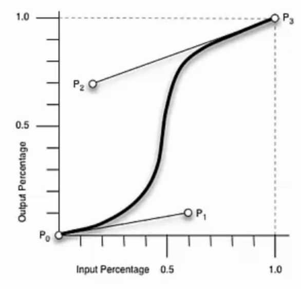
step: 一步一步移动:start表示每一步开始时就移动,end表示每一步结束时才开始移动;
i.e. step(3, start); // 一共分三步移动,每一步开始时就开始移动
i.e. transition-timing-function: ease; == transition-timing-function: cubic-bezier(0.25, 0.1, 0.25, 0.1);
transition-timing-function: linear; == transition-timing-function: cubic-bezier(0, 0, 1, 1);
transition-delay: <time> [, <time>]*
transition: <single-transition> [',' <single-transition> ]*
<single-transition> = [ none | <transition-property> ] || <time> || <transition-timing-function> || <time>
i.e. transition: left 2s ease 1s, color 2s;
transition: 2s; // == all(default) 2s ease(default) 0s(default)
另一种动画效果:animation
区别:
animation进入页面时,动画自动运行;而transition是需要触发的
animation可以做多帧动画;而transition只能从首到尾两帧
animation-name: <single-animation-name> [',' <single-animation-name> ]*
<single=animation-name> = none | <IDENT> (可以任意写,不同于transition只能是属性名)
i.e. animation-name: abc, abcd;
div {
    -webkit -animation-name: abc;
}
@-webkit -keyframes abc{
    0%{left:0; top:0;}
    50%{left:250px; top:100px;}
    100%{left:500px; top:0;}
}
animation-duration: <time> [, <time>]*
animation-timing-function: <single-timing-function> [',' <single-timing-function>]*
animation-iteration-count: <single-animation-iteration-count> [',' <single-animation-iteration-count> ]*
<single-animation-iteration-count> = infinite | <number> (default:1)
animation-direction: <single-animation-direction> [',' <single-animation-direction> ]*
<single-animation-direction> = normal | reverse | alternate (往返) | alternate-reverse
animation-play-state: <single-animation-play-state> [',' <single-animation-play-state> ]*
<single-animation-play-state> = running | paused
i.e. .aaa:hover {-webkit -animation-play-state: paused;}
animation-delay: <time> [, <time>]*
animation-fill-mode: <single-animation-fill-mode> [',' <single-animation-fill-mode> ]*
动画开始/结束时是否要保持在首尾帧的截图
<single-animation-fill-mode> = none | backwards (开始时第一帧) | forwards (结束时最后一帧) | both
animation: <single-animation> [',' <single-animation> ]*
<single-animation> = <single-animation-name> || <time> || <single-animation-timing-function> || <time> || <single-animation-iteration-count> || <single-animation-direction> || <single-animation-fill-mode> || <single-animation-play-state>
i.e. animation: abc 2s ease 0s 1 normal none running;
@keyframes:
@keyframes name {
from {...}
to {...}
}
@keyframes name {
0%, 25%, 50%, 75%, 100% ... {...}
}
i.e. homework:
loading1:
<style type="text/css">
    .loading{
        /* 居中定位和大小设置 */
        position:fixed;top:50%;left:50%;margin:-20px 0 0 -20px;box-sizing:border-box;width:40px;height:40px;
        /* 用边框做出3/4圆 */
        border:2px solid;border-color:#333 #333 transparent;border-radius:50%;
        /* 设置动画 */
        animation:loading 1s linear both infinite;
    }
    /* 定义动画关键帧 */
    @keyframes loading{
        0%{transform:rotate(0deg);}
        100%{transform:rotate(360deg);}
    }
</style>
loading2:
<style type="text/css">
    /* 容器的居中和大小设置 */
    .loading{
        position:fixed;top:50%;left:50%;
        /* 宽度是6个排列点的总和:(8+4*2)*6 */
        width:96px;
        height:12px;
        margin:-6px 0 0 -48px;
        /* 只显示容器范围内的进度条,超出的截掉 */
        overflow:hidden;
    }
    /* 进度条 */
    .loading .bar{
        /* 宽度是所有排列点的总和:(8+4*2)*11 */
        width:176px;
        /* 分成5步的动画来移动进度条 */
        animation:loading 1s steps(5,end) both infinite;
    }
    /* 排列点 */
    .loading i{float:left;width:8px;height:4px;margin:4px;background:#aaa;}
    /* 第6个点高亮,两边各5个普通点 */
    .loading i:nth-child(6){transform:scale(1.5);background:#333;}
    /* 定义关键帧 */
    @keyframes loading{
        /* 把进度条移动到第六个点正好在容器的左侧第一个 */
        0%{transform:translate(-80px);}
        /* 向右移动到第一个点正好在容器的左侧第一个,这里80%就完成一遍动画是为了给最后一步留出1/5的停留时间 */
        80%,100%{transform:translate(0px);}
    }
</style>
单元测验
CSS单元测验:http://www.jianshu.com/p/c9542fdf10df
CSS单元作业:http://www.th7.cn/web/html-css/201605/167618.shtml;http://www.codes51.com/article/detail_1082224.html