最近做demo时,经常需要div垂直居中或者让div内文字相对div垂直居中。水平居中比较简单,就不多说了,这里主要记录一下垂直居中的一些方法。
一、div垂直居中的一些方法:
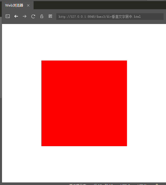
1.当height、width固定大小时,
<!DOCTYPE html>
<html>
    <head>
        <meta charset="utf-8">
        <title>垂直居中</title>
        <style>
            html,body{
                margin: 0px;
                padding: 0px;
                height: 100%;
                width: 100%;
            }
            .div1{
                width: 300px;
                height: 300px;
                background: red;
                margin: 0 auto; /*水平居中*/
                position: relative;
                top: 50%; /*偏移*/
                margin-top: -150px;
            }
        </style>
    </head>
    <body>
        <div class="div1"></div>
    </body>
</html>
运行结果:
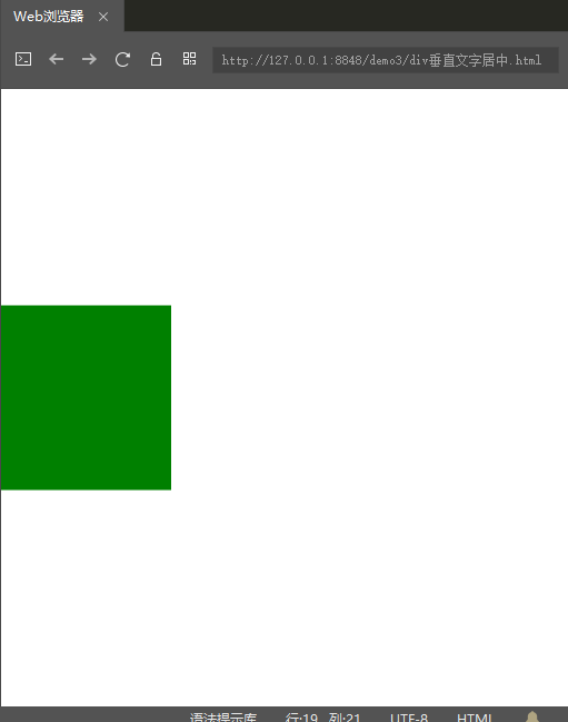
2.当height、width大小是百分比时,有如下三种方法可以实现:
法一:使用CSS3的transform属性
<!DOCTYPE html>
<html>
    <head>
        <meta charset="utf-8">
        <title>垂直居中</title>
        <style>
            html,body{
                margin: 0px;
                padding: 0px;
                height: 100%;
                width: 100%;
            }
            .div1{
                height: 30%;
                width: 30%;
                background: green;

                position: relative;
                top: 50%;
                transform: translateY(-50%);/* 元素往下位移自身高度50%的距离 */
            }
        </style>
    </head>
    <body>
        <div class="div1"></div>
    </body>
</html>
运行效果:
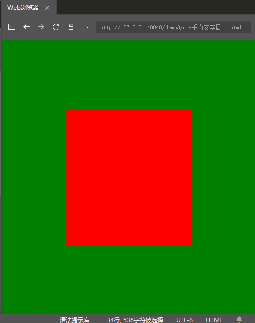
法二:使用CSS3的弹性布局(flex)
<!DOCTYPE html>
<html>
    <head>
        <meta charset="utf-8">
        <title>垂直居中</title>
        <style>
            html,body{
                margin: 0px;
                padding: 0px;
                height: 100%;
                width: 100%;
            }
            .div1{
                height: 100%;
                width: 100%;
                display: flex;/*设置为弹性容器*/
                align-items: center; /*定义div1的元素垂直居中*/
                justify-content: center; /*定义div1的里的元素水平居中*/
                background: green;
            }
            .div2{
                width: 50%;
                height: 50%;
                background: red;
            }
        </style>
    </head>
    <body>
        <div class="div1">
            <div class="div2"></div>
        </div>
    </body>
</html>
运行效果:
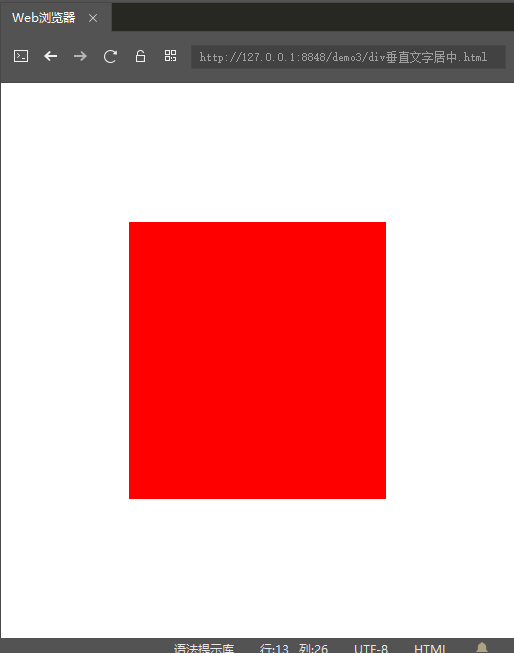
法三:绝对定位时的一种巧妙方法
<!DOCTYPE html>
<html>
    <head>
        <meta charset="utf-8">
        <title>垂直居中</title>
        <style>
            html,body{
                margin: 0px;
                padding: 0px;
                height: 100%;
                width: 100%;
            }
            .div1{
                height: 50%;
                width: 50%;
                background: red;

                position:absolute; /*这里必须是absolute绝对定位*/
                left: 0;
                right: 0;
                top: 0;
                bottom: 0;
                margin:auto;
            }
        </style>
    </head>
    <body>
        <div class="div1"></div>
    </body>
</html>
运行效果:
二、div内文字相对div垂直居中的一些方法:
1.当height、width固定大小时,有如下两种方法可以实现:
法一:只要保证line-height和height相同,即可保证div内的文字垂直居中
<!DOCTYPE html>
<html>
    <head>
        <meta charset="utf-8">
        <title>文字垂直居中</title>
        <style>
            html,body{
                margin: 0px;
                padding: 0px;
                height: 100%;
                width: 100%;
            }
            .div1{
                height: 100px;
                line-height: 100px;
                width: 100px;
                background: red;
            }
        </style>
    </head>
    <body>
        <div class="div1">我的文字1</div>
    </body>
</html>
运行效果:

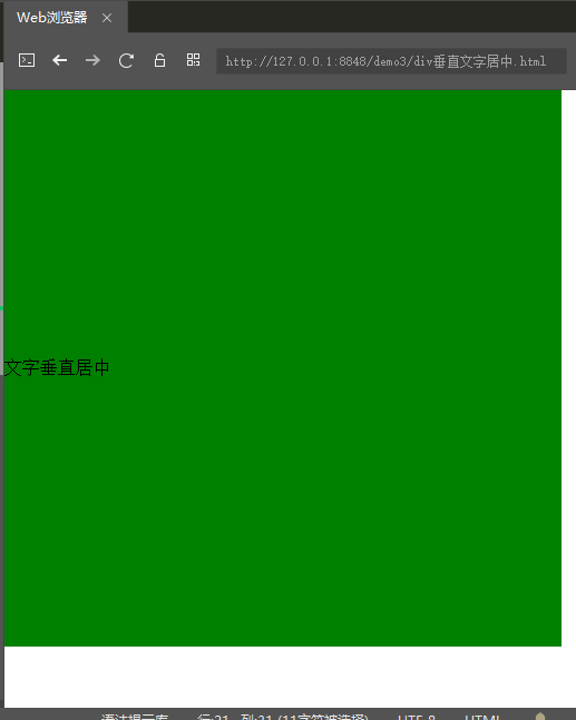
法二:利用table-cell实现
<!DOCTYPE html>
<html>
    <head>
        <meta charset="utf-8">
        <title>垂直居中</title>
        <style>
            html,body{
                margin: 0px;
                padding: 0px;
                height: 100%;
                width: 100%;
            }
            .div1{
                /*这里的宽和高必须固定*/
                height: 500px;
                width: 500px;
                display:table-cell;
                vertical-align: middle;
                background: green;
            }
        </style>
    </head>
    <body>
        <div class="div1">文字垂直居中</div>
    </body>
</html>
运行效果:
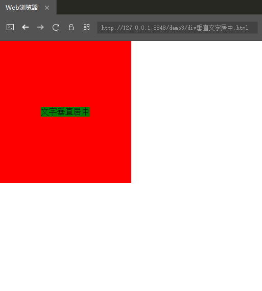
2.当height、width是百分比大小时,上面的方法就不适用了,用如下方法:
法一:借鉴了CSS3的弹性布局(flex)
<!DOCTYPE html>
<html>
    <head>
        <meta charset="utf-8">
        <title>垂直居中</title>
        <style>
            html,body{
                margin: 0px;
                padding: 0px;
                height: 100%;
                width: 100%;
            }
            .div1{
                /*这里的宽和高必须固定*/
                height: 50%;
                width: 50%;
                background: red;
                display: flex;/*设置为弹性容器*/
                align-items: center; /*定义div1的元素垂直居中*/
                justify-content: center; /*定义div1的里的元素水平居中*/
            }
            .div2{
                background: green;
            }
        </style>
    </head>
    <body>
        <div class="div1">
            <div class="div2">文字垂直居中</div>
        </div>
    </body>
</html>
运行效果:
----------------------------------分割线--------------------------------
以上就是我目前知道的一些方法,如果后期还有新的方法,我会及时更新,方便自己,也方便他人。