一、概念
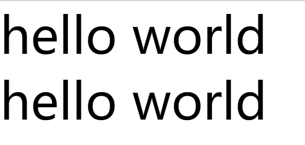
①em大小是基于父元素的字体大小
②rem是相对单位,r是root的意思,在html页面上就是html标签,所以rem的大小是基于html元素的字体大小
    <div class="em">hello world</div>
    <div class="rem">hello world</div>
        html{
            font-size: 50px;
        }
        body{
            margin: 0;
            padding: 0;
            font-size: 50px;
        }
        .em{
            font-size: 2em;
        }
        .rem{
            font-size: 2rem;
        }
二、rem适配
①使用flex的伸缩布局、使用百分比的流式布局、使用媒体查询的响应式布局,共同点就是元素只能做宽度的适配(图片除外)
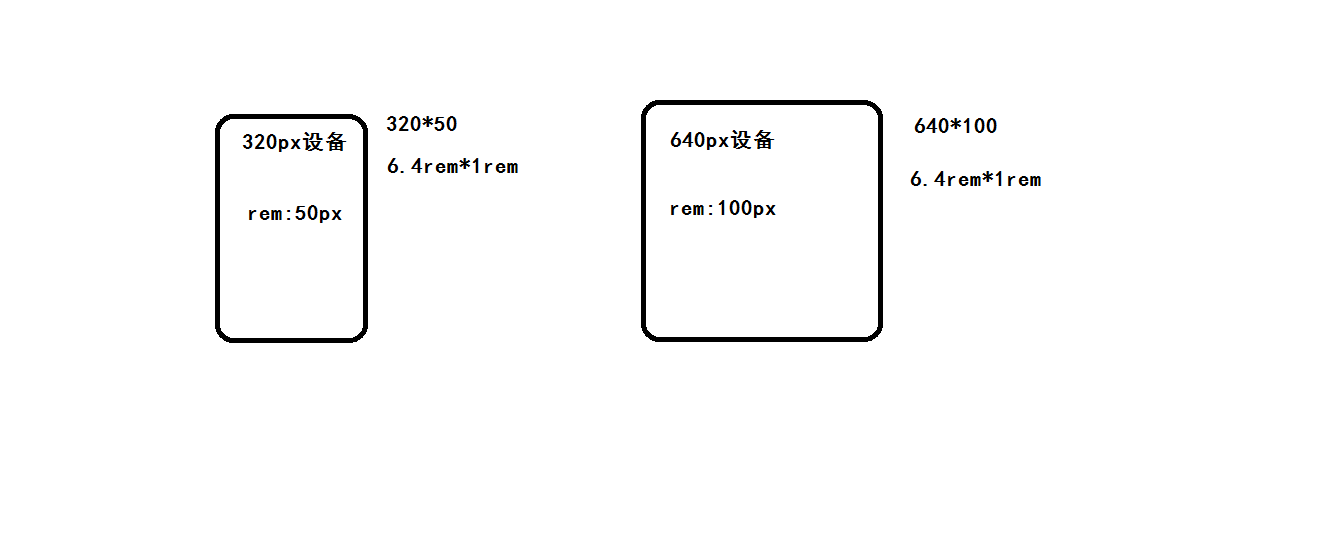
②rem适配可以实现宽度和高度都能做到适配,相当于等比缩放
③适配基本思路:通过控制HTML上的字体大小去控制页面上所有以rem为单位的基准值控制的尺寸
④换算公式:当前rem基准值 = 预设的基准值 / 设计稿宽度 * 当前设备的宽度
三、rem适配实现
①使用媒体查询实现适配
<header>hello world</header>
        /* 假设的设备320px 640px */
        @media(min-320px){
            html{
                font-size: 50px;
            }
        }
        @media(min-640px){
            html{
                font-size: 100px;/* 50px/320px*640px=100px */
            }
        }

        body{
            margin: 0;
            padding: 0;
            font-size: 14px;
        }
        header{
            width: 100%;
            height: 1rem;
            line-height: 1rem;
            font-size: 0.32rem;
            text-align: center;
            background: #ccc;
        }
②配合使用less实现适配
- index.less文件
@charset "UTF-8";
// 变量模块(定义变量)
@adapterDeviceList:750px,640px,540px,420px,320px;// 适配设备
@psdWidth:750px;// 设计稿尺寸
@baseFontSize:100px;// 预设基准值
@len:length(@adapterDeviceList);// 需要适配设备的数组长度
// 混入模块(进行适配)
.adapterMixin(@index) when ( @index > 0){
    @media (min-width: extract(@adapterDeviceList,@index)){
      html{
        font-size: @baseFontSize / @psdWidth * extract(@adapterDeviceList,@index);
      }
    }
    .adapterMixin( @index - 1);
  }
// 适配模块(调用)
.adapterMixin(@len);
- 根据less生成的index.css文件预览
@charset "UTF-8";
@media (min- 320px) {
  html {
    font-size: 42.66666667px;
  }
}
@media (min- 420px) {
  html {
    font-size: 56px;
  }
}
@media (min- 540px) {
  html {
    font-size: 72px;
  }
}
@media (min- 640px) {
  html {
    font-size: 85.33333333px;
  }
}
@media (min- 750px) {
  html {
    font-size: 100px;
  }
}
- index.html文件
<!DOCTYPE html>
<html lang="en">
<head>
    <meta charset="UTF-8">
    <meta name="viewport" content="width=device-width, initial-scale=1.0">
    <meta http-equiv="X-UA-Compatible" content="ie=edge">
    <title>rem适配</title>
    <link rel="stylesheet" type="text/less" href="index.less">
    <script src="less.js"></script>
    <style>
        header{
            width: 100%;
            height: 1rem;
            line-height: 1rem;
            font-size: 0.32rem;
            text-align: center;
            background: #ccc;
        }
    </style>
</head>
<body>
    <header>hello world</header>
</body>
</html>