Anatomy of a Constraint
The layout of your view hierarchy is defined as a series of linear equations. Each constraint represents a single equation. Your goal is to declare a series of equations that has one and only one possible solution.
视图层次结构的布局被定义为一系列线性方程组。每个约束代表一个方程。你的目标是声明一系列方程,其中只有一个可能的解。
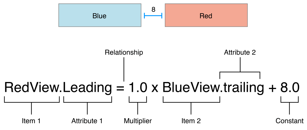
A sample equation is shown below.样本方程如下。
This constraint states that the red view’s leading edge must be 8.0 points after the blue view’s trailing edge. Its equation has a number of parts:
此约束说明红色视图的前缘必须在蓝色视图的后缘处为8点。它的方程有多个部分:
-
Item 1. The first item in the equation—in this case, the red view. The item must be either a view or a layout guide.项目1。方程中的第一个项目在这种情况下,红色视图。该项目必须是视图或布局指南。
-
Attribute 1. The attribute to be constrained on the first item—in this case, the red view’s leading edge.属性1。要在这个项目的第一个项目上约束的属性,红色视图的前缘。
-
Relationship. The relationship between the left and right sides. The relationship can have one of three values: equal, greater than or equal, or less than or equal. In this case, the left and right side are equal.关系。左右关系。关系可以有三个值之一:相等、大于或等于或小于或等于。在这种情况下,左边和右边是相等的。
-
Multiplier. The value of attribute 2 is multiplied by this floating point number. In this case, the multiplier is
1.0.乘数。属性2的值乘以这个浮点数。在这种情况下,乘数为1。 -
Item 2. The second item in the equation—in this case, the blue view. Unlike the first item, this can be left blank.项目2。方程中的第二个项目,在这种情况下,蓝色视图。与第一个项目不同,这可以留空。
-
Attribute 2. The attribute to be constrained on the second item—in this case, the blue view’s trailing edge. If the second item is left blank, this must be
Not an Attribute.属性2。在这种情况下,蓝色视图的后缘将被限制在第二项上的属性。如果第二个项目是空白的,这必须不是一个属性。 -
Constant. A constant, floating-point offset—in this case,
8.0. This value is added to the value of attribute 2.常数。一个常数,浮点偏移在这种情况下,8。此值将添加到属性2的值中。
Most constraints define a relationship between two items in our user interface. These items can represent either views or layout guides. Constraints can also define the relationship between two different attributes of a single item, for example, setting an aspect ratio between an item’s height and width. You can also assign constant values to an item’s height or width. When working with constant values, the second item is left blank, the second attribute is set to Not An Attribute, and the multiplier is set to 0.0.
大多数约束定义了用户界面中两个项之间的关系。这些项目可以表示视图或布局指南。约束还可以定义单个项目的两个不同属性之间的关系,例如,在一个项目的高度和宽度之间设置一个纵横比。您也可以为项目的高度或宽度分配常量值。当使用常量值时,第二个项为空,第二个属性设置为非属性,乘数设置为0。
Auto Layout Attributes
In Auto Layout, the attributes define a feature that can be constrained. In general, this includes the four edges (leading, trailing, top, and bottom), as well as the height, width, and vertical and horizontal centers. Text items also have one or more baseline attributes.
在自动布局中,属性定义了一个可以被约束的特性。在一般情况下,这包括四边(领先,尾随,顶部和底部),以及高度,宽度,垂直和水平中心。文本项也具有一个或多个基线属性。
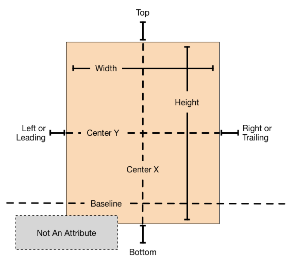
For the complete list of attributes, see the NSLayoutAttribute enum.for the list of the完整的枚举的属性,nslayoutattribute EEA。
NOTE注释
Although both OS X and iOS use the NSLayoutAttribute enum, they define slightly different sets of values. To see the full list of attributes, be sure you are looking at the correct platform’s documentation.尽管使用OS X和茶都还nslayoutattribute枚举定义,他们slightly different sets of values。to see the list of全属性,确定你是看着the correct平台的文件。
Sample Equations样本方程
The wide range of parameters and attributes available to these equations lets you create many different types of constraints. You can define the space between views, align the edge of views, define the relative size of two views, or even define a view’s aspect ratio. However, not all attributes are compatible.
这些方程的参数和属性的广泛范围可以让您创建许多不同类型的约束。您可以定义视图之间的空间,对齐视图的边缘,定义两个视图的相对大小,甚至定义视图的纵横比。然而,并非所有的属性都是兼容的
There are two basic types of attributes. Size attributes (for example, Height and Width) and location attributes (for example, Leading, Left, and Top). Size attributes are used to specify how large an item is, without any indication of its location. Location attributes are used to specify the location of an item relative to something else. However, they carry no indication of the item’s size.
有两种基本类型的属性。大小属性(例如,高度和宽度)和位置属性(例如,引导,左,和顶部)。大小属性用于指定一个项目有多大,没有任何位置的指示。位置属性用于指定项目相对于其他项目的位置。然而,它们没有显示该项目的大小。
With these differences in mind, the following rules apply:考虑到这些差异,以下规则适用:
-
You cannot constrain a size attribute to a location attribute.不能将大小属性限制为位置属性。
-
You cannot assign constant values to location attributes.不能将常量值赋给位置属性。
-
You cannot use a nonidentity multiplier (a value other than 1.0) with location attributes.你不能用一个不同的乘数(非1值)与位置属性。
-
For location attributes, you cannot constrain vertical attributes to horizontal attributes.对于位置属性,不能将垂直属性限制为水平属性。
-
For location attributes, you cannot constrain Leading or Trailing attributes to Left or Right attributes.对于位置属性,不能将前导或尾随属性限制为左或右属性。
For example, setting an item’s Top to the constant value 20.0 has no meaning without additional context. You must always define an item’s location attributes in relation to other items, for example, 20.0 points below the superview’s Top. However, setting an item’s Height to 20.0 is perfectly valid. For more information, see Interpreting Values.
例如,在没有附加上下文的情况下,将项目的顶部设置为常数值20是没有意义的。你必须定义一个项目的位置属性相对于其他的项目,例如,20点父视图的上下。然而,设置一个项目的高度为20是完全有效的。有关更多信息,请参见解释值。
Listing 3-1 shows sample equations for a variety of common constraints.清单3-1显示了各种常见约束的样本方程。
NOTE注释
All the example equations in this chapter are presented using pseudocode. To see real constraints using real code, see Programmatically Creating Constraints or Auto Layout Cookbook.
在这一章中的所有例子的方程使用伪代码。若要使用实代码查看实际约束,请参见编程创建约束或自动布局菜谱。
Listing 3-1Sample equations for common constraints列表3-1sample共同约束方程
// Setting a constant height设置一个恒定高度View.height = 0.0 * NotAnAttribute + 40.0// Setting a fixed distance between two buttons设置两个按钮之间的固定距离Button_2.leading = 1.0 * Button_1.trailing + 8.0// Aligning the leading edge of two buttons调整两个按钮的前缘Button_1.leading = 1.0 * Button_2.leading + 0.0// Give two buttons the same width给两个相同宽度的按钮Button_1.width = 1.0 * Button_2.width + 0.0// Center a view in its superview中心在它的父视图的视图View.centerX = 1.0 * Superview.centerX + 0.0View.centerY = 1.0 * Superview.centerY + 0.0// Give a view a constant aspect ratio给出一个恒定纵横比View.height = 2.0 * View.width + 0.0
Equality, Not Assignment平等,而不是转让
It’s important to note that the equations shown in Note represent equality, not assignment.值得注意的是,注释中的等式表示等式,而不是赋值。
When Auto Layout solves these equations, it does not just assign the value of the right side to the left. Instead, it calculates the value for both attribute 1 and attribute 2 that makes the relationship true. This means we can often freely reorder the items in the equation. For example, the equations in Listing 3-2 are identical to their counterparts in Note.
当自动布局解决这些方程时,它不只是将左边的值赋值给左边。相反,它计算属性1和属性2的值,使关系为真。这意味着我们可以经常自由地重新排序方程中的项目。例如,清单3-2中的等式与注释中的等式相同。
Listing 3-2Inverted equations列表3-2inverted方程
// Setting a fixed distance between two buttons设置两个按钮之间的固定距离Button_1.trailing = 1.0 * Button_2.leading - 8.0// Aligning the leading edge of two buttons调整两个按钮的前缘Button_2.leading = 1.0 * Button_1.leading + 0.0// Give two buttons the same width给两个相同宽度的按钮Button_2.width = 1.0 * Button.width + 0.0// Center a view in its superview中心在它的父视图的视图Superview.centerX = 1.0 * View.centerX + 0.0Superview.centerY = 1.0 * View.centerY + 0.0// Give a view a constant aspect ratio给出一个恒定纵横比View.width = 0.5 * View.height + 0.0
NOTE
When reordering the items, make sure you invert the multiplier and the constant. For example, a constant of 8.0 becomes -8.0. A multiplier of 2.0 becomes 0.5. Constants of 0.0 and multipliers of 1.0 remain unchanged.
当重新排序项目时,确保你颠倒了乘数和常量。例如,常数为8变成- 8。乘数为2变成0.5。常数0和乘数为1保持不变。
You will find that Auto Layout frequently provides multiple ways to solve the same problem. Ideally, you should choose the solution that most clearly describes your intent. However, different developers will undoubtedly disagree about which solution is best. Here, being consistent is better than being right. You will experience fewer problems in the long run if you choose an approach and always stick with it. For example, this guide uses the following rules of thumb:
你会发现自动布局经常提供多种方法来解决同样的问题。理想情况下,你应该选择解决方案,最清楚地描述你的意图。然而,不同的开发商无疑会不同意哪个方案是最好的。在这里,始终如一是比正确的好。如果你选择了一种方法并且总是坚持下去,从长远来看你会遇到更少的问题。例如,本指南使用下列规则:
-
Whole number multipliers are favored over fractional multipliers.整数乘法器优于分数乘法器。
-
Positive constants are favored over negative constants.正常数优于负常数。
-
Wherever possible, views should appear in layout order: leading to trailing, top to bottom.在可能的情况下,视图应该出现在布局顺序:导致尾随,顶部到底部。
Creating Nonambiguous, Satisfiable Layouts创建nonambiguous,满足布局
When using Auto Layout, the goal is to provide a series of equations that have one and only one possible solution. Ambiguous constraints have more than one possible solution. Unsatisfiable constraints don’t have valid solutions.
当使用自动布局,我们的目标是提供一系列方程,有一个唯一的可能的解决方案。暧昧约束有多个可能的解决方案。不可满足的约束,没有有效的解决方案。
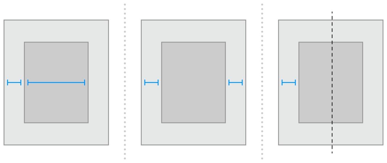
In general, the constraints must define both the size and the position of each view. Assuming the superview’s size is already set (for example, the root view of a scene in iOS), a nonambiguous, satisfiable layout requires two constraints per view per dimension (not counting the superview). However, you have a wide range of options when it comes to choosing which constraints you want to use. For example, the following three layouts all produce nonambiguous, satisfiable layouts (only the horizontal constraints are shown):
一般来说,约束必须定义每个视图的大小和位置。假设父视图的大小已经设置(例如,在iOS的一个场景的根视图),甲nonambiguous,满足布局需要每查看每维两约束(不包括视图)。但是,在选择要使用的约束时,您有多种选择。例如,以下三个布局都产生nonambiguous,满足布局(只有水平约束显示):
-
The first layout constrains the view’s leading edge relative to its superview’s leading edge. It also gives the view a fixed width. The position of the trailing edge can then be calculated based on the superview’s size and the other constraints.第一个布局约束视图的领先优势相对于它的父视图的前缘。它也给视图一个固定宽度。然后,后缘的位置可以基于视图的尺寸和其他约束条件计算。
-
The second layout constrains the view’s leading edge relative to its superview’s leading edge. It also constrains the view’s trailing edge relative to the superview’s trailing edge. The view’s width can then be calculated based on the superview’s size and the other constraints.第二布局约束视图的领先优势相对于它的父视图的前缘。这也制约了视图的后缘相对于父视图的后缘。然后视图的宽度可以根据视图的尺寸和其他约束条件计算。
-
The third layout constrains the view’s leading edge relative to its superview’s leading edge. It also center aligns the view and superview. Both the width and trailing edge’s position can then be calculated based on the superview’s size and the other constraints.第三布局约束视图的领先优势相对于它的父视图的前缘。同时中心对齐视图和视图。然后两宽度和后缘的位置可以基于视图的尺寸和其他约束条件计算。
Notice that each layout has one view and two horizontal constraints. In each case, the constraints fully define both the width and the horizontal position of the view. That means all of the layouts produce a nonambiguous, satisfiable layout along the horizontal axis. However, these layouts are not equally useful. Consider what happens when the superview’s width changes.
注意每个布局都有一个视图和两个水平约束。在每一种情况下,约束完全定义视图的宽度和水平位置。这意味着所有的布局产生nonambiguous,满足布局沿水平轴。然而,这些布局是同样有用的。考虑在父视图的宽度的变化会发生什么。
In the first layout, the view’s width does not change. Most of the time, this is not what you want. In fact, as a general rule, you should avoid assigning constant sizes to views. Auto Layout is designed to create layouts that dynamically adapt to their environment. Whenever you give a view a fixed size, you short circuiting that ability.
在第一个布局中,视图的宽度不会改变。大多数时候,这不是你想要的。事实上,作为一般规则,您应该避免为视图分配常量。自动布局设计用于创建动态适应环境的布局。每当你给视图一个固定的大小,你短路的能力。
It may not be obvious, but the second and third layouts produce identical behaviors: They both maintain a fixed margin between the view and its superview as the superview’s width changes. However, they are not necessarily equal. In general, the second example is easier to understand, but the third example may be more useful, especially when you are center aligning a number of items. As always, choose the best approach for your particular layout.
它可能不是很明显,但第二和第三的布局产生相同的行为:他们都保持观及其父视图的父视图之间的固定边缘宽度的变化。然而,它们不一定相等。一般来说,第二个例子更容易理解,但第三个例子可能更有用,尤其是当你居中对齐多个项目时。一如既往,选择最佳的方法为您的特定布局。
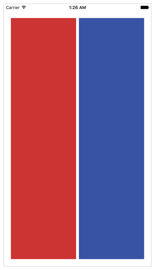
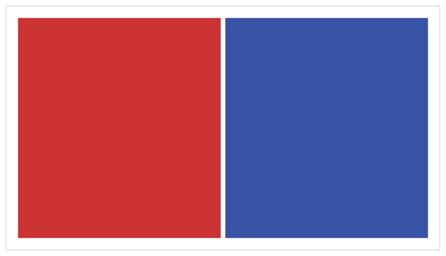
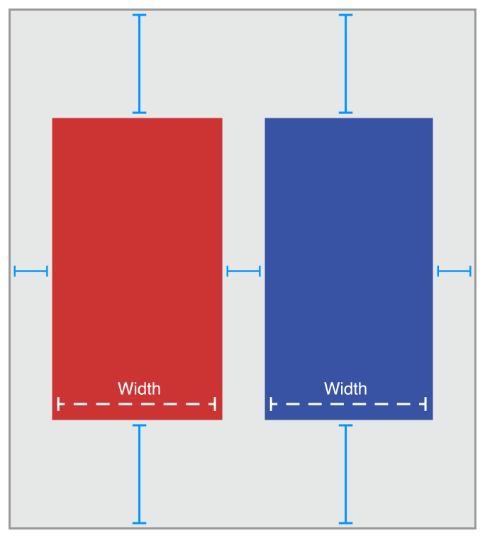
Now consider something a little more complicated. Imagine you want to display two views, side by side, on an iPhone. You want to make sure that they have a nice margin on all sides and that they always have the same width. They should also correctly resize as the device rotates.
现在考虑一些更复杂的问题。想象你想在iPhone上并排显示两个视图。你想确保他们有一个良好的利润率在所有方面,他们总是有相同的宽度。他们也应该正确调整大小,设备旋转。
The following illustrations show the views, in portrait and landscape orientation:下面的插图显示的意见,在肖像和景观方向:
So what should these constraints look like? The following illustration shows one straightforward solution:那么这些约束应该是什么样子呢?下图显示了一个简单的解决方案:
The above solution uses the following constraints:上述解决方案使用以下约束:
// Vertical Constraints垂直约束Red.top = 1.0 * Superview.top + 20.0Superview.bottom = 1.0 * Red.bottom + 20.0Blue.top = 1.0 * Superview.top + 20.0Superview.bottom = 1.0 * Blue.bottom + 20.0// Horizontal Constraints水平约束Red.leading = 1.0 * Superview.leading + 20.0Blue.leading = 1.0 * Red.trailing + 8.0Superview.trailing = 1.0 * Blue.trailing + 20.0Red.width = 1.0 * Blue.width + 0.0
Following the earlier rule of thumb, this layout has two views, four horizontal constraints, and four vertical constraints. While this isn’t an infallible guide, it is a quick indication that you’re on the right track. More importantly, the constraints uniquely specify both the size and the location of both of the views, producing a nonambiguous, satisfiable layout. Remove any of these constraints, and the layout becomes ambiguous. Add additional constraints, and you risk introducing conflicts.
遵循早期的经验法则,这个布局有两个视图,四个水平约束,和四个垂直约束。虽然这不是一个万无一失的指南,这是一个快速的迹象表明,你是在正确的轨道上。更重要的是,约束唯一指定大小和位置的观点,生产nonambiguous,满足布局。删除任何这些限制,布局变得模糊。添加额外的限制,你的风险引入冲突。
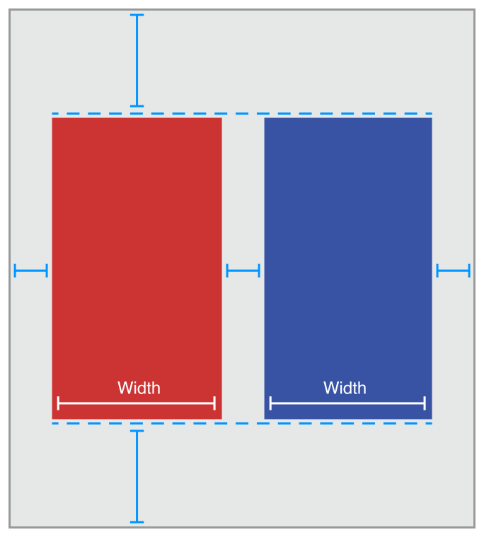
Still, this is not the only possible solution. Here is an equally valid approach:不过,这不是唯一可能的解决方案。这是一个同样有效的方法:
Instead of pinning the top and bottom of the blue box to its superview, you align the top of the blue box with the top of the red box. Similarly, you align the bottom of the blue box with the bottom of the red box. The constraints are shown below.
而不是把蓝色的盒子的顶部和底部的视图,你将用红色框顶部的蓝色盒子上。类似地,您将蓝色框的底部与红色框的底部对齐。约束如下所示。
// Vertical Constraints垂直约束Red.top = 1.0 * Superview.top + 20.0Superview.bottom = 1.0 * Red.bottom + 20.0Red.top = 1.0 * Blue.top + 0.0Red.bottom = 1.0 * Blue.bottom + 0.0//Horizontal Constraints水平约束Red.leading = 1.0 * Superview.leading + 20.0Blue.leading = 1.0 * Red.trailing + 8.0Superview.trailing = 1.0 * Blue.trailing + 20.0Red.width = 1.0 * Blue.width + 0.0
The example still has two views, four horizontal constraints, and four vertical constraints. It still produces a nonambiguous, satisfiable layout.该示例仍然有两个视图,四个水平约束,和四个垂直约束。它还生产nonambiguous,满足布局。
BUT WHICH IS BETTER?但哪个更好?
These solutions both produce valid layouts. So which is better?这些解决方案都产生有效的布局。那么哪个更好?
Unfortunately, it is virtually impossible to objectively prove that one approach is strictly superior to the other. Each has its own strengths and weaknesses.不幸的是,它几乎是不可能客观地证明,一种方法是严格优于其他。每个人都有自己的长处和短处。
The first solution is more robust when a view is removed. Removing a view from the view hierarchy also removes all the constraints that reference that view. So, if you remove the red view, the blue view is left with three constraints holding it in place. You need to add only a single constraint and you have a valid layout again. In the second solution, removing the red view would leave the blue view with only a single constraint.
第一个解决方案是更强大的,当一个视图被删除。从视图层次结构中移除视图也将移除引用该视图的所有约束。因此,如果删除红色视图,蓝色视图将有三个约束将其保持在适当的位置。你只需要添加一个约束,你就有一个有效的布局。在第二个解决方案中,移除红色视图只会使蓝色视图只剩下一个约束。
On the other hand, in the first solution, If you want the top and bottom of the views to align, you must make sure their top and bottom constraints use the same constant value. If you change one constant, you must remember to change the other as well.
另一方面,在第一个解决方案中,如果要使视图的顶部和底部对齐,则必须确保其上、下约束使用相同的常量值。如果你改变一个常量,你必须记住改变另一个。
Constraint Inequalities约束不等式
So far, all of the samples have shown constraints as equalities, but this is only part of the story. Constraints can represent inequalities as well. Specifically, the constraint’s relationship can be equal to, greater than or equal to, or less than or equal to.
到目前为止,所有的样品都显示为等式约束,但这只是故事的一部分。约束也可以代表不等式。具体而言,约束的关系可以等于,大于或等于,或小于或等于。
For example, you can use constraints to define the minimum or maximum size for a view (Listing 3-3).例如,你可以使用约束来定义一个视图的最小或最大尺寸(表3-3)。
Listing 3-3Assigning a minimum and maximum size列表3-3assigning最小和最大尺寸
// Setting the minimum width设置最小宽度View.width >= 0.0 * NotAnAttribute + 40.0// Setting the maximum width设置最大宽度View.width <= 0.0 * NotAnAttribute + 280.0
As soon as you start using inequalities, the two constraints per view per dimension rule breaks down. You can always replace a single equality relationship with two inequalities. In Listing 3-4, the single equal relationship and the pair of inequalities produce the same behavior.
一旦你开始使用不平等,每维视图规则的两个约束分解。总是可以用两个不等式替换单一等式关系。在清单3-4中,单相等关系和对不等式产生相同的行为。
Listing 3-4Replacing a single equal relationship with two inequalitiesl3-4replacing一个平等的关系的两个不等式
// A single equal relationship单一平等关系Blue.leading = 1.0 * Red.trailing + 8.0// Can be replaced with two inequality relationships可以用两个不等式关系替换Blue.leading >= 1.0 * Red.trailing + 8.0Blue.leading <= 1.0 * Red.trailing + 8.0
The inverse is not always true, because two inequalities are not always equivalent to a single equals relationship. For example, the inequalities in Listing 3-3 limit the range of possible values for the view’s width—but by themselves, they do not define the width. You still need additional horizontal constraints to define the view’s position and size within this range.
的逆并不总是正确的,因为两个不等式并不总是等同于一个单一的平等关系。例如,清单3-3限制视图的宽度,但自己可能的值的范围的不平等,他们没有定义宽度。您仍然需要额外的水平约束来定义视图的位置和大小在此范围内
Constraint Priorities优先约束
By default, all constraints are required. Auto Layout must calculate a solution that satisfies all the constraints. If it cannot, there is an error. Auto Layout prints information about the unsatisfiable constraints to the console, and chooses one of the constraints to break. It then recalculates the solution without the broken constraint. For more information, see Unsatisfiable Layouts.
默认情况下,需要所有约束。自动布局必须计算满足所有约束条件的解决方案。如果不能,就有错误。自动布局打印到控制台的不可满足的约束信息,并选择一个约束打破。然后重新计算解不破的约束。更多信息,见永无止境的布局。
You can also create optional constraints. All constraints have a priority between 1 and 1000. Constraints with a priority of 1000 are required. All other constraints are optional.
还可以创建可选约束。所有约束在1和1000之间有优先权。优先级为1000的约束是必需的。所有其他约束是可选的。
When calculating solutions, Auto Layout attempts to satisfy all the constraints in priority order from highest to lowest. If it cannot satisfy an optional constraint, that constraint is skipped and it continues on to the next constraint.
当计算解决方案时,自动布局尝试从最高到最低优先顺序满足所有约束。如果它不能满足可选约束,则跳过该约束,并继续到下一个约束。
Even if an optional constraint cannot be satisfied, it can still influence the layout. If there is any ambiguity in the layout after skipping the constraint, the system selects the solution that comes closest to the constraint. In this way, unsatisfied optional constraints act as a force pulling views towards them.
即使一个可选的约束不能满足,它仍然可以影响布局。如果跳过约束后的布局中存在任何歧义,则系统选择接近约束的解决方案。以这种方式,不满意的可选约束作为一个力拉的意见,对他们。
Optional constraints and inequalities often work hand-in-hand. For example, in Listing 3-4 you can provide different priorities for the two inequalities. The greater-than-or-equal relationship could be required (priority of 1000), and the less-than-or-equal relationship has a lower priority (priority 250). This means that the blue view cannot be closer than 8.0 points from the red. However, other constraints could pull it farther away. Still, the optional constraint pulls the blue view towards the red view, ensuring that it is as close as possible to the 8.0-point spacing, given the other constraints in the layout.
可选的约束和不平等经常携手工作。例如,在清单3-4中,可以为两个不等式提供不同的优先级。大于或等于的关系可能需要(优先级为1000),且小于或等于的关系具有较低的优先级(优先级250)。这意味着蓝色视图不能接近8点,从红色。然而,其他的限制可以把它拉得更远。不过,可选的约束拉蓝对红看来,这是确保尽可能的8.0-point间距接近,在布局上给予其他约束。
NOTE注释
Don’t feel obligated to use all 1000 priority values. In fact, priorities should general cluster around the system-defined low (250), medium (500), high (750), and required (1000) priorities. You may need to make constraints that are one or two points higher or lower than these values, to help prevent ties. If you’re going much beyond that, you probably want to reexamine your layout’s logic.
不觉得有义务使用所有1000个优先值。事实上,优先事项应该围绕系统定义的低(250),中等(500),高(750),和必需的(优先)集群。您可能需要作出的约束,是一个或两个点高于或低于这些值,以帮助防止联系。如果你要超越这一点,你可能想重新审视你的布局逻辑。
For a list of the predefined constraint constants on iOS, see the UILayoutPriority enum. For OS X, see the Layout Priorities constants.
一系列预定义约束常数在iOS上,看到uilayoutpriority枚举。对于OS X,请参见布局优先常数。
Intrinsic Content Size内在的内容大小
So far, all of the examples have used constraints to define both the view’s position and its size. However, some views have a natural size given their current content. This is referred to as their intrinsic content size. For example, a button’s intrinsic content size is the size of its title plus a small margin.
到目前为止,所有的示例都使用约束来定义视图的位置和大小。然而,一些视图有一个自然的大小,其当前内容。这被称为其内在内容的大小。例如,一个按钮的内在内容大小是它的标题的大小加上一个小的利润。
Not all views have an intrinsic content size. For views that do, the intrinsic content size can define the view’s height, its width, or both. Some examples are listed in Table 3-1.
并非所有视图都具有内在内容大小。对于视图而言,内部内容大小可以定义视图的高度、宽度或两者。有些例子列于表3-1。
|
View |
Intrinsic content size |
|---|---|
|
UIView and NSView |
No intrinsic content size. |
|
Sliders |
Defines only the width (iOS). Defines the width, the height, or both—depending on the slider’s type (OS X). |
|
Labels, buttons, switches, and text fields |
Defines both the height and the width. |
|
Text views and image views |
Intrinsic content size can vary. |
The intrinsic content size is based on the view’s current content. A label or button’s intrinsic content size is based on the amount of text shown and the font used. For other views, the intrinsic content size is even more complex. For example, an empty image view does not have an intrinsic content size. As soon as you add an image, though, its intrinsic content size is set to the image’s size.
内部内容大小基于视图的当前内容。标签或按钮的内在内容大小是基于所显示的文本的数量和所使用的字体。对于其他视图,内在内容的大小更为复杂。例如,空图像视图没有内在内容大小。但是,只要添加图像,它的内在内容大小将被设置为图像的大小。
A text view’s intrinsic content size varies depending on the content, on whether or not it has scrolling enabled, and on the other constraints applied to the view. For example, with scrolling enabled, the view does not have an intrinsic content size. With scrolling disabled, by default the view’s intrinsic content size is calculated based on the size of the text without any line wrapping. For example, if there are no returns in the text, it calculates the height and width needed to layout the content as a single line of text. If you add constraints to specify the view’s width, the intrinsic content size defines the height required to display the text given its width.
文本视图的内在内容大小取决于内容,无论它是否启用了滚动,以及其他约束应用到视图。例如,启用了滚动,视图没有内在内容大小。由于滚动禁用,默认情况下,视图的内在内容大小计算的基础上的文本大小没有任何换行。例如,如果文本中没有返回,则计算作为单个文本行布局内容所需的高度和宽度。如果添加约束以指定视图的宽度,则内部内容大小将定义显示文本宽度所需的高度。
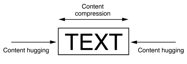
Auto Layout represents a view’s intrinsic content size using a pair of constraints for each dimension. The content hugging pulls the view inward so that it fits snugly around the content. The compression resistance pushes the view outward so that it does not clip the content.
自动布局代表一个视图的内在内容大小使用一对约束的每个维度。内容拥抱拉角度向内它使紧贴在内容。压缩阻力向外推视图,使其不剪辑内容。
These constraints are defined using the inequalities shown in Listing 3-5. Here, the IntrinsicHeight and IntrinsicWidth constants represent the height and width values from the view’s intrinsic content size.
这些约束定义使用清单3-5所示的不等式。这里的intrinsicheight和intrinsicwidth常数代表的高度和宽度值从视图的内容大小。
Listing 3-5Compression-Resistance and Content-Hugging equations列表3-5compression-resistance内容拥抱方程
// Compression Resistance压缩阻力View.height >= 0.0 * NotAnAttribute + IntrinsicHeightView.width >= 0.0 * NotAnAttribute + IntrinsicWidth// Content Hugging内容拥抱View.height <= 0.0 * NotAnAttribute + IntrinsicHeightView.width <= 0.0 * NotAnAttribute + IntrinsicWidth
Each of these constraints can have its own priority. By default, views use a 250 priority for their content hugging, and a 750 priority for their compression resistance. Therefore, it’s easier to stretch a view than it is to shrink it. For most controls, this is the desired behavior. For example, you can safely stretch a button larger than its intrinsic content size; however, if you shrink it, its content may become clipped. Note that Interface Builder may occasionally modify these priorities to help prevent ties. For more information, see Setting Content-Hugging and Compression-Resistance Priorities.
每个约束都可以有自己的优先级。默认情况下,视图使用250优先的内容拥抱,和他们的压缩电阻的750优先。因此,拉伸一个视图比收缩它更容易。对于大多数控件,这是期望的行为。例如,您可以安全地拉伸一个大于其内在内容大小的按钮;但是,如果缩小它,其内容可能会被剪切。请注意,接口生成器可能偶尔修改这些优先级,以帮助防止关系。有关更多信息,请参见设置内容拥抱和压缩电阻优先级。
Whenever possible, use the view’s intrinsic content size in your layout. It lets your layout dynamically adapt as the view’s content changes. It also reduces the number of constraints you need to create a nonambiguous, nonconflicting layout, but you will need to manage the view’s content-hugging and compression-resistance (CHCR) priorities. Here are some guidelines for handling intrinsic content sizes:
只要有可能,在布局中使用视图的内部内容大小。它使您的布局动态适应视图的内容变化。它也能减少你需要创建一个无二义的,数量限制不冲突的布局,但需要管理视图的内容拥抱和抗压(CHCR)优先。这里有一些处理内在内容大小的指南:
-
When stretching a series of views to fill a space, if all the views have an identical content-hugging priority, the layout is ambiguous. Auto Layout doesn’t know which view should be stretched.当拉伸一系列视图以填充空间时,如果所有视图具有相同的内容优先级,则布局是不明确的。自动布局不知道应该拉伸哪个视图。
-
A common example is a label and text field pair. Typically, you want the text field to stretch to fill the extra space while the label remains at its intrinsic content size. To ensure this, make sure the text field’s horizontal content-hugging priority is lower than the label’s.
一个常见的例子是标签和文本字段对。通常,您希望文本字段拉伸以填充额外空间,而标签仍保持其固有内容大小。为了确保这一点,确保文本字段的横向内容拥抱优先级低于标签的。
In fact, this example is so common that Interface Builder automatically handles it for you, setting the content-hugging priority for all labels to 251. If you are programmatically creating the layout, you need to modify the content-hugging priority yourself.事实上,这个例子很常见,接口生成器会自动为你处理它,将所有标签的优先级设置为251。如果您以编程方式创建布局,您需要修改内容优先拥抱自己。
-
Odd and unexpected layouts often occur when views with invisible backgrounds (like buttons or labels) are accidentally stretched beyond their intrinsic content size. The actual problem may not be obvious, because the text simply appears in the wrong location. To prevent unwanted stretching, increase the content-hugging priority.当有不可见背景(如按钮或标签)的视图意外超出其固有内容大小时,通常会出现奇怪和意外的布局。实际问题可能不明显,因为文字只出现在错误的位置。防止不必要的拉伸,增加拥抱优先级的内容。
-
Baseline constraints work only with views that are at their intrinsic content height. If a view is vertically stretched or compressed, the baseline constraints no longer align properly.基线约束仅适用于其内在内容高度的视图。如果视图垂直拉伸或压缩,则基线约束不再正确对齐。
-
Some views, like switches, should always be displayed at their intrinsic content size. Increase their CHCR priorities as needed to prevent stretching or compressing.一些视图,如交换机,应该始终显示在其内在内容的大小。增加重点CHCR需要防止拉伸或压缩。
-
Avoid giving views required CHCR priorities. It’s usually better for a view to be the wrong size than for it to accidentally create a conflict. If a view should always be its intrinsic content size, consider using a very high priority (999) instead. This approach generally keeps the view from being stretched or compressed but still provides an emergency pressure valve, just in case your view is displayed in an environment that is bigger or smaller than you expected.避免给需要CHCR重点工作的意见。它通常是更好的观点是错误的大小比它意外地创建一个冲突。如果一个视图应该始终是它的内在内容的大小,考虑使用一个非常高的优先级(999)代替。这种方法一般保持视图被拉伸或压缩,但仍提供紧急压力阀,以防您的视图显示在一个比您预期的更大或更小的环境中。
Intrinsic Content Size Versus Fitting Size固有内容大小与拟合大小
The intrinsic content size acts as an input to Auto Layout. When a view has an intrinsic content size, the system generates constraints to represent that size and the constraints are used to calculate the layout.内部内容大小作为自动布局的输入。当一个视图有一个内在的内容大小时,系统会产生约束来表示这个大小,并且约束被用来计算布局。
The fitting size, on the other hand, is an output from the Auto Layout engine. It is the size calculated for a view based on the view’s constraints. If the view lays out its subviews using Auto Layout, then the system may be able to calculate a fitting size for the view based on its content.另一方面,装配尺寸是自动布局引擎的输出。它是根据视图的约束计算视图的大小。如果视图列出了使用自动布局它的子视图,然后系统可以计算出的大小根据其内容来看拟合。
The stack view is a good example. Barring any other constraints, the system calculates the stack view’s size based on its content and attributes. In many ways, the stack view acts as if it had an intrinsic content size: You can create a valid layout using only a single vertical and a single horizontal constraint to define its position. But its size is calculated by Auto Layout—it is not an input into Auto Layout. Setting the stack view’s CHCR priorities has no effect, because the stack view does not have an intrinsic content size.
堆栈视图是一个很好的例子。除其他约束外,系统根据其内容和属性计算堆栈视图的大小。在许多方面,堆栈视图的作用好像它有一个内在的内容大小:您可以创建一个有效的布局只使用一个垂直和一个单一的水平约束,以确定其位置。但它的大小是由自动布局计算,它不是一个输入到自动布局。设置堆栈视图CHCR优先权没有影响,因为堆栈的观点不一致的一种内在的内容大小。
If you need to adjust the stack view’s fitting size relative to items outside the stack view, either create explicit constraints to capture those relationships or modify the CHCR priorities of the stack’s contents relative to the items outside the stack.
如果你需要调整堆栈视图的拟合大小相对外堆栈视图项目,创建显式约束捕捉这些关系或修改CHCR优先栈的内容相对于外堆栈的物品。
Interpreting Values价值论解读
Values in Auto Layout are always in points. However, the exact meaning of these measurements can vary depending on the attributes involved and the view’s layout direction.
自动布局中的值总是在点。然而,这些测量的确切含义可以根据所涉及的属性和视图的布局方向而有所不同。
|
Auto Layout Attributes |
Value |
Notes |
|---|---|---|
|
|
The size of the view. |
These attributes can be assigned constant values or combined with other Height and Width attributes. These values cannot be negative.这些属性可以被赋值为常量或与其他高度和宽度属性相结合。这些值不能为负值。 |
|
|
The values increase as you move down the screen.当你向下移动屏幕时,值增加 |
These attributes can be combined only with Center Y, Top, Bottom, and Baseline attributes.这些属性只能与中心y、顶部、底部和基线属性相结合。 |
|
|
The values increase as you move towards the trailing edge. For a left-to-right layout directions, the values increase as you move to the right. For a right-to-left layout direction, the values increase as you move left.当你向后缘移动时,数值会增加。对于左到右布局方向,当您向右移动时,值将增加。对于左到右布局方向,当您向左移动时,值会增加。 |
These attributes can be combined only with Leading, Trailing, or Center X attributes.这些属性只能与前导、尾随或中心x属性相结合。 |
|
|
The values increase as you move to the right.当你移动到右边时,数值会增加 |
These attributes can be combined only with Left, Right, and Center X attributes.这些属性只能与左、右和中心x属性相结合。 Avoid using Left and Right attributes. Use Leading and Trailing instead. This allows the layout to adapt to the view’s reading direction.避免使用左右属性。使用前导和尾随代替。这使得布局能够适应视图的读取方向 By default the reading direction is determined based on the current language set by the user. However, you can override this where necessary. In iOS, set the |
|
|
The interpretation is based on the other attribute in the equation.解释是基于方程中的其他属性。 |
Center X can be combined with Center X, Leading, Trailing, Right, and Left attributes.中心X可以与中心X,领先,尾随,右,左属性相结合。 Center Y can be combined with Center Y, Top, Bottom, and Baseline attributes.中心y可以与中心y、顶部、底部和基线属性相结合 |
