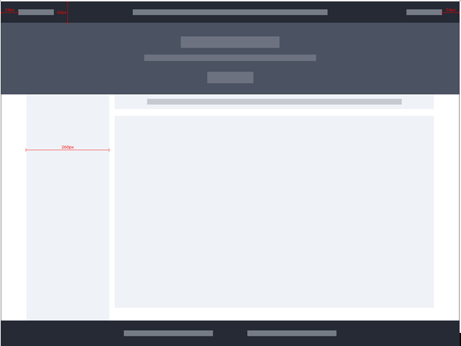
一、页面布局目标效果:
1、页面构成:
- 顶部导航
- banner
- 左侧导航
- 主要内容区(消息区/中间二级导航+内容区)
- 底部信息
2、顶部导航:
- 始终固定在窗体顶部,不随滚动条滚动
3、banner
- 多张图片循环滚动
- 滚动间隔5s
4、左侧导航
- 固定宽度260
5、主要内容区
- 固定宽度:1280-260-24(间隔)
6、核心区:左侧导航+主要内容区
- 总宽度1280px
- 居中:左右留白随分辨率增大
消息区
7、底部
- 不满一屏时在窗体底部
二、核心代码
html
<div class="layout-div">
    <ul class="top-nav"></ul>
    <banner class="banner"></banner>
    <div class="content">
      <div class="aside"><ul class="aside-nav"></ul></div>
      <div class="main"><router-view></router-view></div>
   </div>
  <div class="foot">
    <footer>
        <div class="footer-center"></div>
    </footer>
  </div>
</div>
1、顶部导航
ul.top-nav {
  position: fixed; /*固定定位*/
  top: 0px; /*顶部位置为0*/
  width: 100%;
  /*上下左右间距为0*/
  -webkit-margin-before: 0px;
  -webkit-margin-after: 0px;
  -webkit-margin-start: 0px;
  -webkit-margin-end: 0px;
  text-align: center; /*顶部菜单内部内容居中*/
  z-index: 100; /*浮在最上层,避免banner遮挡*/
}
2、banner
.banner {
  margin-top: 67px; /*顶部导航预,不重叠*/
  height: 326px;
  width: 100%;
}
3、核心区:左侧导航+主要内容区
.content {
  width: 1280px; /*固定宽度,居中,分辨率变大时两侧留白变大*/
  margin-left: auto;
  margin-right: auto;
}
4、左侧导航
.aside {
  float: left; /*靠左*/
  max-height: 100%;
  overflow: auto; /*长度超出加滚动条*/
}
ul.aside-nav {
  width: 260px; /*固定宽度*/
}
5、主要内容区
.main {
  margin-left: 284px; /*左侧导航260px+间距24px*/
}
6、底部
.layout-div { /*整个页面,position*/
  position: relative;
  min-height: 100%; /*内容不够一屏时,长度取一屏*/
  padding-bottom: 80px; /*为底部内容预留位置*/
}
.foot {
  width: 100%;
  position: absolute; /*layout-div为参照*/
  bottom: 0px; /*绝对位置,底部0,使用layout-div的padding-bottom*/
}
footer {
  height: 54px;
  width: 100%;
  color: #D5E0F3;
  background-color: #252A35;
  padding: 13px 0 13px 0;
}
.footer-center {
  position: relative;
  width: 800px; /*内容居中*/
  margin-right: auto;
  margin-left: auto;
}