一、什么是sticky footer
如果页面内容不够长的时候,页脚块粘贴在视窗底部;如果内容足够长时,页脚块会被内容向下推送,我们看到的效果就如下面两张图这样。这种效果基本是无处不在的,很受欢迎。
二、第一种方式,利用margin和padding实现
先看效果
下面是代码
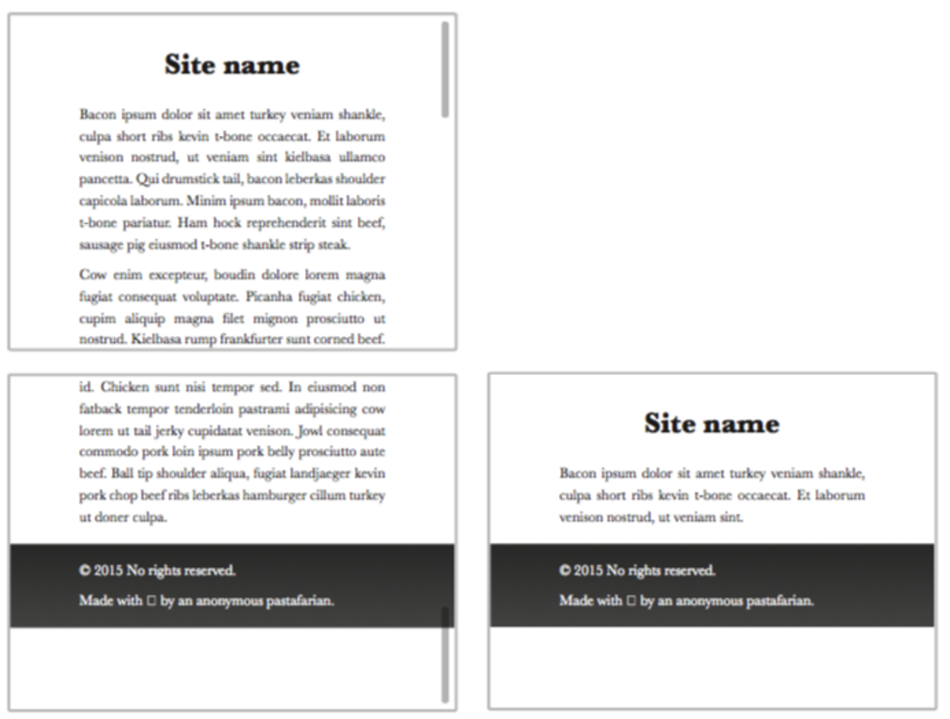
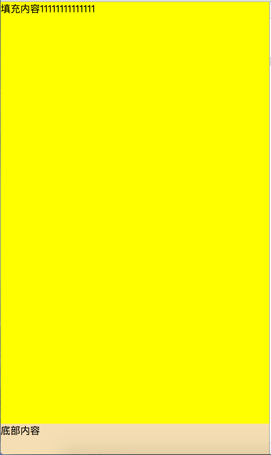
<!DOCTYPE html>
<html>
<head>
    <meta charset=" utf-8">
    <title>margin,padding实现sticky footer</title>
    <style>
        html, body, p {
            padding: 0;
            margin: 0;
            height: 100%;
        }

        body {
            min-height: 100%;
        }

        #wrapper {
            min-height: 100%;
            background: yellow;
        }

        #content {
            padding-bottom: 50px;
            vertical-align: center;

        }
        #text-content{
            height: 500px;
        }
        #footer {
            margin-top: -50px;
            height: 50px;
            background: wheat;
        }
    </style>

</head>
<body>
<div id="wrapper">
    <div id="content">
        <div id="text-content">填充内容11111111111111</div>
    </div>
</div>
<div id="footer">底部内容</div>
</body>
</html>
可以尝试下在text-content中添加内容,可以发现,底部footer是不会受到影响的,坚挺的固定在底部。
这种套路的思路是,给内容区域设置 min-height: 100%,将 footer 推到屏幕下方
然后给 footer 添加 margin-top,其值为 footer 高度的负值,就能让 footer 回到屏幕底部
需要注意的就是内容区域 content 的 padding、footer 的 height 和 margin, 必须保持一致
这种写法的兼容性非常好,实测 IE7 也能正常展示
但是如果页面的主体布局有其他兼容性问题,Sticky Footer 就需要做一些相应的修改
三、第三种方式,使用flex
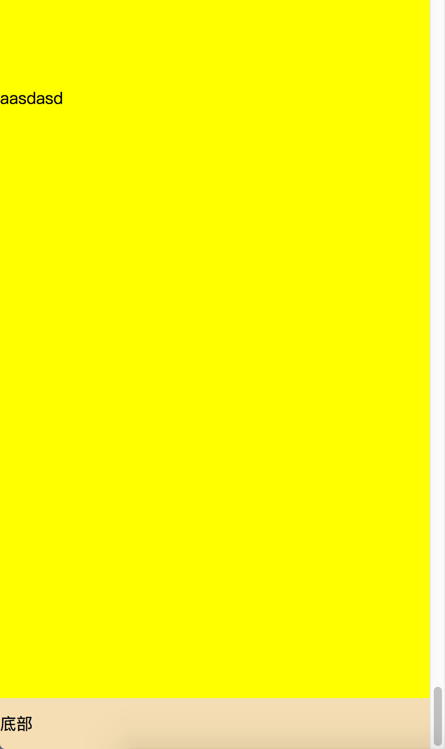
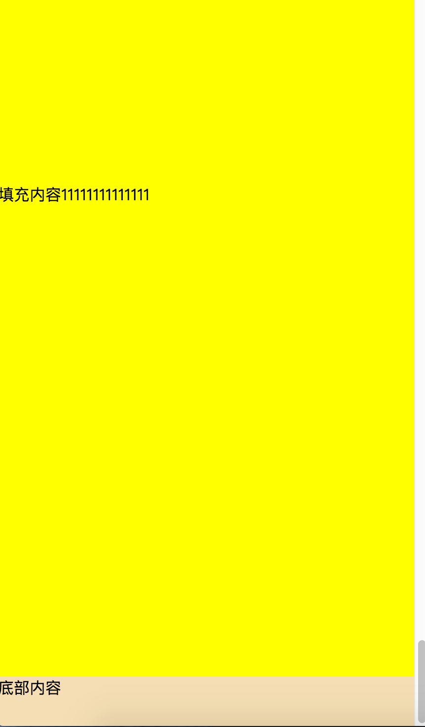
代码如下,没有添加兼容性前缀
<!DOCTYPE html>
<html>
<head>
    <meta charset=" utf-8">
    <title>flex Sticky footer</title>
    <style>
        html, body {
            height: 100%;
            padding: 0;
            margin: 0;
        }

        body {
            min-height: 100%;
            display: flex;
            flex-direction: column;
        }

        #header {
            line-height: 50px;
            background: wheat;
        }

        #content {
            flex: 1;
            background: yellow;
        }

        #text-content {
            height: 600px;
        }

        #footer {
            line-height: 50px;
            background: wheat;
        }
    </style>

</head>
<body>
<div id="header">顶部</div>
<div id="content">
    <div id="text-content">aasdasd</div>

</div>
<div id="footer">底部</div>
</body>
</html>
这种方法就是利用flex布局对视窗高度进行分割。
footer的flex设为0,这样footer获得其固有的高度;
content的flex设为1,这样它会充满除去footer的其他部分。