Echart:
ECharts,一个纯 Javascript 的图表库,可以流畅的运行在 PC 和移动设备上,兼容当前绝大部分浏览器(IE8/9/10/11,Chrome,Firefox,Safari等),底层依赖轻量级的 Canvas 类库 ZRender,提供直观,生动,可交互,可高度个性化定制的数据可视化图表。
ECharts 提供了常规的折线图,柱状图,散点图,饼图,K线图,用于统计的盒形图,用于地理数据可视化的地图,热力图,线图,用于关系数据可视化的关系图,treemap,多维数据可视化的平行坐标,还有用于 BI 的漏斗图,仪表盘,并且支持图与图之间的混搭。
第一步:获取实时的新冠肺炎数据
import requests
from lxml import etree
import re
import json

class Get_data():
    #获取数据
    def get_data(self):
        response = requests.get("https://voice.baidu.com/act/newpneumonia/newpneumonia/")
        with open('html.txt', 'w') as file:
            file.write(response.text)
    #提取更新时间
    def get_time(self):
        with open('html.txt','r') as file:
            text = file.read()
        #正则表达式,返回的是列表,提取最新更新时间
        time = re.findall('"mapLastUpdatedTime":"(.*?)"', text)[0]
        return time
    #解析数据
    def parse_data(self):
        with open('html.txt', 'r') as file:
            text = file.read()
        html = etree.HTML(text)
        result = html.xpath('//script[@type="application/json"]/text()')
        result = result[0]
        result = json.loads(result)
        #转换成字符串
        result = json.dumps(result['component'][0]['caseList'])
        with open('data.json', 'w') as file:
            file.write(result)
            print('数据已写入json文件。。。')
第二步:绘制地图
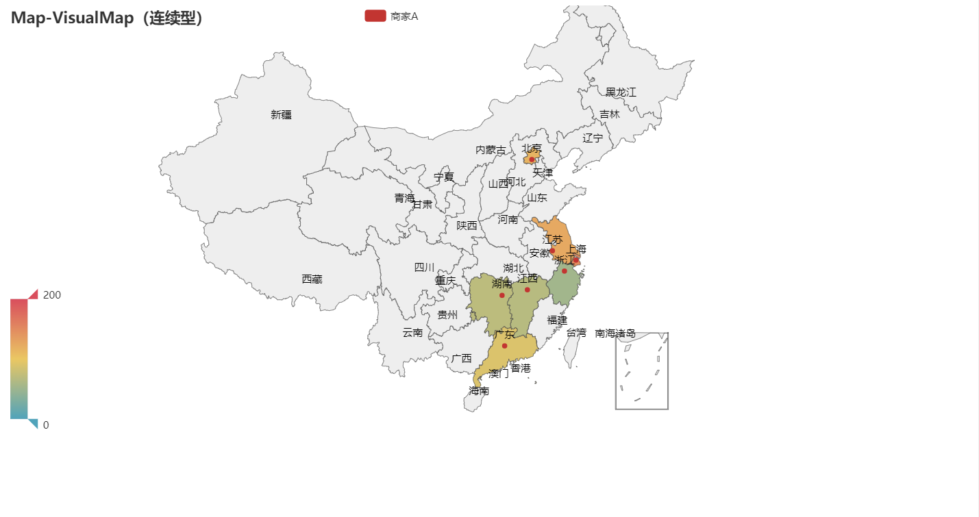
pyecharts的地图官方源码:
from pyecharts import options as opts
from pyecharts.charts import Map
from pyecharts.faker import Faker

c = (
    Map()
    .add("商家A", [list(z) for z in zip(Faker.provinces, Faker.values())], "china")
    .set_global_opts(
        title_opts=opts.TitleOpts(title="Map-VisualMap(连续型)"),
        visualmap_opts=opts.VisualMapOpts(max_=200),
    )
)
效果:
第二步:数据可视化地图
from pyecharts import options as opts
from pyecharts.charts import Map
from pyecharts.faker import Faker
import os

class Draw_map():
    #判断是否存在存放地图的文件夹,没有的话创建文件夹
    def __init__(self):
        if not os.path.exists('./map/china'):
            os.makedirs('./map/china')
    #将RGB转换为绘制地图需要的十六进制的表达形式
    def get_colour(self,a,b,c):
        result = '#' + ''.join(map((lambda x: "%02x" % x), (a,b,c)))
        return result.upper()
    #绘制每个城市的地图
    def to_map_city(self,area, variate,province,update_time):
        #显示标识栏的颜色分层表示
        pieces = [
            {"max": 99999999, "min": 10000, "label": "≥10000", "color": self.get_colour(102, 2, 8)},
            {"max": 9999, "min": 1000, "label": "1000-9999", "color": self.get_colour(140, 13, 13)},
            {"max": 999, "min": 500, "label": "500-999", "color": self.get_colour(204, 41, 41)},
            {"max": 499, "min": 100, "label": "100-499", "color": self.get_colour(255, 123, 105)},
            {"max": 99, "min": 50, "label": "50-99", "color": self.get_colour(255, 170, 133)},
            {"max": 49, "min": 10, "label": "10-49", "color": self.get_colour(255,202,179)},
            {"max": 9, "min": 1, "label": "1-9", "color": self.get_colour(255,228,217)},
            {"max": 0, "min": 0, "label": "0", "color": self.get_colour(255,255,255)},
              ]
        #绘制地图
        c = (
            # 设置地图大小
            Map(init_opts=opts.InitOpts(width = '1000px', height='880px'))
            .add("累计确诊人数", [list(z) for z in zip(area, variate)], province, is_map_symbol_show=False)
            # 设置全局变量  is_piecewise设置数据是否连续,split_number设置为分段数,pices可自定义数据分段
            # is_show设置是否显示图例
            .set_global_opts(
                title_opts=opts.TitleOpts(title="%s地区疫情地图分布"%(province), subtitle = '截止%s  %s省疫情分布情况'%(update_time,province), pos_left = "center", pos_top = "10px"),
                legend_opts=opts.LegendOpts(is_show = False),
                visualmap_opts=opts.VisualMapOpts(max_=200,is_piecewise=True,
                                                  pieces=pieces,
                                                  ),
            )
            .render("./map/china/{}疫情地图.html".format(province))
        )

    # 绘制全国的地图
    def to_map_china(self, area,variate,update_time):
        pieces = [{"max": 999999, "min": 1001, "label": ">10000", "color": "#8A0808"},
                  {"max": 9999, "min": 1000, "label": "1000-9999", "color": "#B40404"},
                  {"max": 999, "min": 100, "label": "100-999", "color": "#DF0101"},
                  {"max": 99, "min": 10, "label": "10-99", "color": "#F78181"},
                  {"max": 9, "min": 1, "label": "1-9", "color": "#F5A9A9"},
                  {"max": 0, "min": 0, "label": "0", "color": "#FFFFFF"},
                  ]

        c = (
            # 设置地图大小
            Map(init_opts=opts.InitOpts(width='1000px', height='880px'))
                .add("累计确诊人数", [list(z) for z in zip(area, variate)], "china", is_map_symbol_show=False)
                .set_global_opts(
                title_opts=opts.TitleOpts(title="中国疫情地图分布", subtitle='截止%s 中国疫情分布情况'%(update_time), pos_left="center", pos_top="10px"),
                legend_opts=opts.LegendOpts(is_show=False),
                visualmap_opts=opts.VisualMapOpts(max_=200, is_piecewise=True,
                                                  pieces=pieces,
                                                  ),
            )
            .render("./map/中国疫情地图.html")
        )
第三步:
使用数据来绘制地图:
import json
import map_draw
import data_get

with open('data.json','r') as file:
    data = file.read()
    data = json.loads(data)
    map = map_draw.Draw_map()
    datas = data_get.Get_data()
    datas.get_data()
    update_time = datas.get_time()
    datas.parse_data()
#中国疫情地图数据
def china_map():
    area = []
    confirmed = []
    for each in data:
        area.append(each['area'])
        confirmed.append(each['confirmed'])
    map.to_map_china(area,confirmed,update_time)

#省份疫情地图数据
def province_map():
    for each in data:
        city = []
        confirmeds = []
        province = each['area']
        for each_city in each['subList']:
            city.append(each_city['city']+"市")
            confirmeds.append(each_city['confirmed'])
            map.to_map_city(city,confirmeds,province,update_time)
        if province == '上海' or '北京' or '天津' or '重庆' or '香港':
            for each_city in each['subList']:
                city.append(each_city['city'])
                confirmeds.append(each_city['confirmed'])
                map.to_map_city(city,confirmeds,province,update_time)
效果:
全国:

内蒙古自治区:

本次内容参考自:
https://pyecharts.org/#/zh-cn/intro
http://gallery.pyecharts.org/#/Map/README
https://www.jianshu.com/p/3e71d73694fa
https://www.jianshu.com/p/d2474e9bce6e
https://www.bilibili.com/medialist/play/ml317727151