网上找了个皮,改成vue登录界面。webpack4.43 vue-cli 4.3.1脚手架。
BootstrapVue 官方文档:https://bootstrap-vue.org/
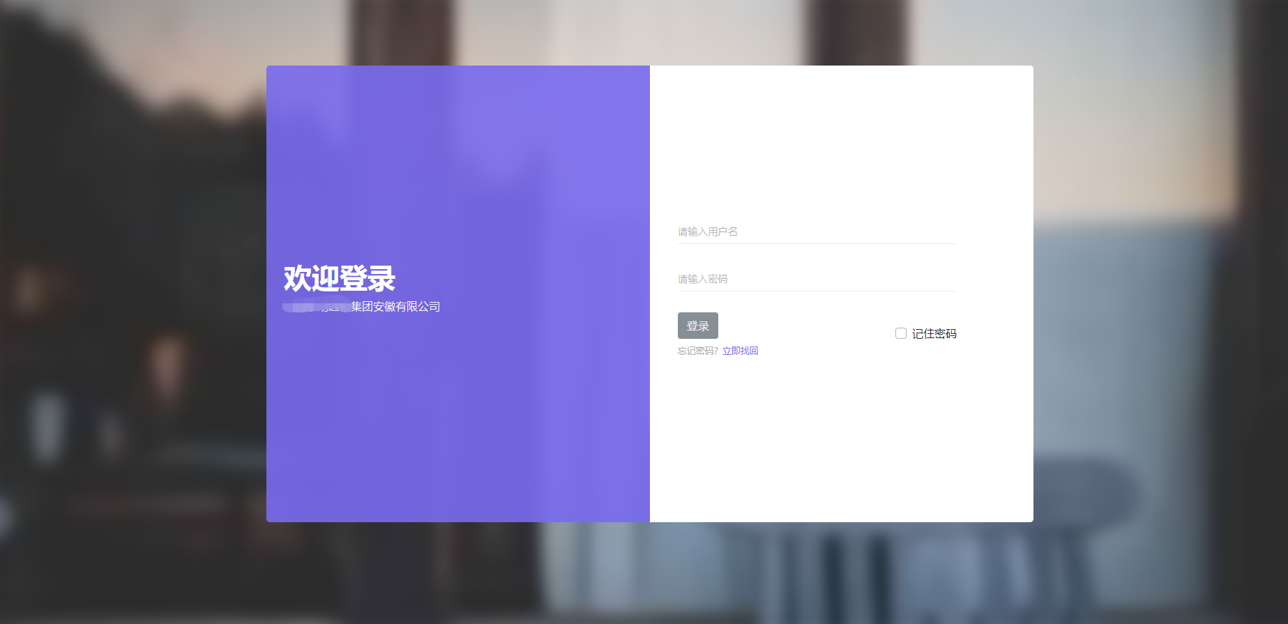
先看下最终效果:
废话不多说,开始:
一、login.css,从网上扒出来的,直接贴上来


/* ========================================================== ========================================================== Bootstrap 4 Admin Template https://bootstrapious.com/p/admin-template ========================================================== ========================================================== */ /* * ========================================================== * GENERAL STYLES * ========================================================== */ body { overflow-x: hidden; } a, i, span { display: inline-block; text-decoration: none; -webkit-transition: all 0.3s; transition: all 0.3s; } a:hover, a:focus, i:hover, i:focus, span:hover, span:focus { text-decoration: none; } section { padding: 50px 0; } canvas { -webkit-user-select: none; -moz-user-select: none; -ms-user-select: none; user-select: none; } .container-fluid { padding: 0 30px; } @media (max- 575px) { .container-fluid { padding: 0 15px; } } header.page-header { padding: 20px 0; } table { font-size: 0.9em; color: #666; } .card-close { position: absolute; top: 15px; right: 15px; } .card-close .dropdown-toggle { color: #999; background: none; border: none; } .card-close .dropdown-toggle:after { display: none; } .card-close .dropdown-menu { border: none; min-width: auto; font-size: 0.9em; border-radius: 0; -webkit-box-shadow: 3px 3px 3px rgba(0, 0, 0, 0.1), -2px -2px 3px rgba(0, 0, 0, 0.1); box-shadow: 3px 3px 3px rgba(0, 0, 0, 0.1), -2px -2px 3px rgba(0, 0, 0, 0.1); } .card-close .dropdown-menu a { color: #999 !important; } .card-close .dropdown-menu a:hover { background: #796AEE; color: #fff !important; } .card-close .dropdown-menu a i { margin-right: 10px; -webkit-transition: none; transition: none; } .content-inner { position: relative; width: calc(100% - 250px); min-height: calc(100vh - 70px); padding-bottom: 60px; } .content-inner.active { width: calc(100% - 90px); } .page-header { background: #fff; padding: 20px; -webkit-box-shadow: 2px 2px 2px rgba(0, 0, 0, 0.1); box-shadow: 2px 2px 2px rgba(0, 0, 0, 0.1); position: relative; z-index: 8; } *[class*="icon-"] { -webkit-transform: translateY(3px); transform: translateY(3px); } button, input { outline: none !important; } .card { margin-bottom: 30px; -webkit-box-shadow: 2px 2px 2px rgba(0, 0, 0, 0.1), -1px 0 2px rgba(0, 0, 0, 0.05); box-shadow: 2px 2px 2px rgba(0, 0, 0, 0.1), -1px 0 2px rgba(0, 0, 0, 0.05); } .card-header { -webkit-box-shadow: 2px 2px 2px rgba(0, 0, 0, 0.05); box-shadow: 2px 2px 2px rgba(0, 0, 0, 0.05); } .card-header h1, .card-header h2, .card-header h3, .card-header h4, .card-header h5, .card-header h6 { margin-bottom: 0; } .breadcrumb-holder { background: #fff; } .breadcrumb { background: #fff; position: relative; z-index: 7; border-radius: 0; padding: 15px 0; margin-bottom: 0; } .breadcrumb li.breadcrumb-item { color: #aaa; font-weight: 300; } /*=== Helpers ===*/ .text-bold { font-weight: 700; } .text-small { font-size: 0.9rem; } .text-xsmall { font-size: 0.8rem; } .bg-red { background: #ff7676 !important; color: #fff; } .bg-red:hover { color: #fff; } .bg-blue { background: #85b4f2 !important; color: #fff; } .bg-blue:hover { color: #fff; } .bg-yellow { background: #eef157 !important; color: #fff; } .bg-yellow:hover { color: #fff; } .bg-green { background: #54e69d !important; color: #fff; } .bg-green:hover { color: #fff; } .bg-orange { background: #ffc36d !important; color: #fff; } .bg-orange:hover { color: #fff; } .bg-violet { background: #796AEE !important; color: #fff; } .bg-violet:hover { color: #fff; } .bg-gray { background: #ced4da !important; } .bg-white { background: #fff !important; } .text-red { color: #ff7676; } .text-red:hover { color: #ff7676; } .text-yellow { color: #eef157; } .text-yellow:hover { color: #eef157; } .text-green { color: #54e69d; } .text-green:hover { color: #54e69d; } .text-orange { color: #ffc36d; } .text-orange:hover { color: #ffc36d; } .text-violet { color: #796AEE; } .text-violet:hover { color: #796AEE; } .text-blue { color: #85b4f2; } .text-blue:hover { color: #85b4f2; } .text-gray { color: #ced4da; } .text-gray:hover { color: #ced4da; } .text-uppercase { letter-spacing: 0.2em; } .lh-2 { line-height: 2; } .page { background: #EEF5F9; } .page .text-white { color: #fff; } .no-padding { padding: 0 !important; } .no-padding-bottom { padding-bottom: 0 !important; } .no-padding-top { padding-top: 0 !important; } .no-margin { margin: 0 !important; } .no-margin-bottom { margin-bottom: 0 !important; } .no-margin-top { margin-top: 0 !important; } .page { overflow-x: hidden; } .has-shadow { -webkit-box-shadow: 2px 2px 2px rgba(0, 0, 0, 0.1), -1px 0 2px rgba(0, 0, 0, 0.05); box-shadow: 2px 2px 2px rgba(0, 0, 0, 0.1), -1px 0 2px rgba(0, 0, 0, 0.05); } .badge { font-weight: 400; } .badge-rounded { border-radius: 50px; } .list-group-item { border-right: 0; border-left: 0; } .list-group-item:first-child, .list-group-item:last-child { border-radius: 0; } .overflow-hidden { overflow: hidden; } .tile-link { position: absolute; cursor: pointer; width: 100%; height: 100%; left: 0; top: 0; z-index: 30; } /* * ========================================================== * SIDEBAR * ========================================================== */ nav.side-navbar { background: #fff; min-width: 250px; max-width: 250px; color: #686a76; -webkit-box-shadow: 1px 1px 1px rgba(0, 0, 0, 0.1); box-shadow: 1px 1px 1px rgba(0, 0, 0, 0.1); z-index: 9; /*==== Sidebar Header ====*/ /*==== Sidebar Menu ====*/ /*==== Shrinked Sidebar ====*/ } nav.side-navbar a { color: inherit; position: relative; font-size: 0.9em; } nav.side-navbar a[data-toggle="collapse"]::before { content: 'f104'; display: inline-block; -webkit-transform: translateY(-50%); transform: translateY(-50%); font-family: 'FontAwesome'; position: absolute; top: 50%; right: 20px; } nav.side-navbar a[aria-expanded="true"] { background: #EEF5F9; } nav.side-navbar a[aria-expanded="true"]::before { content: 'f107'; } nav.side-navbar a i { font-size: 1.2em; margin-right: 10px; -webkit-transition: none; transition: none; } nav.side-navbar .sidebar-header { padding: 30px 15px; } nav.side-navbar .avatar { width: 55px; height: 55px; } nav.side-navbar .title { margin-left: 10px; } nav.side-navbar .title h1 { color: #333; } nav.side-navbar .title p { font-size: 0.9em; font-weight: 200; margin-bottom: 0; color: #aaa; } nav.side-navbar span.heading { text-transform: uppercase; font-weight: 400; margin-left: 20px; color: #ccc; font-size: 0.8em; } nav.side-navbar ul { padding: 15px 0; } nav.side-navbar ul li { /* submenu item active */ } nav.side-navbar ul li a { padding: 10px 15px; text-decoration: none; display: block; font-weight: 300; border-left: 4px solid transparent; } nav.side-navbar ul li a:hover { background: #796AEE; border-left: 4px solid #3b25e6; color: #fff; } nav.side-navbar ul li li a { padding-left: 50px; background: #EEF5F9; } nav.side-navbar ul li.active > a { background: #796AEE; color: #fff; border-left: 4px solid #3b25e6; } nav.side-navbar ul li.active > a:hover { background: #796AEE; } nav.side-navbar ul li li.active > a { background: #8e81f1; } nav.side-navbar ul li ul { padding: 0; } nav.side-navbar.shrinked { min-width: 90px; max-width: 90px; text-align: center; } nav.side-navbar.shrinked span.heading { margin: 0; } nav.side-navbar.shrinked ul li a { padding: 15px 2px; border: none; font-size: 0.8em; color: #aaa; -webkit-transition: color 0.3s, background 0.3s; transition: color 0.3s, background 0.3s; } nav.side-navbar.shrinked ul li a[data-toggle="collapse"]::before { content: 'f107'; -webkit-transform: translateX(50%); transform: translateX(50%); position: absolute; top: auto; right: 50%; bottom: 0; left: auto; } nav.side-navbar.shrinked ul li a[data-toggle="collapse"][aria-expanded="true"]::before { content: 'f106'; } nav.side-navbar.shrinked ul li a:hover { color: #fff; border: none; } nav.side-navbar.shrinked ul li a:hover i { color: #fff; } nav.side-navbar.shrinked ul li a i { margin-right: 0; margin-bottom: 2px; display: block; font-size: 1rem; color: #333; -webkit-transition: color 0.3s; transition: color 0.3s; } nav.side-navbar.shrinked ul li.active > a { color: #fff; } nav.side-navbar.shrinked ul li.active > a i { color: #fff; } nav.side-navbar.shrinked .sidebar-header .title { display: none; } /* SIDEBAR MEDIAQUERIES ----------------------------------- */ @media (max- 1199px) { nav.side-navbar { margin-left: -90px; min-width: 90px; max-width: 90px; text-align: center; overflow: hidden; } nav.side-navbar span.heading { margin: 0; } nav.side-navbar ul li a { padding: 15px 2px; border: none; font-size: 0.8em; color: #aaa; -webkit-transition: color 0.3s, background 0.3s; transition: color 0.3s, background 0.3s; } nav.side-navbar ul li a[data-toggle="collapse"]::before { content: 'f107'; -webkit-transform: translateX(50%); transform: translateX(50%); position: absolute; top: auto; right: 50%; bottom: 0; left: auto; } nav.side-navbar ul li a[data-toggle="collapse"][aria-expanded="true"]::before { content: 'f106'; } nav.side-navbar ul li a:hover { color: #fff; border: none; } nav.side-navbar ul li a:hover i { color: #fff; } nav.side-navbar ul li a i { margin-right: 0; margin-bottom: 5px; display: block; font-size: 1.6em; color: #333; -webkit-transition: color 0.3s; transition: color 0.3s; } nav.side-navbar ul li.active > a { color: #fff; } nav.side-navbar ul li.active > a i { color: #fff; } nav.side-navbar .sidebar-header .title { display: none; } nav.side-navbar.shrinked { margin-left: 0; } .content-inner { width: 100%; } .content-inner.active { width: calc(100% - 90px); } } /* * ========================================================== * MAIN NAVBAR * ========================================================== */ nav.navbar { background: #2f333e; padding-top: 15px; padding-bottom: 15px; color: #fff; position: relative; border-radius: 0; -webkit-box-shadow: 2px 2px 2px rgba(0, 0, 0, 0.2); box-shadow: 2px 2px 2px rgba(0, 0, 0, 0.2); z-index: 10; padding-left: 0; padding-right: 0; /*==== Toggle Sidebar Btn ====*/ /*==== Navbar Items ====*/ /*==== Search Box ====*/ /*==== Dropdowns ====*/ } nav.navbar .badge { width: 22px; height: 22px; line-height: 22px; text-align: center; padding: 0; border-radius: 50%; } nav.navbar .navbar-holder { width: 100%; } nav.navbar a { color: inherit; } nav.navbar .container-fluid { width: 100%; } nav.navbar .menu-btn { margin-right: 20px; font-size: 1.2em; -webkit-transition: all 0.7s; transition: all 0.7s; } nav.navbar .menu-btn span { width: 20px; height: 2px; background: #fff; display: block; margin: 4px auto 0; -webkit-transition: all 0.3s cubic-bezier(0.81, -0.33, 0.345, 1.375); transition: all 0.3s cubic-bezier(0.81, -0.33, 0.345, 1.375); } nav.navbar .menu-btn span:nth-of-type(2) { position: relative; width: 35px; -webkit-transform: rotateY(180deg); transform: rotateY(180deg); } nav.navbar .menu-btn span:nth-of-type(2)::before, nav.navbar .menu-btn span:nth-of-type(2)::after { content: ''; width: 6px; height: 2px; display: block; background: #fff; -webkit-transform: rotate(45deg); transform: rotate(45deg); position: absolute; top: 2px; left: 0; -webkit-transition: all 0.7s; transition: all 0.7s; } nav.navbar .menu-btn span:nth-of-type(2)::after { -webkit-transform: rotate(145deg); transform: rotate(145deg); position: absolute; top: -2px; left: 0; } nav.navbar .menu-btn.active span:first-of-type { -webkit-transform: translateY(12px); transform: translateY(12px); } nav.navbar .menu-btn.active span:nth-of-type(2) { -webkit-transform: none; transform: none; } nav.navbar .menu-btn.active span:last-of-type { -webkit-transform: translateY(-12px); transform: translateY(-12px); } nav.navbar .nav-link { position: relative; } nav.navbar .nav-link span.badge-corner { position: absolute; top: 0; right: 0; font-weight: 400; font-size: 0.7em; } nav.navbar .nav-link.language span { margin-left: .3rem; vertical-align: middle; } nav.navbar .nav-link.logout i { margin-left: 10px; } nav.navbar .nav-menu { margin-bottom: 0; } nav.navbar .search-box { width: 100%; height: 100%; position: absolute; top: 0; right: 0; padding: 0; background: #fff; z-index: 12; border-radius: 0; display: none; } nav.navbar .search-box .dismiss { position: absolute; top: 50%; right: 20px; -webkit-transform: translateY(-50%); transform: translateY(-50%); background: none; border: none; cursor: pointer; font-size: 1.5em; color: #999; } nav.navbar .search-box form { height: 100%; } nav.navbar .search-box form input { height: 100%; border: none; padding: 20px; } nav.navbar .dropdown-toggle::after { border: none !important; content: 'f107'; vertical-align: baseline; font-family: 'FontAwesome'; margin-left: .3rem; } nav.navbar .dropdown-menu { right: 0; min-width: 250px; left: auto; margin-top: 15px; margin-bottom: 0; padding: 15px 0; max-width: 400px; border-radius: 0; border: none; -webkit-box-shadow: 2px 2px 2px rgba(0, 0, 0, 0.1), -2px 0 2px rgba(0, 0, 0, 0.1); box-shadow: 2px 2px 2px rgba(0, 0, 0, 0.1), -2px 0 2px rgba(0, 0, 0, 0.1); } nav.navbar .dropdown-menu .dropdown-item { background: #fff; padding: 10px 20px; font-size: 0.8rem; color: #777; width: 100%; } nav.navbar .dropdown-menu .dropdown-item:hover { background: #f5f5f5; } nav.navbar .dropdown-menu .dropdown-item i { width: 30px; height: 30px; line-height: 30px; background: #796AEE; text-align: center; color: #fff; border-radius: 50%; margin-right: 10px; } nav.navbar .dropdown-menu .dropdown-item small { margin-left: 40px; } nav.navbar .dropdown-menu span { position: static; font-size: 0.9em; color: #999; } nav.navbar .dropdown-menu strong { font-weight: 700; } nav.navbar .dropdown-menu .msg-profile { width: 45px; height: 45px; margin-right: 10px; } nav.navbar .dropdown-menu h3 { font-weight: 500; } /* MAIN NAVBAR MEDIAQUERIES ----------------------------------- */ @media (max- 1199px) { nav.navbar { /*==== Toggle Sidebar Btn ====*/ } nav.navbar .menu-btn { margin-right: 20px; font-size: 1.2em; -webkit-transition: all 0.7s; transition: all 0.7s; } nav.navbar .menu-btn span:first-of-type { -webkit-transform: translateY(12px); transform: translateY(12px); } nav.navbar .menu-btn span:nth-of-type(2) { -webkit-transform: none; transform: none; } nav.navbar .menu-btn span:nth-of-type(2)::before, nav.navbar .menu-btn span:nth-of-type(2)::after { -webkit-transform: rotate(45deg); transform: rotate(45deg); } nav.navbar .menu-btn span:nth-of-type(2)::after { -webkit-transform: rotate(145deg); transform: rotate(145deg); position: absolute; top: -2px; left: 0; } nav.navbar .menu-btn span:last-of-type { -webkit-transform: translateY(-12px); transform: translateY(-12px); } nav.navbar .menu-btn.active span:first-of-type { -webkit-transform: none; transform: none; } nav.navbar .menu-btn.active span:nth-of-type(2) { -webkit-transform: rotateY(180deg); transform: rotateY(180deg); } nav.navbar .menu-btn.active span:last-of-type { -webkit-transform: none; transform: none; } } @media (max- 575px) { nav.navbar { font-size: 14px; } nav.navbar .badge { width: 19px; height: 19px; } nav.navbar .nav-item > a { font-size: 13px; } nav.navbar .dropdown-menu { right: auto; left: -50%; -webkit-transform: translateX(-50%); transform: translateX(-50%); } } /* * ========================================================== * DASHBOARD COUNTS SECTION * ========================================================== */ section.dashboard-counts .icon { width: 40px; height: 40px; line-height: 40px; text-align: center; min-width: 40px; max-width: 40px; border-radius: 50%; } section.dashboard-counts .title { font-size: 1.1em; font-weight: 300; color: #777; margin: 0 20px; } section.dashboard-counts .progress { margin-top: 10px; height: 4px; } section.dashboard-counts .number { font-size: 1.8em; font-weight: 300; } section.dashboard-counts .number strong { font-weight: 700; } section.dashboard-counts .row { padding: 30px 15px; margin: 0; } section.dashboard-counts div[class*='col-'] .item { border-right: 1px solid #eee; padding: 15px 0; } section.dashboard-counts div[class*='col-']:last-of-type .item { border-right: none; } /* DASHBOARD COUNTS MEDIAQUERIES ------------------------ */ @media (max- 1199px) { section.dashboard-counts div[class*='col-']:nth-of-type(2) .item { border-right: none; } } @media (max- 575px) { section.dashboard-counts div[class*='col-'] .item { border-right: none; } } /* * ========================================================== * DASHBOARD HEADER SECTION * ========================================================== */ .statistic { padding: 20px 15px; margin-bottom: 15px; } .statistic:last-of-type { margin-bottom: 0; } .statistic strong { font-size: 1.5em; color: #333; font-weight: 700; line-height: 1; } .statistic small { color: #aaa; text-transform: uppercase; } .statistic .icon { width: 40px; height: 40px; line-height: 40px; text-align: center; min-width: 40px; max-width: 40px; color: #fff; border-radius: 50%; margin-right: 15px; } .chart .title { padding: 15px 0 0 15px; } .chart .title strong { font-weight: 700; font-size: 1.2em; } .chart .title small { color: #aaa; text-transform: uppercase; } .chart .line-chart { width: 100%; height: 100%; padding: 20px 0; } .chart .line-chart canvas { width: calc(100% - 30px) !important; } .chart .bar-chart { margin-bottom: 15px; } .chart .bar-chart canvas { padding: 15px; width: 100%; margin: 0; } /* DASHBOARD HEADER MEDIAQUERIES ------------------------*/ @media (max- 991px) { section.dashboard-header div[class*='col-'] { margin-bottom: 20px; } } /* * ========================================================== * PROJECTS SECTION * ========================================================== */ .project .row { margin: 0; padding: 15px 0; margin-bottom: 15px; } .project div[class*='col-'] { border-right: 1px solid #eee; } .project .text h3 { margin-bottom: 0; color: #555; } .project .text small { color: #aaa; font-size: 0.75em; } .project .project-date span { font-size: 0.9em; color: #999; } .project .image { max-width: 50px; min-width: 50px; height: 50px; margin-right: 15px; } .project .time, .project .comments, .project .project-progress { color: #999; font-size: 0.9em; margin-right: 20px; } .project .time i, .project .comments i, .project .project-progress i { margin-right: 5px; } .project .project-progress { width: 200px; } .project .project-progress .progress { height: 4px; } .project .card { margin-bottom: 0; } /* PROJECTS SECTION ------------------------------------- */ @media (max- 991px) { .project .right-col { margin-top: 20px; margin-left: 65px; } .project .project-progress { width: 150px; } } @media (max- 480px) { .project .project-progress { display: none; } } /* * ========================================================== * CLIENT SECTION * ========================================================== */ /*====== Work Amount Box ======*/ .work-amount .chart { margin: 40px auto; position: relative; } .work-amount .chart .text { display: inline-block; position: absolute; top: 50%; left: 50%; -webkit-transform: translate(-50%, -50%); transform: translate(-50%, -50%); } .work-amount .chart strong { font-size: 1.5rem; } .work-amount .chart span { color: #999; font-weight: 300; } .work-amount li span { font-size: 0.85em; margin-bottom: 10px; color: #777; display: block; } .work-amount li span::before { content: ''; display: inline-block; margin-right: 10px; width: 7px; height: 7px; line-height: 7px; background: #85b4f2; border-radius: 50%; } /*====== Client Profile Box ======*/ .client .client-avatar { width: 100px; height: 100px; margin: 0 auto; position: relative; } .client .client-avatar .status { content: ''; display: block; width: 18px; height: 18px; border: 3px solid #fff; border-radius: 50%; position: absolute; right: 4px; bottom: 4px; } .client .client-title { margin-top: 20px; } .client .client-title h3 { font-weight: 500; color: #555; } .client .client-title span { font-size: 0.9em; color: #aaa; display: block; } .client .client-title a { padding: 2px 30px; border-radius: 40px; background: #54e69d; color: #fff; margin-top: 5px; font-size: 0.9em; text-decoration: none; } .client .client-title a:hover { background: #85b4f2; } .client .client-info { margin-top: 20px; } .client .client-info strong { font-weight: 700; } .client .client-social { margin-top: 20px; } .client .client-social a { color: #aaa; } /*====== Total Overdue Box ======*/ .overdue .chart canvas { width: 100% !important; z-index: 1; } .overdue .card { margin-bottom: 0; } .overdue .card-body { padding: 20px; } .overdue .card-body small { font-weight: 300; color: #aaa; } .overdue .card-body h3 { margin-bottom: 5px; } .overdue .number { font-size: 1.8em; font-weight: 400; color: #555; margin: 35px 0; } /* * ========================================================== * FEEDS SECTION * ========================================================== */ /*====== Checklist Box ======*/ .checklist label { font-size: 0.8em; color: #999; line-height: 1.8em; margin-bottom: 0; } .checklist .item { padding: 20px; } .checklist .item:nth-of-type(even) { background: #fafafa; } /*====== Trending Articles Box ======*/ .articles a { text-decoration: none !important; display: block; margin-bottom: 0; color: #555; } .articles .badge { font-size: 0.7em; padding: 5px 10px; line-height: 1; margin-left: 10px; } .articles .item { padding: 20px; } .articles .item:nth-of-type(even) { background: #fafafa; } .articles .item .image { min-width: 50px; max-width: 50px; height: 50px; margin-right: 15px; } .articles .item img { padding: 3px; border: 1px solid #28a745; } .articles .item h3 { color: #555; font-weight: 400; margin-bottom: 0; } .articles .item small { color: #aaa; font-size: 0.75em; } /* * ========================================================== * UPDATES SECTION * ========================================================== */ /*====== Recent Updates Box ======*/ .recent-updates .item { padding: 20px; } .recent-updates .item:nth-of-type(even) { background: #fafafa; } .recent-updates .icon { margin-right: 10px; } .recent-updates h5 { margin-bottom: 5px; color: #333; font-weight: 400; } .recent-updates p { font-size: 0.8em; color: #aaa; margin-bottom: 0; } .recent-updates .date { font-size: 0.9em; color: #adadad; } .recent-updates .date strong { font-size: 1.4em; line-height: 0.8em; display: block; } .recent-updates .date span { font-size: 0.9em; font-weight: 300; } /*====== Daily Feeds Box ======*/ .daily-feeds .item { padding: 20px; border-bottom: 1px solid #eee; } .daily-feeds .feed-profile { max-width: 50px; min-width: 50px; margin-right: 10px; } .daily-feeds h5 { margin-bottom: 0; color: #555; } .daily-feeds span { font-size: 0.8em; color: #999; } .daily-feeds .full-date { font-size: 0.85em; color: #aaa; font-weight: 300; } .daily-feeds .CTAs { margin-top: 5px; } .daily-feeds .CTAs a { font-size: 0.7em; padding: 3px 8px; margin-right: 5px; } .daily-feeds .CTAs a i { margin-right: 5px; } .daily-feeds .quote { background: #fafafa; margin-top: 5px; border-radius: 0; padding: 15px; margin-left: 60px; } .daily-feeds .quote small { font-size: 0.75em; color: #777; } .daily-feeds .date { font-size: 0.9em; color: #aaa; } /*====== Recent Activities Box ======*/ .recent-activities .item { padding: 0 15px; border-bottom: 1px solid #eee; } .recent-activities .item div[class*='col-'] { padding: 15px; } .recent-activities h5 { font-weight: 400; color: #333; } .recent-activities p { font-size: 0.75em; color: #999; } .recent-activities .icon { width: 35px; height: 35px; line-height: 35px; background: #f5f5f5; text-align: center; display: inline-block; } .recent-activities .date { font-size: 0.75em; color: #999; padding: 10px; } .recent-activities .date-holder { padding: 0 !important; border-right: 1px solid #eee; } /* * ========================================================== * FOOTER * ========================================================== */ footer.main-footer { position: absolute; bottom: 0; width: 100%; background: #2f333e; color: #fff; padding: 20px 10px; } footer.main-footer a { color: inherit; } footer.main-footer p { margin: 0; font-size: 0.8em; } /* FOOTER MEDIAQUERIES --------------------------------- */ @media (max- 575px) { footer.main-footer div[class*='col'] { text-align: center !important; } } section.charts div[class*="col-"] { margin-bottom: 30px; } section.charts header { padding: 30px 0; } section.charts div[class*="col-"] { margin-bottom: 0; } /* * ========================================================== * LINE CHART * ========================================================== */ .line-chart-example .card-block { padding: 20px; } /* * ========================================================== * POLAR CHART * ========================================================== */ /* * ========================================================== * POLAR CHART * ========================================================== */ .polar-chart-example canvas { max-width: 350px; max-height: 350px; margin: 20px auto; } /* * ========================================================== * PIE CHART * ========================================================== */ .pie-chart-example canvas { max-width: 350px; max-height: 350px; margin: 15px auto; } /* * ========================================================== * RADAR CHART * ========================================================== */ .radar-chart-example canvas { max-width: 350px; max-height: 350px; margin: 20px auto; } /* FORMS MEDIAQUERIES -------------------------- */ @media (max- 991px) { section.charts h2 { font-size: 1rem; } } /* * ========================================================== * FORMS * ========================================================== */ .form-control { height: calc(2.25rem + 2px); border: 1px solid #dee2e6; border-radius: 0; padding: 0.375rem 0.75rem; } .form-control::-moz-placeholder { font-size: 0.9em; font-weight: 300; font-family: "Poppins", sans-serif; color: #aaa; } .form-control::-webkit-input-placeholder { font-size: 0.9em; font-weight: 300; font-family: "Poppins", sans-serif; color: #aaa; } .form-control:-ms-input-placeholder { font-size: 0.9em; font-weight: 300; font-family: "Poppins", sans-serif; color: #aaa; } .form-control:focus { color: #495057; background-color: #fff; border-color: #796AEE; outline: none; -webkit-box-shadow: 0 0 0 0.2rem rgba(121, 106, 238, 0.25); box-shadow: 0 0 0 0.2rem rgba(121, 106, 238, 0.25); } .form-control-sm { height: calc(1.8125rem + 2px); padding: 0.25rem 0.5rem; font-size: 0.875rem; line-height: 1.5; } .form-control-lg { height: calc(2.875rem + 2px); padding: 0.5rem 1rem; font-size: 1.25rem; line-height: 1.5; } textarea.form-control { height: auto; } select.form-control[size], select.form-control[multiple] { height: auto; } select.form-control option { color: #999; } .input-group .dropdown-menu { padding: 15px; color: #777; border-radius: 0; } .input-group .dropdown-menu a { padding: 5px 0; color: inherit; text-decoration: none; } .input-group .dropdown-menu a:hover { color: #796AEE; background: none; } .input-group-text { color: #868e96; background: #f8f9fa; border-color: #dee2e6; border-radius: 0; } .input-group-text .checkbox-template, .input-group-text .radio-template { -webkit-transform: none; transform: none; } .form-control-label { font-size: .9rem; color: #777; } button, input[type='submit'] { cursor: pointer; font-family: inherit; font-weight: 300 !important; } .input-group .dropdown-toggle { background: #f5f5f5; color: #777; } .checkbox-template, .radio-template { -webkit-transform: translateY(3px); transform: translateY(3px); -webkit-user-select: none; -moz-user-select: none; -ms-user-select: none; user-select: none; cursor: pointer; position: relative; } .checkbox-template + label, .radio-template + label { margin-left: 10px; } .checkbox-template::before, .radio-template::before { margin-right: 10px; content: ''; display: inline-block; -webkit-transform: translate(-2px, -2px); transform: translate(-2px, -2px); width: 18px; height: 18px; line-height: 18px; text-align: center; background: #dae2e7; -webkit-transition: all 0.2s; transition: all 0.2s; } .checkbox-template::after, .radio-template::after { content: 'f00c'; width: 12px; height: 12px; line-height: 12px; text-align: center; display: block; font-family: 'FontAwesome'; position: absolute; top: 1px; left: 1px; font-size: 0.7em; opacity: 0; -webkit-transition: all 0.2s; transition: all 0.2s; color: #fff; } .checkbox-template:checked::before, .radio-template:checked::before { background: #796AEE; } .checkbox-template:checked::after, .radio-template:checked::after { opacity: 1; } .radio-template::before { border-radius: 50%; -webkit-transform: translate(-3px, -3px); transform: translate(-3px, -3px); } .radio-template::after { width: 6px; height: 6px; line-height: 6px; text-align: center; position: absolute; top: 3px; left: 3px; border-radius: 50%; content: ''; } .radio-template:checked::after { background: #fff; } input.input-material { width: 100%; border: none; border-bottom: 1px solid #eee; padding: 10px 0; } input.input-material.is-invalid { border-color: #dc3545 !important; } input.input-material:focus { border-color: #796AEE; } input.input-material ~ label { color: #aaa; position: absolute; top: 14px; left: 0; cursor: text; -webkit-transition: all 0.2s; transition: all 0.2s; font-weight: 300; } input.input-material ~ label.active { font-size: 0.8rem; top: -10px; color: #796AEE; } input.input-material.is-invalid ~ label { color: #dc3545; } .form-group-material { position: relative; margin-bottom: 30px; } .modal-content { border-radius: 0; } .i-checks { display: -webkit-box; display: -ms-flexbox; display: flex; } /* * ========================================================== * FORM PAGE * ========================================================== */ .forms p { font-size: 0.9em; color: #555; } .forms form small { font-size: 0.8em; color: #999; font-weight: 300; } .forms .line { width: 100%; height: 1px; border-bottom: 1px dashed #eee; margin: 30px 0; } /* * ========================================================== * LOGIN PAGE * ========================================================== */ .login-page { position: relative; } .login-page::before { content: ''; width: 100%; height: 100%; display: block; z-index: -1; background: url(../img/p_big3.jpg); background-size: cover; -webkit-filter: blur(10px); filter: blur(10px); z-index: 1; position: absolute; top: 0; right: 0; } .login-page .container { min-height: 100vh; z-index: 999; padding: 20px; position: relative; } .login-page .form-holder { width: 100%; border-radius: 5px; overflow: hidden; margin-bottom: 50px; } .login-page .form-holder .info, .login-page .form-holder .form { min-height: 70vh; padding: 40px; height: 100%; } .login-page .form-holder div[class*='col-'] { padding: 0; } .login-page .form-holder .info { background: rgba(121, 106, 238, 0.9); color: #fff; } .login-page .form-holder .info h1 { font-size: 2.5em; font-weight: 600; } .login-page .form-holder .info p { font-weight: 300; } .login-page .form-holder .form .form-group { position: relative; margin-bottom: 30px; } .login-page .form-holder .form .content { width: 100%; } .login-page .form-holder .form form { width: 100%; max-width: 400px; } .login-page .form-holder .form #login, .login-page .form-holder .form #register { margin-bottom: 20px; cursor: pointer; } .login-page .form-holder .form a.forgot-pass, .login-page .form-holder .form a.signup { font-size: 0.9em; color: #85b4f2; } .login-page .form-holder .form small { color: #aaa; } .login-page .form-holder .form .terms-conditions label { cursor: pointer; color: #aaa; font-size: 0.9em; } .login-page .copyrights { width: 100%; z-index: 9999; position: absolute; bottom: 0; left: 0; color: #fff; } @media (max- 991px) { .login-page .info, .login-page .form { min-height: auto !important; } .login-page .info { padding-top: 100px !important; padding-bottom: 100px !important; } } /* ===================== STYLE SWITCHER FOR DEMO ===================== */ #style-switch-button { position: fixed; top: 120px; right: 0px; border-radius: 0; z-index: 12; } #style-switch { width: 300px; padding: 20px; position: fixed; top: 160px; right: 0; background: #fff; border: solid 1px #ced4da; z-index: 12; } #style-switch h4 { color: #495057; } /* ========================================= THEMING OF BOOTSTRAP COMPONENTS ========================================= */ /* * 1. NAVBAR */ .navbar { padding: 0.5rem 1rem; } .navbar-brand { display: inline-block; padding-top: 0.3125rem; padding-bottom: 0.3125rem; margin-right: 1rem; font-size: 1.25rem; } .navbar-toggler { padding: 0.25rem 0.75rem; font-size: 1.25rem; line-height: 1; border: 1px solid transparent; border-radius: 0.25rem; } .navbar-light .navbar-brand { color: rgba(0, 0, 0, 0.9); } .navbar-light .navbar-brand:focus, .navbar-light .navbar-brand:hover { color: rgba(0, 0, 0, 0.9); } .navbar-light .navbar-nav .nav-link { color: rgba(0, 0, 0, 0.5); } .navbar-light .navbar-nav .nav-link:focus, .navbar-light .navbar-nav .nav-link:hover { color: rgba(0, 0, 0, 0.7); } .navbar-light .navbar-nav .nav-link.disabled { color: rgba(0, 0, 0, 0.3); } .navbar-light .navbar-nav .show > .nav-link, .navbar-light .navbar-nav .active > .nav-link, .navbar-light .navbar-nav .nav-link.show, .navbar-light .navbar-nav .nav-link.active { color: rgba(0, 0, 0, 0.9); } .navbar-light .navbar-toggler { color: rgba(0, 0, 0, 0.5); border-color: rgba(0, 0, 0, 0.1); } .navbar-light .navbar-toggler-icon { background-image: url("data:image/svg+xml;charset=utf8,%3Csvg viewBox='0 0 30 30' xmlns='http://www.w3.org/2000/svg'%3E%3Cpath stroke='rgba(0, 0, 0, 0.5)' stroke-width='2' stroke-linecap='round' stroke-miterlimit='10' d='M4 7h22M4 15h22M4 23h22'/%3E%3C/svg%3E"); } .navbar-light .navbar-text { color: rgba(0, 0, 0, 0.5); } .navbar-dark .navbar-brand { color: #fff; } .navbar-dark .navbar-brand:focus, .navbar-dark .navbar-brand:hover { color: #fff; } .navbar-dark .navbar-nav .nav-link { color: rgba(255, 255, 255, 0.5); } .navbar-dark .navbar-nav .nav-link:focus, .navbar-dark .navbar-nav .nav-link:hover { color: rgba(255, 255, 255, 0.75); } .navbar-dark .navbar-nav .nav-link.disabled { color: rgba(255, 255, 255, 0.25); } .navbar-dark .navbar-nav .show > .nav-link, .navbar-dark .navbar-nav .active > .nav-link, .navbar-dark .navbar-nav .nav-link.show, .navbar-dark .navbar-nav .nav-link.active { color: #fff; } .navbar-dark .navbar-toggler { color: rgba(255, 255, 255, 0.5); border-color: rgba(255, 255, 255, 0.1); } .navbar-dark .navbar-toggler-icon { background-image: url("data:image/svg+xml;charset=utf8,%3Csvg viewBox='0 0 30 30' xmlns='http://www.w3.org/2000/svg'%3E%3Cpath stroke='rgba(255, 255, 255, 0.5)' stroke-width='2' stroke-linecap='round' stroke-miterlimit='10' d='M4 7h22M4 15h22M4 23h22'/%3E%3C/svg%3E"); } .navbar-dark .navbar-text { color: rgba(255, 255, 255, 0.5); } /* * 2. BUTTONS */ .btn { font-weight: 400; border: 1px solid transparent; padding: 0.375rem 0.75rem; font-size: 1rem; line-height: 1.5; border-radius: 0.25rem; -webkit-transition: color 0.15s ease-in-out, background-color 0.15s ease-in-out, border-color 0.15s ease-in-out, -webkit-box-shadow 0.15s ease-in-out; transition: color 0.15s ease-in-out, background-color 0.15s ease-in-out, border-color 0.15s ease-in-out, -webkit-box-shadow 0.15s ease-in-out; transition: color 0.15s ease-in-out, background-color 0.15s ease-in-out, border-color 0.15s ease-in-out, box-shadow 0.15s ease-in-out; transition: color 0.15s ease-in-out, background-color 0.15s ease-in-out, border-color 0.15s ease-in-out, box-shadow 0.15s ease-in-out, -webkit-box-shadow 0.15s ease-in-out; } .btn:focus, .btn.focus { outline: 0; -webkit-box-shadow: 0 0 0 0.2rem rgba(121, 106, 238, 0.25); box-shadow: 0 0 0 0.2rem rgba(121, 106, 238, 0.25); } .btn.disabled, .btn:disabled { opacity: .65; } .btn:not([disabled]):not(.disabled):active, .btn:not([disabled]):not(.disabled).active { background-image: none; } .btn-primary { color: color-yiq(#796AEE); background-color: #796AEE; border-color: #796AEE; } .btn-primary:hover { color: color-yiq(#5a48ea); background-color: #5a48ea; border-color: #503ce9; } .btn-primary:focus, .btn-primary.focus { -webkit-box-shadow: 0 0 0 0.2rem rgba(121, 106, 238, 0.5); box-shadow: 0 0 0 0.2rem rgba(121, 106, 238, 0.5); } .btn-primary.disabled, .btn-primary:disabled { color: color-yiq(#796AEE); background-color: #796AEE; border-color: #796AEE; } .btn-primary:not(:disabled):not(.disabled):active, .btn-primary:not(:disabled):not(.disabled).active, .show > .btn-primary.dropdown-toggle { color: color-yiq(#503ce9); background-color: #503ce9; border-color: #4631e7; } .btn-primary:not(:disabled):not(.disabled):active:focus, .btn-primary:not(:disabled):not(.disabled).active:focus, .show > .btn-primary.dropdown-toggle:focus { -webkit-box-shadow: 0 0 0 0.2rem rgba(121, 106, 238, 0.5); box-shadow: 0 0 0 0.2rem rgba(121, 106, 238, 0.5); } .btn-secondary { color: color-yiq(#868e96); background-color: #868e96; border-color: #868e96; } .btn-secondary:hover { color: color-yiq(#727b84); background-color: #727b84; border-color: #6c757d; } .btn-secondary:focus, .btn-secondary.focus { -webkit-box-shadow: 0 0 0 0.2rem rgba(134, 142, 150, 0.5); box-shadow: 0 0 0 0.2rem rgba(134, 142, 150, 0.5); } .btn-secondary.disabled, .btn-secondary:disabled { color: color-yiq(#868e96); background-color: #868e96; border-color: #868e96; } .btn-secondary:not(:disabled):not(.disabled):active, .btn-secondary:not(:disabled):not(.disabled).active, .show > .btn-secondary.dropdown-toggle { color: color-yiq(#6c757d); background-color: #6c757d; border-color: #666e76; } .btn-secondary:not(:disabled):not(.disabled):active:focus, .btn-secondary:not(:disabled):not(.disabled).active:focus, .show > .btn-secondary.dropdown-toggle:focus { -webkit-box-shadow: 0 0 0 0.2rem rgba(134, 142, 150, 0.5); box-shadow: 0 0 0 0.2rem rgba(134, 142, 150, 0.5); } .btn-success { color: color-yiq(#28a745); background-color: #28a745; border-color: #28a745; } .btn-success:hover { color: color-yiq(#218838); background-color: #218838; border-color: #1e7e34; } .btn-success:focus, .btn-success.focus { -webkit-box-shadow: 0 0 0 0.2rem rgba(40, 167, 69, 0.5); box-shadow: 0 0 0 0.2rem rgba(40, 167, 69, 0.5); } .btn-success.disabled, .btn-success:disabled { color: color-yiq(#28a745); background-color: #28a745; border-color: #28a745; } .btn-success:not(:disabled):not(.disabled):active, .btn-success:not(:disabled):not(.disabled).active, .show > .btn-success.dropdown-toggle { color: color-yiq(#1e7e34); background-color: #1e7e34; border-color: #1c7430; } .btn-success:not(:disabled):not(.disabled):active:focus, .btn-success:not(:disabled):not(.disabled).active:focus, .show > .btn-success.dropdown-toggle:focus { -webkit-box-shadow: 0 0 0 0.2rem rgba(40, 167, 69, 0.5); box-shadow: 0 0 0 0.2rem rgba(40, 167, 69, 0.5); } .btn-info { color: color-yiq(#17a2b8); background-color: #17a2b8; border-color: #17a2b8; } .btn-info:hover { color: color-yiq(#138496); background-color: #138496; border-color: #117a8b; } .btn-info:focus, .btn-info.focus { -webkit-box-shadow: 0 0 0 0.2rem rgba(23, 162, 184, 0.5); box-shadow: 0 0 0 0.2rem rgba(23, 162, 184, 0.5); } .btn-info.disabled, .btn-info:disabled { color: color-yiq(#17a2b8); background-color: #17a2b8; border-color: #17a2b8; } .btn-info:not(:disabled):not(.disabled):active, .btn-info:not(:disabled):not(.disabled).active, .show > .btn-info.dropdown-toggle { color: color-yiq(#117a8b); background-color: #117a8b; border-color: #10707f; } .btn-info:not(:disabled):not(.disabled):active:focus, .btn-info:not(:disabled):not(.disabled).active:focus, .show > .btn-info.dropdown-toggle:focus { -webkit-box-shadow: 0 0 0 0.2rem rgba(23, 162, 184, 0.5); box-shadow: 0 0 0 0.2rem rgba(23, 162, 184, 0.5); } .btn-warning { color: color-yiq(#ffc107); background-color: #ffc107; border-color: #ffc107; } .btn-warning:hover { color: color-yiq(#e0a800); background-color: #e0a800; border-color: #d39e00; } .btn-warning:focus, .btn-warning.focus { -webkit-box-shadow: 0 0 0 0.2rem rgba(255, 193, 7, 0.5); box-shadow: 0 0 0 0.2rem rgba(255, 193, 7, 0.5); } .btn-warning.disabled, .btn-warning:disabled { color: color-yiq(#ffc107); background-color: #ffc107; border-color: #ffc107; } .btn-warning:not(:disabled):not(.disabled):active, .btn-warning:not(:disabled):not(.disabled).active, .show > .btn-warning.dropdown-toggle { color: color-yiq(#d39e00); background-color: #d39e00; border-color: #c69500; } .btn-warning:not(:disabled):not(.disabled):active:focus, .btn-warning:not(:disabled):not(.disabled).active:focus, .show > .btn-warning.dropdown-toggle:focus { -webkit-box-shadow: 0 0 0 0.2rem rgba(255, 193, 7, 0.5); box-shadow: 0 0 0 0.2rem rgba(255, 193, 7, 0.5); } .btn-danger { color: color-yiq(#dc3545); background-color: #dc3545; border-color: #dc3545; } .btn-danger:hover { color: color-yiq(#c82333); background-color: #c82333; border-color: #bd2130; } .btn-danger:focus, .btn-danger.focus { -webkit-box-shadow: 0 0 0 0.2rem rgba(220, 53, 69, 0.5); box-shadow: 0 0 0 0.2rem rgba(220, 53, 69, 0.5); } .btn-danger.disabled, .btn-danger:disabled { color: color-yiq(#dc3545); background-color: #dc3545; border-color: #dc3545; } .btn-danger:not(:disabled):not(.disabled):active, .btn-danger:not(:disabled):not(.disabled).active, .show > .btn-danger.dropdown-toggle { color: color-yiq(#bd2130); background-color: #bd2130; border-color: #b21f2d; } .btn-danger:not(:disabled):not(.disabled):active:focus, .btn-danger:not(:disabled):not(.disabled).active:focus, .show > .btn-danger.dropdown-toggle:focus { -webkit-box-shadow: 0 0 0 0.2rem rgba(220, 53, 69, 0.5); box-shadow: 0 0 0 0.2rem rgba(220, 53, 69, 0.5); } .btn-light { color: color-yiq(#f8f9fa); background-color: #f8f9fa; border-color: #f8f9fa; } .btn-light:hover { color: color-yiq(#e2e6ea); background-color: #e2e6ea; border-color: #dae0e5; } .btn-light:focus, .btn-light.focus { -webkit-box-shadow: 0 0 0 0.2rem rgba(248, 249, 250, 0.5); box-shadow: 0 0 0 0.2rem rgba(248, 249, 250, 0.5); } .btn-light.disabled, .btn-light:disabled { color: color-yiq(#f8f9fa); background-color: #f8f9fa; border-color: #f8f9fa; } .btn-light:not(:disabled):not(.disabled):active, .btn-light:not(:disabled):not(.disabled).active, .show > .btn-light.dropdown-toggle { color: color-yiq(#dae0e5); background-color: #dae0e5; border-color: #d3d9df; } .btn-light:not(:disabled):not(.disabled):active:focus, .btn-light:not(:disabled):not(.disabled).active:focus, .show > .btn-light.dropdown-toggle:focus { -webkit-box-shadow: 0 0 0 0.2rem rgba(248, 249, 250, 0.5); box-shadow: 0 0 0 0.2rem rgba(248, 249, 250, 0.5); } .btn-dark { color: color-yiq(#343a40); background-color: #343a40; border-color: #343a40; } .btn-dark:hover { color: color-yiq(#23272b); background-color: #23272b; border-color: #1d2124; } .btn-dark:focus, .btn-dark.focus { -webkit-box-shadow: 0 0 0 0.2rem rgba(52, 58, 64, 0.5); box-shadow: 0 0 0 0.2rem rgba(52, 58, 64, 0.5); } .btn-dark.disabled, .btn-dark:disabled { color: color-yiq(#343a40); background-color: #343a40; border-color: #343a40; } .btn-dark:not(:disabled):not(.disabled):active, .btn-dark:not(:disabled):not(.disabled).active, .show > .btn-dark.dropdown-toggle { color: color-yiq(#1d2124); background-color: #1d2124; border-color: #171a1d; } .btn-dark:not(:disabled):not(.disabled):active:focus, .btn-dark:not(:disabled):not(.disabled).active:focus, .show > .btn-dark.dropdown-toggle:focus { -webkit-box-shadow: 0 0 0 0.2rem rgba(52, 58, 64, 0.5); box-shadow: 0 0 0 0.2rem rgba(52, 58, 64, 0.5); } .btn-default { color: color-yiq(#ced4da); background-color: #ced4da; border-color: #ced4da; } .btn-default:hover { color: color-yiq(#b8c1ca); background-color: #b8c1ca; border-color: #b1bbc4; } .btn-default:focus, .btn-default.focus { -webkit-box-shadow: 0 0 0 0.2rem rgba(206, 212, 218, 0.5); box-shadow: 0 0 0 0.2rem rgba(206, 212, 218, 0.5); } .btn-default.disabled, .btn-default:disabled { color: color-yiq(#ced4da); background-color: #ced4da; border-color: #ced4da; } .btn-default:not(:disabled):not(.disabled):active, .btn-default:not(:disabled):not(.disabled).active, .show > .btn-default.dropdown-toggle { color: color-yiq(#b1bbc4); background-color: #b1bbc4; border-color: #aab4bf; } .btn-default:not(:disabled):not(.disabled):active:focus, .btn-default:not(:disabled):not(.disabled).active:focus, .show > .btn-default.dropdown-toggle:focus { -webkit-box-shadow: 0 0 0 0.2rem rgba(206, 212, 218, 0.5); box-shadow: 0 0 0 0.2rem rgba(206, 212, 218, 0.5); } .btn-outline-primary { color: #796AEE; background-color: transparent; background-image: none; border-color: #796AEE; } .btn-outline-primary:hover { color: #fff; background-color: #796AEE; border-color: #796AEE; } .btn-outline-primary:focus, .btn-outline-primary.focus { -webkit-box-shadow: 0 0 0 0.2rem rgba(121, 106, 238, 0.5); box-shadow: 0 0 0 0.2rem rgba(121, 106, 238, 0.5); } .btn-outline-primary.disabled, .btn-outline-primary:disabled { color: #796AEE; background-color: transparent; } .btn-outline-primary:not(:disabled):not(.disabled):active, .btn-outline-primary:not(:disabled):not(.disabled).active, .show > .btn-outline-primary.dropdown-toggle { color: color-yiq(#796AEE); background-color: #796AEE; border-color: #796AEE; } .btn-outline-primary:not(:disabled):not(.disabled):active:focus, .btn-outline-primary:not(:disabled):not(.disabled).active:focus, .show > .btn-outline-primary.dropdown-toggle:focus { -webkit-box-shadow: 0 0 0 0.2rem rgba(121, 106, 238, 0.5); box-shadow: 0 0 0 0.2rem rgba(121, 106, 238, 0.5); } .btn-outline-secondary { color: #868e96; background-color: transparent; background-image: none; border-color: #868e96; } .btn-outline-secondary:hover { color: #fff; background-color: #868e96; border-color: #868e96; } .btn-outline-secondary:focus, .btn-outline-secondary.focus { -webkit-box-shadow: 0 0 0 0.2rem rgba(134, 142, 150, 0.5); box-shadow: 0 0 0 0.2rem rgba(134, 142, 150, 0.5); } .btn-outline-secondary.disabled, .btn-outline-secondary:disabled { color: #868e96; background-color: transparent; } .btn-outline-secondary:not(:disabled):not(.disabled):active, .btn-outline-secondary:not(:disabled):not(.disabled).active, .show > .btn-outline-secondary.dropdown-toggle { color: color-yiq(#868e96); background-color: #868e96; border-color: #868e96; } .btn-outline-secondary:not(:disabled):not(.disabled):active:focus, .btn-outline-secondary:not(:disabled):not(.disabled).active:focus, .show > .btn-outline-secondary.dropdown-toggle:focus { -webkit-box-shadow: 0 0 0 0.2rem rgba(134, 142, 150, 0.5); box-shadow: 0 0 0 0.2rem rgba(134, 142, 150, 0.5); } .btn-outline-success { color: #28a745; background-color: transparent; background-image: none; border-color: #28a745; } .btn-outline-success:hover { color: #fff; background-color: #28a745; border-color: #28a745; } .btn-outline-success:focus, .btn-outline-success.focus { -webkit-box-shadow: 0 0 0 0.2rem rgba(40, 167, 69, 0.5); box-shadow: 0 0 0 0.2rem rgba(40, 167, 69, 0.5); } .btn-outline-success.disabled, .btn-outline-success:disabled { color: #28a745; background-color: transparent; } .btn-outline-success:not(:disabled):not(.disabled):active, .btn-outline-success:not(:disabled):not(.disabled).active, .show > .btn-outline-success.dropdown-toggle { color: color-yiq(#28a745); background-color: #28a745; border-color: #28a745; } .btn-outline-success:not(:disabled):not(.disabled):active:focus, .btn-outline-success:not(:disabled):not(.disabled).active:focus, .show > .btn-outline-success.dropdown-toggle:focus { -webkit-box-shadow: 0 0 0 0.2rem rgba(40, 167, 69, 0.5); box-shadow: 0 0 0 0.2rem rgba(40, 167, 69, 0.5); } .btn-outline-info { color: #17a2b8; background-color: transparent; background-image: none; border-color: #17a2b8; } .btn-outline-info:hover { color: #fff; background-color: #17a2b8; border-color: #17a2b8; } .btn-outline-info:focus, .btn-outline-info.focus { -webkit-box-shadow: 0 0 0 0.2rem rgba(23, 162, 184, 0.5); box-shadow: 0 0 0 0.2rem rgba(23, 162, 184, 0.5); } .btn-outline-info.disabled, .btn-outline-info:disabled { color: #17a2b8; background-color: transparent; } .btn-outline-info:not(:disabled):not(.disabled):active, .btn-outline-info:not(:disabled):not(.disabled).active, .show > .btn-outline-info.dropdown-toggle { color: color-yiq(#17a2b8); background-color: #17a2b8; border-color: #17a2b8; } .btn-outline-info:not(:disabled):not(.disabled):active:focus, .btn-outline-info:not(:disabled):not(.disabled).active:focus, .show > .btn-outline-info.dropdown-toggle:focus { -webkit-box-shadow: 0 0 0 0.2rem rgba(23, 162, 184, 0.5); box-shadow: 0 0 0 0.2rem rgba(23, 162, 184, 0.5); } .btn-outline-warning { color: #ffc107; background-color: transparent; background-image: none; border-color: #ffc107; } .btn-outline-warning:hover { color: #fff; background-color: #ffc107; border-color: #ffc107; } .btn-outline-warning:focus, .btn-outline-warning.focus { -webkit-box-shadow: 0 0 0 0.2rem rgba(255, 193, 7, 0.5); box-shadow: 0 0 0 0.2rem rgba(255, 193, 7, 0.5); } .btn-outline-warning.disabled, .btn-outline-warning:disabled { color: #ffc107; background-color: transparent; } .btn-outline-warning:not(:disabled):not(.disabled):active, .btn-outline-warning:not(:disabled):not(.disabled).active, .show > .btn-outline-warning.dropdown-toggle { color: color-yiq(#ffc107); background-color: #ffc107; border-color: #ffc107; } .btn-outline-warning:not(:disabled):not(.disabled):active:focus, .btn-outline-warning:not(:disabled):not(.disabled).active:focus, .show > .btn-outline-warning.dropdown-toggle:focus { -webkit-box-shadow: 0 0 0 0.2rem rgba(255, 193, 7, 0.5); box-shadow: 0 0 0 0.2rem rgba(255, 193, 7, 0.5); } .btn-outline-danger { color: #dc3545; background-color: transparent; background-image: none; border-color: #dc3545; } .btn-outline-danger:hover { color: #fff; background-color: #dc3545; border-color: #dc3545; } .btn-outline-danger:focus, .btn-outline-danger.focus { -webkit-box-shadow: 0 0 0 0.2rem rgba(220, 53, 69, 0.5); box-shadow: 0 0 0 0.2rem rgba(220, 53, 69, 0.5); } .btn-outline-danger.disabled, .btn-outline-danger:disabled { color: #dc3545; background-color: transparent; } .btn-outline-danger:not(:disabled):not(.disabled):active, .btn-outline-danger:not(:disabled):not(.disabled).active, .show > .btn-outline-danger.dropdown-toggle { color: color-yiq(#dc3545); background-color: #dc3545; border-color: #dc3545; } .btn-outline-danger:not(:disabled):not(.disabled):active:focus, .btn-outline-danger:not(:disabled):not(.disabled).active:focus, .show > .btn-outline-danger.dropdown-toggle:focus { -webkit-box-shadow: 0 0 0 0.2rem rgba(220, 53, 69, 0.5); box-shadow: 0 0 0 0.2rem rgba(220, 53, 69, 0.5); } .btn-outline-light { color: #f8f9fa; background-color: transparent; background-image: none; border-color: #f8f9fa; } .btn-outline-light:hover { color: #fff; background-color: #f8f9fa; border-color: #f8f9fa; } .btn-outline-light:focus, .btn-outline-light.focus { -webkit-box-shadow: 0 0 0 0.2rem rgba(248, 249, 250, 0.5); box-shadow: 0 0 0 0.2rem rgba(248, 249, 250, 0.5); } .btn-outline-light.disabled, .btn-outline-light:disabled { color: #f8f9fa; background-color: transparent; } .btn-outline-light:not(:disabled):not(.disabled):active, .btn-outline-light:not(:disabled):not(.disabled).active, .show > .btn-outline-light.dropdown-toggle { color: color-yiq(#f8f9fa); background-color: #f8f9fa; border-color: #f8f9fa; } .btn-outline-light:not(:disabled):not(.disabled):active:focus, .btn-outline-light:not(:disabled):not(.disabled).active:focus, .show > .btn-outline-light.dropdown-toggle:focus { -webkit-box-shadow: 0 0 0 0.2rem rgba(248, 249, 250, 0.5); box-shadow: 0 0 0 0.2rem rgba(248, 249, 250, 0.5); } .btn-outline-dark { color: #343a40; background-color: transparent; background-image: none; border-color: #343a40; } .btn-outline-dark:hover { color: #fff; background-color: #343a40; border-color: #343a40; } .btn-outline-dark:focus, .btn-outline-dark.focus { -webkit-box-shadow: 0 0 0 0.2rem rgba(52, 58, 64, 0.5); box-shadow: 0 0 0 0.2rem rgba(52, 58, 64, 0.5); } .btn-outline-dark.disabled, .btn-outline-dark:disabled { color: #343a40; background-color: transparent; } .btn-outline-dark:not(:disabled):not(.disabled):active, .btn-outline-dark:not(:disabled):not(.disabled).active, .show > .btn-outline-dark.dropdown-toggle { color: color-yiq(#343a40); background-color: #343a40; border-color: #343a40; } .btn-outline-dark:not(:disabled):not(.disabled):active:focus, .btn-outline-dark:not(:disabled):not(.disabled).active:focus, .show > .btn-outline-dark.dropdown-toggle:focus { -webkit-box-shadow: 0 0 0 0.2rem rgba(52, 58, 64, 0.5); box-shadow: 0 0 0 0.2rem rgba(52, 58, 64, 0.5); } .btn-lg { padding: 0.5rem 1rem; font-size: 1.25rem; line-height: 1.5; border-radius: 0.3rem; } .btn-sm { padding: 0.25rem 0.5rem; font-size: 0.875rem; line-height: 1.5; border-radius: 0.2rem; } /* * 3. TYPE */ body { font-family: "Poppins", sans-serif; font-size: 1rem; font-weight: 400; line-height: 1.5; color: #212529; background-color: #fff; } a { color: #796AEE; text-decoration: none; } a:focus, a:hover { color: #3b25e6; text-decoration: underline; } h1, h2, h3, h4, h5, h6, .h1, .h2, .h3, .h4, .h5, .h6 { margin-bottom: 0.5rem; font-family: inherit; font-weight: 700; line-height: 1.1; color: inherit; } h1, .h1 { font-size: 1.5rem; } h2, .h2 { font-size: 1.3rem; } h3, .h3 { font-size: 1.2rem; } h4, .h4 { font-size: 1.1rem; } h5, .h5 { font-size: 1rem; } h6, .h6 { font-size: 0.95rem; } .lead { font-size: 1.25rem; font-weight: 300; } .display-1 { font-size: 6rem; font-weight: 300; line-height: 1.1; } .display-2 { font-size: 5.5rem; font-weight: 300; line-height: 1.1; } .display-3 { font-size: 4.5rem; font-weight: 300; line-height: 1.1; } .display-4 { font-size: 3.5rem; font-weight: 300; line-height: 1.1; } hr { border-top: 1px solid rgba(0, 0, 0, 0.1); } small, .small { font-size: 80%; font-weight: 400; } mark, .mark { padding: 0.2em; background-color: #fcf8e3; } .blockquote { padding: 0.5rem 1rem; margin-bottom: 2rem; font-size: 1.25rem; border-left: 5px solid #796AEE; } .blockquote-footer { color: #868e96; } .blockquote-footer::before { content: "2014 �0A0"; } .text-primary { color: #796AEE !important; } a.text-primary:focus, a.text-primary:hover { color: #503ce9 !important; } /* * 4. PAGINATION */ .page-item:first-child .page-link { border-top-left-radius: 0.25rem; border-bottom-left-radius: 0.25rem; } .page-item:last-child .page-link { border-top-right-radius: 0.25rem; border-bottom-right-radius: 0.25rem; } .page-item.active .page-link { color: #fff; background-color: #796AEE; border-color: #796AEE; } .page-item.disabled .page-link { color: #868e96; background-color: #fff; border-color: #ddd; } .page-link { padding: 0.5rem 0.75rem; margin-left: -1px; line-height: 1.25; color: #796AEE; background-color: #fff; border: 1px solid #ddd; } .page-link:hover { z-index: 2; color: #3b25e6; background-color: #e9ecef; border-color: #ddd; } .page-link:focus { z-index: 2; outline: 0; -webkit-box-shadow: none; box-shadow: none; text-decoration: none; } .pagination-lg .page-link { padding: 0.75rem 1.5rem; font-size: 1.25rem; line-height: 1.5; } .pagination-lg .page-item:first-child .page-link { border-top-left-radius: 0.3rem; border-bottom-left-radius: 0.3rem; } .pagination-lg .page-item:last-child .page-link { border-top-right-radius: 0.3rem; border-bottom-right-radius: 0.3rem; } .pagination-sm .page-link { padding: 0.25rem 0.5rem; font-size: 0.875rem; line-height: 1.5; } .pagination-sm .page-item:first-child .page-link { border-top-left-radius: 0.2rem; border-bottom-left-radius: 0.2rem; } .pagination-sm .page-item:last-child .page-link { border-top-right-radius: 0.2rem; border-bottom-right-radius: 0.2rem; } /* * 5. UTILITIES */ .bg-primary { background-color: #796AEE !important; } a.bg-primary:focus, a.bg-primary:hover { background-color: #503ce9 !important; } .bg-secondary { background-color: #868e96 !important; } a.bg-secondary:focus, a.bg-secondary:hover { background-color: #6c757d !important; } .bg-success { background-color: #28a745 !important; } a.bg-success:focus, a.bg-success:hover { background-color: #1e7e34 !important; } .bg-info { background-color: #17a2b8 !important; } a.bg-info:focus, a.bg-info:hover { background-color: #117a8b !important; } .bg-warning { background-color: #ffc107 !important; } a.bg-warning:focus, a.bg-warning:hover { background-color: #d39e00 !important; } .bg-danger { background-color: #dc3545 !important; } a.bg-danger:focus, a.bg-danger:hover { background-color: #bd2130 !important; } .bg-light { background-color: #f8f9fa !important; } a.bg-light:focus, a.bg-light:hover { background-color: #dae0e5 !important; } .bg-dark { background-color: #343a40 !important; } a.bg-dark:focus, a.bg-dark:hover { background-color: #1d2124 !important; } .border-primary { border-color: #796AEE !important; } .border-secondary { border-color: #868e96 !important; } .border-success { border-color: #28a745 !important; } .border-info { border-color: #17a2b8 !important; } .border-warning { border-color: #ffc107 !important; } .border-danger { border-color: #dc3545 !important; } .border-light { border-color: #f8f9fa !important; } .border-dark { border-color: #343a40 !important; } .text-primary { color: #796AEE !important; } a.text-primary:focus, a.text-primary:hover { color: #503ce9 !important; } .text-secondary { color: #868e96 !important; } a.text-secondary:focus, a.text-secondary:hover { color: #6c757d !important; } .text-success { color: #28a745 !important; } a.text-success:focus, a.text-success:hover { color: #1e7e34 !important; } .text-info { color: #17a2b8 !important; } a.text-info:focus, a.text-info:hover { color: #117a8b !important; } .text-warning { color: #ffc107 !important; } a.text-warning:focus, a.text-warning:hover { color: #d39e00 !important; } .text-danger { color: #dc3545 !important; } a.text-danger:focus, a.text-danger:hover { color: #bd2130 !important; } .text-light { color: #f8f9fa !important; } a.text-light:focus, a.text-light:hover { color: #dae0e5 !important; } .text-dark { color: #343a40 !important; } a.text-dark:focus, a.text-dark:hover { color: #1d2124 !important; } .badge-primary { color: color-yiq(#796AEE); background-color: #796AEE; } .badge-primary[href]:focus, .badge-primary[href]:hover { color: color-yiq(#796AEE); text-decoration: none; background-color: #503ce9; } .badge-secondary { color: color-yiq(#868e96); background-color: #868e96; } .badge-secondary[href]:focus, .badge-secondary[href]:hover { color: color-yiq(#868e96); text-decoration: none; background-color: #6c757d; } .badge-success { color: color-yiq(#28a745); background-color: #28a745; } .badge-success[href]:focus, .badge-success[href]:hover { color: color-yiq(#28a745); text-decoration: none; background-color: #1e7e34; } .badge-info { color: color-yiq(#17a2b8); background-color: #17a2b8; } .badge-info[href]:focus, .badge-info[href]:hover { color: color-yiq(#17a2b8); text-decoration: none; background-color: #117a8b; } .badge-warning { color: color-yiq(#ffc107); background-color: #ffc107; } .badge-warning[href]:focus, .badge-warning[href]:hover { color: color-yiq(#ffc107); text-decoration: none; background-color: #d39e00; } .badge-danger { color: color-yiq(#dc3545); background-color: #dc3545; } .badge-danger[href]:focus, .badge-danger[href]:hover { color: color-yiq(#dc3545); text-decoration: none; background-color: #bd2130; } .badge-light { color: color-yiq(#f8f9fa); background-color: #f8f9fa; } .badge-light[href]:focus, .badge-light[href]:hover { color: color-yiq(#f8f9fa); text-decoration: none; background-color: #dae0e5; } .badge-dark { color: color-yiq(#343a40); background-color: #343a40; } .badge-dark[href]:focus, .badge-dark[href]:hover { color: color-yiq(#343a40); text-decoration: none; background-color: #1d2124; } /* * 6.CODE */ code { padding: 0.2rem 0.4rem; font-size: 90%; color: #bd4147; background-color: #f8f9fa; border-radius: 0.25rem; } a > code { padding: 0; color: inherit; background-color: inherit; } /* * 7. NAV */ .nav-link { padding: 0.5rem 1rem; } .nav-link.disabled { color: #868e96; } .nav-tabs .nav-item { margin-bottom: -1px; } .nav-tabs .nav-link { border: 1px solid transparent; border-top-left-radius: 0.25rem; border-top-right-radius: 0.25rem; } .nav-tabs .nav-link:focus, .nav-tabs .nav-link:hover { border-color: #e9ecef #e9ecef #dee2e6; } .nav-tabs .nav-link.disabled { color: #868e96; } .nav-tabs .nav-link.active, .nav-tabs .nav-item.show .nav-link { color: #495057; background-color: #fff; } .nav-tabs .dropdown-menu { margin-top: -1px; } .nav-pills .nav-link { border-radius: 0.25rem; } .nav-pills .nav-link.active, .nav-pills .show > .nav-link { color: #fff; background-color: #796AEE; } /* * 8. CARD */ .card { background-color: #fff; border: 0 solid #eee; border-radius: 0; } .card > .list-group:first-child .list-group-item:first-child { border-top-left-radius: 0; border-top-right-radius: 0; } .card > .list-group:last-child .list-group-item:last-child { border-bottom-right-radius: 0; border-bottom-left-radius: 0; } .card-body { padding: 1.25rem; } .card-title { margin-bottom: 1rem; } .card-subtitle { margin-top: -0.5rem; } .card-link + .card-link { margin-left: 1.25rem; } .card-header { padding: 1rem 1.25rem; background-color: #fff; border-bottom: 1px solid #eee; } .card-header:first-child { border-radius: 0 0 0 0; } .card-header-transparent { background-color: rgba(0, 0, 0, 0.3); border-bottom: none; } .card-footer { padding: 1rem 1.25rem; background-color: #f8f9fa; border-top: 1px solid #eee; } .card-footer:last-child { border-radius: 0 0 0 0; } .card-header-tabs { margin-right: -0.625rem; margin-bottom: -1rem; margin-left: -0.625rem; border-bottom: 0; } .card-header-pills { margin-right: -0.625rem; margin-left: -0.625rem; } .card-img-overlay { padding: 1.25rem; } .card-img-overlay-opacity { background: rgba(0, 0, 0, 0.2); } .card-img { border-radius: 0; } .card-img-top { border-top-left-radius: 0; border-top-right-radius: 0; } .card-img-bottom { border-bottom-right-radius: 0; border-bottom-left-radius: 0; } .card-deck .card { margin-bottom: 15px; } @media (min- 576px) { .card-deck { margin-right: -15px; margin-left: -15px; } .card-deck .card { margin-right: 15px; margin-left: 15px; } } .custom-select { height: calc(2.25rem + 2px); padding: 0.375rem 1.75rem 0.375rem 0.75rem; line-height: 1.5; color: #495057; vertical-align: middle; background: #fff url("data:image/svg+xml;charset=utf8,%3Csvg xmlns='http://www.w3.org/2000/svg' viewBox='0 0 4 5'%3E%3Cpath fill='%23343a40' d='M2 0L0 2h4zm0 5L0 3h4z'/%3E%3C/svg%3E") no-repeat right 0.75rem center; background-size: 8px 10px; border: 1px solid #ced4da; border-radius: 0; -webkit-appearance: none; -moz-appearance: none; appearance: none; } .custom-select:focus { border-color: #796AEE; outline: 0; -webkit-box-shadow: 0 0 0 0.2rem rgba(121, 106, 238, 0.5); box-shadow: 0 0 0 0.2rem rgba(121, 106, 238, 0.5); } .custom-select:focus::-ms-value { color: #495057; background-color: #fff; } .custom-select[multiple], .custom-select[size]:not([size="1"]) { height: auto; padding-right: 0.75rem; background-image: none; } .custom-select:disabled { color: #868e96; background-color: #e9ecef; } .custom-select::-ms-expand { opacity: 0; } .custom-select-sm { height: calc(1.8125rem + 2px); padding-top: 0.375rem; padding-bottom: 0.375rem; font-size: 75%; } .custom-select-lg { height: calc(2.875rem + 2px); padding-top: 0.375rem; padding-bottom: 0.375rem; font-size: 125%; }
二、BootstrapVue导入
我是基于npm,在vscode控制台运行:
npm i bootstrap-vue bootstrap
在main.js中引入bootstrap
import { BootstrapVue,IconsPlugin } from 'bootstrap-vue'

Vue.use(BootstrapVue)
Vue.use(IconsPlugin)

//css import
import 'bootstrap/dist/css/bootstrap.css'
import 'bootstrap-vue/dist/bootstrap-vue.css'
三、Login.vue布局
<template>
  <div class="page login-page">
    <div class="container d-flex align-items-center">
      <div class="form-holder has-shdow">
        <div class="row">
          <!-- log area-->
          <div class="col-lg-6">
            <div class="info d-flex align-items-center">
              <div class="logo">
                <h1>欢迎登录</h1>
                <p>中国xxxxxxxxxxx集团安徽有限公司</p>
              </div>
            </div>
          </div>
          <!-- form area -->
          <div class="col-lg-6 bg-white">
            <div class="form d-flex align-items-center">
              <div class="content">
                <form action="" method="post" class="form-validate" id="login-form">
                  <div class="form-group">
                    <b-input id="username" name="username" required="true" data-msg="请输入用户名" class="input-material" placeholder="请输入用户名"></b-input>
                  </div>
                  <div class="form-group">
                    <b-input type="password" name="password" required="true" data-msg="请输入密码" class="input-material" placeholder="请输入密码"></b-input>
                  </div>
                  <b-button class="btn btn-primary" id="btnLogin">登录</b-button>
                  <div style="margin-top:-20px;">
                    <div class="custom-control custom-checkbox" style="float:right;">
                      <b-form-checkbox id="chkremenber">记住密码</b-form-checkbox>
                    </div>
                  </div>
                </form>
                <p style="clear:both;">
                  <small>忘记密码?<b-link href="#">立即找回</b-link></small>
                </p>
              </div>
            </div>
          </div>
        </div>
      </div>
    </div>
  </div>
</template>
<script>
import '../assets/css/login.css'
export default {
    name: 'Login'
}
</script>
form-validate暂未实现。代码扔到github上了。