<!DOCTYPE html>
<html lang="en">
<head>
<meta charset="UTF-8">
<meta name="viewport" content="width=device-width, initial-scale=1.0">
<title>Document</title>
<style>
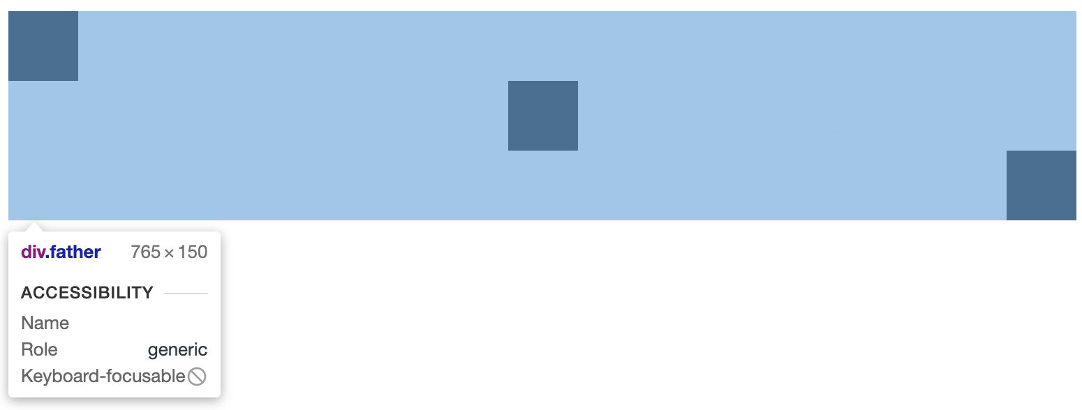
.father{
display: flex;
flex-direction: column;
}
.son{
height: 50px;
50px;
background: #000;
}
.son:nth-child(1){
align-self: flex-start;
}
.son:nth-child(2){
align-self: center;
}
.son:nth-child(3){
align-self: flex-end;
}
</style>
</head>
<body>
<div class="father">
<div class="son"></div>
<div class="son"></div>
<div class="son"></div>
</div>
</body>
</html>
flex属性是flex-grow, flex-shrink 和 flex-basis的简写,默认值为0 1 auto。后两个属性可选。