CSS基本结构
/*规范,<style>可以编写CSS代码,声明最好用分号结尾
语法:
     选择器{
          声明1;
          声明2;
          声明3;
     }
*/
h1{
    color: #ff76c2;
}
选择器
作用:选择页面上的某一个或者某一类元素
标签选择器
h1{
    color: #ff76c2;
}
类选择器
形式:.calss的名称{}
好处:可以多个标签归类,是同一个class,可以复用
<h1 class="kuang">首页标题</h1>
<h1 class="ag0">首页标题</h1>
<p class="kuang">这里是正文........</p>
.kuang{
    color: #db7ee2;
}
.ag0{
    color: #ff1d51;
}
ID选择器
形式:#id名称{}
与类不同,在一个 HTML 文档中,ID 选择器会使用一次,而且仅一次。
<h1 id="kuang">一级标题</h1>
<h2 id="kuang">二级标题</h2>
#kuang{
    color: #0cff00;
}
id选择器 > 类选择器 > 标签选择器
层次选择器
后代选择器:在某个元素的后面
body p{
    background: lawngreen;
}
子选择器:
body>p{
    background: dodgerblue;
}
相邻兄弟选择器:只有一个,向下相邻
.active+p {
    background: #db7ee2;
}
通用选择器:选择当前元素向下的所有兄弟元素
.active~p{
        background: #ffd3c2;
    }
结构伪类选择器
<h1>标题1</h1>
<p>p1</p>
<p>p2</p>
<p>p3</p>
<ul>
    <li>001</li>
    <li>002</li>
    <li>003</li>
</ul>
选择ul下的最后一个元素:
ul li:last-child{
    background: #0cff00;
}
选择父元素下p元素的第二个:
p:nth-child(2){
    background: #ff1d51;
}

属性选择器
*= 绝对等于
= 包含这个元素
^= 以这个开头
$= 以这个结尾
<p class="demo">
    <a href="https://www.baidu.com" class="link item first" id="first">001</a>
    <a href="" class="links item active" target="_blank" title="这是第二个">002</a>
    <a href="https://www.zhihu.com" class="links item">003</a>
    <a href="images/123.html" class="links item" id="second">004</a>
    <a href="images/a.pdf" class="link item firs">005</a>
    <a href="https://www.taobao.com" class="links item first">006</a>
    <a href="images/test.jpg" class="links item">007</a>
    <a href="images/1.word" class="links item">008</a>
</p>
选择id=first的元素:
a[id=first]{
    background: yellow;
}
选择以jpg为结尾的元素:
a[href$=jpg]{
            background: #ff1700;
        }
网页元素美化
字体样式
font-family:字体类型
font-size:字体大小
font-weight:字体粗细
oblique:斜体
文本样式
color:字体颜色
RGB: 0~F
RGBA: A: 0~1 多了一个不透明度
text-align: center; 对齐方式
text-indent: 80px; 文本缩进
background: yellow; 背景颜色
height: 500px; 文本块高度
line-height: 50px; 行高
text-decoration:underline 下划线
vertiacl-align:middle 文本图片水平对齐
超链接伪类
默认状态:
a{
    text-decoration: none;
    color: dodgerblue;
}
鼠标悬浮状态:
a:hover{
    color: orange;
    font:oblique 100 20px "楷体";
}
鼠标按住未释放状态:
a:active{
    color: gray;
}
列表样式
list-style:
none 去掉原点
circle 空心圆
decimal 数字
square 正方形
背景
div{
     800px;
    height: 500px;
    border: 1px solid red;
    background-image: url("../image/壁纸.jpg"); /*设置背景为图片*/
    /*默认是平铺的*/
}
background-repeat: repeat-x; 按照x方向平铺
background-repeat: no-repeat; 不平铺
渐变
body{
    background-color: #08AEEA;
    background-image: linear-gradient(0deg, #08AEEA 0%, #2AF598 100%);
}
盒子模型
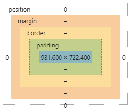
margin:外边距
border:边界
padding:内边距
内外边距
1、外边距妙用:margin: 0 auto;实现居中元素
要求:块元素div,且块元素有固定宽度
2、盒子计算方式:你这个元素到底有多大?
margin+border+padding+内容宽度
圆角边框
所画为半圆:border-radius: 100px 100px 0 0;
/*左上 右上 右下 左下,顺时针方向
画圆:   圆角=半径
*/
div{
     100px;
    height: 50px;
    border:10px solid red;
    border-radius: 100px 100px 0 0;
}
盒子阴影
box-shadow: 10px 10px 1000px #fffc00;
浮动
标准文档流
块级元素:独占一行
h1~h6 p div 列表……
行内元素:不独占一行,可以包含在块级元素中
span a img strong

display和浮动
/*
block 块元素
inline 行内元素
inline-block 是块元素,但可以内联,在一行*/
div{
     100px;
    height: 100px;
    border: 1px solid red;
    display: block;
}
span{
     200px;
    height: 100px;
    border: 1px solid red;
    display: inline;
}
这也是一种实现行内元素排列的方式,但我们很多情况都是用float
float: left;
父级边框塌陷问题
解决方案:
-
增加父级元素的高度
#father{ border:1px #000 solid; height: 800px; } -
增加一个空的div标签,清除浮动
<div class="clear"></div> .clear{ clear: both; margin: 0; padding: 0; } -
overflow:在父类元素中增加一个
overflow: hidden;#father{ 200px; height: 150px; overflow: scroll; /*在一定空间内形成一个有滚动条的块*/ } -
父类中加一个伪类:after
#father:after{
    content: '';
    display: block;
    clear: both
}
小结:
-
浮动元素后加div
简单,但代码中尽量避免空div
-
设置父类元素高度
简单,但元素如果有固定高度会受限
-
overflow
简单,但下拉的一些场景要避免使用
-
父类添加伪类:after(推荐)
写法稍微复杂,但没有副作用,推荐使用
对比:
-
display
方向不可控制
-
float
浮动起来会脱离标准文档流,所以要解决父类边框塌陷问题
定位
相对定位(relative)
<div class="box">
    <a class="a1" href="#">链接a</a>
    <a class="a2" href="#">链接b</a>
    <a class="a3" href="#">链接c</a>
    <a class="a4" href="#">链接d</a>
    <a class="a5" href="#">链接e</a>
</div>
.box{
     300px;
    height: 300px;
    padding: 10px;
    border: 2px solid red;
}
a{
     100px;
    height: 100px;
    text-decoration: none;
    background: #db7ee2;
    line-height: 100px;
    text-align: center;
    color: white;
    display: block;
}
a:hover{
    background: blue;
}
.a2,.a4{
    position: relative;
    left:200px;
    top:-100px;
}
.a5{
    position: relative;
    left:100px;
    top:-300px;
}
注意:在使用相对定位时,无论是否进行移动,元素仍然占据原来的空间。因此,移动元素会导致它覆盖其它框。
 }
}
绝对定位
绝对定位的元素的位置相对于最近的已定位祖先元素,如果元素没有已定位的祖先元素,那么它的位置相对于最初的包含块。
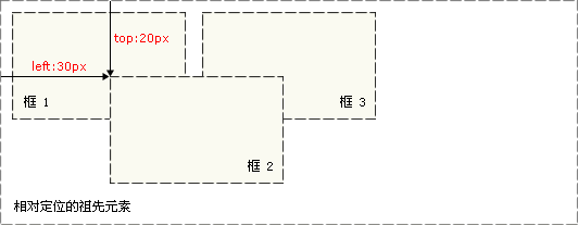
对于定位的主要问题是要记住每种定位的意义。所以,现在让我们复习一下学过的知识吧:相对定位是“相对于”元素在文档中的初始位置,而绝对定位是“相对于”最近的已定位祖先元素,如果不存在已定位的祖先元素,那么“相对于”最初的包含块。
z-index
z-index 属性指定一个元素的堆叠顺序。
拥有更高堆叠顺序的元素总是会处于堆叠顺序较低的元素的前面。
<h1>This is a heading</h1>
<img src="w3css.gif" width="100" height="140" />
<p>因为图像元素设置了 z-index 属性值为 -1, 所以它会显示在文字之后。</p>
img
{
	position:absolute;
	left:0px;
	top:0px;
	z-index:-1;
}

透明度
img
{
    opacity:1.0;
    filter:alpha(opacity=100); /* For IE8 and earlier */
}