图形
在WPF中使用绘图最简单的就是使用Shape类。Shape类继承自FrameworkElement,是一个专门用来绘图的类。Shape类中年派生的类有直线、矩形、多边形和圆形等。
System.Windows.Shapes.Shape类是一个抽象类,从该类又派生出多个不同的子类,如下图:

Shape类的通用属性
|
属性名称 |
描述 |
|
Fill |
绘制填充的画刷 |
|
Stroke |
绘制边框的画刷 |
|
StrokeThickness |
与设备无关的边框宽度 |
|
StrokeStartLineCap和StrokeEndLineCap |
PenLineCap枚举值,用于描述Stroke起始和结束位置的形状 |
|
StrokeDashArray StrokeDashOffset StrokeDashCap |
绘制虚线边框,控制虚线的尺寸频率,以及虚线的两端。 |
|
StrokeLineJoin和StrokeMiterLimit |
设置边框的形状和线段的连接处形状 |
|
Stretch |
确定如何填充形状 |
|
DefiningGeometry |
为形状定义一个几何图形,几何对象描述形状的坐标和尺寸,但不具有UIElement的特性,不支持鼠标键盘事件。 |
|
GeometryTransform |
形状的变换,改变绘图的坐标。可以拉伸 旋转 或者位移。 |
|
RenderedGeometry |
提供一个几何对象来描述最终的输出形状 |
如果图形不为Fill和Stroke提供一个Brush对象,图形将不显示。
Ellipse和Rectangle都具有尺寸自适应的能力,如果不为对象设置高度和宽度,图形的尺寸将被自动进行缩放。如果将这两个控件的高度和宽度设置一样则可以绘制出正方形和圆形。
Rectangle
使用RadiusX和RadiusY属性可以设置矩形的圆角。
<Window x:Class="WPFDemo.RectangleDemo"
        xmlns="http://schemas.microsoft.com/winfx/2006/xaml/presentation"
        xmlns:x="http://schemas.microsoft.com/winfx/2006/xaml"
        xmlns:d="http://schemas.microsoft.com/expression/blend/2008"
        xmlns:mc="http://schemas.openxmlformats.org/markup-compatibility/2006"
        xmlns:local="clr-namespace:WPFDemo"
        mc:Ignorable="d"
        Title="RectangleDemo" Height="400" Width="800">
    <Grid>
        <Grid.RowDefinitions>
            <RowDefinition Height="100" />
            <RowDefinition />
        </Grid.RowDefinitions>
        <Rectangle Grid.Row="0"  Margin="10"    Stroke="Black" StrokeThickness="2" Canvas.Left="10" Canvas.Top="10" />
        <Canvas  Grid.Row="1"  Background="Red">
            <!--绘制一个长100 高40的矩形 填充颜色为#FF169AE6-->
            <Rectangle  Width="100" Height="40" Fill="#FF169AE6" Canvas.Left="10" Canvas.Top="10">
            </Rectangle>
            <!--绘制一个长100 高40的矩形 填充颜色#FF169AE6 边框Black-->
            <Rectangle  Width="100" Height="40" Fill="#FF169AE6" Stroke="Black" StrokeThickness="2" Canvas.Left="10" Canvas.Top="60"/>
            <!--绘制一个长100 高40的矩形 无填充颜色 边框Black-->
            <Rectangle  Width="100" Height="40" Stroke="Black" StrokeThickness="2" Canvas.Left="10" Canvas.Top="110"/>
            <!--绘制一个长100 高40的圆角矩形 填充颜色为#FF169AE6-->
            <Rectangle  Width="100" Height="40" Fill="#FF169AE6" RadiusX="5" RadiusY="5" Canvas.Left="120" Canvas.Top="10">
            </Rectangle>
            <!--绘制一个长100 高40的圆角矩形 填充颜色#FF169AE6 边框Black-->
            <Rectangle  Width="100" Height="40" Fill="#FF169AE6" Stroke="Black" StrokeThickness="2" RadiusX="5" RadiusY="5" Canvas.Left="120" Canvas.Top="60"/>
            <!--绘制一个长100 高40的圆角矩形 无填充颜色 边框Black-->
            <Rectangle  Width="100" Height="40" Stroke="Black" StrokeThickness="2" RadiusX="5" RadiusY="5" Canvas.Left="120" Canvas.Top="110"/>
            <!--绘制一个长100 高40的圆 填充颜色为#FF169AE6-->
            <Rectangle  Width="40" Height="40" Fill="#FF169AE6" RadiusX="20" RadiusY="20" Canvas.Left="230" Canvas.Top="10">
            </Rectangle>
            <!--绘制一个长100 高40的圆 填充颜色#FF169AE6 边框Black-->
            <Rectangle  Width="40" Height="40" Fill="#FF169AE6" Stroke="Black" StrokeThickness="2" RadiusX="20" RadiusY="20" Canvas.Left="230" Canvas.Top="60"/>
            <!--绘制一个长100 高40的圆 无填充颜色 边框Black-->
            <Rectangle  Width="40" Height="40" Stroke="Black" StrokeThickness="2" RadiusX="20" RadiusY="20" Canvas.Left="230" Canvas.Top="110"/>
            <!--绘制一个长100 高40的椭圆 填充颜色为#FF169AE6-->
            <Rectangle  Width="100" Height="40" Fill="#FF169AE6" RadiusX="20" RadiusY="20" Canvas.Left="280" Canvas.Top="10">
            </Rectangle>
            <!--绘制一个长100 高40的椭圆 填充颜色#FF169AE6 边框Black-->
            <Rectangle  Width="100" Height="40" Fill="#FF169AE6" Stroke="Black" StrokeThickness="2" RadiusX="20" RadiusY="20" Canvas.Left="280" Canvas.Top="60"/>
            <!--绘制一个长100 高40的椭圆 无填充颜色 边框Black-->
            <Rectangle  Width="100" Height="40" Stroke="Black" StrokeThickness="2" RadiusX="20" RadiusY="20" Canvas.Left="280" Canvas.Top="110"/>
            <!--绘制一个长100 高40的椭圆 填充颜色为#FF169AE6-->
            <Rectangle  Width="40" Height="40" Fill="#FF169AE6"   Canvas.Left="390" Canvas.Top="10">
            </Rectangle>
            <!--绘制一个长100 高40的椭圆 填充颜色#FF169AE6 边框Black-->
            <Rectangle  Width="40" Height="40" Fill="#FF169AE6" Stroke="Black" StrokeThickness="2"   Canvas.Left="390" Canvas.Top="60"/>
            <!--绘制一个长100 高40的椭圆 无填充颜色 边框Black-->
            <Rectangle  Width="40" Height="40" Stroke="Black" StrokeThickness="2"  Canvas.Left="390" Canvas.Top="110"/>
        </Canvas>
    </Grid>
</Window>

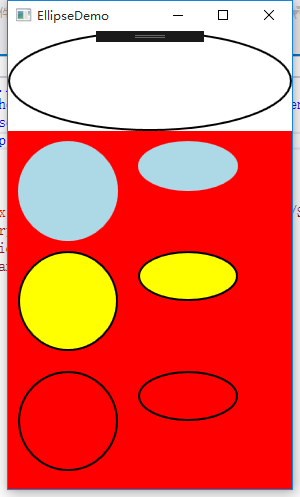
Ellipse
<Window x:Class="WPFDemo.EllipseDemo"
        xmlns="http://schemas.microsoft.com/winfx/2006/xaml/presentation"
        xmlns:x="http://schemas.microsoft.com/winfx/2006/xaml"
        xmlns:d="http://schemas.microsoft.com/expression/blend/2008"
        xmlns:mc="http://schemas.openxmlformats.org/markup-compatibility/2006"
        xmlns:local="clr-namespace:WPFDemo"
        mc:Ignorable="d"
        Title="EllipseDemo" Height="600" Width="400">
    <Grid>
        <Grid.RowDefinitions>
            <RowDefinition Height="100"/>
            <RowDefinition/>
        </Grid.RowDefinitions>
        <Ellipse Grid.Row="0"  Stroke="Black" StrokeThickness="2" ></Ellipse>
        <Canvas Grid.Row="1"  Background="Red">
            <!--绘制圆形 填充LightBlue-->
            <Ellipse Width="100" Height="100" Fill="LightBlue" Canvas.Left="10" Canvas.Top="10"></Ellipse>
            <!--绘制圆形 填充Yellow 边框Black-->
            <Ellipse Width="100" Height="100" Fill="Yellow" Stroke="Black" StrokeThickness="2" Canvas.Top="120" Canvas.Left="10"></Ellipse>
            <!--绘制圆形 无填充 边框black-->
            <Ellipse Width="100" Height="100" Stroke="Black" StrokeThickness="2" Canvas.Top="240" Canvas.Left="10"></Ellipse>
            <!--绘制圆形 填充LightBlue-->
            <Ellipse Width="100" Height="50" Fill="LightBlue" Canvas.Left="130" Canvas.Top="10"></Ellipse>
            <!--绘制圆形 填充Yellow 边框Black-->
            <Ellipse Width="100" Height="50" Fill="Yellow" Stroke="Black" StrokeThickness="2" Canvas.Top="120" Canvas.Left="130"></Ellipse>
            <!--绘制圆形 无填充 边框black-->
            <Ellipse Width="100" Height="50" Stroke="Black" StrokeThickness="2" Canvas.Top="240" Canvas.Left="130"></Ellipse>
        </Canvas>
    </Grid>
</Window>
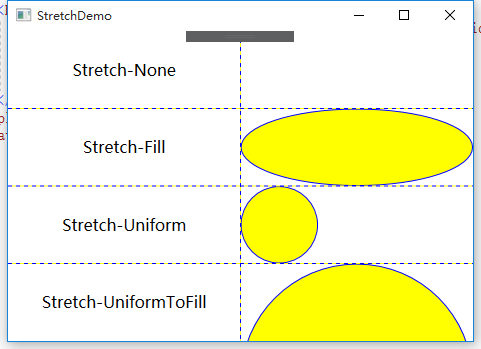
Stretch属性
Ellipse和Rectangle尺寸可以自适应与可用的空间。这种行为依赖于Stretch属性值。Stretch枚举类型的值:
1、 None:保持器原始尺寸。
2、 Fill:调整内容的大小以填充目标尺寸。不保留横纵比。
3、 Uniform:在保留内容原有纵横比的同时调整内容的大小,以适合目标尺寸。
4、 UniformToFill:在保留内容原有纵横比的同时调整内容的大小,以填充目标尺寸。如果目标矩形的纵横比不同于源矩形的纵横比,则对源内容进行剪裁以适合目标尺寸。
<Window x:Class="WPFDemo.StretchDemo"
        xmlns="http://schemas.microsoft.com/winfx/2006/xaml/presentation"
        xmlns:x="http://schemas.microsoft.com/winfx/2006/xaml"
        xmlns:d="http://schemas.microsoft.com/expression/blend/2008"
        xmlns:mc="http://schemas.openxmlformats.org/markup-compatibility/2006"
        xmlns:local="clr-namespace:WPFDemo"
        mc:Ignorable="d"
        Title="StretchDemo" Height="300" Width="300">
    <Grid ShowGridLines="True">
        <Grid.RowDefinitions>
            <RowDefinition/>
            <RowDefinition/>
            <RowDefinition/>
            <RowDefinition/>
        </Grid.RowDefinitions>
        <Grid.ColumnDefinitions>
            <ColumnDefinition/>
            <ColumnDefinition/>
        </Grid.ColumnDefinitions>
        <TextBlock FontSize="16" HorizontalAlignment="Center" VerticalAlignment="Center" Text="Stretch-None" Grid.Row="0" Grid.Column="0"></TextBlock>
        <TextBlock FontSize="16" HorizontalAlignment="Center" VerticalAlignment="Center" Text="Stretch-Fill" Grid.Row="1" Grid.Column="0"></TextBlock>
        <TextBlock FontSize="16" HorizontalAlignment="Center" VerticalAlignment="Center" Text="Stretch-Uniform" Grid.Row="2" Grid.Column="0"></TextBlock>
        <TextBlock FontSize="16" HorizontalAlignment="Center" VerticalAlignment="Center" Text="Stretch-UniformToFill" Grid.Row="3" Grid.Column="0"></TextBlock>
        <!--为Ellipse设置Stretch属性-->
        <Ellipse Grid.Row="0" Grid.Column="1" Fill="Yellow" Stroke="Blue" Stretch="None" />
        <Ellipse Grid.Row="1" Grid.Column="1" Fill="Yellow" Stroke="Blue" Stretch="fill"/>
        <Ellipse Grid.Row="2" Grid.Column="1" Fill="Yellow" Stroke="Blue" Stretch="Uniform"/>
        <Ellipse Grid.Row="3" Grid.Column="1" Fill="Yellow" Stroke="Blue" Stretch="UniformToFill"/>
    </Grid>
</Window>
Line
<Window x:Class="WPFDemo.LineDemo"
        xmlns="http://schemas.microsoft.com/winfx/2006/xaml/presentation"
        xmlns:x="http://schemas.microsoft.com/winfx/2006/xaml"
        xmlns:d="http://schemas.microsoft.com/expression/blend/2008"
        xmlns:mc="http://schemas.openxmlformats.org/markup-compatibility/2006"
        xmlns:local="clr-namespace:WPFDemo"
        mc:Ignorable="d"
        Title="LineDemo" Height="300" Width="300">
    <Canvas>
        <!--使用Line绘图工具写一个“田”-->
        <Line  Stroke="Black" StrokeThickness="2" X1="10" Y1="10" X2="10" Y2="100"></Line>
        <Line  Stroke="Black" StrokeThickness="2" X1="10" Y1="10" X2="100" Y2="10"></Line>
        <Line  Stroke="Black" StrokeThickness="2" X1="100" Y1="10" X2="100" Y2="100"></Line>
        <Line  Stroke="Black" StrokeThickness="2" X1="10" Y1="55" X2="100" Y2="55"></Line>
        <Line  Stroke="Black" StrokeThickness="2" X1="55" Y1="10" X2="55" Y2="100"></Line>
        <Line  Stroke="Black" StrokeThickness="2" X1="10" Y1="100" X2="100" Y2="100"></Line>
        <TextBlock FontSize="18" Text="使用Line绘图工具写一个"田"" Canvas.Left="10" Canvas.Top="120"></TextBlock>
    </Canvas>
</Window>

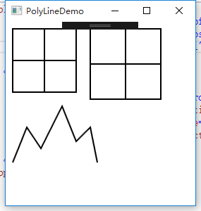
Polyline
<Window x:Class="WPFDemo.PolyLineDemo"
        xmlns="http://schemas.microsoft.com/winfx/2006/xaml/presentation"
        xmlns:x="http://schemas.microsoft.com/winfx/2006/xaml"
        xmlns:d="http://schemas.microsoft.com/expression/blend/2008"
        xmlns:mc="http://schemas.openxmlformats.org/markup-compatibility/2006"
        xmlns:local="clr-namespace:WPFDemo"
        mc:Ignorable="d"
        Title="PolyLineDemo" Height="300" Width="300">
    <Canvas Name="canvas1">
        <!--使用Polyline写“田”-->
        <Polyline Stroke="Black" StrokeThickness="2" Points="10 10,100 10,100 100,10 100,10,10,55 10,55 100,10 100,10 55,10 55,100 55">
        </Polyline>
        <!--使用Polyline绘制折线-->
        <Polyline Stroke="Black" StrokeThickness="2"
                  Points="10 200,30 150,50 180,80 120,100 170,120 150,130 200"></Polyline>
    </Canvas>
</Window>
使用后台代码创建“田”字形
 public void CreateTian()
        {
            Polyline myPolyline = new Polyline();
            myPolyline.Stroke = Brushes.Black;
            myPolyline.StrokeThickness = 2;
            //指定坐标
            PointCollection ps = new PointCollection();
            ps.Add(new Point(120, 10));
            ps.Add(new Point(220, 10));
            ps.Add(new Point(220, 110));
            ps.Add(new Point(120, 110));
            ps.Add(new Point(120, 10));
            ps.Add(new Point(170, 10));
            ps.Add(new Point(170, 110));
            ps.Add(new Point(120, 110));
            ps.Add(new Point(120, 60));
            ps.Add(new Point(220, 60));
            myPolyline.Points = ps;
            canvas1.Children.Add(myPolyline);
        }
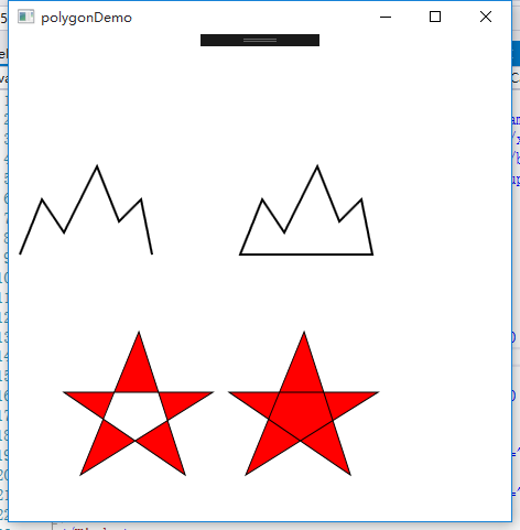
Polygon
<Window x:Class="WPFDemo.polygonDemo"
        xmlns="http://schemas.microsoft.com/winfx/2006/xaml/presentation"
        xmlns:x="http://schemas.microsoft.com/winfx/2006/xaml"
        xmlns:d="http://schemas.microsoft.com/expression/blend/2008"
        xmlns:mc="http://schemas.openxmlformats.org/markup-compatibility/2006"
        xmlns:local="clr-namespace:WPFDemo"
        mc:Ignorable="d"
        Title="polygonDemo" Height="500" Width="600">
    <Canvas>
       <!--使用Polyline绘制折线-->
        <Polyline Stroke="Black" StrokeThickness="2"
                  Points="10 200,30 150,50 180,80 120,100 170,120 150,130 200" ></Polyline>
        <!--使用Polygon绘制折线 会自动封闭-->
        <Polygon Stroke="Black" StrokeThickness="2"
                  Points="10 200,30 150,50 180,80 120,100 170,120 150,130 200" Canvas.Left="200"></Polygon>
       <!--polygon 填充方式EvenOdd -->
        <Polygon Stroke="Black" StrokeThickness="1" Fill="Red" FillRule="EvenOdd" Points="15,200 68,70 110,200 0,125 135,125"  Canvas.Left="50" Canvas.Top="200"/>
        <!--polygon 填充方式Nonzero -->
        <Polygon Stroke="Black" StrokeThickness="1" Fill="Red"  FillRule="Nonzero" Points="15,200 68,70 110,200 0,125 135,125" Canvas.Left="200" Canvas.Top="200" />
    </Canvas>
</Window>
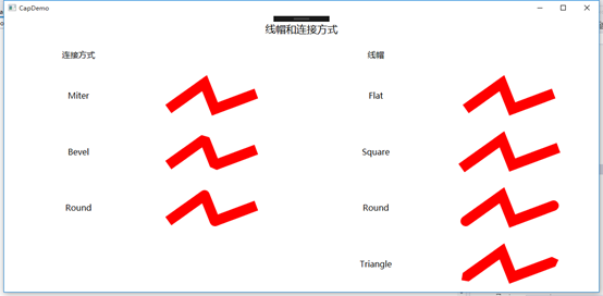
线帽和连接点
<Window x:Class="WPFDemo.CapDemo"
        xmlns="http://schemas.microsoft.com/winfx/2006/xaml/presentation"
        xmlns:x="http://schemas.microsoft.com/winfx/2006/xaml"
        xmlns:d="http://schemas.microsoft.com/expression/blend/2008"
        xmlns:mc="http://schemas.openxmlformats.org/markup-compatibility/2006"
        xmlns:local="clr-namespace:WPFDemo"
        mc:Ignorable="d"
        Title="CapDemo" Height="300" Width="300">
    <Grid >
        <Grid.RowDefinitions>
            <RowDefinition Height="50"/>
            <RowDefinition Height="50"/>
            <RowDefinition />
            <RowDefinition />
            <RowDefinition />
            <RowDefinition />
        </Grid.RowDefinitions>
        <Grid.ColumnDefinitions>
            <ColumnDefinition />
            <ColumnDefinition />
            <ColumnDefinition />
            <ColumnDefinition />
        </Grid.ColumnDefinitions>
        <TextBlock Grid.Row="0" Grid.Column="0" Grid.ColumnSpan="4" HorizontalAlignment="Center" VerticalAlignment="Center" Text="线帽和连接方式" FontSize="20" />
        <TextBlock Grid.Row="1" Grid.Column="0" HorizontalAlignment="Center" VerticalAlignment="Center" Text="连接方式" FontSize="16" />
        <TextBlock Grid.Row="1" Grid.Column="2" HorizontalAlignment="Center" VerticalAlignment="Center" Text="线帽" FontSize="16" />
        <!--连接方式-->
        <TextBlock Grid.Row="2" Grid.Column="0" HorizontalAlignment="Center" VerticalAlignment="Center" Text="Miter" FontSize="16" />
        <Polyline Grid.Row="2" Grid.Column="1" Points="30 80,100 30,120 80,200 50" Stroke="Red" StrokeThickness="20" StrokeLineJoin="Miter" />
        <TextBlock Grid.Row="3" Grid.Column="0" HorizontalAlignment="Center" VerticalAlignment="Center" Text="Bevel" FontSize="16" />
        <Polyline Grid.Row="3" Grid.Column="1" Points="30 80,100 30,120 80,200 50" Stroke="Red" StrokeThickness="20" StrokeLineJoin="Bevel" />
        <TextBlock Grid.Row="4" Grid.Column="0" HorizontalAlignment="Center" VerticalAlignment="Center" Text="Round" FontSize="16" />
        <Polyline Grid.Row="4" Grid.Column="1" Points="30 80,100 30,120 80,200 50" Stroke="Red" StrokeThickness="20" StrokeLineJoin="Round" />
        <!--线帽-->
        <TextBlock Grid.Row="2" Grid.Column="2" HorizontalAlignment="Center" VerticalAlignment="Center" Text="Flat" FontSize="16" />
        <Polyline Grid.Row="2" Grid.Column="3" Points="30 80,100 30,120 80,200 50" Stroke="Red" StrokeThickness="20" StrokeStartLineCap="Flat" StrokeEndLineCap="Flat"/>
        <TextBlock Grid.Row="3" Grid.Column="2" HorizontalAlignment="Center" VerticalAlignment="Center" Text="Square" FontSize="16" />
        <Polyline Grid.Row="3" Grid.Column="3" Points="30 80,100 30,120 80,200 50" Stroke="Red" StrokeThickness="20"  StrokeStartLineCap="Square" StrokeEndLineCap="Square"/>
        <TextBlock Grid.Row="4" Grid.Column="2" HorizontalAlignment="Center" VerticalAlignment="Center" Text="Round" FontSize="16" />
        <Polyline Grid.Row="4" Grid.Column="3" Points="30 80,100 30,120 80,200 50" Stroke="Red" StrokeThickness="20"  StrokeStartLineCap="Round"  StrokeEndLineCap="Round"/>
        <TextBlock Grid.Row="5" Grid.Column="2" HorizontalAlignment="Center" VerticalAlignment="Center" Text="Triangle" FontSize="16" />
        <Polyline Grid.Row="5" Grid.Column="3" Points="30 80,100 30,120 80,200 50" Stroke="Red" StrokeThickness="20"  StrokeStartLineCap="Triangle" StrokeEndLineCap="Triangle" />
    </Grid>
</Window>
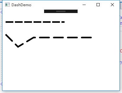
绘制虚线
<Window x:Class="WPFDemo.DashDemo"
        xmlns="http://schemas.microsoft.com/winfx/2006/xaml/presentation"
        xmlns:x="http://schemas.microsoft.com/winfx/2006/xaml"
        xmlns:d="http://schemas.microsoft.com/expression/blend/2008"
        xmlns:mc="http://schemas.openxmlformats.org/markup-compatibility/2006"
        xmlns:local="clr-namespace:WPFDemo"
        mc:Ignorable="d"
        Title="DashDemo" Height="300" Width="300">
    <Canvas>
        <Line X1="10" Y1="10" X2="200" Y2="10" Stroke="Black" StrokeThickness="5" StrokeDashArray="5 1" Canvas.Top="30" />
        <Polyline Points="10 10,50 50,100 20,300 20" StrokeDashArray="6 3" StrokeDashCap="Round" Stroke="Black" StrokeThickness="5" Canvas.Top="70"></Polyline>
    </Canvas>
</Window>
画刷
在上面使用的SolidColorBrush填充图形内部区域,画刷主要的作用是填充区域,比如填充图形或控件的前景色、背景色、边框等。在WPF中,派生System.Windows.Media.Brush的类类除了SolidColorBrush画刷之外,还提供了下面这些画刷:
LinearCradientBrush:线性渐变画刷。
RadialGradientBrush:径向渐变画刷。
ImageBrush:图像画刷。
DrawingBrush:图形画刷。
VisualBrush:可视化对象画刷。
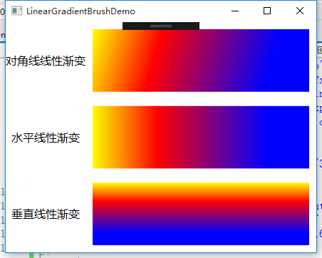
LinearGradientBrush线性渐变画刷
线性渐变使用直线方向从一种颜色向另一种颜色进行渐变填充,直线的起始点和终点由StartPoint和EndPoint属性指定。StartPoint默认为(0,0),EndPoint(1,1) 表示相对于图形的左上角和右下角。在直线之间,可以使用GradientStops渐变停止点集合定义多个渐变停止点GradientStop。
<Window x:Class="WPFDemo.LinearGradientBrushDemo"
        xmlns="http://schemas.microsoft.com/winfx/2006/xaml/presentation"
        xmlns:x="http://schemas.microsoft.com/winfx/2006/xaml"
        xmlns:d="http://schemas.microsoft.com/expression/blend/2008"
        xmlns:mc="http://schemas.openxmlformats.org/markup-compatibility/2006"
        xmlns:local="clr-namespace:WPFDemo"
        mc:Ignorable="d"
        Title="LinearGradientBrushDemo" Height="300" Width="300">
    <Window.Resources>
        <Style TargetType="{x:Type TextBlock}">
            <Setter Property="HorizontalAlignment" Value="Center" />
            <Setter Property="VerticalAlignment" Value="Center" />
            <Setter Property="FontSize" Value="16"/>
        </Style>
    </Window.Resources>
    <Grid>
        <Grid.RowDefinitions>
            <RowDefinition/>
            <RowDefinition/>
            <RowDefinition/>
        </Grid.RowDefinitions>
        <Grid.ColumnDefinitions>
            <ColumnDefinition Width="Auto"/>
            <ColumnDefinition />
        </Grid.ColumnDefinitions>
        <TextBlock Grid.Row="0" Grid.Column="0" Text="对角线线性渐变"></TextBlock>
        <!--使用对角线线性渐变填充-->
        <Rectangle Grid.Row="0" Grid.Column="1" Margin="10">
            <Rectangle.Fill>
                <!--指定渐变起始和终止坐标-->
                <LinearGradientBrush StartPoint="0,0" EndPoint="1,1" >
                    <!--渐变停止位增加渐变颜色-->
                    <GradientStop  Color="Yellow" Offset="0.0"/>
                    <GradientStop  Color="Red" Offset="0.3"/>
                    <GradientStop  Color="Blue" Offset="0.8"/>
                </LinearGradientBrush>
            </Rectangle.Fill>
        </Rectangle>
        <TextBlock Grid.Row="1" Grid.Column="0" Text="水平线性渐变"></TextBlock>
        <!--使用水平线线性渐变填充-->
        <Rectangle Grid.Row="1" Grid.Column="1" Margin="10">
            <Rectangle.Fill>
                <!--指定渐变起始和终止坐标-->
                <LinearGradientBrush StartPoint="0,0" EndPoint="1,0" >
                    <!--渐变停止位增加渐变颜色-->
                    <GradientStop  Color="Yellow" Offset="0.0"/>
                    <GradientStop  Color="Red" Offset="0.3"/>
                    <GradientStop  Color="Blue" Offset="0.8"/>
                </LinearGradientBrush>
            </Rectangle.Fill>
        </Rectangle>
        <TextBlock Grid.Row="2" Grid.Column="0" Text="垂直线性渐变"></TextBlock>
        <!--使用垂直线性渐变填充-->
        <Rectangle Grid.Row="2" Grid.Column="1" Margin="10">
            <Rectangle.Fill>
                <!--指定渐变起始和终止坐标-->
                <LinearGradientBrush StartPoint="0,0" EndPoint="0,1" >
                    <!--渐变停止位增加渐变颜色-->
                    <GradientStop  Color="Yellow" Offset="0.0"/>
                    <GradientStop  Color="Red" Offset="0.3"/>
                    <GradientStop  Color="Blue" Offset="0.8"/>
                </LinearGradientBrush>
            </Rectangle.Fill>
        </Rectangle>
    </Grid>
</Window>
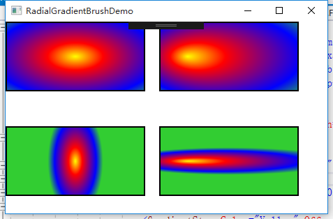
RadialGradientBrush:径向渐变画刷
径向渐变和线性渐变类似,径向渐变有一个圆及一个焦点用于定义渐变行为。该圆定义渐变的终点。焦点定义渐变的中心。
Gradientorigin用于指定渐变焦点位置;第一个颜色的起始点,默认为圆形位置。
Center用于指定圆形渐变的中心位置。
RadiusX和RadiusY分别用于指定渐变填充的半径。
<Window x:Class="WPFDemo.RadialGradientBrushDemo"
        xmlns="http://schemas.microsoft.com/winfx/2006/xaml/presentation"
        xmlns:x="http://schemas.microsoft.com/winfx/2006/xaml"
        xmlns:d="http://schemas.microsoft.com/expression/blend/2008"
        xmlns:mc="http://schemas.openxmlformats.org/markup-compatibility/2006"
        xmlns:local="clr-namespace:WPFDemo"
        mc:Ignorable="d"
        Title="RadialGradientBrushDemo" Height="300" Width="300">
    <Canvas>
        <!--设置焦点为中心点-->
        <Rectangle Width="200" Height="100" Stroke="Black" StrokeThickness="2">
            <Rectangle.Fill>
                <RadialGradientBrush GradientOrigin="0.5,0.5" Center="0.5,0.5" RadiusX="0.8" RadiusY="0.8">
                    <RadialGradientBrush.GradientStops>
                        <GradientStop Color="Yellow" Offset="0" />
                        <GradientStop Color="Red" Offset="0.25" />
                        <GradientStop Color="Blue" Offset="0.75" />
                        <GradientStop Color="LimeGreen" Offset="1" />
                    </RadialGradientBrush.GradientStops>
                </RadialGradientBrush>
            </Rectangle.Fill>
        </Rectangle>

        <!--设置焦点为左上角-->
        <Rectangle Width="200" Height="100" Stroke="Black" StrokeThickness="2" Canvas.Left="220">
            <Rectangle.Fill>
                <RadialGradientBrush GradientOrigin="0.2,0.5" Center="0.5,0.5" RadiusX="0.8" RadiusY="0.8">
                    <RadialGradientBrush.GradientStops>
                        <GradientStop Color="Yellow" Offset="0" />
                        <GradientStop Color="Red" Offset="0.25" />
                        <GradientStop Color="Blue" Offset="0.75" />
                        <GradientStop Color="LimeGreen" Offset="1" />
                    </RadialGradientBrush.GradientStops>
                </RadialGradientBrush>
            </Rectangle.Fill>
        </Rectangle>
        <!--水平椭圆 设置焦点为中心点-->
        <Rectangle Width="200" Height="100" Stroke="Black" StrokeThickness="2" Canvas.Top="150">
            <Rectangle.Fill>
                <RadialGradientBrush GradientOrigin="0.5,0.5" Center="0.5,0.5" RadiusX="0.2" RadiusY="0.8">
                    <RadialGradientBrush.GradientStops>
                        <GradientStop Color="Yellow" Offset="0" />
                        <GradientStop Color="Red" Offset="0.25" />
                        <GradientStop Color="Blue" Offset="0.75" />
                        <GradientStop Color="LimeGreen" Offset="1" />
                    </RadialGradientBrush.GradientStops>
                </RadialGradientBrush>
            </Rectangle.Fill>
        </Rectangle>

       <!--垂直椭圆 设置焦点为左上角-->
        <Rectangle Width="200" Height="100" Stroke="Black" StrokeThickness="2" Canvas.Left="220" Canvas.Top="150">
            <Rectangle.Fill>
                <RadialGradientBrush GradientOrigin="0.2,0.5" Center="0.5,0.5" RadiusX="0.8" RadiusY="0.2">
                    <RadialGradientBrush.GradientStops>
                        <GradientStop Color="Yellow" Offset="0" />
                        <GradientStop Color="Red" Offset="0.25" />
                        <GradientStop Color="Blue" Offset="0.75" />
                        <GradientStop Color="LimeGreen" Offset="1" />
                    </RadialGradientBrush.GradientStops>
                </RadialGradientBrush>
            </Rectangle.Fill>
        </Rectangle>
    </Canvas>
</Window>
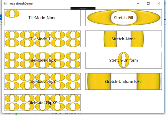
ImageBrush图像画刷
ImageBrush允许开发人员使用图像来填充区域,支持大多数常用的图像文件,包括:BMP、PNG、GIF、JPEG文件。ImmageBrush具有一个ImageSource的属性,在XAML中,可以直接为该属性直接赋值一个图片文件路径。
<Window x:Class="WPFDemo.ImageBrushDemo"
        xmlns="http://schemas.microsoft.com/winfx/2006/xaml/presentation"
        xmlns:x="http://schemas.microsoft.com/winfx/2006/xaml"
        xmlns:d="http://schemas.microsoft.com/expression/blend/2008"
        xmlns:mc="http://schemas.openxmlformats.org/markup-compatibility/2006"
        xmlns:local="clr-namespace:WPFDemo"
        mc:Ignorable="d"
        Title="ImageBrushDemo" Height="500" Width="720">
    <Window.Resources>
        <Style TargetType="{x:Type Button}">
            <Setter Property="FontSize" Value="16" />
            <Setter Property="Margin" Value="10" />
            <Setter Property="Padding" Value="10" />
        </Style>
    </Window.Resources>
    <Grid>
        <!--使用ImageBrush设置图片的背景图-->
        <Grid>
            <Grid.RowDefinitions>
                <RowDefinition />
                <RowDefinition />
                <RowDefinition />
                <RowDefinition />
                <RowDefinition />
            </Grid.RowDefinitions>
            <Grid.ColumnDefinitions>
                <ColumnDefinition/>
                <ColumnDefinition/>
            </Grid.ColumnDefinitions>
             <!--Viewport属性和TileMode属性-->
            <Button  Grid.Row="0"  Content="TileMode-None" >
                <Button.Background>
                    <!--使用Viewport和TileMode控制重复背景图片-->
                    <ImageBrush ImageSource="Images/0.jpg" Viewport="0,0,0.2,0.5" TileMode="None"/>
                </Button.Background>
            </Button>
            <Button Grid.Row="1"  Content="TileMode-Tile" >
                <Button.Background>
                    <!--使用Viewport和TileMode控制重复背景图片-->
                    <ImageBrush ImageSource="Images/0.jpg" Viewport="0,0,0.2,0.5" TileMode="Tile"/>
                </Button.Background>
            </Button>
            <Button Grid.Row="2"  Content="TileMode-FlipX" >
                <Button.Background>
                    <!--使用Viewport和TileMode控制重复背景图片-->
                    <ImageBrush ImageSource="Images/0.jpg" Viewport="0,0,0.2,0.5" TileMode="FlipX"/>
                </Button.Background>
            </Button>
            <Button Grid.Row="3"  Content="TileMode-FlipY" >
                <Button.Background>
                    <!--使用Viewport和TileMode控制重复背景图片-->
                    <ImageBrush ImageSource="Images/0.jpg" Viewport="0,0,0.2,0.5" TileMode="FlipY"/>
                </Button.Background>
            </Button>
            <Button Grid.Row="4"  Content="TileMode-FlipXY" >
                <Button.Background>
                    <!--使用Viewport和TileMode控制重复背景图片-->
                    <ImageBrush ImageSource="Images/0.jpg" Viewport="0,0,0.2,0.5" TileMode="FlipXY"/>
                </Button.Background>
            </Button>

            <!--Stretch属性-->
            <Button  Grid.Row="0" Grid.Column="1"  Content="Stretch-Fill" >
                <Button.Background>
                    <!--使用Stretch属性Fill-->
                    <ImageBrush ImageSource="Images/0.jpg" Stretch="Fill"/>
                </Button.Background>
            </Button>
            <Button Grid.Row="1" Grid.Column="1"   Content="Stretch-None" >
                <Button.Background>
                    <!--使用Stretch属性None-->
                    <ImageBrush ImageSource="Images/0.jpg" Stretch="None"/>
                </Button.Background>
            </Button>
            <Button  Grid.Row="2" Grid.Column="1"   Content="Stretch-Uniform" >
                <Button.Background>
                    <!--使用Stretch属性Uniform-->
                    <ImageBrush ImageSource="Images/0.jpg" Stretch="Uniform"/>
                </Button.Background>
            </Button>
            <Button Grid.Row="3" Grid.Column="1"   Content="Stretch-UniformToFill" >
                <Button.Background>
                    <!--使用Stretch属性UniformToFill-->
                    <ImageBrush ImageSource="Images/0.jpg" Stretch="UniformToFill"/>
                </Button.Background>
            </Button>
        </Grid>
    </Grid>
</Window>
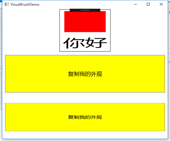
VisualBrush可视化画刷
<Window x:Class="WPFDemo.VisualBrushDemo"
        xmlns="http://schemas.microsoft.com/winfx/2006/xaml/presentation"
        xmlns:x="http://schemas.microsoft.com/winfx/2006/xaml"
        xmlns:d="http://schemas.microsoft.com/expression/blend/2008"
        xmlns:mc="http://schemas.openxmlformats.org/markup-compatibility/2006"
       xmlns:local="clr-namespace:WPFDemo"
        mc:Ignorable="d"
        Title="VisualBrushDemo" Height="500" Width="600">
    <Grid>
        <Grid.RowDefinitions>
            <RowDefinition/>
            <RowDefinition />
            <RowDefinition />
        </Grid.RowDefinitions>

        <!--使用VisualBrush填充矩形-->
        <Rectangle Grid.Row="0" Stroke="Black" Height="150" Width="180">
            <Rectangle.Fill>
                <VisualBrush>
                    <VisualBrush.Visual>
                        <StackPanel Background="White">
                            <Rectangle Width="25" Height="25" Fill="Red" Margin="2" />
                            <TextBlock FontSize="10pt" Margin="2">你好
                            </TextBlock>
                        </StackPanel>
                    </VisualBrush.Visual>
                </VisualBrush>
            </Rectangle.Fill>
        </Rectangle>
        <!--使用VisualBrush复制按钮外观-->
        <Button Padding="5" Margin="10" Name="btn1" FontSize="20" Content="复制我的外观" Grid.Row="1" Background="Yellow"/>
        <Rectangle Grid.Row="2" Margin="10" Height="100">
            <Rectangle.Fill>
                <!--使用VisualBrush复制btn1的外观-->
                <VisualBrush Visual="{Binding ElementName=btn1}" />
            </Rectangle.Fill>
        </Rectangle>
    </Grid>
</Window>
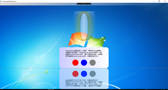
OpacityMask不透明蒙版
<Window x:Class="WPFDemo.OpacityMaskDemo"
        xmlns="http://schemas.microsoft.com/winfx/2006/xaml/presentation"
        xmlns:x="http://schemas.microsoft.com/winfx/2006/xaml"
        xmlns:d="http://schemas.microsoft.com/expression/blend/2008"
        xmlns:mc="http://schemas.openxmlformats.org/markup-compatibility/2006"
        xmlns:local="clr-namespace:WPFDemo"
        mc:Ignorable="d"
        Title="OpacityMaskDemo"
        WindowState="Maximized"
        Height="300" Width="300">
    <Window.Background>
        <ImageBrush ImageSource="Images/back.png"></ImageBrush>
    </Window.Background>
    <Grid>
        <Grid.RowDefinitions>
            <RowDefinition Height="Auto"/>
            <RowDefinition/>
            <RowDefinition/>
        </Grid.RowDefinitions>
        <!--按钮蒙版-->
        <Button FontSize="14" FontWeight="Bold" Content="局部透明效果的按钮">
            <Button.OpacityMask>
                <LinearGradientBrush StartPoint="0,0" EndPoint="1,0">
                    <GradientStop Offset="0" Color="Red"></GradientStop>
                    <GradientStop Offset="1" Color="Transparent"></GradientStop>
                </LinearGradientBrush>
            </Button.OpacityMask>
        </Button>
        <!--图像蒙版效果-->
        <Image Source="Images/0.jpg" Grid.Row="1" Stretch="None">
            <Image.OpacityMask>
                <LinearGradientBrush StartPoint="0,0" EndPoint="1,0">
                    <GradientStop Offset="0" Color="Transparent"></GradientStop>
                    <GradientStop Offset="0.5" Color="#95EEEEFF"></GradientStop>
                    <GradientStop Offset="1" Color="#10EFEFEF"></GradientStop>
                </LinearGradientBrush>
            </Image.OpacityMask>
        </Image>
        <StackPanel Grid.Row="2">
            <Border  Name="ReflectedVisual" Width="400" CornerRadius="20,20,20,20" >
                <Border.Background>
                    <LinearGradientBrush StartPoint="0,0.5" EndPoint="1,0.5">
                        <GradientStop Offset="0.0" Color="#CCCCFF" />
                        <GradientStop Offset="1.0" Color="White" />
                    </LinearGradientBrush>
                </Border.Background>
                <StackPanel Margin="10">
                    <TextBlock TextWrapping="Wrap" Width="300" Margin="10">
                    OpacityMask属性接收一个画刷,
                    画刷的Alpha通道决定哪部分进行透明,
                    比如当为OpacityMask使用一个透明度的SolidColorBrush时,
                    整个元素将会消失,如果使用不透明的SolidColorBrush时,元素将完全可见。
                    </TextBlock>
                    <!--在文本下面放置3个椭圆形-->
                    <StackPanel Orientation="Horizontal" HorizontalAlignment="Center">
                        <Ellipse Margin="10" Height="50" Width="50" Fill="Red" />
                        <Ellipse Margin="10" Height="50" Width="50" Fill="Blue" />
                        <Ellipse Margin="10" Height="50" Width="50" Fill="Gray" />
                    </StackPanel>
                </StackPanel>
            </Border>
            <Rectangle Height="1" Fill="Gray" HorizontalAlignment="Stretch" />
            <!--反射效果的矩形-->
            <Rectangle Height="{Binding Path=ActualHeight,ElementName=ReflectedVisual}"
                       Width="{Binding Path=ActualWidht,ElementName=ReflectedVisual}">
                <Rectangle.Fill>
                    <!---创建反射-->
                    <VisualBrush Opacity="0.75" Stretch="None" Visual="{Binding ElementName=ReflectedVisual}">
                        <VisualBrush.RelativeTransform>
                            <!--调整反射图形的位置和大小-->
                            <TransformGroup>
                                <ScaleTransform ScaleX="1" ScaleY="-1" />
                                <TranslateTransform Y="1"/>
                            </TransformGroup>
                        </VisualBrush.RelativeTransform>
                    </VisualBrush>
                </Rectangle.Fill>
                <Rectangle.OpacityMask>
                    <LinearGradientBrush StartPoint="0.5,0" EndPoint="0.5,1">
                        <GradientStop Color="#FF000000" Offset="0.0"/>
                        <GradientStop Color="#FF000000" Offset="0.5"/>
                        <GradientStop Color="#FF000000" Offset="0.75"/>
                    </LinearGradientBrush>
                </Rectangle.OpacityMask>
                <!--对反射图形应用位置效果-->
                <Rectangle.BitmapEffect>
                    <BlurBitmapEffect Radius="0.8" />
                </Rectangle.BitmapEffect>
            </Rectangle>
        </StackPanel>
    </Grid>
</Window>
变换
在WPF应用程序中,变换可以为图形添加丰富的变换效果,使用变换可以平移、缩放、旋转和扭曲对象。WPF内置了如下所示的几种预定义的变换特效:
TranslateTransform移动变换:移动图形到特定的偏移位置,在不同的位置绘制相同的图形,或者动画使用图形移动位置时非常有用。
RotateTrransform旋转变换:按照指定的角度和中心点旋转图形。
ScaleTransfrom缩放变换:按指定的缩放比例和中心点缩放图形。
SkewTransform扭曲变换:按指定的角度扭曲图形。
另外可以使用MatrixTan创建自定义变换,TransformGroup使开发人员可以组合多个变换,此外还可以使用Transform3D进行三维坐标的变换。
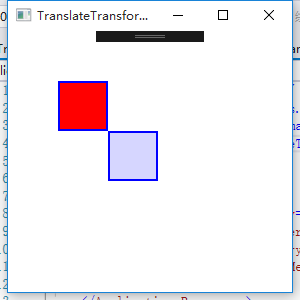
TranslateTransform移动变换
移动变换将一个图形对象从一个位置移动到另一个位置,具有如下两个属性:
X:水平移动的距离,默认为0
Y:垂直移动的距离,默认为0
<Window x:Class="WPFDemo.TranslateTransformDemo"
        xmlns="http://schemas.microsoft.com/winfx/2006/xaml/presentation"
        xmlns:x="http://schemas.microsoft.com/winfx/2006/xaml"
        xmlns:d="http://schemas.microsoft.com/expression/blend/2008"
        xmlns:mc="http://schemas.openxmlformats.org/markup-compatibility/2006"
        xmlns:local="clr-namespace:WPFDemo"
        mc:Ignorable="d"
        Title="TranslateTransformDemo" Height="300" Width="300">
    <Canvas>
        <!--将矩形水平移动50单位,垂直移动50单位-->
        <Rectangle Height="50" Width="50" Fill="Red" Stroke="Blue" StrokeThickness="2" Canvas.Left="50" Canvas.Top="50">
        </Rectangle>
        <Rectangle Height="50" Width="50" Fill="#CCCCCCFF" Stroke="Blue" StrokeThickness="2" Canvas.Left="50" Canvas.Top="50">
            <Rectangle.RenderTransform>
               <TranslateTransform X="50" Y="50" />
            </Rectangle.RenderTransform>
        </Rectangle>
    </Canvas>
</Window>
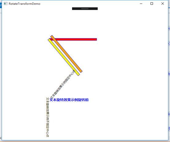
RotateTransform旋转变换
旋转变换可以将图形对象按指定的中心点旋转一个指定的角度,具体有三个属性:
Angle:旋转指定角度值,默认值0;
CenterX:旋转的水平中心点,默认值0;
CenterY:旋转的垂直中心点,默认值0;
默认的
<Window x:Class="WPFDemo.RotateTransformDemo"
        xmlns="http://schemas.microsoft.com/winfx/2006/xaml/presentation"
        xmlns:x="http://schemas.microsoft.com/winfx/2006/xaml"
        xmlns:d="http://schemas.microsoft.com/expression/blend/2008"
        xmlns:mc="http://schemas.openxmlformats.org/markup-compatibility/2006"
        xmlns:local="clr-namespace:WPFDemo"
        mc:Ignorable="d"
        Title="RotateTransformDemo" Height="300" Width="300">
    <Canvas Height="400" Width="400">
        <!--旋转前的矩形-->
        <Rectangle Name="Rec3" Width="200" Height="10" Stroke="Blue" Fill="Red" Canvas.Left="50" Canvas.Top="50">
        </Rectangle>
        <!--不指定旋转基点(centerX,centerY)-->
        <Rectangle Name="Rec1" Width="200" Height="10" Stroke="Blue" Fill="Yellow" Canvas.Left="50" Canvas.Top="50">
            <Rectangle.RenderTransform>
                <RotateTransform Angle="50" />
            </Rectangle.RenderTransform>
        </Rectangle>
        <!--指定旋转基点-->
        <Rectangle Name="Rect2" Width="200" Height="10" Stroke="Blue" Fill="Orange" Canvas.Left="50" Canvas.Top="50">
            <Rectangle.RenderTransform>
                <RotateTransform Angle="50" CenterX="20" CenterY="5" />
            </Rectangle.RenderTransform>
        </Rectangle>


        <!--旋转前的文本对象-->
        <TextBlock  Name="txt2" FontSize="15" Foreground="Blue" FontWeight="Bold" Canvas.Left="50" Canvas.Top="300" Text="文本旋转效果示例旋转前"/>

        <!--旋转文本对象-->
        <TextBlock Name="txt1" Canvas.Left="50" Canvas.Top="300" Text="文本旋转效果示例不指定中心点">
            <TextBlock.RenderTransform>
                <RotateTransform Angle="90"/>
            </TextBlock.RenderTransform>
        </TextBlock>
        <!--旋转文本对象,指定中心点-->
        <TextBlock Name="txt3" Canvas.Left="50" Canvas.Top="300" Text="文本旋转效果示例指定中心点">
            <TextBlock.RenderTransform>
                <RotateTransform Angle="-50" CenterX="0" CenterY="0" />
            </TextBlock.RenderTransform>
        </TextBlock>
    </Canvas>
</Window>
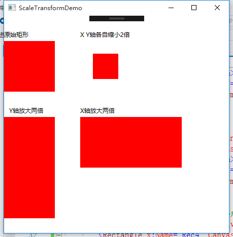
ScaleTransform缩放变换
缩放变换用于放大或缩小一个图形对象,可以水平或者垂直缩放。在这个对象有如下4个属性:
ScaleX:增加图形对象的宽度,默认1.
ScaleY:增加图形对象的高度,默认1.
CenterX:水平缩放的方向,默认0.
CenterY:垂直缩放的方向,默认0.
<Window x:Class="WPFDemo.ScaleTransformDemo"
        xmlns="http://schemas.microsoft.com/winfx/2006/xaml/presentation"
        xmlns:x="http://schemas.microsoft.com/winfx/2006/xaml"
        xmlns:d="http://schemas.microsoft.com/expression/blend/2008"
        xmlns:mc="http://schemas.openxmlformats.org/markup-compatibility/2006"
        xmlns:local="clr-namespace:WPFDemo"
        mc:Ignorable="d"
        Title="ScaleTransformDemo" Height="450" Width="500">
    <Canvas>
        <!--原始矩形-->
        <TextBlock Canvas.Top="30" Text="原始矩形"></TextBlock>
        <Rectangle x:Name="Rec1" Canvas.Left="0" Canvas.Top="50" Width="100" Height="100" Fill="Red"></Rectangle>

        <!--垂直放大2倍-->
        <TextBlock Canvas.Top="180" Canvas.Left="10" Text="Y轴放大两倍"></TextBlock>
        <Rectangle x:Name="Rec2" Canvas.Left="0" Canvas.Top="200" Width="100" Height="100" Fill="Red">
            <Rectangle.RenderTransform>
                <ScaleTransform ScaleY="2"></ScaleTransform>
            </Rectangle.RenderTransform>
        </Rectangle>

        <!--水平放大2倍-->
        <TextBlock Canvas.Top="180" Canvas.Left="150" Text="X轴放大两倍"></TextBlock>
        <Rectangle x:Name="Rec3" Canvas.Left="150" Canvas.Top="200" Width="100" Height="100" Fill="Red">
            <Rectangle.RenderTransform>
                <ScaleTransform ScaleX="2"></ScaleTransform>
            </Rectangle.RenderTransform>
        </Rectangle>

        <!--水平和垂直缩小,并指定中心点-->
        <TextBlock Canvas.Top="30" Canvas.Left="150" Text="X Y轴各自缩小2倍" />
        <Rectangle x:Name="Rec4" Canvas.Left="150" Canvas.Top="50" Width="100" Height="100" Fill="Red">
            <Rectangle.RenderTransform>
                <ScaleTransform ScaleX="0.5" ScaleY="0.5" CenterX="50" CenterY="50" />
            </Rectangle.RenderTransform>
        </Rectangle>
    </Canvas>
</Window>
SkewTransform扭曲变换
扭曲变换用于将一个图形对象按指定的中心点扭曲指定的角度,具有4个属性:
AngleX:水平扭曲值,默认0;
AngleY:垂直扭曲值,默认0;
CenterX:扭曲水平基点,默认0;
CenterY:扭曲垂直基点,默认0;
<Window x:Class="WPFDemo.SkewTransformDemo"
        xmlns="http://schemas.microsoft.com/winfx/2006/xaml/presentation"
        xmlns:x="http://schemas.microsoft.com/winfx/2006/xaml"
        xmlns:d="http://schemas.microsoft.com/expression/blend/2008"
        xmlns:mc="http://schemas.openxmlformats.org/markup-compatibility/2006"
        xmlns:local="clr-namespace:WPFDemo"
        mc:Ignorable="d"
        Title="SkewTransformDemo" Height="300" Width="600">
    <Canvas>
        <!--原始矩形-->
        <Rectangle x:Name="Rec1" Canvas.Left="0" Canvas.Top="0" Width="200" Height="100" Fill="Blue"></Rectangle>
        <!--水平扭曲50度-->
        <Rectangle x:Name="Rec2" Canvas.Left="210" Canvas.Top="0" Width="200" Height="100" Fill="Orange">
            <Rectangle.RenderTransform>
                <SkewTransform  AngleX="50"/>
            </Rectangle.RenderTransform>
        </Rectangle>

        <!--垂直扭曲10度-->
        <Rectangle x:Name="Rec3" Canvas.Left="0" Canvas.Top="120" Width="200" Height="100" Fill="Yellow">
            <Rectangle.RenderTransform>
                <SkewTransform  AngleY="10"/>
            </Rectangle.RenderTransform>
        </Rectangle>

        <!--基于指定的中心点水平和垂直扭曲-->
        <Rectangle x:Name="Rec4" Canvas.Left="220" Canvas.Top="120" Width="200" Height="100" Fill="Green">
            <Rectangle.RenderTransform>
                <SkewTransform AngleY="10" AngleX="10" CenterX="100" CenterY="50"></SkewTransform>
            </Rectangle.RenderTransform>
        </Rectangle>
    </Canvas>
</Window>

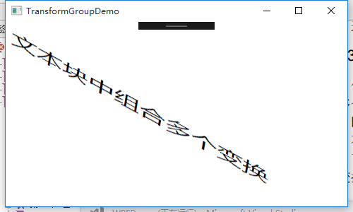
TransformGroup组合变换
使用TransformGroup组合变换,可以为一个图形元素与应用多个变换特性能,在组合的多个变换时,定义的顺序十分重要。
<Window x:Class="WPFDemo.TransformGroupDemo"
        xmlns="http://schemas.microsoft.com/winfx/2006/xaml/presentation"
        xmlns:x="http://schemas.microsoft.com/winfx/2006/xaml"
        xmlns:d="http://schemas.microsoft.com/expression/blend/2008"
        xmlns:mc="http://schemas.openxmlformats.org/markup-compatibility/2006"
        xmlns:local="clr-namespace:WPFDemo"
        mc:Ignorable="d"
        Title="TransformGroupDemo" Height="300" Width="500">
    <Canvas>
        <!---先旋转,在扭曲一个文本块-->
        <TextBlock FontSize="28" Canvas.Left="10" Canvas.Top="10" Text="文本块中组合多个变换">
            <TextBlock.RenderTransform>
                <TransformGroup>
                    <RotateTransform Angle="45" />
                    <SkewTransform CenterX="0" CenterY="0" AngleX="40" />
                </TransformGroup>
            </TextBlock.RenderTransform>
        </TextBlock>
    </Canvas>
</Window>
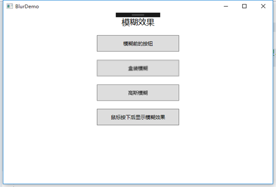
模糊效果
在BitmapEffect属性中赋一个BlurBitmapEffect对象可以应用模糊效果,模糊(KernelType属性)效果有两种:
Gaussian 高斯模糊:为模糊创建平滑分布的分布曲线
Box盒装模糊:用平直分布曲线创建模糊
<Window x:Class="WPFDemo.BlurDemo"
        xmlns="http://schemas.microsoft.com/winfx/2006/xaml/presentation"
        xmlns:x="http://schemas.microsoft.com/winfx/2006/xaml"
        xmlns:d="http://schemas.microsoft.com/expression/blend/2008"
        xmlns:mc="http://schemas.openxmlformats.org/markup-compatibility/2006"
        xmlns:local="clr-namespace:WPFDemo"
        mc:Ignorable="d"
        Title="BlurDemo" Height="300" Width="300">
    <Window.Resources>
        <Style  TargetType="Button"  >
            <Setter Property="Width" Value="200" />
            <Setter Property="Height" Value="40" />
            <Setter Property="Margin" Value="0,10,0,10" />
        </Style>
        <!---按下按钮,显示按钮模糊效果-->
        <Style x:Key="PressDim" TargetType="Button"  >
            <Setter Property="Width" Value="200" />
            <Setter Property="Height" Value="40" />
            <Setter Property="Margin" Value="0,10,0,10" />
            <Style.Triggers>
                <!--按钮按下显示模糊效果-->
               <Trigger Property="Button.IsPressed" Value="true">
                    <Setter Property="Button.BitmapEffect">
                        <Setter.Value>
                            <BlurBitmapEffect Radius="10" />
                        </Setter.Value>
                    </Setter>
                </Trigger>
            </Style.Triggers>
        </Style>
    </Window.Resources>
    <Grid>

        <!--模糊效果-->
        <StackPanel  >
            <TextBlock Text="模糊效果" HorizontalAlignment="Center" Margin="0,10,0,10" FontSize="20"></TextBlock>
            <Button  Content="模糊前的按钮"/>
            <Button  Content="盒装模糊">
                <Button.BitmapEffect>
                    <!--使用属性元素语法为按钮应用BlurBitmaoEffect模糊效果-->
                    <BlurBitmapEffect Radius="1" KernelType="Box" />
                    <!--Radius属性设置模糊的半径,半径越到效果越模糊.
                    KernelType属性用于获取或设置BlurBitmapEffect的模糊内核类型。
                    枚举类型:Gaussian 高斯模糊:为模糊创建平滑分布的分布曲线
                    Box盒状模糊:用平直分布曲线创建的简单模糊
                    -->
                </Button.BitmapEffect>
            </Button>
            <Button  Content="高斯模糊">
                <Button.BitmapEffect>
                    <BlurBitmapEffect Radius="1" KernelType="Gaussian" />
                </Button.BitmapEffect>
            </Button>
            <Button   Content="鼠标按下后显示模糊效果"
                    Style="{StaticResource PressDim}"></Button>
        </StackPanel>
    </Grid>
</Window>