动画(animation)
相比较过渡,动画可以实现更多变化,更多控制,连续自动播放等。
一、动画声明
语法:
@keyframes 动画名 {
0% {...}
100% {...}
}
注意点
keyframes即关键帧,关键帧可以设置无限个
二、常见属性

注意点
- 图中属性并不完整,仅列举常用属性和属性值
- animation-name和animation-duration必须有
- 逆向播放也要计算迭代次数
代码
<div></div>
        /* 动画声明 */
        @keyframes move {
            0% {
                transform: translate(0);
            }

            100% {
                transform: translate(1000px);
            }
        }

        div {
             200px;
            height: 200px;
            background-color: pink;
            /* 动画调用 */
            animation-name: move;
            /* 动画生命周期 */
            animation-duration: 2s;
            /* 动画速度曲线 */
            animation-timing-function: linear;
            /* 开始时延 */
            animation-delay: .5s;
            /* 动画执行次数或者迭代次数 infinite无穷大*/
            animation-iteration-count: 3;
            /* 是否逆向播放 计算次数 */
            animation-direction: alternate;
            /* 规定动画停止位置 */
            animation-fill-mode: forwards;
        }

        div:hover {
            /* 规定动画运动或停止状态 */
            animation-play-state: paused;
        }
三、动画简写
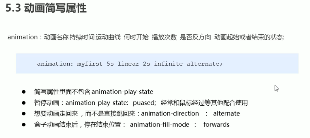
语法:
animation: name duration timing-function delay iteration-count direction fill-mode;
注意点
- name和duration必须写,其他可以选择性写
- 简写不包含结束状态animation-play-state: paused;经常和鼠标经过等配合
四、速度曲线步长

案例
<div>雨滴滴落在林间的小路上</div>
        @keyframes move {
            0% {
                 0;
            }

            100% {
                 220px;
            }
        }

        div {
            overflow: hidden;
             0px;
            height: 20px;
            margin: 100px auto;
            background-color: pink;
            font-size: 20px;
            text-align: center;
            line-height: 20px;
            white-space: nowrap;
            animation: move 5.5s steps(11) infinite;
        }
五、案例
热点图
背景图
     <div class="map">
<div class="city">
    <div class="dote"></div>
    <div class="pulse1"></div>
    <div class="pulse2"></div>
    <div class="pulse3"></div>
</div>
<div class="city taibei">
    <div class="dote"></div>
    <div class="pulse1"></div>
    <div class="pulse2"></div>
    <div class="pulse3"></div>
</div>
<div class="city guangzhou">
    <div class="dote"></div>
    <div class="pulse1"></div>
    <div class="pulse2"></div>
    <div class="pulse3"></div>
</div>
</div>
body {
    background-color: #333;
}

.map {
    position: relative;
     747px;
    height: 617px;
    background: url(../素材/18-动画素材/map.png) no-repeat;
    margin: 100px auto;
}

@keyframes pulse {
    0% {}

    70% {
         40px;
        height: 40px;
        /* 透明度 */
        opacity: 1;
    }

    100% {
         70px;
        height: 70px;
        opacity: 0;
    }
}

.city {
    position: absolute;
    top: 228px;
    right: 188px;
}

.dote {
     8px;
    height: 8px;
    background-color: #09f;
    border-radius: 50%;
}

.city div[class^='pulse'] {
    /* 保证波纹在父盒子水平垂直居中,放大后波纹会从中心向四周发散 */
    position: absolute;
    top: 50%;
    left: 50%;
    transform: translate(-50%, -50%);
     8px;
    height: 8px;
    border-radius: 50%;
    box-shadow: 0 0 12px #09f;
    animation: pulse 1.2s linear infinite;
}

/* 只用.pulse2权重不够 */
.city div.pulse2 {
    animation-delay: .4s;
}

.city div.pulse3 {
    animation-delay: .8s;
}

.taibei {
    top: 500px;
    right: 79px;
}

.guangzhou {
    top: 532px;
    right: 186px;
}
奔跑的熊大


    <div class="bg2"></div>
    <div class="bg1">
        <div class="bear"></div>
    </div>
        body {
            background-color: #0c1125;
        }

        @keyframes bear {
            0% {}

            100% {
                background-position: -1600px 0;
            }
        }

        @keyframes move {
            0% {
                left: 0;
            }

            100% {
                left: 50%;
                transform: translateX(-50%);
            }
        }

        @keyframes background_move {
            0% {}

            100% {
                background-position: -2000px 0;
            }
        }

        .bg1,
        .bg2 {
            position: absolute;
            bottom: 0;
             100%;
            height: 200px;
            animation: background_move 15s linear infinite;
        }

        .bg1 {
            background: url("../素材/18-动画素材/bg1.png") no-repeat;
        }

        .bg2 {
            background: url("../素材/18-动画素材/bg2.png") no-repeat;
            animation-duration: 20s;
        }

        .bear {
            z-index: 2;
            position: absolute;
            bottom: 0;
             200px;
            height: 100px;
            background: url(../素材/18-动画素材/bear.png);
            animation: bear 1s steps(8) infinite, move 3s forwards;
        }