纯粹就是觉得好玩
1.css3动画奔跑的大熊
代码
<!DOCTYPE html>
<html lang="en">
<head>
    <meta charset="UTF-8">
    <title>奔跑的大熊</title>
    <style type="text/css">
        body{
            background: #ccc;
        }

        div{
            position: absolute;
             200px;
            height: 100px;
            background: url(bear.png) no-repeat;
            /*元素可以添加多个动画中间用逗号隔开*/
            animation:bear .4s steps(8) infinite,move 3s forwards;
        }
        @keyframes bear {
            0%{
                background-position:0 0;
            }
            100% {
                background-position:-1600px 0;
            }
        }
        @keyframes move {
            0%{
                left:0;
            }
            100%{
                left:50%;
                transform: translateX(-50%);
            }
        }

    </style>
</head>
<body>
    <div></div>
</body>
</html>
效果
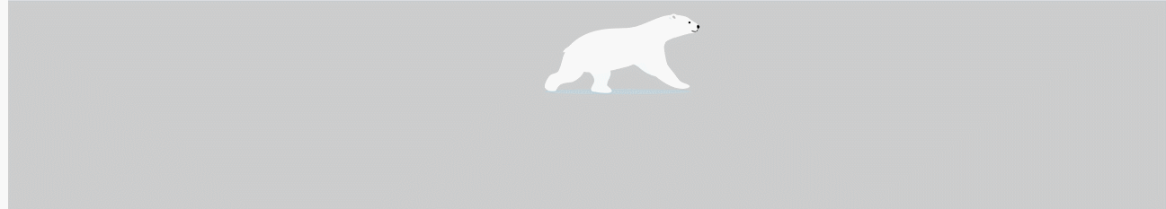
背景图

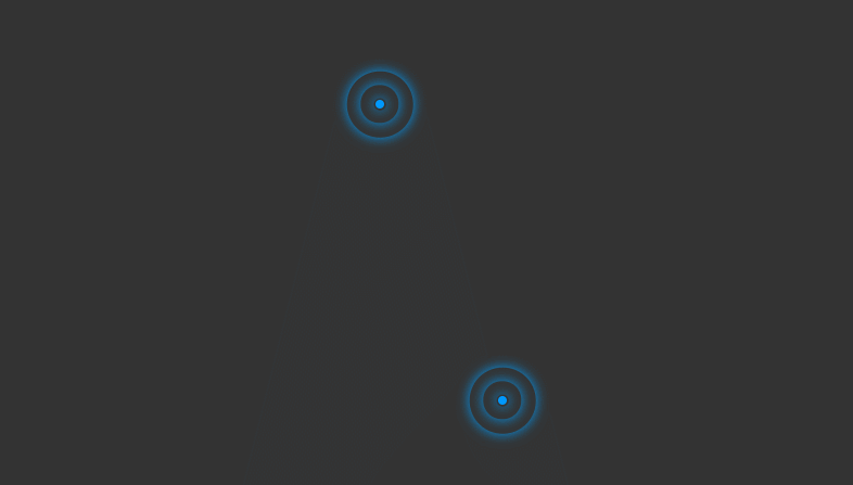
2.大数据热点图
代码
<!DOCTYPE html>
<html lang="en">
<head>
    <meta charset="UTF-8">
    <title>大数据热点图</title>
    <style type="text/css">
        body{
            background: #333;
        }
        .map{
            position: relative;
             747px;
            height: 616px;
            margin: 0 auto;
        }
        .city{
            position: absolute;
            top: 227px;
            right: 193px;
            color: #fff
        }
        .tb{
            top: 500px;
            right: 80px;
        }
        .dotted{
             8px;
            height: 8px;
            background: #09f;
            border-radius: 50%
        }
        .city div[class^="pulse"]{
            position: absolute;
            top: 50%;
            left: 50%;
            transform: translate(-50%,-50%);
             8px;
            height: 8px;
            border-radius: 50%;
            box-shadow: 0 0 12px #009dfd;
            animation: pulse 1.2s linear infinite;
        }
        .city div.pulse2{
            animation-delay: 0.4s;
        }
        .city div.pulse3{
            animation-delay: 0.8s;
        }
        @keyframes pulse {
            0%{}
            70%{
                60px;
                height: 60px;
                opacity: 1
            }
            100%{
                120px;
                height: 120px;
                opacity: 0
            }
        }

    </style>
</head>
<body>
    <div class="map">
        <div class="city">
            <div class="dotted"></div>
            <div class="pulse1"></div>
            <div class="pulse2"></div>
            <div class="pulse3"></div>
        </div>
        <div class="city tb">
            <div class="dotted"></div>
            <div class="pulse1"></div>
            <div class="pulse2"></div>
            <div class="pulse3"></div>
        </div>
    </div>
</body>
</html>
效果