移动端采用rem适配非常方便
比如在iphone6尺寸下,将html font-size 设置为 100px,那么写css时,只要将尺寸/100 + rem 即可。
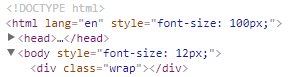
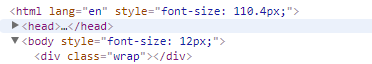
在iphone6Plus尺寸下,html font-size会自动调节,兼容多种尺寸的手机
以下是js代码,复制到你的项目中即可使用
(function(win) {
var ratio, scaleValue, renderTime,
    htmlEle = document.documentElement,
    vpMeta = document.querySelector('meta[name="viewport"]');

if (vpMeta) {
    var tempArr = vpMeta.getAttribute("content").match(/initial-scale=(["']?)([d.]+)1?/);
    if (tempArr) {
        scaleValue = parseFloat(tempArr[2]);
        ratio = parseInt(1 / scaleValue);
    }
} else {
    vpMeta = document.createElement("meta");
    vpMeta.setAttribute("name", "viewport");
    vpMeta.setAttribute("content", "width=device-width, initial-scale=0.5, user-scalable=no, minimal-ui");
    htmlEle.firstElementChild.appendChild(vpMeta);
    ratio = 2;
}

win.addEventListener("resize", function() {
    clearTimeout(renderTime);
    renderTime = setTimeout(initPage, 300);
}, false);

win.addEventListener("pageshow", function(e) {
    if(e.persisted){
        clearTimeout(renderTime);
        renderTime = setTimeout(initPage, 300)
    }
}, false);

if("complete" === document.readyState){
    document.body.style.fontSize = 12 * ratio + "px";
}else{
    document.addEventListener("DOMContentLoaded", function() {
        document.body.style.fontSize = 12 * ratio + "px";
    }, false);
}

initPage();

function initPage() {
    var htmlWidth = htmlEle.getBoundingClientRect().width;
    htmlWidth / ratio > 768 && (htmlWidth = 768 * ratio);
    win.rem = 100 * (htmlWidth / 375);
    htmlEle.style.fontSize = win.rem + "px";
}
})(window);
代码分析
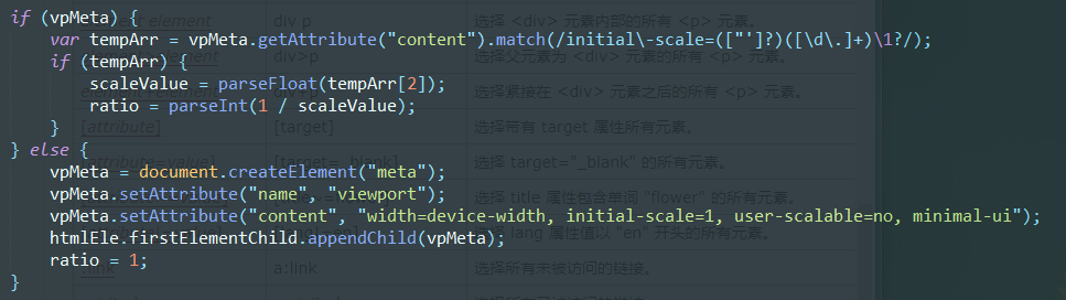
如果你设置了meta标签的视口属性,则获取initial-scale缩放比例,如果没设置,则自动添加。
一般initial-scale为1
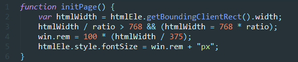
- line 2 获取屏幕宽度
- line 3 如果宽度超过768(ipad平板宽度),则不再进行调节
- line 4、5 设置rem,我以iphone6宽度375设置的,在该尺寸下,rem=100px,如果是其他尺寸,修改375即可
(htmlWidth/375)得到的是缩放比例,在IPHONE6下计算时,不用管html的font-size,直接px/100即算出rem
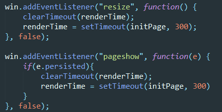
- 当页面改变尺寸,或者初次显示的时候,执行方法
persisted是pageshow事件的属性,检测浏览器是否读取缓存,是的话为true
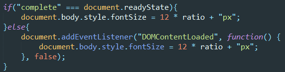
当页面渲染完后,设置body html-size,防止使用默认样式的元素出错