1、按钮
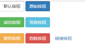
(1)按按钮的功能分类
<body>
                <button type="button" class="btn btn-default">默认按钮</button>
                <button type="button" class="btn btn-primary">原始按钮</button><br><br>
                <button type="button" class="btn btn-success">成功按钮</button>
                <button type="button" class="btn btn-info">信息按钮</button><br><br>
                <button type="button" class="btn btn-warning">警告按钮</button>
                <button type="button" class="btn btn-danger">危险按钮</button>
                <button type="button" class="btn btn-link">链接按钮</button><br><br>
</body>
效果:
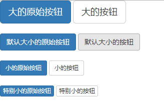
(2)按按钮的大小分类:
  <body>
               <button type="button" class="btn btn-primary btn-lg">大的原始按钮</button>
               <button type="button" class="btn btn-default btn-lg">大的按钮</button><br><br>
               <button type="button" class="btn btn-primary"> 默认大小的原始按钮</button>
               <button type="button" class="btn btn-default"> 默认大小的按钮</button><br><br>
               <button type="button" class="btn btn-primary btn-sm">小的原始按钮</button>
               <button type="button" class="btn btn-default btn-sm">小的按钮</button><br><br>
               <button type="button" class="btn btn-primary btn-xs">特别小的原始按钮</button>
               <button type="button" class="btn btn-default btn-xs">特别小的按钮</button><br><br>
               <button type="button" class="btn btn-primary btn-lg btn-block">块级的原始按钮</button>
               <button type="button" class="btn btn-default btn-lg btn-block">块级的按钮</button>
      </body>
(3)按钮的状态分类(激活、禁用)
<body>
        <button type="button" class="btn btn-default btn-lg ">默认按钮</button>
           <button type="button" class="btn btn-default btn-lg active">激活按钮</button>
           <button type="button" class="btn btn-primary btn-lg ">原始按钮</button>
           <button type="button" class="btn btn-primary btn-lg active">激活的原始按钮</button>
      </body>
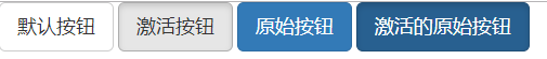
 <body>
         <button type="button" class="btn btn-primary btn-lg ">原始按钮</button>
         <button type="button" class="btn btn-primary btn-lg" disabled="disabled">禁用的原始按钮</button
 </body>
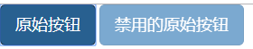
处于禁用状态的按钮不能点击。
2、图片
(1)图片的样式:
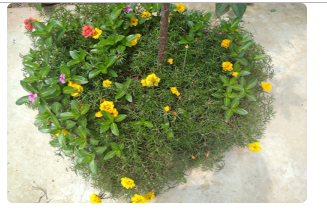
为图片添加圆角:
<img width="300" height="200" src="../img/1.jpg" class="img-rounded"/>
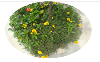
将图片变为圆形:
<img width="300" height="200" src="../img/1.jpg" class="img-circle"/>
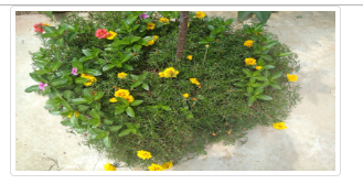
缩略图功能:
<img width="300" height="200" src="../img/1.jpg" class="img-thumbnail"/>
(2)响应式图片(将max- 100%;和 height: auto;样式应用在图片上)
<img width="300" height="200" src="../img/1.jpg" class="img-rounded" class="img-responsive"/>