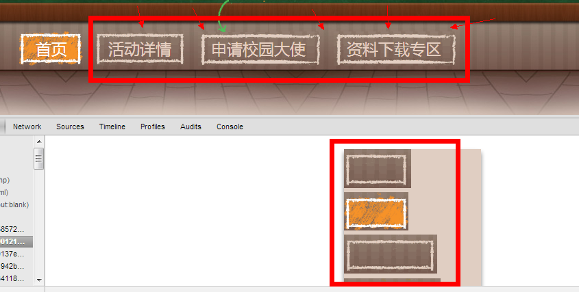
1. a activity website of Open Class http://open.163.com/lxh
These navigation buttons aren't uesed transparent background images, lead to images malpositon.
2. login page in recruiment website http://campus.163.com/applyJob.do?positionId=J1239
There some problems with th background image. In chrome , the words are hidde, but in firefox and ie10, it miss all.
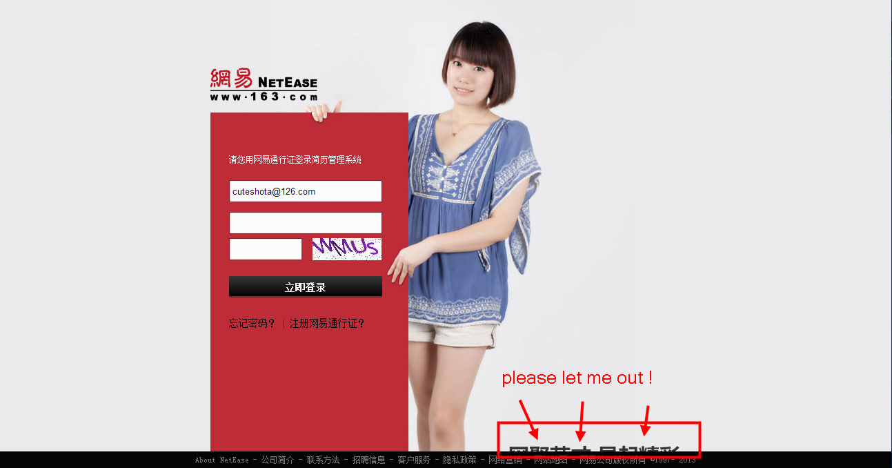
Check the resouse, you can find the whole bg img, it should like this, how can designer and coder have no communication about this!! The designer may don't know about the browser resolution, but how can the front coder dont communicate with the designer to modify the PSD or move the words upper. Further more , the coder use the whole img without thinking about the position problem,also non-transparent image is a problem. What the hell !

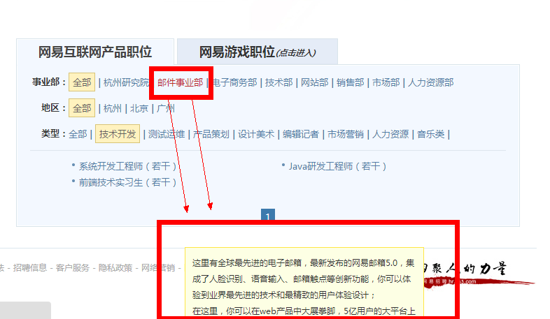
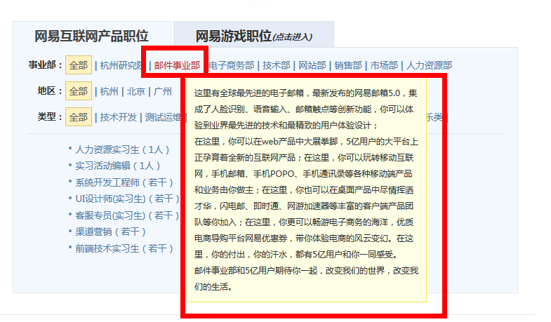
3. Campus recruiment infomation pages http://campus.163.com/queryPosition.do?rms=2
The first effect is in chrome, horrible !The second one is in FF, it works well. If you see this page, how can you dare to applay for the front coder jobs in NetEsae. = =
———— From Laker's blog.
Coding and changing~
Fighting and insisting~