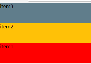
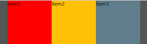
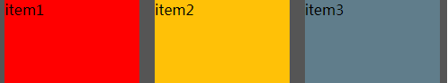
<div class="div1">
        <div class="block" style="background:#f00">item1</div>
        <div class="block" style="background:#ffc107">item2</div>
        <div class="block" style="background:#607d8b">item3</div>
</div>
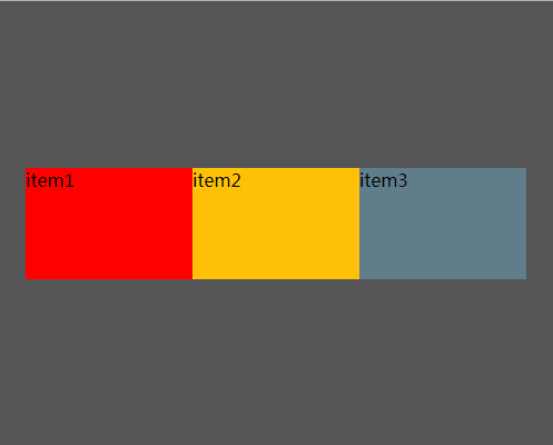
flex-direction: row;
 .div1{
      display: flex;
      flex-direction: row;
 }
 .block{
      flex:auto;
      height:200px;
 }
显示:

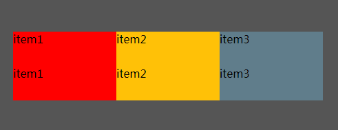
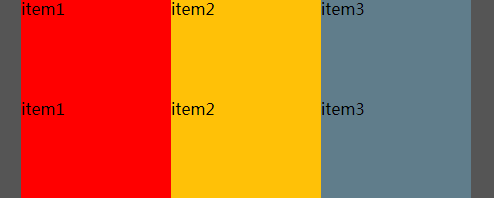
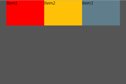
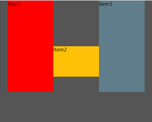
flex-direction: column;
        .div1{
            display: flex;
            flex-direction: column;
        }
        .block{
            flex:auto;
            height:200px;
        }
显示:

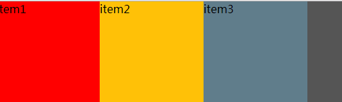
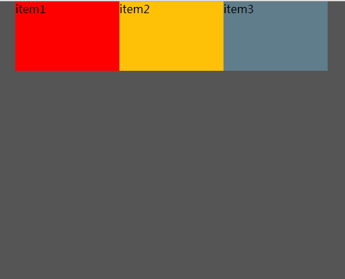
flex-direction: row-reverse;
       .div1{
            display: flex;
            height:200px;
            flex-direction: row-reverse;
        }
        .block{
            flex:auto;

        }
显示

flex-direction: column-reverse;
        .div1{
            display: flex;
            height:200px;
            flex-direction: column-reverse;
        }
        .block{
            flex:auto;
        }
显示
flex-wrap: nowrap | wrap | wrap-reverse;
nowrap 指的是在一行显示不换行;
wrap 指的是多行显示;
wrap-reverse 指的是多行显示,但是跟规定排列方向相反;
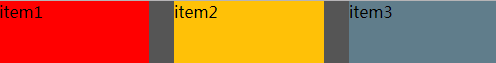
justify-content: flex-start | flex-end | center | space-between | space-around;
        .div1{
            display: flex;
            height:200px;
            width:500px;
            flex-direction: row;
            background:#555;
       justify-content: flex-start;
        }
        .block{
            flex:0 0 30%;
        }
        .div1{
            display: flex;
            height:200px;
            500px;
            flex-direction: row;
            background:#555;
            justify-content: center;
        }
        .block{
            flex:0 0 30%;
        }
        .div1{
            display: flex;
            height:200px;
            width:500px;
            flex-direction: row;
            background:#555;
            justify-content: space-between;
        }
        .block{
            flex:0 0 30%;
        }
       .div1{
            display: flex;
            height:200px;
            width:500px;
            flex-direction: row;
            background:#555;
            justify-content: space-around;
        }
        .block{
            flex:0 0 30%;
        }
        .div1{
            display: flex;
            height:200px;
            width:500px;
            flex-direction: row;
            background:#555;
            justify-content: flex-end;
        }
        .block{
            flex:0 0 30%;
        }

align-content: flex-start | flex-end | center | space-between | space-around | stretch;
        .div1{
            display: flex;
            height:400px;
            500px;
            flex-direction: row;
            flex-wrap: wrap;
            background:#555;
            justify-content:center;
            align-content: flex-end;
        }
        .block{
            flex:0 0 30%;
            height:100px;
        }

        .div1{
            display: flex;
            height:200px;
            500px;
            flex-direction: row;
            flex-wrap: wrap;
            background:#555;
            justify-content:center;
            align-content: center;
        }
        .block{
            flex:0 0 30%;
            height:50px;
        }
        .div1{
            display: flex;
            height:200px;
            width:500px;
            flex-direction: row;
            flex-wrap: wrap;
            background:#555;
            justify-content:center;
            align-content: stretch;/*项目高度不是固定值*/
        }
        .block{
            flex:0 0 30%;
        }
align-items是在所有项目上的对齐方式。
align-self是在单独的项目上的对齐方式。
align-items: flex-start | flex-end | center | baseline | stretch;
align-self: auto | flex-start | flex-end | center | baseline | stretch;
        .div1{
            display: flex;
            height:400px;
            width:500px;
            flex-direction: row;
            flex-wrap: wrap;
            background:#555;
            justify-content:center;
            align-items: flex-end;
        }
        .block{
            flex:0 0 30%;
            min-height: 100px;
            max-height: 300px;
        }
        .block:nth-child(2){
            max-height: 200px;

        }

        .div1{
            display: flex;
            height:400px;
            width:500px;
            flex-direction: row;
            flex-wrap: wrap;
            background:#555;
            justify-content:center;
           /* align-items: flex-end;*/
        }
        .block{
            flex:0 0 30%;
            min-height: 100px;
            max-height: 300px;
        }
        .block:nth-child(2){
            max-height: 200px;
            align-self: flex-start

        }

        .div1{
            display: flex;
            height:400px;
            width:500px;
            flex-direction: row;
            flex-wrap: wrap;
            background:#555;
            justify-content:center;
            align-items: flex-start;
        }
        .block{
            flex:0 0 30%;
            min-height: 100px;
            max-height: 300px;
        }
        .block:nth-child(2){
            max-height: 200px;
           /* align-self: flex-start*/

        }
        .div1{
            display: flex;
            height:400px;
            width:500px;
            flex-direction: row;
            flex-wrap: wrap;
            background:#555;
            justify-content:center;
            align-items: center;
        }
        .block{
            flex:0 0 30%;
            min-height: 100px;
            max-height: 300px;
        }
        .block:nth-child(2){
            max-height: 200px;
           /* align-self: flex-start*/
        }
        .div1{
            display: flex;
            height:400px;
            width:500px;
            flex-direction: row;
            flex-wrap: wrap;
            background:#555;
            justify-content:center;
           /* align-items: center;*/
        }
        .block{
            flex:0 0 30%;
            min-height: 100px;
            max-height: 300px;
        }
        .block:nth-child(2){
            max-height: 200px;
            align-self: center
        }
        .div1{
            display: flex;
            height:400px;
            width:500px;
            flex-direction: row;
            flex-wrap: wrap;
            background:#555;
            justify-content:center;
            align-items: baseline;
        }
        .block{
            flex:0 0 30%;
            min-height: 100px;
            max-height: 300px;
        }
        .block:nth-child(2){
            max-height: 200px;
           /* align-self: center*/
        }
float clear vertical-align 在flex布局里里面无效。