二、QSS加载方式
方式一:
1 myDialog->setStyleSheet("QLineEdit { background-color: yellow }");
2 nameEdit->setStyleSheet("background-color: yellow");
方式二:
1 QFile file(":/qss/main.qss");
2 file.open(QFile::ReadOnly);
3 QTextStream filetext(&file);
4 QString stylesheet = filetext.readAll();
5 this->setStyleSheet(stylesheet);
6 file.close();
三、QSS选择器类型
3.1 通配选择器
*
匹配所有的控件
3.2 类型选择器
QPushButton
匹配所有QPushButton和其子类的实例
QPushButton {background: gray;}
3.3 属性选择器
QPushButton[flat="false"]
匹配所有flat属性是false的QPushButton实例,注意该属性可以是自定义的属性,不一定非要是类本身具有的属性
QPushButton[level='dangerous'] { background: magenta; }
/*openButton->setProperty("level",  "dangerous");*/
3.4 类选择器
.QPushButton
匹配所有QPushButton的实例,但是并不匹配其子类。这是与CSS中的类选择器不一样的地方,注意前面有一个点号
1 .RedButton { background: magenta; }
2
3 /*
4 openButton->setProperty("class",  "RedButton");
5 closeButton->setProperty("class", "RedButton");
6 */
3.5 ID选择器
#myButton
匹配所有id为myButton的控件实例,这里的id实际上就是objectName指定的值
#openButton, #closeButton { background: magenta; }
3.6 后代选择器
QDialog QPushButton
所有QDialog容器中包含的QPushButton,不管是直接的还是间接的
1 QDialog {background: gray;}
2 /* 设置 QDialog中的 QPushButton 的 QSS */
3 QDialog QPushButton {
4     border: 2px solid magenta;
5     border-radius: 10px;
6     background: white;
7     padding: 2px 15px;
8 }
3.7 子选择器
QFrame> QPushButton
所有QFrame容器下面的QPushButton,其中要求QPushButton的直接父容器是QFrame,注意和后代选择器的区别
1 QFrame {background: gray;}
2 QFrame > QPushButton {
3     border: 2px solid magenta;
4     border-radius: 10px;
5     background: white;
6     padding: 2px 15px;
7 }
3.8 伪类选择器
选择器:状态 作为选择器,支持 ! 操作符,表示 非。
1 QPushButton:hover { color: white }
2 QCheckBox:checked { color: white }
3 QCheckBox:!checked { color: red }
所有的这些选择器可以联合使用,并且支持一次设置多个选择器类型,用逗号隔开,这点与CSS一样,例如:
#frameCut,#frameInterrupt,#frameJoin
表示所有这些id使用一个规则。
#mytable QPushButton
表示选择所有id为mytable的容器下面的QPushButton实例
四、QSS常用属性
4.1 字体
大小 {font-size: x-large;}(特大) xx-small;(极小) 一般中文用不到,只要用数值就可以,单位:PX、PD
样式 {font-style: oblique;}(偏斜体) italic;(斜体) normal;(正常)
行高 {line-height: normal;}(正常) 单位:PX、PD、EM
粗细 {font-weight: bold;}(粗体) lighter;(细体) normal;(正常)
变体 {font-variant: small-caps;}(小型大写字母) normal;(正常)
大小写 {text-transform: capitalize;}(首字母大写) uppercase;(大写) lowercase;(小写) none;(无)
修饰 {text-decoration: underline;}(下划线) overline;(上划线) line-through;(删除线) blink;(闪烁)
字体名: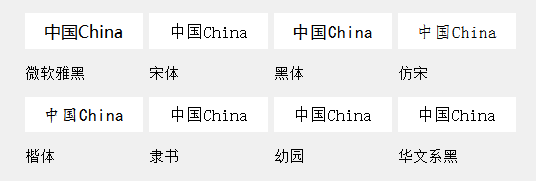
微软雅黑:Microsoft YaHei
宋体:SimSun
黑体:SimHei
仿宋: FangSong
楷体: KaiTi
隶书:LiSu
幼圆:YouYuan
华文细黑:STXihei
华文楷体:STKaiti
华文宋体:STSong
华文中宋:STZhongsong
华文仿宋:STFangsong
方正舒体:FZShuTi
方正姚体:FZYaoti
华文彩云:STCaiyun
华文琥珀:STHupo
华文隶书:STLiti
华文行楷:STXingkai
华文新魏:STXinwei
1 font: 15px "Segoe UI";             /* 字体:大小 名称 */
2 font-family: "Segoe UI";           /* 字体名称 */
4.2 颜色
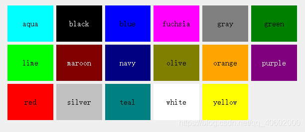
17种标准色:aqua, black, blue, fuchsia, gray, green, lime, maroon, navy,olive, orange, purple, red, silver, teal, white, yellow
1 colo:rgb(255,255,255);
2 color: #F5F5F5;               /* 前景(文本)颜色 */
3 color: qlineargradient();     /* 前景(文本)颜色:线性渐变*/
4 color: qradialgradient();     /* 前景(文本)颜色:辐射渐变*/
5 color: qconicalgradient();    /* 前景(文本)颜色:梯形渐变*/
4.3 内边距
1 padding: 4px;                      /* 文字边距 */
2 padding-left: 5px;                 /* 文字左边距 */
3 padding-right: 10px;               /* 文字右边距 */
4 padding-top: 3px;                  /* 文字顶边距 */
5 padding-bottom: 3px;               /* 文字底边距 */
4.4 外边距
1 margin: 14px 18px 20px 18px; /*外边距 顺序上右下左 */
2 margin-top: 14px;
3 margin-right: 18px;
4 margin-bottom: 20px;
5 margin-left: 18px;
4.5 背景
1 background-color: #202122;               /* 背景颜色 */
2 background-color: qlineargradient();    /* 背景颜色:线性渐变*/
3 background-color: qradialgradient();    /* 背景颜色:辐射渐变*/
4 background-color: qconicalgradient();   /* 背景颜色:梯形渐变*/
5 background-image:url(boder.png);        /* 背景图片 */
6 background-position: ;                 /* 背景图片对齐方式 */
7 background-repeat: ;                   /* 背景图片平铺方式 */
4.6 边框
border-style: dotted;(点线) dashed;(虚线) solid; double;(双线) groove;(槽线) ridge;(脊状) inset;(凹陷) outset;
border-; 边框宽度
border-color:#;
简写方法border:width style color; /*简写*/
border: 1px solid #FDBC03;                       /* 边框:宽度 颜色*/
border-image:url(boder.png) 4 8 12 16;           /* 边界图 切线 */
border-radius: 4px;                              /* 角弧度 */
border-top-left-radius: ;                        /* 角弧度:左上角*/
border-top-right-radius: ;                       /* 角弧度:右上角*/
border-bottom-left-radius: ;                     /* 角弧度:左下角*/
border-bottom-right-radius: ;                    /* 角弧度:右下角*/
4.7 宽高
1 12px;   /*设置宽度 单位像素*/
2 height:40px     /*设置高度*/
3 min-65px;     /*最小宽度 设置width无效可以尝试设置min-width */
4 min-height:12px;    /*最小高度*/
5 max-12px;
6 max-height:12px;
五:QSS伪状态与子控件
伪状态列表
 1 :checked                        /*button部件被选中*/
 2 :unchecked                      /*button部件未被选中*/
 3 :disabled                       /*部件被禁用*/
 4 :enabled                        /*部件被启用*/
 5 :focus                          /*部件获得焦点*/
 6 :hover                          /*鼠标位于部件上*/
 7 :indeterminate                  /*checkbox或radiobutton被部分选中*/
 8 :off                            /*部件可以切换,且处于off状态*/
 9 :on                             /*部件可以切换,且处于on状态*/
10 :pressed                        /*部件被鼠标按下*/
子部件列表
 1 ::down-arrow         /*combo box或spin box的下拉箭头*/
 2 ::drop-down          /*combo box的下拉箭头*/
 3
 4 ::indicator      /*checkbox、radio button或可选择group box的指示器*/
 5 ::item               /*menu、menu bar或status bar的子项目*/
 6 ::menu-indicator     /*push button的菜单指示器*/
 7 ::title              /*group box的标题*/
 8
 9 ::down-button        /*spin box的向下按钮*/
10 ::up-arrow           /*spin box的向上箭头*/
11 ::up-button          /*spin box的向上按钮*/