一. 选择器
1. 伪类选择器
(1). first-child 第一个
last-child 最后一个
(2). nth-child(x),正着数
①. 表示单个元素, 比如nth-child(2),表示第二个元素
②. 表示多个元素
A. nth-child(2n)、nth-child(even):表示偶数个元素
B. nth-child(2n+1)、nth-child(2n-1)、nth-child(odd):表示奇数个元素
C. nth-child(-n+5): 表示前5个元素
D. nth-child(n+5): 表示从第5个往后
(3). nth-last-child(x), 倒着数
①. 表示单个元素, 比如nth-last-child(2),表示倒数第2个元素
②. 表示多个元素
A. nth-last-child(-n+4), 表示后4个元素
(4). 对于a标签
4个伪类选择符,分别是link、visited、hover、active,分别代表没有点击过、访问过、鼠标悬浮在上面、鼠标点击不松手
代码分享:
查看代码<head>
<meta charset="UTF-8">
<meta http-equiv="X-UA-Compatible" content="IE=edge">
<meta name="viewport" content="width=device-width, initial-scale=1.0">
<title>Document</title>
<style>
/* 表示前3个元素 */
ul li:nth-child(-n+3) {
color: red;
}
/* 表示后4个元素 */
ul li:nth-last-child(-n+4) {
color: green;
}
</style>
</head>
<body>
<ul>
<li class="one">我是第1个li</li>
<li class="one">我是第2个li</li>
<li>我是第3个li</li>
<li>我是第4个li</li>
<li>我是第5个li</li>
<li>我是第6个li</li>
<li>我是第7个li</li>
<li>我是第8个li</li>
<li>我是第9个li</li>
<li>我是第10个li</li>
</ul>
</body>
</html>2. 焦点选择器
input:focus{}
选中input获取焦点的状态
3. 属性选择器
input[type] 找到页面中的input,并且需要有type属性
input[type="text"] 找到页面中的input,并且需要type属性值为text
input[type="password"] 找到页面中的input,并且需要type属性值为password
二. 优先级/权重
1. 步骤
(1). 先判断选择器是否能【直接选中】标签,如果不能直接选中 → 是继承,优先级最低 → 直接pass
(2). 如果选中了目标标签,则通过权重计算公式,判断谁权重最高
2. 权重规则
(1). 首先看是否选中了标签,如果选中了标签,那么按照(id数 > class类数 > 标签数)来计算权重,谁大听谁的;
如果权重相同,后写的会覆盖前面写的(层叠性),因此以后写的为准。
(2). 如果没有选中,那么权重就是0,采取就近原则,即哪个选择器隔着目标标签近,就听谁的。
(3). 行内样式属性的优先级要高于Id选择器.
(4). !important
A. 当作用在一个选择器选中的标签上,它的优先级是最高的!!
B. 当!important是以继承的形式生效,它不能提升继承的优先级,继承的优先级是最低的。
总结:继承 < 通配符选择器 < 标签选择器 < 类选择器 < id选择器 < 行内样式 < !important
案例1


<!DOCTYPE html>
<html lang="en">
<html>

<head>
    <meta http-equiv="content-type" content="text/html;charset=utf-8" />
    <meta name="keywords" content="关键词1,关键词2,关键词3" />
    <meta name="description" content="对网站的描述" />
    <title>第1题</title>
    <style type="text/css">
        div div {
            color: blue;
        }

        div {
            color: red;
        }
    </style>
</head>

<body>
    <div>
        <div>
            <div>
                试问这行字体是什么颜色的?
            </div>
        </div>
    </div>
</body>

</html>
答案:blue
案例2
<!DOCTYPE html>
<html lang="en">
<html>

<head>
    <meta http-equiv="content-type" content="text/html;charset=utf-8" />
    <meta name="keywords" content="关键词1,关键词2,关键词3" />
    <meta name="description" content="对网站的描述" />
    <title>第2题</title>
    <style type="text/css">
        #father {
            color: red;
        }

        p {
            color: blue;
        }
    </style>
</head>

<body>
    <div id="father">
        <p>试问这行字体是什么颜色的?</p>
    </div>
</body>

</html>
答案:blue
案例3
<!DOCTYPE html>
<html lang="en">

<head>
    <meta http-equiv="Content-Type" content="text/html;charset=UTF-8">
    <title>Document</title>
    <style type="text/css">
        div div div div div div div div div div div div {
            color: red;
        }

        .me {
            color: blue;
        }
    </style>
</head>

<body>
    <div>
        <div>
            <div>
                <div>
                    <div>
                        <div>
                            <div>
                                <div>
                                    <div>
                                        <div>
                                            <div>
                                                <div class="me">试问这行文字是什么颜色的</div>
                                            </div>
                                        </div>
                                    </div>
                                </div>
                            </div>
                        </div>
                    </div>
                </div>
            </div>
        </div>
    </div>
</body>

</html>
答案:blue
案例4
<!DOCTYPE html>
<html lang="en">
<html>

<head>
    <meta http-equiv="content-type" content="text/html;charset=utf-8" />
    <meta name="keywords" content="关键词1,关键词2,关键词3" />
    <meta name="description" content="对网站的描述" />
    <title>第4题</title>
    <style type="text/css">
        div p {
            color: red;
        }

        #father {
            color: red;
        }

        p.c2 {
            color: blue;
        }
    </style>
</head>

<body>
    <div id="father" class="c1">
        <p class="c2">
            试问这行字体是什么颜色的?
        </p>
    </div>
</body>

</html>
答案:blue
案例5
<!DOCTYPE html>
<html lang="en">

<head>
    <meta http-equiv="Content-Type" content="text/html;charset=UTF-8">
    <title>Document</title>
    <style type="text/css">
        .c1 .c2 div {
            color: blue;
        }

        div #box3 {
            color: green;
        }

        #box1 div {
            color: yellow;
        }
    </style>
</head>

<body>
    <div id="box1" class="c1">
        <div id="box2" class="c2">
            <div id="box3" class="c3">
                文字
            </div>
        </div>
    </div>
</body>

</html>
答案:yellow
案例6
<!DOCTYPE html>
<html lang="en">

<head>
    <meta http-equiv="content-type" content="text/html;charset=utf-8" />
    <meta name="keywords" content="关键词1,关键词2,关键词3" />
    <meta name="description" content="对网站的描述" />
    <title>第6题</title>
    <style type="text/css">
        #father #son {
            color: blue;
        }

        #father p.c2 {
            color: black;
        }

        div.c1 p.c2 {
            color: red;
        }

        #father {
            color: green !important;
        }
    </style>
</head>

<body>
    <div id="father" class="c1">
        <p id="son" class="c2">
            试问这行字体是什么颜色的?
        </p>
    </div>
</body>

</html>
答案:blue
三. 盒子模型
1. 纠正概念
一个盒子由:内容区域、内边距、边框、外边距组成, 即width、height、padding、border、margin
特别注意:这里的width和height默认情况下指的是内容区域的宽度和高度
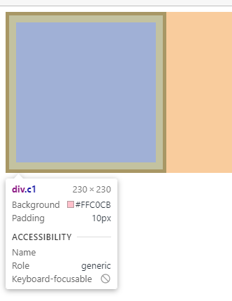
2. 盒子的宽度
盒子的宽度=左border+左padding+width+右padding+右border
如下案例:
盒子宽度=5+10+200+10+5=230 (可以直接F12浏览器查看,显示230px,而内容区域的宽度为200px)
PS:高度同理
代码分享:
<head>
    <meta charset="UTF-8">
    <meta http-equiv="X-UA-Compatible" content="IE=edge">
    <meta name="viewport" content="width=device-width, initial-scale=1.0">
    <title>Document</title>
    <style>
        .c1 {
            background-color: pink;
             200px;
            height: 200px;
            padding: 10px;
            border: 5px solid black;
        }
    </style>
</head>

<body>
    <div class="c1"></div>
</body>
运行效果:
四. CSS3中的模型
1. 说明
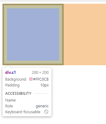
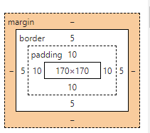
设置: box-sizing: border-box
此时:width和height代表的就是整个盒子的宽度和高度了,就不再是内容区域的宽高了
2. 盒子的宽度
盒子的宽度=width
会自动缩减内容区域的宽度:
如下案例:
内容区域宽度=200-5-10-5-10=170px (可以直接F12浏览器查看,宽度为200px,内容区域的宽度为170px)
PS:高度同理
代码分享:
<head>
    <meta charset="UTF-8">
    <meta http-equiv="X-UA-Compatible" content="IE=edge">
    <meta name="viewport" content="width=device-width, initial-scale=1.0">
    <title>Document</title>
    <style>
        .c1 {
            background-color: pink;
             200px;
            height: 200px;
            padding: 10px;
            border: 5px solid black;
            box-sizing: border-box
        }
    </style>
</head>

<body>
    <div class="c1"></div>
</body>
运行效果:
五. 几个特殊现象
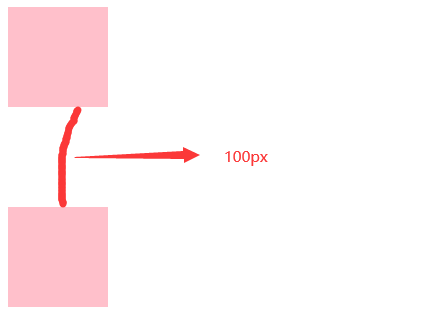
1. 垂直布局 的 块级元素,上下的margin会合并
(1) 结果:最终两者距离为margin的最大值
(2) 解决方法:避免就好,只给其中一个盒子设置margin即可
如下案例1:最终间隔为100px
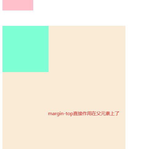
2. 互相嵌套 的 块级元素,子元素的 margin-top 会作用在父元素上
(1) 结果:导致父元素一起往下移动
(2) 解决方法:
A. 给父元素设置overflow:hidden
B. 将自身转换成行内块元素
C. 给自身设置浮动
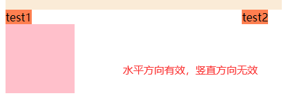
3. 行内元素的margin和padding无效情况
结果:
A. 水平方向的margin和padding布局中有效!
B. 垂直方向的margin和padding布局中无效!
代码分享:
<head>
  <meta charset="UTF-8">
  <meta http-equiv="X-UA-Compatible" content="IE=edge">
  <meta name="viewport" content="width=device-width, initial-scale=1.0">
  <title>Document</title>
</head>
<style>
  .c1 {
    width: 100px;
    height: 100px;
    background-color: pink;
    margin-bottom: 50px;
  }

  .c2 {
    width: 100px;
    height: 100px;
    background-color: pink;
    margin-top: 100px;
  }

  .father {
    width: 400px;
    height: 400px;
    background-color: antiquewhite;
    /* 设置浮动 */
    /* float: left; */
    /* 转换为行内块元素 */
    /* display: inline-block; */
  }

  .son {
    width: 150px;
    height: 150px;
    background-color: aquamarine;
    margin-top: 50px;
  }

  span {
    background-color: coral;
    /* 水平方向有效 */
    margin-right: 300px;
    /* 竖直方向无效 */
    margin-bottom: 300px;
  }
</style>

<body>
  <!-- 现象1 -->
  <div>
    <div class="c1"></div>
    <div class="c2"></div>
  </div>
  <!-- 现象2 -->
  <div class="father">
    <div class="son"></div>
  </div>
  <!-- 现象3 -->
  <span>test1</span>
  <span>test2</span>
  <div class="c1"></div>
</body>
运行效果:
!
- 作 者 : Yaopengfei(姚鹏飞)
- 博客地址 : http://www.cnblogs.com/yaopengfei/
- 声 明1 : 如有错误,欢迎讨论,请勿谩骂^_^。
- 声 明2 : 原创博客请在转载时保留原文链接或在文章开头加上本人博客地址,否则保留追究法律责任的权利。