如果使用float做固定宽度的div,这个div要写在自适应div的前面,不然后导致两个div不在同一行,这是用float的弊端
absolute可以解决这个问题,但是使用absolute时,如果固定宽带的div比较高,会影响后面的布局
所以还需要使用float,一个向左浮动,一个向右浮动,自适应的div里还要再添加一个div,很复杂的
最终方案:
<!DOCTYPE html>
<html lang="en">
<head>
    <meta charset="UTF-8">
    <title>css实现右侧固定宽度,左侧宽度自适应(最终方案)</title>
    <style type="text/css">
        .wrap {
            max- 900px;
            margin:0 auto;
            overflow: hidden;  /*清除浮动,以及隐藏向左移动出去的部分*/
        }

        .content {
            float: left;
             100%;
            margin-left: -310px;
            background-color: #eee;
        }
        .content-inner {
            margin-left: 310px;
            border: 1px solid green;
        }
        .sidebar {
            float: right;
             300px;
            height: 500px;
            background-color: gold;
        }
        .footer{margin:0 auto;max- 900px;height: 100px; background:green;}
    </style>
</head>
<body>
    <div class="wrap">
        <div class="content">
            <div class="content-inner">自适应区,浏览器宽度缩小时文字会自动换行。</div>
        </div>
        <div class="sidebar">固定宽度区(float与margin齐上阵)</div>
    </div>
    <div class="footer">底部</div>
</body>
</html>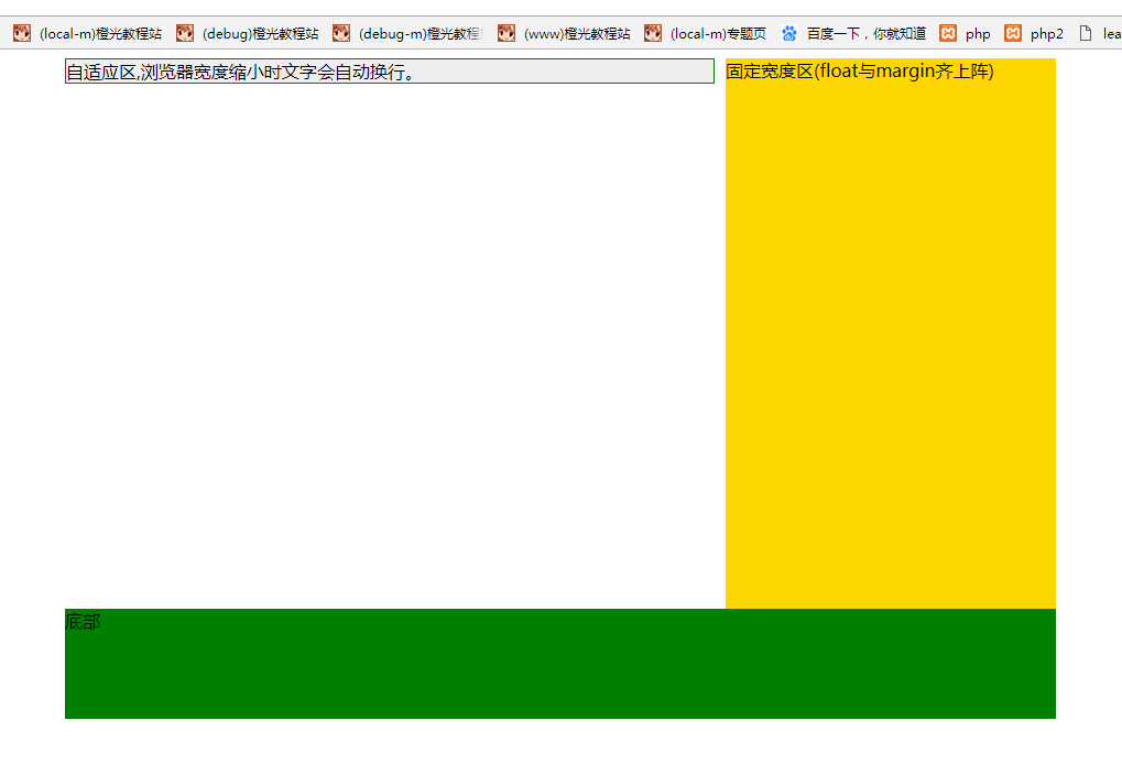
前期探索方案:
<!DOCTYPE html>
<html lang="en">
<head>
    <meta charset="UTF-8">
    <title>css实现右侧固定宽度,左侧宽度自适应</title>
    <style type="text/css">
        .wrap {
            max- 900px;
            margin:0 auto 10px;
            border: 1px solid green;
            overflow: hidden;
        }
        .content ,.sidebar {
            background-color: #eee;
        }
        .sidebar {
            float: right;
             300px;
            background-color: gold;
        }
        .content {
            margin-right: 310px;
            background-color: #eee;
        }
        .sidebar2 {
            float: left;
             300px;
            background-color: gold;
        }
        .content2 {
            margin-left: 310px;
            background-color: #eee;
        }
        .wrap2 {
            max- 900px;
            margin:0 auto 10px;
            border: 1px solid green;
            position: relative;
        }
        .content3 {
            margin-right: 310px;
            background-color: #eee;
        }
        .sidebar3 {
            position: absolute;
            right: 0;
            top: 0;
             300px;
            background-color: gold;
        }
        .content4 {
            margin-left: 310px;
            background-color: #eee;
        }
        .sidebar4 {
            position: absolute;
            left: 0;
            top: 0;
             300px;
            background-color: gold;
        }
        .content5 {
            float: left;
             100%;
            margin-left: -310px;
            background-color: #eee;
        }
        .content5s {
            margin-left: 310px;
        }
        .sidebar5 {
            float: right;
             300px;
            background-color: gold;
        }
        .content6 {
            float: right;
             100%;
            margin-right: -310px;
            background-color: #eee;
        }
        .content6s {
            margin-right: 310px;
        }
        .sidebar6 {
            float: left;
             300px;
            background-color: gold;
        }
        .wrap3 {
            display: table;
            max- 900px;
             100%;
            margin:0 auto 10px;
            border: 1px solid green;
        }
        .content7 {
            display: table-cell;
            background-color: #eee;
        }
        .sidebar7 {
            display: table-cell;
             300px;
            background-color: gold;
        }
    </style>
</head>
<body>
    <div class="wrap">
        <div class="sidebar">固定宽度区(float)</div>
        <div class="content">自适应区,浏览器宽度缩小时文字会自动换行。</div>
    </div>
    <div class="wrap">
        <div class="sidebar2">固定宽度区(float)</div>
        <div class="content2">自适应区,浏览器宽度缩小时文字会自动换行。</div>
    </div>
    <div class="wrap2">
        <div class="content3">自适应区,浏览器宽度缩小时文字会自动换行。</div>
        <div class="sidebar3">固定宽度区(absolute)</div>
    </div>
    <div class="wrap2">
        <div class="content4">自适应区,浏览器宽度缩小时文字会自动换行。</div>
        <div class="sidebar4">固定宽度区(absolute)</div>
    </div>
    <div class="wrap">
        <div class="content5">
            <div class="content5s">自适应区,浏览器宽度缩小时文字会自动换行。</div>
        </div>
        <div class="sidebar5">固定宽度区(float与margin齐上阵)</div>
    </div>
    <div class="wrap">
        <div class="content6">
            <div class="content6s">自适应区,浏览器宽度缩小时文字会自动换行。</div>
        </div>
        <div class="sidebar6">固定宽度区(float与margin齐上阵)</div>
    </div>
    <div class="wrap3">
        <div class="content7">自适应区,浏览器宽度缩小时文字会自动换行。</div>
        <div class="sidebar7">固定宽度区(display:table)</div>
    </div>
    <div class="wrap3">
        <div class="sidebar7">固定宽度区(display:table)</div>
        <div class="content7">自适应区,浏览器宽度缩小时文字会自动换行。</div>
    </div>
</body>
</html> 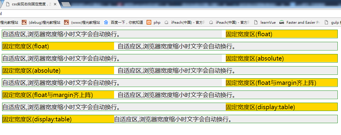

如果是不需要兼容版本比较低的浏览器,可以使用flex布局:
    <!DOCTYPE html>
    <html>
    <head>
        <meta charset="UTF-8">
        <meta name="viewport" content="width=device-width, initial-scale=1.0, minimum-scale=1.0, maximum-scale=1.0, user-scalable=no">
        <title>flex布局</title>
        <style type="text/css">
            body{margin: 0}
            /*
            flex-direction: row | row-reverse | column | column-reverse;
            flex-wrap: nowrap | wrap | wrap-reverse;
            */
            .m-flex{display: flex;flex-direction: row;}
            .m-content{flex:1;border:1px solid blue;}
            .m-right{flex:0 0 300px;border:1px solid blue;}
        </style>
    </head>
    <body>
        <div class="m-flex">
            <div class="m-content">自适应区,浏览器宽度缩小时文字会自动换行。</div>
            <div class="m-right">固定宽度区(flex)</div>
        </div>

    </body>
</html> 参考链接:http://jo2.org/css-auto-adapt-width/