R语言中有很多现成的R包,可以绘制venn图,但是最多支持5组,当组别数大于5时,venn图即使能够画出来,看上去也非常复杂,不够直观;
在实际的数据分析中,组别大于5的情况还是经常遇到的,这是就可以考虑用花瓣图来进行数据的可视化
比如下面这个例子:
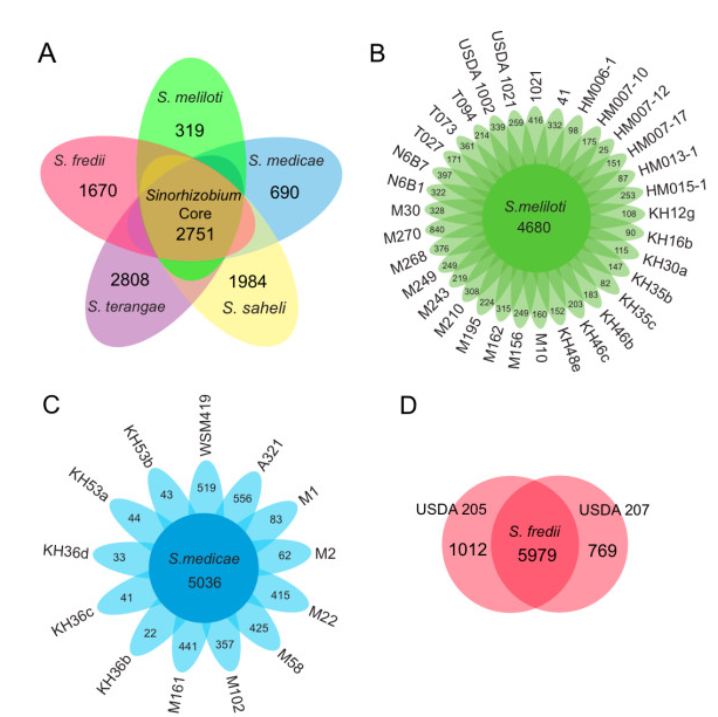
来源于该链接 https://www.researchgate.net/figure/235681265_fig3_The-pan-genome-of-Sinorhizobium-The-flower-plots-and-Venn-diagrams-illustrate-the-number
A和D是我们常见的venn图,B和C 就是花瓣图了
在花瓣图中,我们能够看到两种信息;
1)所有样本共有的信息;
2)每个样本独有的信息;
花瓣图既美观,展示信息也很直观,那么这样的图如何画呢?
我在网上找了半天,也没找到现成的工具,只能自己写代码来画!
在写代码之前,首先来分析下这张图,每一片花瓣就是一个椭圆型,整幅图片可以看做有1个椭圆通过旋转得到
通过以上分析,我们只需要先画一个椭圆,然后循环旋转即可
中间的调试过程就不细讲了,直接看写好的代码
flower_plot <- function(sample, value, start, a, b,
	ellipse_col = rgb(135, 206, 235, 150, max = 255),
	circle_col = rgb(0, 162, 214, max = 255),
	circle_text_cex = 1.5
	) {
	par( bty = "n", ann = F, xaxt = "n", yaxt = "n", mar = c(1,1,1,1))
	plot(c(0,10),c(0,10),type="n")
	n   <- length(sample)
	deg <- 360 / n
	res <- lapply(1:n, function(t){
		draw.ellipse(x = 5 + cos((start + deg * (t - 1)) * pi / 180),
			         y = 5 + sin((start + deg * (t - 1)) * pi / 180),
			         col = ellipse_col,
			         border = ellipse_col,
			         a = a, b = b, angle = deg * (t - 1))
		text(x = 5 + 2.5 * cos((start + deg * (t - 1)) * pi / 180),
			 y = 5 + 2.5 * sin((start + deg * (t - 1)) * pi / 180),
			 value[t]
			)

		if (deg * (t - 1) < 180 && deg * (t - 1) > 0 ) {
			text(x = 5 + 3.3 * cos((start + deg * (t - 1)) * pi / 180),
				 y = 5 + 3.3 * sin((start + deg * (t - 1)) * pi / 180),
				 sample[t],
				 srt = deg * (t - 1) - start,
				 adj = 1,
				 cex = circle_text_cex
				)

		} else {
			text(x = 5 + 3.3 * cos((start + deg * (t - 1)) * pi / 180),
				 y = 5 + 3.3 * sin((start + deg * (t - 1)) * pi / 180),
				 sample[t],
				 srt = deg * (t - 1) + start,
				 adj = 0,
				 cex = circle_text_cex
				)
		}
	})
	draw.circle(x = 5, y = 5, r = 1.3, col = circle_col, border = circle_col)
}
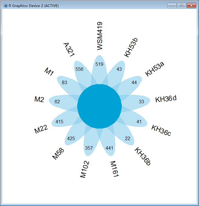
这里我写成了1个函数,函数的调用方式如下;
flower_plot(c("WSM419", "A321", "M1", "M2", "M22", "M58",
	          "M102", "M161", "KH36b", "KH36c", "KH36d", "KH53a", "KH53b"),
	         c(519, 556, 83, 62, 415, 425, 357, 441, 22, 41, 33, 44, 43), 90, 0.5, 2)
第一个参数为样本名字构成的向量,第二个参数为每个样本独有的数目,第三个参数为起始椭圆的角度,第四个参数为椭圆的短轴的长度,第五个参数为椭圆的长轴的长度
效果图如下: