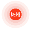
css3 动画设置水波纹,效果如下图:
源码:
<!DOCTYPE html>
<html lang="en">
<head>
    <meta charset="UTF-8">
    <meta name="viewport" content="width=device-width, user-scalable=no, initial-scale=1.0, maximum-scale=1.0, minimum-scale=1.0">
    <title>test</title>
</head>
<style type="text/css">
.dot-box{height:40px;width:40px;border-radius:100%;position:relative;margin:40px;}
.dot-box:hover{cursor:pointer;}
.dot1 {
  animation: keyframes-dot1 1.5s cubic-bezier(.17,.67,.18,.41);
}
.dot2 {
  animation: keyframes-dot2 1.5s cubic-bezier(.17,.67,.18,.41);//贝塞尔曲线生成网站:http://cubic-bezier.com/
}
.dot3 {
  animation: keyframes-dot3 1.5s cubic-bezier(.17,.67,.18,.41);
}
.dot1,.dot2,.dot3{
  height: 40px;
  width: 40px;
  background: rgba(249,58,28, 1);
  color: white;
  line-height: 40px;
  text-align: center;
  border-radius: 100%;
  animation-iteration-count:infinite;
}
@keyframes keyframes-dot1 {
  0% {
    box-shadow: 0 0 0 0px rgba(238,67,40, 0.7);
  }
  100% {
    box-shadow: 0 0 0 30px rgba(238,67,40, 0);
  }
}
@keyframes keyframes-dot2 {
  0% {
    box-shadow: 0 0 0 0px rgba(238,67,40, 0.8);
  }
  100% {
    box-shadow: 0 0 0 20px rgba(238,67,40, 0);
  }
}
@keyframes keyframes-dot3 {
  0% {
    box-shadow: 0 0 0 0px rgba(238,67,40, 0.9);
  }
  100% {
    box-shadow: 0 0 0 10px rgba(238,67,40, 0);
  }
}

</style>
<body>
    <div class="dot-box">
        <div class="dot1">
              <div class="dot2">
                   <div class="dot3">扬州</div>
              </div>
        </div>
  </div>
</body>
</html>