在设置background-image属性时,经常会遇到一个background-position ;一直不怎么会用,今天有空研究下.
版本:CSS1 兼容性:IE4+ NS6+ 继承性:无
语法:
background-position : position || position
| length | : | 百分数 | 由浮点数字和单位标识符组成的长度值。请参阅 长度单位 |
| position | : | top | center | bottom | left | center | right |
该属性定位不受对象的补丁属性( padding )设置影响。
默认值为: 0% 0% 。此时背景图片将被定位于对象不包括补丁( padding )的内容区域的左上角。
如果只指定了一个值,该值将用于横坐标。纵坐标将默认为 50% 。如果指定了两个值,第二个值将用于纵坐标。
如果设置值为 right center ,因为 right 作为横坐标值将会覆盖 center 值,所以背景图片将被居右定位。
对应的脚本特性为 backgroundPosition 。
menu { background: url("images/aardvark.gif"); background-position: 35% 2.5cm; }
a { background: url("images/aardvark.gif"); background-position: 3.25in; }
body { background: url("images/aardvark.gif"); background-position: top right; }
其实background-position就是用来控制background-image的position
如果指定一个值,该值用于横坐标,纵坐标采用默认,即50%(center)
如果指定两个值,第二个值用于纵坐标,
例如你写定:background-position: left center;其实和background-position: left;是一样的都是左对齐,垂直居中对齐
如果指定:background-position: left left;就是左对齐,垂直居中对齐
如果指定:background-position: right right;就是右对齐,垂直居中对齐
如果指定:background-position: left right;其实这两个值都是在横坐标上的作用,right会覆盖left属性,所以最后显示的还是就是右对齐,垂直居中对齐。
除了left center right 还有TOP bottom,这两个分别是顶部对齐,底部对齐.
例如指定:background-position: left top;那么图片将位于左上角。
利用这个特性可以实现一个非常酷的效果
<!DOCTYPE html PUBLIC "-//W3C//DTD XHTML 1.0 Transitional//EN" "http://www.w3.org/TR/xhtml1/DTD/xhtml1-transitional.dtd">
<html xmlns="http://www.w3.org/1999/xhtml">
<head>
<meta http-equiv="Content-Type" content="text/html; charset=gb2312" />
<title>让我们共同推广WEB标准在中国的发展</title>
<style type="text/css">
<!--
ul#menu { width:300px; height:300px; margin:0px auto; padding:0px; overflow:hidden; background:transparent url(/articleimg/2006/04/3366/01.jpg)}
ul#menu li { list-style-type:none; float:left; width:100px; height:100px;}
ul#menu li a { display:block; width:100px; height:100px; text-decoration:none; background:transparent url(/articleimg/2006/04/3366/02.jpg) no-repeat 500px 500px;}
a#item1:hover {background-position: 0 0; }
a#item2:hover {background-position: -100px 0;}
a#item3:hover {background-position: -200px 0;}
a#item4:hover {background-position: 0 -100px;}
a#item5:hover {background-position: -100px -100px;}
a#item6:hover {background-position: -200px -100px;}
a#item7:hover {background-position: 0 -200px;}
a#item8:hover {background-position: -100px -200px;}
a#item9:hover {background-position: -200px -200px;}
-->
</style>
</head>
<body>
<ul id="menu">
<li><a id="item1" href="#" title="Item 1"> </a></li>
<li><a id="item2" href="#" title="Item 2"> </a></li>
<li><a id="item3" href="#" title="Item 3"> </a></li>
<li><a id="item4" href="#" title="Item 4"> </a></li>
<li><a id="item5" href="#" title="Item 5"> </a></li>
<li><a id="item6" href="#" title="Item 6"> </a></li>
<li><a id="item7" href="#" title="Item 7"> </a></li>
<li><a id="item8" href="#" title="Item 8"> </a></li>
<li><a id="item9" href="#" title="Item 9"> </a></li>
</ul>
</body>
</html>
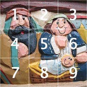
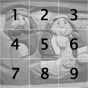
是不是非常简单,而我们所用到的图片也仅仅是下面的2张而已:
现在我们来分析 background-position 的用法:
A元素一开始的时候背景位置设置成 background-position:500px 500px,而它的大小仅只有100px*100px而已,所以A标签下的所有背景都超过了可视范围无法显示,我们一开始看见的黑白照片就是UL的背景图象。接着当鼠标移动到A元素上的时候,再根据每个A元素所处的位置来分别为他们设置背景的移动大小,这样就形成上面的黑白图片交替效果。
转自一醉而过的博客
原文链接http://www.cnblogs.com/yizuierguo/archive/2009/03/10/1407860.html