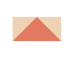
气泡效果最麻烦的是下面的小三角,而小三角是怎么来的呢?首先先看下面的代码
<div class="box"></div>

  <style>
    .box {
      width: 0;
      height: 0;
      border-top: 50px solid #e27a61;
      border-bottom: 50px solid #e27a61;
      border-left: 50px solid #efd2b4;
      border-right: 50px solid #efd2b4;
    }

  </style>
效果如下

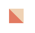
接下来,去掉border-top,
  <style>
    .box {
      width: 0;
      height: 0;
      border-bottom: 50px solid #e27a61;
      border-left: 50px solid #efd2b4;
      border-right: 50px solid #efd2b4;
    }

  </style>
效果如下
再去掉,border-left,
  <style>
    .box {
      width: 0;
      height: 0;
      border-bottom: 50px solid #e27a61;
      border-right: 50px solid #efd2b4;
    }

  </style>
效果如下
再隐藏border-right,
  <style>
    .box {
      width: 0;
      height: 0;
      border-top: 50px solid transparent;
    }

  </style>
效果如下

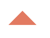
去掉上,隐藏左右,
  <style>
    .box {
      width: 0;
      height: 0;
      border-bottom: 50px solid #e27a61;
      border-left: 50px solid transparent;
      border-right: 50px solid transparent;
    }

  </style>
效果如下
只需变化border的不同方向就可以得到不同的三角,接下来可以画气泡了.
<div class="bubble">
  <div class="triangle common"></div>  <!--倒三角-->

</div>

  <style>
    .bubble {
      position: relative;
      width: 200px;
      height: 50px;
      border: 5px solid #e27a61;
    }
    .common {
      position: absolute;
      width: 0;
      height: 0;
      left: 0;
      right: 0;
      margin: auto;
    }
    .triangle {
      bottom: -20px;
      border-top: 20px solid #e27a61;
      border-left: 20px solid transparent;
      border-right: 20px solid transparent;
    }

  </style>
效果如下
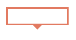
接下来只需再绘制一个倒三角,覆盖在上面就可以啦
<div class="bubble">
  <div class="triangle common"></div>  <!--倒三角-->
  <div class="cover common"></div>   <!--用来覆盖倒三角的-->
</div>

  <style>
    .bubble {
      position: relative;
      width: 200px;
      height: 50px;
      border: 5px solid #e27a61;
    }
    .common {
      position: absolute;
      width: 0;
      height: 0;
      left: 0;
      right: 0;
      margin: auto;
      border-top: 20px solid #e27a61;
      border-left: 20px solid transparent;
      border-right: 20px solid transparent;
    }
    .triangle {
      bottom: -20px;
    }
    .cover {
      bottom: -13px;
      border-top-color: #fff;
    }

  </style>
效果
