在之前的网络爬虫作业当中,我已经初步掌握了爬虫的用法,可以从高考网爬取hg的录取分数线
现在我要对数据进行一些处理,制成分数线柱状图,更直观地比较各省份的录取分数情况
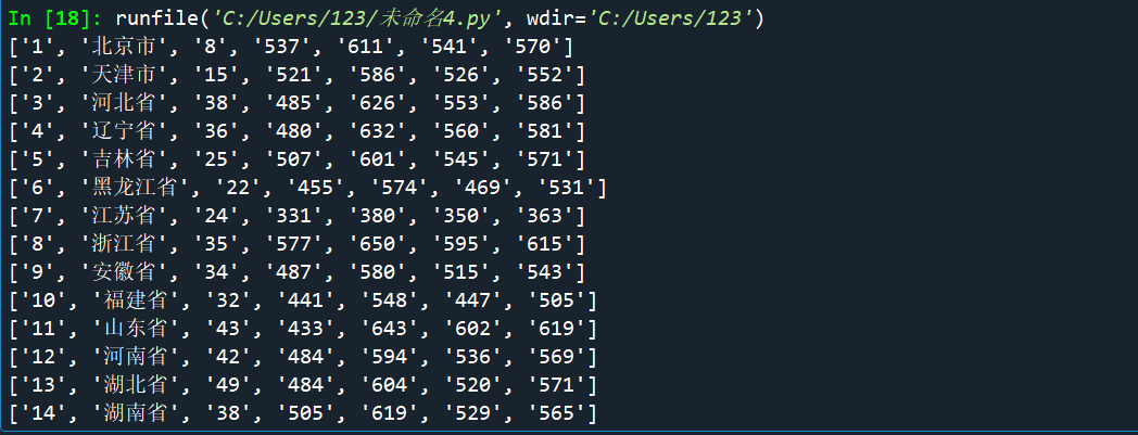
首先爬取分数线:
import matplotlib.pyplot as plt
import requests
from bs4 import BeautifulSoup
def get(url):
    try:
        r=requests.get(url,timeout=30)
        r.raise_for_status()
        r.encoding=r.apparent_encoding
        return r.text
    except:
        return''

url='http://www.gaokw.com/gk/gxfsx/189856.html'
demo=get(url)
ls=[]
soup=BeautifulSoup(demo,'html.parser')
data=soup.find_all('tr')

for tr in data:
    lt=[]
    lg=[]
    ltd=tr.find_all('td')
    if len(ltd)==0:
        continue
    for td in ltd:
        lt.append(td.string)
    for word in lt:
        word=word.strip()
        lg.append(word)
    ls.append(lg)


shengfen=[]
fenshuxian=[]
for i in range(15,36):
    u=ls[i]
    shengfen.append((u[1]))
    fenshuxian.append(int(u[3]))
得到了分数线和省份的列表
其中包括很多元素,计划数,最高分,最低分,平均分等
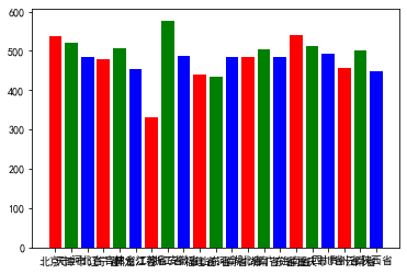
使用matplotlib
plt.bar(range(len(fenshuxian)), fenshuxian,color='rgb',tick_label=shengfen)
plt.show()
满怀期待地等到了我的图
然鹅……
第一次生的成柱状图存在很多问题:

首先是x轴乱码,无法显示
其次是y轴的数字排列无序,无法达成直观比较的效果
在问同学和查资料之后,我发现x轴的问题是因为matplotlib不支持中文字体
(我在做word cloud的时候也遇到这样的问题,好像很多数据可视化的库都这样)
于是我采用了word cloud的解决办法,给字体写上路径
对于y轴,在原来的代码当中给生成列表的步骤加上int(因为在给列表添加元素的时候被认为是字符串,所以无法处理)

变成了 酱婶儿:
这x轴根本看不清啊
我尝试了对x的宽度和柱状图的宽度进行设置,希望把他们分得开一点
但是并没有成功

我只好换个方法,使用一个函数:
plt.xticks(rotation=270)
让x轴的坐标旋转270度,朝向竖直方向
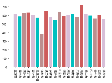
结果如下

虽然图表没什么问题了然而说实话这个配色实在是丑的一匹
好在我发现了新大陆:
原来有这么多好看的颜色
只是我不会用而已。。。。

开心地玩了一波:


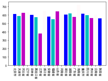


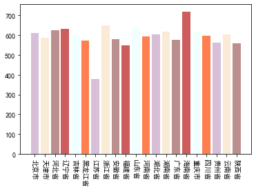
最终版:
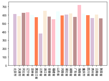
我还是最喜欢粉嫩嫩的马卡龙色
大家看x轴的时候可能需要转一下头哈 不要在意这些细节(●ˇ∀ˇ●) 就当是活动颈椎了嘛(●'◡'●)
有需要的童鞋也可以自己去这个网站找到美美的配色:http://www.wahart.com.hk/rgb.htm
代码如下~

# -*- coding: utf-8 -*-
"""
Created on Sun May 10 08:37:12 2020
@author: 123
"""
import matplotlib.pyplot as plt
import requests
from bs4 import BeautifulSoup
def get(url):
try:
r=requests.get(url,timeout=30)
r.raise_for_status()
r.encoding=r.apparent_encoding
return r.text
except:
return''
url='http://www.gaokw.com/gk/gxfsx/189856.html'
demo=get(url)
ls=[]
soup=BeautifulSoup(demo,'html.parser')
data=soup.find_all('tr')
for tr in data:
lt=[]
lg=[]
ltd=tr.find_all('td')
if len(ltd)==0:
continue
for td in ltd:
lt.append(td.string)
for word in lt:
word=word.strip()
lg.append(word)
ls.append(lg)
shengfen=[]
fenshuxian=[]
for i in range(15,36):
u=ls[i]
shengfen.append((u[1]))
fenshuxian.append(int(u[4]))
plt.bar(range(len(fenshuxian)), fenshuxian,color=['Thistle','AntiqueWhite','rosybrown','Pink','Azure','Coral'],tick_label=shengfen)
plt.xticks(rotation=270)
plt.show()


