1.绘制散点图
# 使用ggplot2
library(ggplot2)
ggplot(data = mtcars, aes(x = wt, y = mpg)) + geom_point()

2.绘制折线图
# 使用ggplot
library(ggplot2)
# 绘制第一条折线附有数据点
g <- ggplot(data = pressure, aes(x = temperature, y = pressure)) +
  geom_line(color = "blue") +
  geom_point(color = "blue")


g + # 绘制第二条折线附有数据点
  geom_line(data = pressure, aes(temperature, pressure/2), color = "red") +
  geom_point(data = pressure, aes(temperature, pressure/2), color = "red")

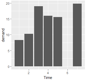
3.绘制条形图
# 使用ggplot2(左图)
library(ggplot2)
g <- ggplot(data = BOD, aes(x = Time, y = demand)) +
  geom_bar(stat = "identity")

# 调用
g

# ===========================================================

# 使用factor是为了离散x轴取值,这样没有多余的间隔(右图)
library(ggplot2)
g <- ggplot(data = BOD, aes(x = factor(Time), y = demand)) +
  geom_bar(stat = "identity")

# 调用
g

4.绘制直方图
# 绘制直方图 "+" 运算通过赋值在调用
library(ggplot2)
g <- ggplot(data = mtcars, aes(x = mpg)) +
  geom_histogram(binwidth = 4)

# 调用
g

5.绘制函数图
# 使用ggplot2
# 设置函数
myFun <- function(x){
  1/x
}

g <- ggplot(data = data.frame(x = c(0, 20)), aes(x = x)) +
  stat_function(fun = myFun, geom = "line", col = "red") # col设置颜色

# 调用
g
