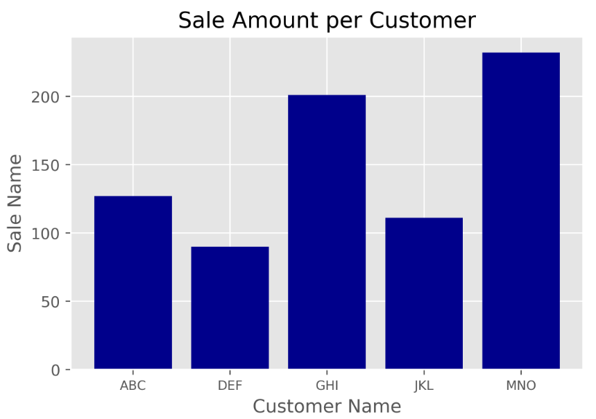
1、条形图
#!/usr/bin/env python3
#条形图,表示一组分类数值
#导入pyplot模块
import matplotlib.pyplot as plt
#使用ggplot样式模拟R语言中ggplot2的绘图包
plt.style.use('ggplot')
#为x轴准备数据
customers = ['ABC','DEF','GHI','JKL','MNO']
#计算X轴的长度
customers_index = range(len(customers))
#为y轴准备数据
sale_amounts = [127,90,201,111,232]
#使用matplotlib绘图时,首先要创建一个基础图
fig = plt.figure()
#在基础图中添加了一个子图,add_subplot(1,1,1)表示创建1行1列的子图,并使用第一个子图
ax1 = fig.add_subplot(1,1,1)
#创建条形图,customers_index设置条形图左侧在x轴上的坐标,sale_amounts设置条形图的高度
#align='center'设置条形与标签中间对齐,color='darkblue'设置条形的颜色
ax1.bar(customers_index,sale_amounts,align='center',color='darkblue')
#设置刻度线位置在x轴的底部
ax1.xaxis.set_ticks_position('bottom')
#设置刻度线位置在y轴的左侧
ax1.yaxis.set_ticks_position('left')
#将条形图的刻度线标签由客户索引值更改为实际的客户名称
#rotation=0表示刻度标签应该是水平的,而不是倾斜的。fontsize='small'将刻度标签的字体设为小字体
plt.xticks(customers_index,customers,rotation=0,fontsize='small')
#添加x轴标签
plt.xlabel('Customer Name')
#添加y轴标签
plt.ylabel('Sale Name')
#添加图例标题
plt.title('Sale Amount per Customer')
#将统计图保存在指定文件夹中,名为bar_plot.png,dpi=400设置图形分辨率(每英寸约2.54cm的点数)
#bbox_inches='tight'表示保存图形时,将图形四周的空白部分去掉
plt.savefig('F://python入门//文件//bar_plot.png',dpi=400,bbox_inches='tight')
#指示matplotlib在一个新窗口中显示统计图
plt.show()
结果:
本地中的bar_plot.png:
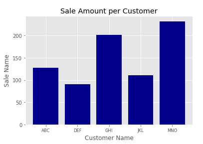
Spyder右下角显示为:
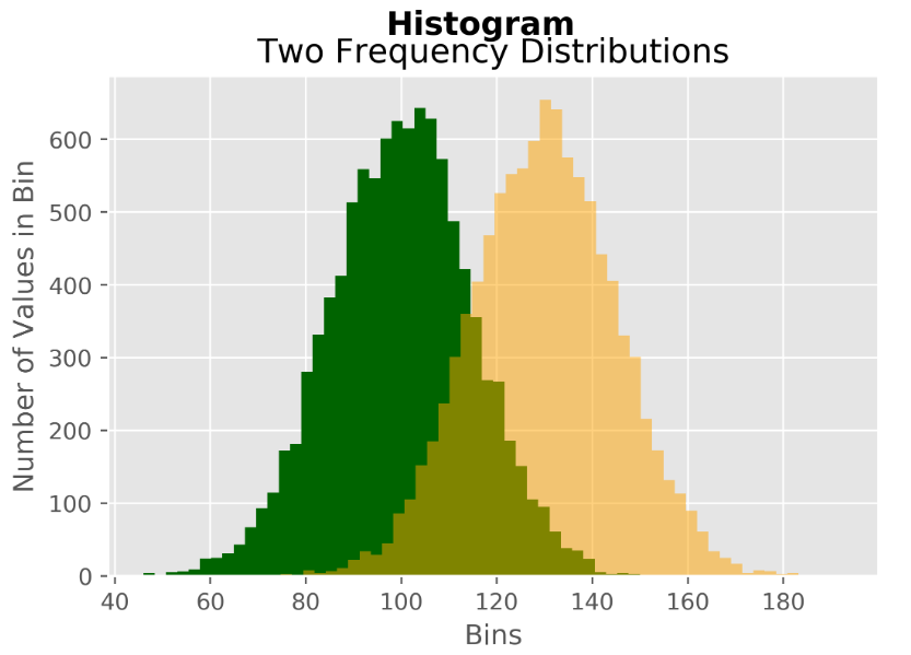
2、直方图
#!/usr/bin/env python3
#直方图,表示数值分布
#numpy提供了多维数组(ndarray)数据类型
import numpy as np
#导入pyplot模块
import matplotlib.pyplot as plt
#使用ggplot样式模拟R语言中ggplot2的绘图包
plt.style.use('ggplot')
#为正太分布设置常量
mu1,mu2,sigma=100,130,15
#python随机数生成器创建x1正太分布变量,均值为100
x1 = mu1+sigma*np.random.randn(10000)
#python随机数生成器创建x2正太分布变量,均值为130
x2 = mu2+sigma*np.random.randn(10000)
#使用matplotlib绘图时,首先要创建一个基础图
fig = plt.figure()
#在基础图中添加了一个子图,add_subplot(1,1,1)表示创建1行1列的子图,并使用第一个子图
ax1 = fig.add_subplot(1,1,1)
#创建柱形图,bins=50表示每个变量的值应该被分成50份,density=False表示直方图显示的是频率分布,
#而不是概率密度。color='darkgreen'直方图颜色为暗绿色
n,bins,patches=ax1.hist(x1,bins=50,density=False,color='darkgreen')
#创建柱形图,color='darkgreen'直方图颜色为橙色
n,bins,patches=ax1.hist(x2,bins=50,density=False,color='orange',alpha=0.5)
#设置刻度线位置在x轴的底部
ax1.xaxis.set_ticks_position('bottom')
#设置刻度线位置在y轴的左侧
ax1.yaxis.set_ticks_position('left')
#添加x轴标签
plt.xlabel('Bins')
#添加y轴标签
plt.ylabel('Number of Values in Bin')
#为基础图添加一个居中的标题,字体大小为14,粗体
fig.suptitle('Histogram',fontsize=14,fontweight='bold')
#为子图添加一个居中的标题,位于基础图标题下面
ax1.set_title('Two Frequency Distributions')
#将统计图保存在指定文件夹中,名为histogram.png,dpi=400设置图形分辨率(每英寸约2.54cm的点数)
#bbox_inches='tight'表示保存图形时,将图形四周的空白部分去掉
plt.savefig('F://python入门//文件//histogram.png',dpi=400,bbox_inches='tight')
#指示matplotlib在一个新窗口中显示统计图
plt.show()
结果:
本地中的histogram.png:
Spyder右下角显示为:

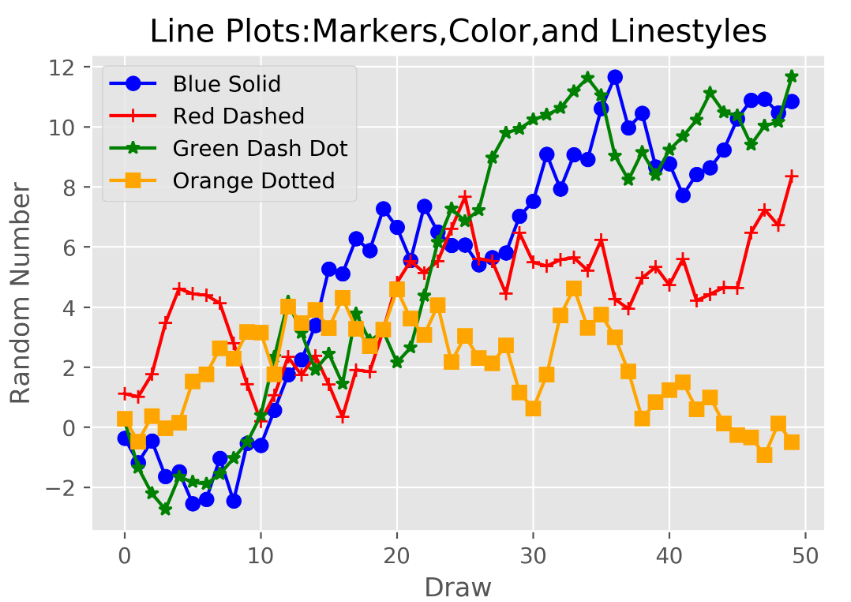
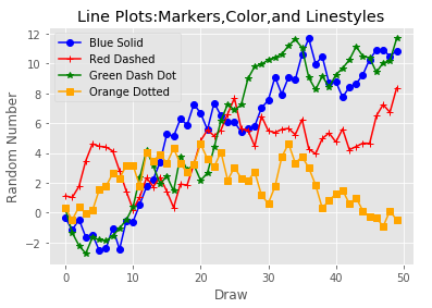
3、折线图
#!/usr/bin/env python3
#折线图
#导入随机数模块
from numpy.random import randn
#导入pyplot模块
import matplotlib.pyplot as plt
#使用ggplot样式模拟R语言中ggplot2的绘图包
plt.style.use('ggplot')
#cumsum()轴向元素累加和
plot_data1 = randn(50).cumsum()
plot_data2 = randn(50).cumsum()
plot_data3 = randn(50).cumsum()
plot_data4 = randn(50).cumsum()
#使用matplotlib绘图时,首先要创建一个基础图
fig = plt.figure()
#在基础图中添加了一个子图,add_subplot(1,1,1)表示创建1行1列的子图,并使用第一个子图
ax1 = fig.add_subplot(1,1,1)
#创建折线,marker表示折线类型,color颜色,linestyle线型,label为图例
ax1.plot(plot_data1,marker=r'o',color=u'blue',linestyle='-',label='Blue Solid')
ax1.plot(plot_data2,marker=r'+',color=u'red',linestyle='-',label='Red Dashed')
ax1.plot(plot_data3,marker=r'*',color=u'green',linestyle='-',label='Green Dash Dot')
ax1.plot(plot_data4,marker=r's',color=u'orange',linestyle='-',label='Orange Dotted')
#设置刻度线位置在x轴的底部
ax1.xaxis.set_ticks_position('bottom')
#设置刻度线位置在y轴的左侧
ax1.yaxis.set_ticks_position('left')
#为添加一个居中的标题
ax1.set_title('Line Plots:Markers,Color,and Linestyles')
#添加x轴标签
plt.xlabel('Draw')
#添加y轴标签
plt.ylabel('Random Number')
#loc='best'指示matplotlib根据图中的空白部分将图例放在最合适的位置
plt.legend(loc='best')
#bbox_inches='tight'表示保存图形时,将图形四周的空白部分去掉
plt.savefig('F://python入门//文件//line_plot.png',dpi=400,bbox_inches='tight')
#指示matplotlib在一个新窗口中显示统计图
plt.show()
结果:
本地中的line_plot.png:
Spyder右下角显示为:
4、散点图
#!/usr/bin/env python3
#散点图,表示两个数值变量之间的关系
#numpy提供了多维数组(ndarray)数据类型
import numpy as np
#导入pyplot模块
import matplotlib.pyplot as plt
#使用ggplot样式模拟R语言中ggplot2的绘图包
plt.style.use('ggplot')
#构建x
x = np.arange(start=1.,stop=15.,step=1.)
#构建y1
y_liner = x + 5. * np.random.randn(14)
#构建y2
y_quadratic = x**2 + 10.*np.random.randn(14)
#使用polyfit函数通过两组数据点拟合出一条直线
fn_liner = np.poly1d(np.polyfit(x,y_liner,deg=1))
#使用polyfit函数通过两组数据点拟合出一条二次曲线
fn_quadratic = np.poly1d(np.polyfit(x,y_quadratic,deg=2))
#使用matplotlib绘图时,首先要创建一个基础图
fig = plt.figure()
#在基础图中添加了一个子图,add_subplot(1,1,1)表示创建1行1列的子图,并使用第一个子图
ax1 = fig.add_subplot(1,1,1)
#创建带有两条回归曲线的散点图
#'bo'蓝色圆圈,'go'绿色圆圈,'b-'蓝色实线,'g-'绿色实线,linewidth线的宽度
ax1.plot(x,y_liner,'bo',x,y_quadratic,'go',x,fn_liner(x),'b-',x,fn_quadratic(x),'g-',linewidth=2.)
#设置刻度线位置在x轴的底部
ax1.xaxis.set_ticks_position('bottom')
#设置刻度线位置在y轴的左侧
ax1.yaxis.set_ticks_position('left')
#为基础图添加一个居中的标题
ax1.set_title('Scatter Plots Regression Lines')
#添加x轴标签
plt.xlabel('x')
#添加y轴标签
plt.ylabel('f(x)')
#设置X轴的范围
plt.xlim(min(x)-1.,max(x)+1.)
#设置Y轴的范围
plt.ylim((min(y_quadratic)-10.,max(y_quadratic)+10.))
#将统计图保存在指定文件夹中,名为scatter_plot.png,dpi=400设置图形分辨率(每英寸约2.54cm的点数)
#bbox_inches='tight'表示保存图形时,将图形四周的空白部分去掉
plt.savefig('F://python入门//文件//scatter_plot.png',dpi=400,bbox_inches='tight')
#指示matplotlib在一个新窗口中显示统计图
plt.show()
结果:
本地中的scatter_plot.png:
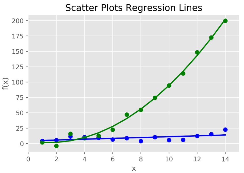
Spyder右下角显示为:
5、箱线图
#!/usr/bin/env python3
#箱线图,可以表示出数据的最小值、第一四分位数、中位数、第三四分位数和最大值。
#箱体的下部和上部边缘线分别表示第一四分位数和第三四分位数,箱体的中间的直线表示中位数。
#箱体的上下两端延伸出去的直线表示非离群点的最小值和最大值,在直线之外的点表示离群点
#numpy提供了多维数组(ndarray)数据类型
import numpy as np
#导入pyplot模块
import matplotlib.pyplot as plt
#使用ggplot样式模拟R语言中ggplot2的绘图包
plt.style.use('ggplot')
#设定一个常量
N = 500
#高斯随机,loc=0.0对应概率分布的均值,
#scale对应概率分布的标准差(对应于分布的宽度,scale越大越矮胖,scale越小,越瘦高)
#size表示输出的shape,默认为None,只输出一个值
normal = np.random.normal(loc=0.0,scale=1.0,size=N)
#对数正态分布,均值和标准差
lognormal = np.random.lognormal(mean=0.0,sigma=1.0,size=N)
#生成闭区间[low,high]上离散均匀分布的整数值
index_value = np.random.random_integers(low=0,high=N-1,size=N)
#高斯随机
normal_sample = normal[index_value]
#对数正态分布
lognormal_sample = lognormal[index_value]
#将生成的目标数据放到列表中
box_plot_data = [normal,normal_sample,lognormal,lognormal_sample]
#使用matplotlib绘图时,首先要创建一个基础图
fig = plt.figure()
#在基础图中添加了一个子图,add_subplot(1,1,1)表示创建1行1列的子图,并使用第一个子图
ax1 = fig.add_subplot(1,1,1)
#存放箱线图的标签
box_label = ['normal','normal_sample','lognormal','lognormal_sample']
#box_plot创建4个箱线图,notch=False表示箱体是矩形,而不是中间收缩
#sym='.'表示离群点使用圆点,而不是默认的+号。vert=True表示箱体是垂直的,不是水平的
#whis=1.5设定了直线从第一四分位数和第三四分位数延伸出的范围
#showmeans=True表示箱体在显示中位数的同时也显示均值lables=box_lable表示使用box_lable中的值来标记箱线图
ax1.boxplot(box_plot_data,notch=False,sym='.',vert=True,whis=1.5,showmeans=True,labels=box_label)
#设置刻度线位置在x轴的底部
ax1.xaxis.set_ticks_position('bottom')
#设置刻度线位置在y轴的左侧
ax1.yaxis.set_ticks_position('left')
#为基础图添加一个居中的标题
ax1.set_title('Box Plots:Resampling of Two Distributions')
#添加x轴标签
ax1.set_xlabel('Distribution')
#添加y轴标签
ax1.set_ylabel('Value')
#将统计图保存在指定文件夹中,名为box_plot.png,dpi=400设置图形分辨率(每英寸约2.54cm的点数)
#bbox_inches='tight'表示保存图形时,将图形四周的空白部分去掉
plt.savefig('F://python入门//文件//box_plot.png',dpi=400,bbox_inches='tight')
#指示matplotlib在一个新窗口中显示统计图
plt.show()
结果:
本地中的box_plot.png:

Spyder右下角显示为:

6、组合图
#!/usr/bin/env python3
#创建一个条形图和箱线图,并将它们并排放置
#引入pandas模块,辅助绘图
import pandas as pd
#numpy提供了多维数组(ndarray)数据类型
import numpy as np
#导入pyplot模块
import matplotlib.pyplot as plt
#使用ggplot样式模拟R语言中ggplot2的绘图包
plt.style.use('ggplot')
#创建一个基础图和两个并排放置的子图
fig,axes=plt.subplots(nrows=1,ncols=2)
#使用ravel()函数将两个子图分别赋给两个变量ax1和ax2,这样可以避免是使用行和列的索引
ax1,ax2 = axes.ravel()
#创建一个数据框,存放5*3
data_frame = pd.DataFrame(np.random.rand(5,3),
                          index=['Customer 1','Customer 2','Customer 3','Customer 4','Customer 5'],
                          columns=pd.Index(['Metric 1','Metric 2','Metric 3'],name='Metric'))
print(data_frame)
#创建条形图,在由句柄ax指定的轴框内绘图,alpha是横轴
data_frame.plot(kind='bar',ax=ax1,alpha=0.75,title='Bar Plot')
#设置x轴的旋转角度和字体,fontsize=10字体大小为10,旋转角度为45度
plt.setp(ax1.get_xticklabels(),rotation=45,fontsize=10)
#设置y轴的旋转角度和字体
plt.setp(ax1.get_yticklabels(),rotation=0,fontsize=10)
#添加x轴标签
ax1.set_xlabel('Customer')
#添加y轴标签
ax1.set_ylabel('Value')
#设置刻度线位置在x轴的底部
ax1.xaxis.set_ticks_position('bottom')
#设置刻度线位置在y轴的左侧
ax1.yaxis.set_ticks_position('left')
#创建箱线图并设置相关属性
#创建一个颜色字典,箱体设置为深蓝,将离群点的值设置为红色
colors = dict(boxes='DarkBlue',whiskers='Gray',medians='Red',caps='Black')
#绘制箱线图
data_frame.plot(kind='box',color=colors,sym='r.',ax=ax2,title='Box Plot')
#设置x轴的旋转角度和字体
plt.setp(ax2.get_xticklabels(),rotation=45,fontsize=10)
#设置y轴的旋转角度和字体
plt.setp(ax2.get_yticklabels(),rotation=0,fontsize=10)
#添加x轴标签
ax2.set_xlabel('Metric')
#添加y轴标签
ax2.set_ylabel('Value')
#设置刻度线位置在x轴的底部
ax2.xaxis.set_ticks_position('bottom')
#设置刻度线位置在y轴的左侧
ax2.yaxis.set_ticks_position('left')
#将统计图保存在指定文件夹中,名为pandas_plots.png,dpi=400设置图形分辨率(每英寸约2.54cm的点数)
#bbox_inches='tight'表示保存图形时,将图形四周的空白部分去掉
plt.savefig('F://python入门//文件//pandas_plots.png',dpi=400,bbox_inches='tight')
#指示matplotlib在一个新窗口中显示统计图
plt.show()
结果:
本地中的pandas_plots.png:
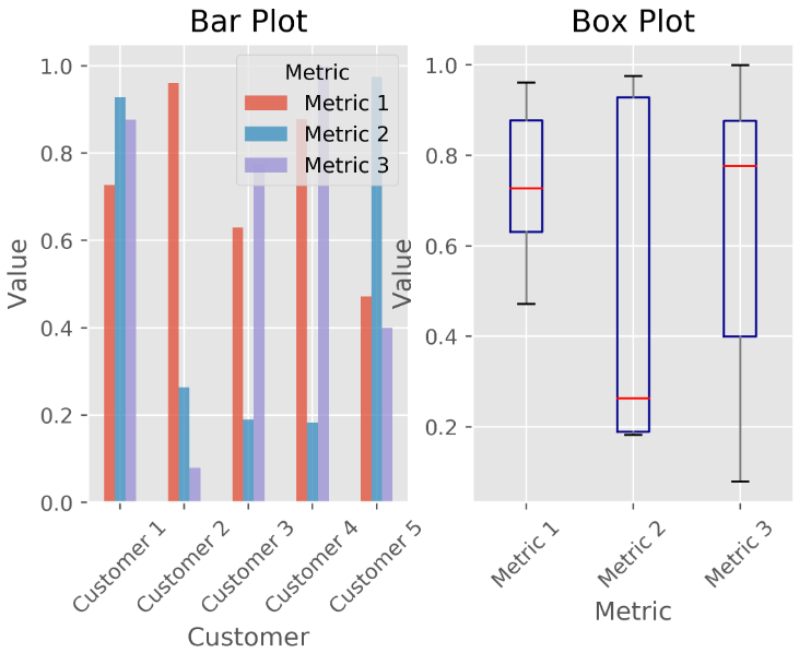
Spyder右下角显示为:
Metric      Metric 1  Metric 2  Metric 3
Customer 1  0.727154  0.928098  0.876256
Customer 2  0.960446  0.262999  0.078873
Customer 3  0.630254  0.189192  0.776164
Customer 4  0.877072  0.182347  0.999244
Customer 5  0.471769  0.974709  0.399506
