<!DOCTYPE html>
<html>
<head>
<meta charset="UTF-8">
<title>线性渐变和径向渐变</title>
<style type="text/css">
#dd{
500px;
height: 200px;
/*线性渐变*/
background-image: linear-gradient(red,yellow);
}
#dd1{
500px;
height: 200px;
/*方向线性渐变*/
background-image: linear-gradient(to top right,red,yellow);
}
#dd2{
500px;
height: 200px;
/*角度线性渐变*/
background-image: linear-gradient(45deg,red,yellow);
}
#dd3{
500px;
height: 200px;
/*多种颜色等比例渐变*/
background-image: linear-gradient(to bottom right,red 0%,yellow 30%, orange 60%,green 100%);
}
#dd4{
500px;
height: 200px;
/*径向渐变*/
background-image: radial-gradient(green,blue);
}
#dd5{
500px;
height: 200px;
/*椭圆径向渐变*/
background-image: radial-gradient(ellipse,red,yellow);
}
#dd6{
500px;
height: 200px;
/*圆形可设置大小的径向渐变*/
background-image: radial-gradient(circle 100px,#000,#ff0000);
}
#dd7{
500px;
height: 200px;
/*重复的径向渐变*/
background-image:repeating-radial-gradient(circle 50px,#000,#ff0000);
}
/* 文字渐变 */
.text-gradient {
display: inline-block;
font-family: '微软雅黑';
font-size: 10em;
position: relative;
}
.text-gradient[data-text]::after {
content: attr(data-text);
color: #FBEE00;
position: absolute;
left: 0;
z-index: 2;
-webkit-mask-image: -webkit-gradient(linear, 0 0, 0 bottom, from(#FBEE00), to(rgba(251,246,147,.6)));
}
</style>
</head>
<body>
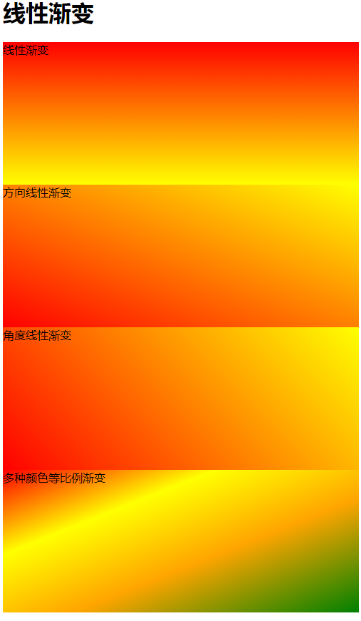
<h1>线性渐变</h1>
<div id="dd">
线性渐变
</div>
<div id="dd1">
方向线性渐变
</div>
<div id="dd2">
角度线性渐变
</div>
<div id="dd3">
多种颜色等比例渐变
</div>
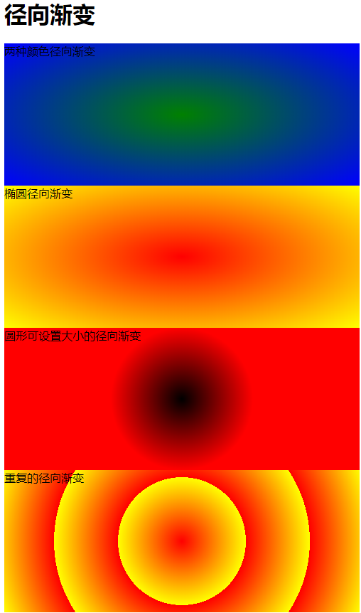
<h1>径向渐变</h1>
<div id="dd4">
两种颜色径向渐变
</div>
<div id="dd5">
椭圆径向渐变
</div>
<div id="dd6">
圆形可设置大小的径向渐变
</div>
<div id="dd7">
重复的径向渐变
</div>
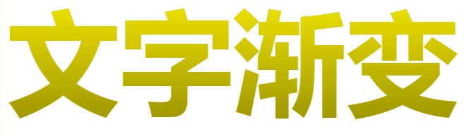
<h2 class="text-gradient" data-text="文字渐变">文字渐变</h2>
</body>
</html>
<script>
var dd = document.getElementById("dd7");
var xd = 50;
setInterval(function(){
xd+=5;
if(xd>=100){
xd=50;
}
dd.style.backgroundImage='repeating-radial-gradient(circle '+xd+'px,red,yellow)';
},100);
</script>