transform 属性
1、向元素应用 2D 或 3D 转换
2、该属性允许我们对元素进行旋转、缩放、移动或倾斜。
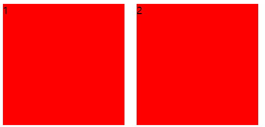
缩放与位移
transform: scale(2, 0.5);//水平缩放,垂直缩放
transform: translate(150px, 150px);//水平位移(正值向右负值向左),垂直位移(正值向下负值向上)
<!DOCTYPE html>
<html lang="en">
<head>
    <meta charset="UTF-8">
    <title>Title</title>
    <style>
        .box {
            width: 480px;
            height: 400px;
            margin: 150px auto;
        }

        .box > div {
            width: 200px;
            height: 200px;
            float: left;
            margin: 0 10px;
            background-color: red;
            transition: all 1s;
        }

        .box1:hover {
            /*水平缩放,垂直缩放*/
            transform: scale(2, 0.5);
        }

        .box2:hover {
            /*水平位移,垂直位移*/
            transform: translate(150px, 150px);
        }
    </style>
</head>
<body>
<div class="box">
    <div class="box1">1</div>
    <div class="box2">2</div>
</div>
</body>
</html>
<!DOCTYPE html>
<html lang="en">
<head>
    <meta charset="UTF-8">
    <title>Title</title>
    <style>
        div {
            width: 200px;
            height: 200px;
            background-color: pink;
            position: absolute;
            left: 50%;
            top: 50px;
            transform: translate(-50%);
        }
    </style>
</head>
<body>
<div>定位居中</div>
</body>
</html>
角度旋转
transform:rotate(-945deg);//正值顺时针,负值逆时针
transform-origin: 50px 50px;//水平坐标,垂直坐标
transform-origin: 20% 20%;//水平坐标,垂直坐标
transform-origin: center bottom;//水平坐标,垂直坐标
<!DOCTYPE html>
<html lang="en">
<head>
    <meta charset="UTF-8">
    <title>Title</title>
    <style>
        * {
            padding: 0;
            margin: 0;
            background-color: #ccc;
        }

        p {
            margin-top: 20px;
            text-align: center;
            font-size: 50px;
            color: red;
        }

        .box {
            width: 300px;
            height: 450px;
            margin: 70px auto;
            position: relative;
        }

        .box > div {
            width: 100%;
            height: 100%;
            background-color: #fff;
            position: absolute;
            top: 0;
            left: 0;
            font-size: 30px;
            transform-origin: center bottom;
            transition: all 1s;
            box-shadow: 0 0 3px 1px #666;
        }

        .box:hover .p1:nth-child(6) {
            transform: rotate(-10deg);
        }

        .box:hover .p1:nth-child(5) {
            transform: rotate(-20deg);
        }

        .box:hover .p1:nth-child(4) {
            transform: rotate(-30deg);
        }

        .box:hover .p1:nth-child(3) {
            transform: rotate(-40deg);
        }

        .box:hover .p1:nth-child(2) {
            transform: rotate(-50deg);
        }

        .box:hover .p1:nth-child(1) {
            transform: rotate(-60deg);
        }

        .box:hover .p1:nth-child(8) {
            transform: rotate(10deg);
        }

        .box:hover .p1:nth-child(9) {
            transform: rotate(20deg);
        }

        .box:hover .p1:nth-child(10) {
            transform: rotate(30deg);
        }

        .box:hover .p1:nth-child(11) {
            transform: rotate(40deg);
        }

        .box:hover .p1:nth-child(12) {
            transform: rotate(50deg);
        }

        .box:hover .p1:nth-child(13) {
            transform: rotate(60deg);
        }
    </style>
</head>
<body>
<p>派克牌摊开</p>
<div class="box">
    <div class="p1">1</div>
    <div class="p1">2</div>
    <div class="p1">3</div>
    <div class="p1">4</div>
    <div class="p1">5</div>
    <div class="p1">6</div>
    <div class="p1">7</div>
    <div class="p1">8</div>
    <div class="p1">9</div>
    <div class="p1">10</div>
    <div class="p1">11</div>
    <div class="p1">12</div>
    <div class="p1">13</div>
</div>
</body>
</html>

倾斜
skew(deg, deg):可以使元素按一定的角度进行倾斜,可为负值,第二个参数不写默认为0