transition:1、开始状态 2、终止状态 3、过渡属性
transition: width 2s, background-color 2s;//属性,时间
transition: all 2s linear 1s;//属性,时间,运动曲线,延迟时间
属性详解
/* 如果希望所有的属性都发生过渡 使用过all*/
transition-property: all;
/* 过渡持续时间*/
transition-duration: 4s;
/*运动曲线 linear 线性 ease-in ease-out  ease-in-out :先加速后减速 */
transition-timing-function: ease-in-out;
/* 过渡延迟*/
transition-delay: 1s;
/* 简写*/
transition: width 4s ease-in-out 0s;
泡泡案例
<!DOCTYPE html>
<html lang="en">
<head>
    <meta charset="UTF-8">
    <title>Title</title>
    <style>
        div {
            margin: 100px auto;
            width: 300px;
            height: 100px;
            background: url("images/paopao.png") no-repeat left top,
            url("images/paopao.png") no-repeat right bottom blue;
            transition: all 1s;
        }

        div:hover {
            background: url("images/paopao.png") no-repeat left bottom,
            url("images/paopao.png") no-repeat right top blue;
        }
    </style>
</head>
<body>
<div></div>
</body>
</html>

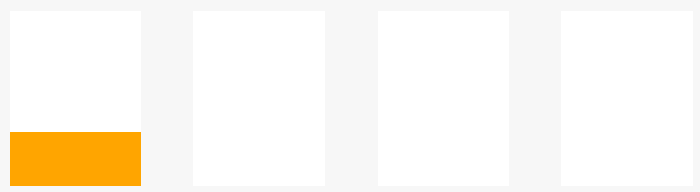
小米案例
<!DOCTYPE html>
<html lang="en">
<head>
    <meta charset="UTF-8">
    <title>Title</title>
    <style>
        body {
            margin: 0;
            padding: 0;
            background-color: #F7F7F7;
        }

        .box {
            width: 1000px;
            height: 400px;
            margin: 150px auto;
        }

        .box1 {
            width: 150px;
            height: 200px;
            margin: 0 30px;
            background-color: #fff;
            float: left;
            position: relative;
            overflow: hidden;
        }

        .box2 {
            position: absolute;
            bottom: -80px;
            left: 0;
            width: 100%;
            height: 80px;
            background-color: orange;
            transition: all 1s;
        }

        .box1:hover .box2 {
            bottom: 0;
        }
    </style>
</head>
<body>
<div class="box">
    <div class="box1">
        <div class="box2"></div>
    </div>
    <div class="box1">
        <div class="box2"></div>
    </div>
    <div class="box1">
        <div class="box2"></div>
    </div>
    <div class="box1">
        <div class="box2"></div>
    </div>
</div>
</body>
</html>