微信小程序组件标签
<!--
微信小程序中 标签也叫做组件
1.view组件是一个容器组件(可以放文字、可以放组件),可以理解为div标签
hover-class:指定按下去的样式类
--->
<view hover-class="a">123</view>
<!--
2.button组件
size:按钮的大小
type: primary 绿色 default 白色 warn 红色
plain:false|true 按钮是否镂空,背景色透明
disabled:boolean|false 是否禁用
loading:false|true 名称前是否带 loading 图标
form-type:"submit"|"reset" 点击分别会触发 form 组件的 submit/reset 事件
hover-class:"class名" :按下去的样式类。当 hover-class="none" 时,没有点击态效果
hover-stop-propagation:false|true 阻止本节点的祖先节点出现点击态
hover-start-time: 默认20毫秒,按住后多久出现点击态
hover-stay-time:默认70毫秒 松开后点击状态保留时间
-->
<button size="mini">按钮1</button>
<button size="default" type='primary'>按钮1</button>
<button size="mini" type='default'>按钮1</button>
<button size="mini" type='warn'>按钮1</button>
<button size="mini" type='warn' plain='true'>按钮1</button>
<button size="mini" disabled='true'>按钮1</button>
<button size="default" loading='true'>按钮1</button>
<button size="mini" hover-class="a">按钮1</button>
<view hover-class="a" >
<button hover-stop-propagation="true" size="mini" hover-class="a">按钮1</button>
</view>
<button hover-start-time="2000" size="mini" hover-class="a">按钮1</button>
<button hover-stay-time="5000" size="mini" hover-class="a">按钮1</button>
效果:

<!--
2.输入框
value string 是 输入框的初始内容
type string text 否 input 的类型
password boolean false 否 是否是密码类型
placeholder string 是 输入框为空时占位符
placeholder-style string 是 指定 placeholder 的样式
placeholder-class string input-placeholder 否 指定 placeholder 的样式类
disabled boolean false 否 是否禁用
maxlength number 140 否 最大输入长度,设置为 -1 的时候不限制最大长度
bindinput eventhandle 是 键盘输入时触发,event.detail = {value, cursor, keyCode},keyCode 为键值,处理函数可以直接 return 一个字符串,将替换输入框的内容。
bindfocus eventhandle 是 输入框聚焦时触发,event.detail = { value, height },height 为键盘高度
bindblur eventhandle 是 输入框失去焦点时触发,event.detail = {value: value}
-->
<input style="border:1px solid"/>
效果:

<!--
3.表单标签
表单。将组件内的用户输入的switch input checkbox slider radio picker 提交。
bindsubmit eventhandle 否 携带 form 中的数据触发 submit 事件,event.detail = {value : {'name': 'value'} , formId: ''}
bindreset eventhandle 否 表单重置时会触发 reset 事件
-->
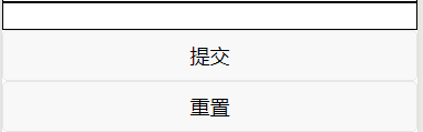
<form>
<input style="border:1px solid"/>
<button form-type="submit">提交</button>
<button form-type="reset">重置</button>
</form>
效果:
<!--
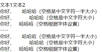
3.text组件:用来放文本、类似于span标签, 内只支持 text 嵌套
selectable:false|true 文本是否能选中
space:ensp|emsp|nbsp 显示连续空格
decode:true|false 是否解码 < >
-->
<view>---</view>
<text>文本1</text>
<text selectable="true">文本2</text>
<view><text space="ensp">你好, 哈哈哈(空格是中文字符一半大小)</text></view>
<view><text space="emsp">你好, 哈哈哈(空格是中文字符大小)</text></view>
<view><text space="nbsp">你好, 哈哈哈(空格根据字体设置)</text></view>
<view>----</view>
<view><text decode="{{true}}">你好, 哈哈哈(空格是中文字符一半大小)</text></view>
<view><text decode="{{true}}">你好, 哈哈哈(空格是中文字符大小)</text></view>
<view><text decode="{{true}}">你好, 哈哈哈(空格根据字体设置)</text></view>
效果:
<!--
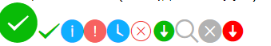
4.icon图标
type:图标类型:success, success_no_circle, info, warn, waiting, cancel, download, search, clear
size:图标大小 number/string 默认23
color:图标颜色
-->
<icon type="success" size='40'></icon>
<icon type="success_no_circle"></icon>
<icon type="info"></icon>
<icon type="warn"></icon>
<icon type="waiting"></icon>
<icon type="cancel"></icon>
<icon type="download"></icon>
<icon type="search"></icon>
<icon type="clear"></icon>
<icon type="download" color="red"></icon>
效果:
<!--
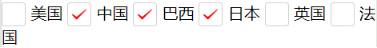
5.checkbox多选
value string 否 checkbox标识,选中时触发checkbox-group的 change 事件,并携带 checkbox 的 value
disabled:true|false 是否禁用
checked:true|false 当前是否选中,可用来设置默认选中
color:'颜色' #09BB07 否 checkbox对号的颜色
6.checkbox-group 多项选择器,内部由多个checkbox组成。
checkbox-group中选中项发生改变时触发 change 事件,detail = {value:[选中的checkbox的value的数组]}
-->
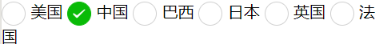
<checkbox-group bindchange="checkboxChange">
<label class="checkbox" wx:for="{{items}}" wx:key>
<checkbox color="red" value="{{item.name}}" checked="{{item.checked}}"/>{{item.value}}
</label>
</checkbox-group>
效果:
<!--
7.radio单选
value string 否 radio 标识。当该radio 选中时,radio-group 的 change 事件会携带radio的value
disabled:true|false 是否禁用
checked:true|false 当前是否选中,可用来设置默认选中
color:'颜色' #09BB07 否 checkbox对号的颜色
8.radio-group 单项选择器,内部由多个 radio 组成
bindchange radio-group中选中项发生改变时触发 change 事件,detail = {value:[选中的checkbox的value的数组]}
-->
<radio-group class="radio-group" bindchange="radioChange">
<label class="radio" wx:for="{{items}}" wx:key>
<radio value="{{item.name}}" checked="{{item.checked}}"/>{{item.value}}
</label>
</radio-group>
效果:
<!--
9.textarea
value string 否 输入框的内容
placeholder string 否 输入框为空时占位符
placeholder-style string 否 指定 placeholder 的样式,目前仅支持color,font-size和font-weight
placeholder-class string textarea-placeholder 否 指定 placeholder 的样式类
disabled boolean false 否 是否禁用
bindinput eventhandle 否 当键盘输入时,触发 input 事件,event.detail = {value, cursor, keyCode}
-->
<textarea bindinput="textareaInput" style="border:1rpx solid red" value='11' ></textarea>
效果:
<!--
10.switch开关组件
checked 默认false 否 是否选中
disabled 默认 false 否 是否禁用
type 默认 switch 否 样式,有效值:switch, checkbox
color 默认 #04BE02 开关背景颜色
-->
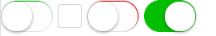
<switch></switch>
<switch type='checkbox'></switch>
<switch color='#f00' ></switch>
<switch checked bindchange="switch1Change"/>
效果:
<!--
11.slider 滑动杆标签
min number 0 否 最小值
max number 100 否 最大值
step number 1 否 步长,取值必须大于 0,并且可被(max - min)整除
disabled boolean false 否 是否禁用
value number 0 否 当前取值
backgroundColor #e9e9e9 否 背景条的颜色
activeColor color #1aad19 否 已选择的颜色
block-size number 28 否 滑块的大小,取值范围为 12 - 28
block-color color #ffffff 否 滑块的颜色
show-value boolean false 否 是否显示当前 value
bindchange eventhandle 否 完成一次拖动后触发的事件,event.detail = {value}
bindchanging eventhandle 否 拖动过程中触发的事件,event.detail = {value}
-->
<slider bindchange="sliderchange" show-value="true" block-color="#00f" activeColor="#00f" backgroundColor="red" bindchanging="sliderchange2" step="5"/>
效果:

<!--
13.progress 进度条
进度条。组件属性的长度单位默认为px,2.4.0起支持传入单位(rpx/px)。
percent number 否 百分比0~100
show-info boolean false 否 在进度条右侧显示百分比
border-radius number/string 0 否 圆角大小
font-size number/string 16 否 右侧百分比字体大小
stroke-width number/string 6 否 进度条线的宽度
activeColor string #09BB07 否 已选择的进度条的颜色
backgroundColor string #EBEBEB 否 未选择的进度条的颜色
active boolean false 否 进度条从左往右的动画
active-mode string backwards 否 backwards: 动画从头播;forwards:动画从上次结束点接着播
bindactiveend eventhandle 否 动画完成事件
-->
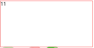
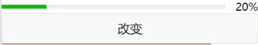
<progress percent="{{num}}" active active-mode="forwards" show-info/>
<button bindtap='changeNum'>改变</button>
效果:
<!--
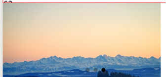
14.image图片,支持JPG、PNG、SVG格式
src string 否 图片资源地址
mode string scaleToFill 否 图片裁剪、缩放的模式
scaleToFill 缩放模式,不保持纵横比缩放图片,使图片的宽高完全拉伸至填满 image 元素
aspectFit 缩放模式,保持纵横比缩放图片,使图片的长边能完全显示出来。也就是说,可以完整地将图片显示出来。
aspectFill 缩放模式,保持纵横比缩放图片,只保证图片的短边能完全显示出来。也就是说,图片通常只在水平或垂直方向是完整的,另一个方向将会发生截取。
widthFix 缩放模式,宽度不变,高度自动变化,保持原图宽高比不变
show-menu-by-longpress boolean false 否 开启长按图片显示识别小程序码菜单
binderror eventhandle 否 当错误发生时触发,,event.detail = {errMsg}
bindload eventhandle 否 当图片载入完毕时触发,event.detail = {height, width}
-->
<image style='200rpx;height:200rpx;border:1px solid red' src="../../img/img.jpg" mode="scaleToFill"/>
<image style='200rpx;height:200rpx;border:1px solid red' src="../../img/img.jpg" mode="aspectFit"/>
<image style='200rpx;height:200rpx;border:1px solid red' src="../../img/img.jpg" mode="aspectFill"/>
<image style='200rpx;height:200rpx;border:1px solid red' src="../../img/img.jpg" mode="widthFix"/>
<image show-menu-by-longpress style='200rpx;height:200rpx;border:1px solid red' src="../../img/img.jpg" />
效果:

<!--
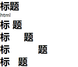
15.富文本:里面插入的标签可以显示
nodes array/string [] 否 节点列表/HTML String
space string 否 显示连续空格
ensp 中文字符空格一半大小 emsp 中文字符空格大小 nbsp 根据字体设置的空格大小
-->
<rich-text nodes="<h1>标题</h1>"></rich-text>
<rich-text nodes="html" space="ensp"></rich-text>
<rich-text nodes="<h1>标 题</h1>" ></rich-text>
<rich-text nodes="<h1>标 题</h1>" space="ensp"></rich-text>
<rich-text nodes="<h1>标 题</h1>" space="emsp"></rich-text>
<rich-text nodes="<h1>标 题</h1>" space="nbsp"></rich-text>
效果:
<!--
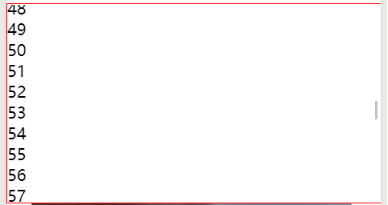
16.可滚动视图区域
使用竖向滚动时,需要给scroll-view一个固定高度
scroll-x boolean false 否 允许横向滚动
scroll-y boolean false 否 允许纵向滚动
upper-threshold number/string 50 否 距顶部/左边多远时,触发 scrolltoupper 事件
lower-threshold number/string 50 否 距底部/右边多远时,触发 scrolltolower 事件
scroll-top number/string 否 设置竖向滚动条位置
scroll-left number/string 否 设置横向滚动条位置
scroll-into-view string 否 值应为某子元素id(id不能以数字开头)。
设置哪个方向可滚动,则在哪个方向滚动到该元素
scroll-with-animation boolean false 否 在设置滚动条位置时使用动画过渡
bindscrolltoupper eventhandle 否 滚动到顶部/左边时触发
bindscrolltolower eventhandle 否 滚动到底部/右边时触发
bindscroll eventhandle 否 滚动时触发,
event.detail = {scrollLeft, scrollTop, scrollHeight, scrollWidth, deltaX, deltaY}
-->
<scroll-view scroll-y style="height:200px;border:1px solid red;box-sizing:border-box">
<view wx:for="{{99}}" wx:key>{{item}}</view>
</scroll-view>
效果:
<!--
17.swiper 轮播图
滑块视图容器。其中只可放置swiper-item组件,否则会导致未定义的行为。
ndicator-dots boolean false 否 是否显示面板指示点
indicator-color color rgba(0, 0, 0, .3) 否 指示点颜色
indicator-active-color color #000000 否 当前选中的指示点颜色
autoplay boolean false 否 是否自动切换
current number 0 否 当前所在滑块的 index
interval number 5000 否 自动切换时间间隔
duration number 500 否 滑动动画时长
circular boolean false 否 是否采用衔接滑动
vertical boolean false 否 滑动方向是否为纵向
previous-margin string "0px" 否 前边距,可用于露出前一项的一小部分,接受 px 和 rpx 值
next-margin string "0px" 否 后边距,可用于露出后一项的一小部分,接受 px 和 rpx 值
display-multiple-items number 1 否 同时显示的滑块数量
skip-hidden-item-layout boolean false 否 是否跳过未显示的滑块布局,设为 true 可优化复杂情况下的滑动性能,但会丢失隐藏状态滑块的布局信息
easing-function string "default" 否 指定 swiper 切换缓动动画类型
default 默认缓动函数
linear 线性动画
easeInCubic 缓入动画
easeOutCubic 缓出动画
easeInOutCubic 缓入缓出动画
bindchange eventhandle 否 current 改变时会触发 change 事件,event.detail = {current, source}
bindtransition eventhandle 否 swiper-item 的位置发生改变时会触发 transition 事件,event.detail = {dx: dx, dy: dy}
bindanimationfinish eventhandle 否 动画结束时会触发 animationfinish 事件,event.detail 同上
18.swiper-item 仅可放置在swiper组件中,宽高自动设置为100%。
item-id string 否 该 swiper-item 的标识符
-->
<swiper indicator-dots="{{true}}"
autoplay="{{true}}" interval="5000" duration="1000" >
<block wx:for="{{imgUrls}}" wx:key>
<swiper-item>
<image src="{{item}}" class="slide-image" width="355" height="150"/>
</swiper-item>
</block>
</swiper>
效果:
<!--
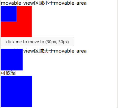
19.movable-area 可移动区域
scale-area Boolean false 否 当里面的movable-view设置为支持双指缩放时,
设置此值可将缩放手势生效区域修改为整个movable-area
注意:
movable-area 必须设置width和height属性,不设置默认为10px**
当movable-view小于movable-area时,movable-view的移动范围是在movable-area内;
当movable-view大于movable-area时,movable-view的移动范围必须包含movable-area(x轴方向和y轴方向分开考虑)
20.movable-view 可移动的容器
可移动的视图容器,在页面中可以拖拽滑动。movable-view必须在 movable-area 组件中,并且必须是直接子节点,否则不能移动。
direction string none 否 movable-view的移动方向,属性值有all、vertical、horizontal、none
inertia boolean false 否 movable-view是否带有惯性
out-of-bounds boolean false 否 超过可移动区域后,movable-view是否还可以移动
x number 否 定义x轴方向的偏移,如果x的值不在可移动范围内,会自动移动到可移动范围;改变x的值会触发动画
y number 否 定义y轴方向的偏移,如果y的值不在可移动范围内,会自动移动到可移动范围;改变y的值会触发动画
damping number 20 否 阻尼系数,用于控制x或y改变时的动画和过界回弹的动画,值越大移动越快
friction number 2 否 摩擦系数,用于控制惯性滑动的动画,值越大摩擦力越大,滑动越快停止;必须大于0,否则会被设置成默认值
disabled boolean false 否 是否禁用
scale boolean false 否 是否支持双指缩放,默认缩放手势生效区域是在movable-view内
scale-min number 0.5 否 定义缩放倍数最小值
scale-max number 10 否 定义缩放倍数最大值
scale-value number 1 否 定义缩放倍数,取值范围为 0.5 - 10
animation boolean true 否 是否使用动画
bindchange eventhandle 否 拖动过程中触发的事件,event.detail = {x, y, source}
bindscale eventhandle 否 缩放过程中触发的事件,event.detail = {x, y, scale},x和y字段在2.1.0之后支持
htouchmove eventhandle 否 初次手指触摸后移动为横向的移动时触发,如果catch此事件,则意味着touchmove事件也被catch
vtouchmove eventhandle 否 初次手指触摸后移动为纵向的移动时触发,如果catch此事件,则意味着touchmove事件也被catch
-->
<view class="section">
<view class="section__title">movable-view区域小于movable-area</view>
<movable-area style="height: 200px; 200px; background: red;">
<movable-view style="height: 50px; 50px; background: blue;" x="{{x}}" y="{{y}}" direction="all">
</movable-view>
</movable-area>
<view class="btn-area">
<button size="mini" bindtap="tap">click me to move to (30px, 30px)</button>
</view>
<view class="section__title">movable-view区域大于movable-area</view>
<movable-area style="height: 100px; 100px; background: red;">
<movable-view style="height: 200px; 200px; background: blue;" direction="all">
</movable-view>
</movable-area>
<view class="section__title">可放缩</view>
<movable-area style="height: 200px; 200px; background: red;" scale-area>
<movable-view style="height: 50px; 50px; background: blue;" direction="all" bindchange="onChange" bindscale="onScale" scale scale-min="0.2" scale-max="4" scale-value="2">
</movable-view>
</movable-area>
</view>
效果:
<!--
21.跳转的链接
navigator
url string 否 当前小程序内的跳转链接
open-type string navigate 否 跳转方式
navigate 保留当前页面,跳转到应用内的某个页面。
redirect 关闭当前页面,跳转到应用内的某个页面。
switchTab 跳转到 tabBar 页面,并关闭其他所有非 tabBar 页面
reLaunch 关闭所有页面,打开到应用内的某个页面
navigateBack 关闭当前页面,返回上一页面或多级页面。
-->
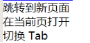
<view class="btn-area">
<navigator url="/pages/a/a" >跳转到新页面</navigator>
<navigator url="/pages/c/c" open-type="redirect">在当前页打开</navigator>
<navigator url="/pages/b/b" open-type="switchTab">切换 Tab</navigator>
</view>
效果:
<!--
22.滚动选择器
mode string selector 否 选择器类型
selector 普通选择器
multiSelector 多列选择器
time 时间选择器
date 日期选择器
region 省市区选择器
-->
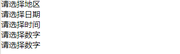
<picker mode="region">请选择地区</picker>
<picker mode="date">请选择日期</picker>
<picker mode="time">请选择时间</picker>
<picker mode="selector" range="{{[1,2,3,4]}}">请选择数字</picker>
<picker mode="multiSelector" value="1" range="{{[[1,1],[2,2]]}}">请选择数字</picker>
效果:
Js页面对应的代码
/**
* 页面的初始数据
*/
data: {
items: [
{ name: 'USA', value: '美国' },
{ name: 'CHN', value: '中国', checked: 'true' },
{ name: 'BRA', value: '巴西' },
{ name: 'JPN', value: '日本' },
{ name: 'ENG', value: '英国' },
{ name: 'TUR', value: '法国' },
],
num:20,
html: [{
name: 'div',
attrs: {
class: 'div_class',
style: 'line-height: 60px; color: red;'
},
children: [{
type: 'text',
text: 'Hello World!'
}]}
],
imgUrls: [
'https://images.unsplash.com/photo-1551334787-21e6bd3ab135?w=640',
'https://images.unsplash.com/photo-1551214012-84f95e060dee?w=640',
'https://images.unsplash.com/photo-1551446591-142875a901a1?w=640'
]
},
checkboxChange: function (e) {
console.log('checkbox发生change事件,携带value值为:', e.detail.value)
},
radioChange: function (e) {
console.log('radio发生change事件,携带value值为:', e.detail.value)
},
textareaInput:function(e){
console.log(e.detail )
},
switch1Change: function (e) {
console.log('switch1 发生 change 事件,携带值为', e.detail.value)
},
sliderchange:function (e) {
console.log('发生 change 事件,携带值为', e.detail.value)
},
sliderchange2: function (e) {
console.log('发生 changeing 事件,携带值为', e.detail.value)
},
changeNum:function(e){
this.setData({num:50})
},