布局和常用Panel学习
一、简介
所有的WPF布局容器都派生自System.Windows.Controls.Panel。Panel继承自FrameworkElement。 在Panel中有一个比较重要的属性是UIElementCollection 类型的Children属性,UIElementCollection是一个有序的集合。我们可以使用继承自Panel的类来重写MeasureOverride(),ArrangeOverride()实现自定义面板。
常用的布局容器:
Border不是布局面板,但是经过几个大佬的提醒,用好他真的很重要,所以我就放在第一个了。
StackPanel: 堆栈面板,水平或垂直放置元素。
WrapPanel:可换行的行中放置元素,在水平方向上从左向右放置元素,换行后也是从左向右。在垂直方向上,从上到下放置元素,在切换列后也是从上到下。
DockPanel: 根据容器的整个边界调整元素。
Grid:在行列表格中排列元素。
UniformGrid:强制所有单元格具有相同尺寸。
Canvas:使用固定坐标绝对定位元素。
ScrollViewer:通过添加滚动条可以使当前过长布局内的内容纵向或者横向滚动。再有限的区域内可以通过滚动呈现更多的内容。
二、代码案例
1.Border
Border不是布局面板,但是经常与布局类的面板一起配合使用,所以先介绍Border。Border的主要作用是给元素添加边框,这个元素可以理解为一个布局面板,一个控件等等。他包含设置边框的2个属性,BorderBrush用来设置颜色,BorderThickness用来设置宽度。CornerRadius设置圆角。而Padding和Margin一个设置边框和里面元素的间距,一个设置边框和其他临近元素的间距。而Background则是设置border所有内容的颜色。
案例XAML代码:
<Window x:Class="Wpf_Panel.MainWindow"
        xmlns="http://schemas.microsoft.com/winfx/2006/xaml/presentation"
        xmlns:x="http://schemas.microsoft.com/winfx/2006/xaml"
        xmlns:d="http://schemas.microsoft.com/expression/blend/2008"
        xmlns:mc="http://schemas.openxmlformats.org/markup-compatibility/2006"
        xmlns:local="clr-namespace:Wpf_Panel"
        mc:Ignorable="d"
        Title="MainWindow" Height="500" Width="800">
    <StackPanel>
        <!--BorderBrush用来设置颜色-->
        <!--BorderThickness用来设置宽度-->
        <!--CornerRadius设置圆角-->
        <!--Padding设置边框和里面元素的间距-->
        <!--Margin设置边框和其他临近元素的间距-->
        <!--Background则是设置border所有内容的颜色-->
        <Border Background="Bisque" BorderBrush="Coral"  BorderThickness="3">
            <Button Content="Button A" Width="120"/>
        </Border>
        <Border BorderBrush="Red" BorderThickness="3" Margin="5">
            <Button Content="Button B"/>
        </Border>
        <Border BorderBrush="DarkRed" BorderThickness="3" Background="Red" Padding="5">
            <Button Content="Button C"/>
        </Border>
    </StackPanel>
    <!--<Grid>

    </Grid>-->
</Window>
运行效果:

2.StackPanel
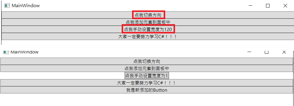
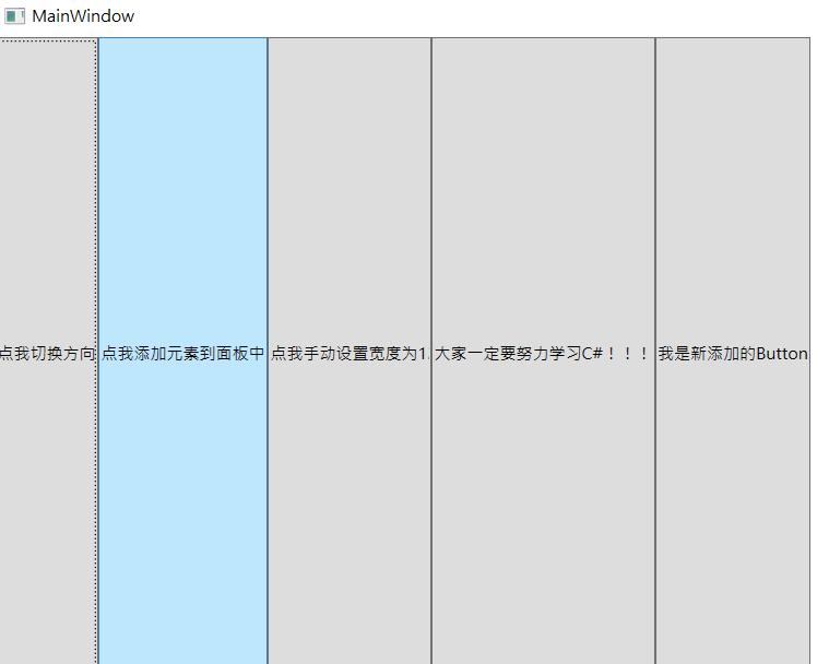
StackPanel面板可以在单行或者单列以堆栈的形式排列子元素。默认情况下StackPanel面板按从上到下的顺序排列元素。如果不指定宽度、则默认宽度和StackPanel面板宽度一致,如果StackPanel宽度发生变化,则按钮也会拉伸以适应变化。而如果设置了宽度、就不会跟面板宽度变更发生变化。但是想要设计出自己想要的好看布局,还需要更多的元素,先看一个基本的例子。
案例XAML代码:
<Window x:Class="Wpf_Panel.MainWindow"
        xmlns="http://schemas.microsoft.com/winfx/2006/xaml/presentation"
        xmlns:x="http://schemas.microsoft.com/winfx/2006/xaml"
        xmlns:d="http://schemas.microsoft.com/expression/blend/2008"
        xmlns:mc="http://schemas.openxmlformats.org/markup-compatibility/2006"
        xmlns:local="clr-namespace:Wpf_Panel"
        mc:Ignorable="d"
        Title="MainWindow" Height="500" Width="800">
    <StackPanel x:Name="root_spanel" >
        <Button Content="点我切换方向" Click="OrientationTranslator_Click"/>
        <Button Content="点我添加元素到面板中" Click="AddElementToPanel_Click"/>
        <Button x:Name="btn_FixedWidth" Content="点我手动设置宽度为120" Click="SetCurrentWidth_Click"/>
        <Button Content="大家一定要努力学习C#!!!"/>
    </StackPanel>
</Window>
后台逻辑代码:
       private void OrientationTranslator_Click(object sender, RoutedEventArgs e)
        {
            root_spanel.Orientation = root_spanel.Orientation == Orientation.Horizontal ? Orientation.Vertical : Orientation.Horizontal;
        }

        private void AddElementToPanel_Click(object sender, RoutedEventArgs e)
        {
            Button btn = new Button();
            btn.Content = "我是新添加的Button";
            root_spanel.Children.Add(btn);
        }

        private void SetCurrentWidth_Click(object sender, RoutedEventArgs e)
        {
            btn_FixedWidth.Width = 120;
        }
运行效果:
3.WrapPanel
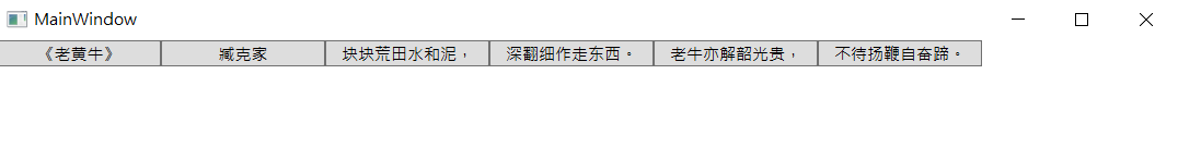
WrapPanel面板可以一次排列一行或一列然后再换行继续排列,和StackPanel一样,可以通过设置Orientation属性来设置当前是以水平还是垂直来排列子元素。因为是根据窗体变化演示布局排列,这个只有XAML。
案例XAML代码:
<Window x:Class="Wpf_Panel.MainWindow"
        xmlns="http://schemas.microsoft.com/winfx/2006/xaml/presentation"
        xmlns:x="http://schemas.microsoft.com/winfx/2006/xaml"
        xmlns:d="http://schemas.microsoft.com/expression/blend/2008"
        xmlns:mc="http://schemas.openxmlformats.org/markup-compatibility/2006"
        xmlns:local="clr-namespace:Wpf_Panel"
        mc:Ignorable="d"
        Title="MainWindow" Height="500" Width="800">
    <WrapPanel>
        <Button Content="《老黄牛》" Width="120"/>
        <Button Content="臧克家"  Width="120"/>
        <Button Content="块块荒田水和泥,"  Width="120"/>
        <Button Content="深翻细作走东西。"  Width="120"/>
        <Button Content="老牛亦解韶光贵,"  Width="120"/>
        <Button Content="不待扬鞭自奋蹄。"  Width="120"/>
    </WrapPanel>
</Window>
运行效果:

4.DockPanel
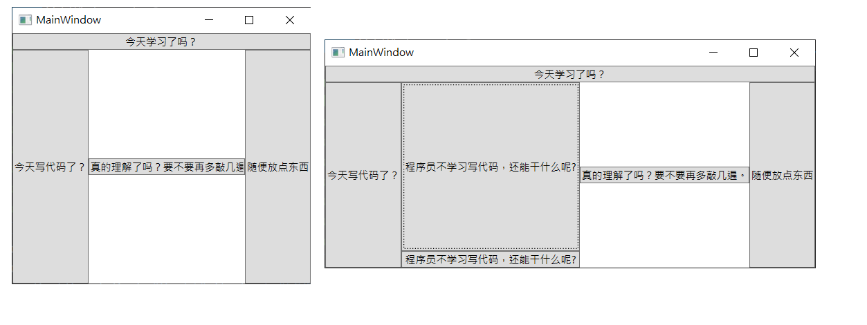
DockPanel面板与StackPanel面板类似,但是DockPanel可以通过设置Dock附加属性设置子元素停靠的边。Dock的值为Left、Right、Top、Bottom。通过设置子元素再DockPanel面板中的Dock属性。可以修改子元素再DockPanel面板内的位置。可以通过LastChildFill设置为true来告诉DockPanel面板使最后一个元素占满剩余控件。而设置的停靠顺序会影响布局结果。
案例XAML代码:
<Window x:Class="Wpf_Panel.MainWindow"
        xmlns="http://schemas.microsoft.com/winfx/2006/xaml/presentation"
        xmlns:x="http://schemas.microsoft.com/winfx/2006/xaml"
        xmlns:d="http://schemas.microsoft.com/expression/blend/2008"
        xmlns:mc="http://schemas.openxmlformats.org/markup-compatibility/2006"
        xmlns:local="clr-namespace:Wpf_Panel"
        mc:Ignorable="d"
        Title="MainWindow" Height="500" Width="900">
    <DockPanel LastChildFill="True">
        <Button DockPanel.Dock="Top" Content="今天学习了吗?"/>
        <Button DockPanel.Dock="Left" Content="今天写代码了?"/>
        <Button DockPanel.Dock="Right" Content="随便放点东西"/>
        <Button DockPanel.Dock="Right" VerticalAlignment="Center" Content="真的理解了吗?要不要再多敲几遍。"/>
        <Button DockPanel.Dock="Bottom" Content="程序员不学习写代码,还能干什么呢?"/>
        <Button DockPanel.Dock="Bottom" Content="程序员不学习写代码,还能干什么呢?"/>

    </DockPanel>
</Window>
运行效果:
5.Grid
Grid面板是把显示内容分割到不可见的行列网格中。通过设置行列和对应的宽高占比。来进行网格布局。Grid布局再平时使用的比较多。大部分都是用来做布局的嵌套,设计外框各个部分的比例,然后在子元素中嵌套其他布局控件。来实现区域的划分。
在使用Grid面板时,需要用到一个叫做附加依赖项属性的参数。在布局相关的内容里不会去讲什么是附加依赖项属性,这个会在依赖项属性中去讲解,这里只有了解就行。因为这个针对于Grid布局来说是固定写法。
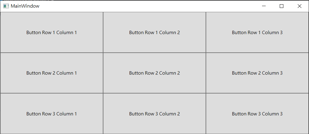
我们添加一个三行三列的Grid面板。Grid.RowDefinitions和Grid.ColumnDefinitions里面的内容是我们设置的Gird的行列数。各有3个,代表我们是一个三行三列的网格。我们没有设置宽高。就会默认为是等分的。
案例XAML代码:
<Window x:Class="Wpf_Panel.MainWindow"
        xmlns="http://schemas.microsoft.com/winfx/2006/xaml/presentation"
        xmlns:x="http://schemas.microsoft.com/winfx/2006/xaml"
        xmlns:d="http://schemas.microsoft.com/expression/blend/2008"
        xmlns:mc="http://schemas.openxmlformats.org/markup-compatibility/2006"
        xmlns:local="clr-namespace:Wpf_Panel"
        mc:Ignorable="d"
        Title="MainWindow" Height="500" Width="900">
    <Grid>
        <Grid.RowDefinitions>
            <RowDefinition/>
            <RowDefinition/>
            <RowDefinition />
        </Grid.RowDefinitions>
        <Grid.ColumnDefinitions>
            <!--各列平分宽度-->
            <ColumnDefinition/>
            <ColumnDefinition />
            <ColumnDefinition />

            <!--要求左边一列宽度固定,右边一列以文本内容宽度适配,剩下的宽度区域都给中间的列。为了提高代码可读性,不建议省略Width="*"虽然都是一样的。-->
            <!--<ColumnDefinition Width="140"/>
            <ColumnDefinition Width="*"/>
            <ColumnDefinition Width="Auto"/>-->
        </Grid.ColumnDefinitions>
        <!--网格布局设计好之后。我们需要往里面放置内容。我们要使用Grid.Column、Grid.Row这2个附加依赖项属性来实现把Button放置到不同的网格中-->
        <Button Grid.Column="0" Grid.Row="0" Content="Button Row 1 Column 1"/>
        <Button Grid.Column="1" Grid.Row="0" Content="Button Row 1 Column 2"/>
        <Button Grid.Column="2" Grid.Row="0" Content="Button Row 1 Column 3"/>
        <Button Grid.Column="0" Grid.Row="1" Content="Button Row 2 Column 1"/>
        <Button Grid.Column="1" Grid.Row="1" Content="Button Row 2 Column 2"/>
        <Button Grid.Column="2" Grid.Row="1" Content="Button Row 2 Column 3"/>
        <Button Grid.Column="0" Grid.Row="2" Content="Button Row 3 Column 1"/>
        <Button Grid.Column="1" Grid.Row="2" Content="Button Row 3 Column 2"/>
        <Button Grid.Column="2" Grid.Row="2" Content="Button Row 3 Column 3"/>
    </Grid>
</Window>
运行效果:
我们尝试运行代码。就会得到9个一样大小的Button。我们尝试拖动窗体大小。不管怎么拖动,应该都是等量变化的。
6.UniformGrid
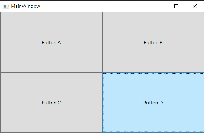
UniformGrid面板的特点是每个单元格始终保持一致的大小。通过设置行列数量来分割布局。元素通过放入的前后顺序被分配到不同的位置。这个再某些特定场景配合数据虚拟化和列表虚拟化使用的还是比较多的。
案例XAML代码:
<Window x:Class="Wpf_Panel.MainWindow"
        xmlns="http://schemas.microsoft.com/winfx/2006/xaml/presentation"
        xmlns:x="http://schemas.microsoft.com/winfx/2006/xaml"
        xmlns:d="http://schemas.microsoft.com/expression/blend/2008"
        xmlns:mc="http://schemas.openxmlformats.org/markup-compatibility/2006"
        xmlns:local="clr-namespace:Wpf_Panel"
        mc:Ignorable="d"
        Title="MainWindow" Height="500" Width="900">
    <UniformGrid Columns="2" Rows="2">
        <!--按照先来后到的顺序,先行后列的放入到行列单元格-->
        <Button Content="Button A"/>
        <Button Content="Button B"/>
        <Button Content="Button C"/>
        <Button Content="Button D"/>
    </UniformGrid>
</Window>
运行效果:
7.Canvas
Canvas是一个基于坐标的布局面板。他主要用于构建图形工具的绘图、Canvas知识再指定的位置放置子元素。并且子元素要提供精确的尺寸。再Canvas中需要设置Canvas.Left和Canvas.Top属性。用来设置相对于原点的left和top。
也可以使用Canvas.Right和Canvas.Bottom。但是Canvas.left和Right不能同时使用,Canvas.Top和Canvas.Bottom也不能同时使用。使用Panel.ZIndex来设置子元素的层级关系。
案例XAML代码:
<Window x:Class="Wpf_Panel.MainWindow"
        xmlns="http://schemas.microsoft.com/winfx/2006/xaml/presentation"
        xmlns:x="http://schemas.microsoft.com/winfx/2006/xaml"
        xmlns:d="http://schemas.microsoft.com/expression/blend/2008"
        xmlns:mc="http://schemas.openxmlformats.org/markup-compatibility/2006"
        xmlns:local="clr-namespace:Wpf_Panel"
        mc:Ignorable="d"
        Title="MainWindow" Height="500" Width="900">
    <Canvas>
        <!--Panel.ZIndex="1"设置子元素的层级关系,哪个数字大,哪个在上面-->
        <Button Content="Button A" Canvas.Left="255" Canvas.Top="70"  Panel.ZIndex="2" Width="80px" Height="30px"/>
        <Button Content="Button B" Canvas.Left="110" Canvas.Top="100"  Width="80px" Height="30px"/>
        <Button Content="Button C" Canvas.Left="295" Canvas.Top="81" Panel.ZIndex="1"  Width="80px" Height="30px"/>
    </Canvas>
</Window>
运行效果:
Button A和Button C的重叠关系使用Panel.ZIndex来设置。

8.ScrollViewer
如果要再一个比较小的区域内显示特别多的内容,就需要使用ScrollViewer来进行横向或纵向滚动了,但是再实际使用过程中往往配合数据虚拟化和列表虚拟化来实现支持更多内容的滚动效果。不然如果内容一旦特别多,ScrollViewer下的内容又特别长,每次滚动都会触发布局的重新测量和排列。如果不使用虚拟化,会全部重新计算所有的布局元素,会特别卡,导致使用困难。
案例XAML代码:
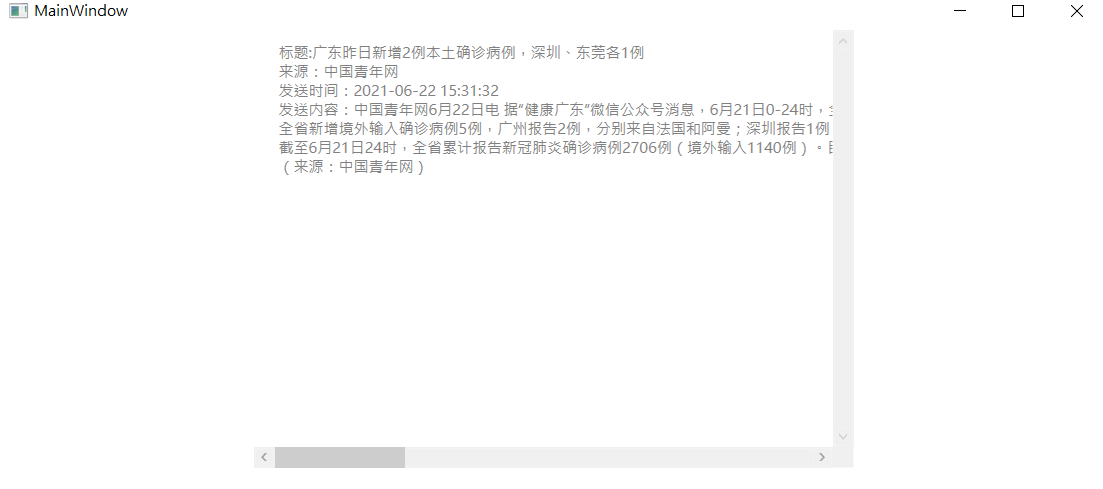
<Window x:Class="Wpf_Panel.MainWindow"
        xmlns="http://schemas.microsoft.com/winfx/2006/xaml/presentation"
        xmlns:x="http://schemas.microsoft.com/winfx/2006/xaml"
        xmlns:d="http://schemas.microsoft.com/expression/blend/2008"
        xmlns:mc="http://schemas.openxmlformats.org/markup-compatibility/2006"
        xmlns:local="clr-namespace:Wpf_Panel"
        mc:Ignorable="d"
        Title="MainWindow" Height="500" Width="900">
    <Grid>
        <StackPanel>
            <ScrollViewer Name="scroll" Width="480"  Height="350" HorizontalScrollBarVisibility="Auto" VerticalScrollBarVisibility="Visible" >
                <TextBlock    Name="txtShowArticle"   Foreground="Gray" Margin="20,10" Loaded="txtShowArticle_Loaded" />
            </ScrollViewer>
        </StackPanel>
    </Grid>
</Window>
后台逻辑代码:
  string content = @"中国青年网6月22日电 据“健康广东”微信公众号消息,6月21日0-24时,全省新增2例本土确诊病例,深圳报告1例,东莞报告1例。
全省新增境外输入确诊病例5例,广州报告2例,分别来自法国和阿曼;深圳报告1例,来自印度尼西亚;珠海报告1例,来自孟加拉国;东莞报告1例,来自阿联酋。新增境外输入无症状感染者7例,广州报告3例,2例来自柬埔寨,1例来自阿联酋;佛山报告1例,来自柬埔寨;中山报告1例,来自加蓬;肇庆报告2例,均来自印度尼西亚。新增出院16例。
截至6月21日24时,全省累计报告新冠肺炎确诊病例2706例(境外输入1140例)。目前在院221例。
(来源:中国青年网)";
        private void ShowArticle()
        {
            //获取私信信息
            StringBuilder strMessage = new StringBuilder();
            strMessage.Append("标题:" + "广东昨日新增2例本土确诊病例,深圳、东莞各1例" + "
");
            strMessage.Append("来源:" + "中国青年网" + "
");
            strMessage.Append("发送时间:" + "2021-06-22 15:31:32" + "
");
            strMessage.Append("发送内容:" + content + "

");
            txtShowArticle.Text = strMessage.ToString();
        }

        private void txtShowArticle_Loaded(object sender, RoutedEventArgs e)
        {
            ShowArticle();
        }
运行效果: