Vue 项目接入 echarts
里面有些地方是抄他的:
https://www.cnblogs.com/tcz1018/p/13130495.html
Echarts 官网教程:
https://echarts.apache.org/zh/tutorial.html#5%20%E5%88%86%E9%92%9F%E4%B8%8A%E6%89%8B%20ECharts
安装 echarts 插件
npm install echarts --save
使用
引入 echarts 插件。
import echarts from 'echarts'
也可以在main.js全局引用,觉得没必要,看情况吧。
import echarts from 'echarts'
Vue.prototype.$echarts = echarts
在绘图前我们需要为 ECharts 准备一个具备高宽的 DOM 容器。
  <div>
    <h1>Echarts报表使用</h1>
    <!-- 为 ECharts 准备一个具备大小(宽高)的 DOM -->
    <div id="main" style=" 600px;height:400px;border:1px solid red"></div>
  </div>
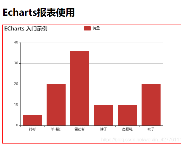
然后就可以通过 echarts.init 方法初始化一个 echarts 实例并通过 setOption 方法生成一个简单的柱状图,下面是完整代码。
<template>
  <div class="hello">
    <h1>Echarts报表使用</h1>
    <!-- 为 ECharts 准备一个具备大小(宽高)的 DOM -->
    <div id="main" style=" 600px;height:400px;border:1px solid red"></div>
  </div>
</template>

<script>

import echarts from 'echarts'

export default {
  name: "HelloWorld",
  mounted() {
    this.init("main")
  },
  data() {
    return {
      charts:'',
    };
  },
  methods: {
    init(id){
      this.charts = echarts.init(document.getElementById(id))
      var option = {
            title: {
                text: 'ECharts 入门示例'
            },
            tooltip: {},
            legend: {
                data:['销量']
            },
            xAxis: {
                data: ["衬衫","羊毛衫","雪纺衫","裤子","高跟鞋","袜子"]
            },
            yAxis: {},
            series: [{
                name: '销量',
                type: 'bar',
                data: [5, 20, 36, 10, 10, 20]
            }]
        };
        // 使用刚指定的配置项和数据显示图表。
        this.charts.setOption(option);
    }
  }
};
</script>

<style scoped lang="scss">
</style>
案例
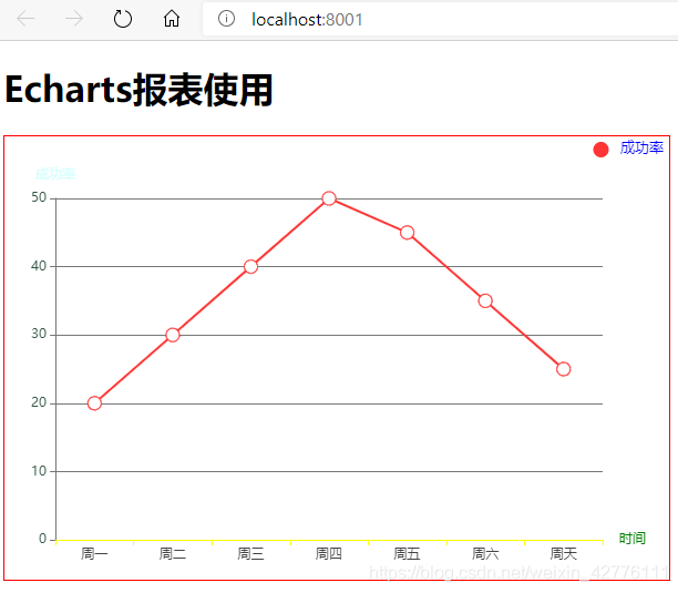
再来一个案例,里面包含了大部分常用的图标修饰样式,具体再去官网看。
<template>
  <div class="hello">
    <h1>Echarts报表使用</h1>
    <!-- 为 ECharts 准备一个具备大小(宽高)的 DOM -->
    <div id="main" style=" 600px;height:400px;border:1px solid red"></div>
  </div>
</template>

<script>
import echarts from "echarts";

export default {
  name: "HelloWorld",
  mounted() {
    this.init("main");
  },
  data() {
    return {
      charts: ""
    };
  },
  methods: {
    init(id) {
      var xData = ["周一", "周二", "周三", "周四", "周五", "周六", "周天"];
      var yData1 = [20, 30, 40, 50, 45, 35, 25];
      // for (let item of this.showData) {
      //   xData.push(item.task_time)
      //   yData1.push(parseFloat(item.successRate).toFixed(2))
      // }
      // if (!xData.length) {
      //   xData.push(this.currDate)
      //   yData1.push(0)
      // }
      var option = {
        tooltip: {
          // 提示框组件。
          trigger: "axis", // 触发类型  axis 坐标轴触发,主要在柱状图,折线图等会使用类目轴的图表中使用。
          axisPointer: {
            // 坐标轴指示器配置项
            type: "cross" // 指示类型  cross 十字准星指示器
          }
        },
        legend: {
          // 图例组件。
          x: "right", // x y轴位置
          y: "0px",
          textStyle: {
            // 文字样式
            color: "blue", // 文字颜色
            fontSize: 13 // 文字大小
          },
          icon: "circle", // 图标样式
          data: ["成功率"] // 图例的数据数组。
        },
        grid: {
          // 直角坐标系内绘图网格
          right: "10%", // 距离右侧多大
          bottom: "4%",
          left: "4%",
          top: "14%",
          containLabel: true // grid 区域是否包含坐标轴的刻度标签
        },
        dataZoom: [
          //  组件 用于区域缩放
          {
            type: "slider",
            show: true, // 是否显示!
            height: 20, // 高度
            left: "10%", // 距离左侧位置
            right: "10%",
            bottom: "2%",
            start: 50, // 开始位置
            end: 100, // 结束位置
            textStyle: {
              // 字体样式
              color: "#d4ffff", // 字体颜色
              fontSize: 11 // 字体大小
            }
          },
          {
            type: "inside" // 可以拖拽
          }
        ],
        xAxis: [
          // 直角坐标系 grid 中的 x 轴
          {
            type: "category", // 坐标轴类型。
            data: xData, // 数据
            name: "时间",
            nameTextStyle: {
              // 坐标轴名称的样式
              color: "green"
            },
            axisLine: {
              // 坐标轴轴线相关设置
              lineStyle: {
                // 坐标轴轴线样式
                color: "yellow"
              }
            },
            axisTick: {
              // 坐标轴刻度相关设置。
              show: true
            },
            axisLabel: {
              // 坐标轴刻度标签的相关设置。
              show: true,
              textStyle: {
                color: "#444",
                fontSize: 12
              }
            }
          }
        ],
        yAxis: [
          // // 直角坐标系 grid 中的 y 轴
          {
            type: "value", // value 数值轴,适用于连续数据。
            name: "成功率", // 坐标轴名称
            nameTextStyle: {
              // 坐标轴名称的文字样式。
              color: "#d4ffff"
            },
            position: "left", //  y 轴的位置
            axisLine: {
              lineStyle: {
                color: "#777"
              }
            },
            splitLine: {
              lineStyle: {
                color: "#777"
              }
            },
            axisLabel: {
              color: "#354",
              fontSize: 12
            }
          }
        ],
        series: [
          {
            name: "成功率",
            type: "line",
            yAxisIndex: 0,
            symbolSize: 12,
            itemStyle: {
              normal: {
                color: "#ff3535"
              }
            },
            data: yData1
          }
        ]
      };
      // 下面的判断是为了决定dataZoom的使用,当数据量小的时候不需要滚动,数据量大在显示,我设的是超过10个数据就显示
      if (xData.length <= 10) {
        option.dataZoom[0].show = false;
        option.dataZoom[0].start = 0;
      } else {
        option.dataZoom[0].show = true;
        option.dataZoom[0].start = 100 - (10 / xData.length) * 100;
      }
      // 初始化图表
      this.charts = echarts.init(document.getElementById(id));
      // 清除图表旧数据
      this.charts.clear();
      // 重新加载新数据
      this.charts.setOption(option);
    }
  },
  // 销毁
  destroyed() {
    // 当页面销毁的时候,销毁echarts图表
    this.charts.dispose();
  }
};
</script>

<style scoped lang="scss">
</style>
【案例源码】:https://gitee.com/wjw1014/vue_learning_vuex/blob/master/src/components/HelloWorld.vue