渐变就是多种颜色混合而成的效果,css3要实现渐变,就必须使用渐变函数来设置background或则background-imge属性。同时为了兼容各个浏览器(IE,safari,chrome,Firefox),还需要添加对应的带开发商前缀的渐变
1,线性渐变
a,使用 linear-gradient()函数可以创建渐变
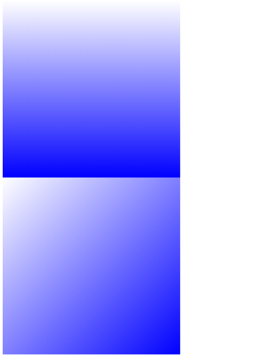
<style>
    #div1 {
        width:200px;
        height: 200px;
        background: linear-gradient(top, white, blue);
        background: -ms-linear-gradient(top, white, blue);
        background: -webkit-linear-gradient(top, white, blue);
        background: -moz-linear-gradient(top, white, blue);
    }

    #div2 {
        width:200px;
        height: 200px;
        background: linear-gradient(top left, white, blue);/*渐变从左上角到右下角*/
        background: -ms-linear-gradient(top left, white, blue);
        background: -webkit-linear-gradient(top left, white, blue);
        background: -moz-linear-gradient(top left, white, blue);
    }
</style>

<div id="div1"></div>
<div id="div2"></div>
b,设置多个颜色渐变
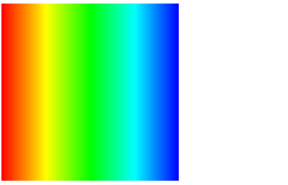
#div1 {
width: 200px;
height: 200px;
background: linear-gradient(left, red, yellow, lime, aqua, blue);
background: -ms-linear-gradient(left, red, yellow, lime, aqua, blue);
background: -webkit-linear-gradient(left, red, yellow, lime, aqua, blue);
background: -moz-linear-gradient(left, red, yellow, lime, aqua, blue);
}
c,使用渐变点(gradient stop)控制每个颜色的起点
每个渐变点用百分比值表示,0%是整个渐变的起点,100%是整个渐变的终点。下面样例把橙色和黄色的范围扩展到了中间:
#div1 {

background: linear-gradient(left, red 0%, orange 10%, yellow 90%, violet 100%);

background: -ms-linear-gradient(left, red 0%, orange 10%, yellow 90%, violet 100%);

background: -webkit-linear-gradient(left, red 0%, orange 10%, yellow 90%, violet 100%);

background: -moz-linear-gradient(left, red 0%, orange 10%, yellow 90%, violet 100%);

}

2,放射性渐变
(1)使用 radial-gradient() 函数创建放射性渐变
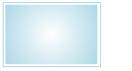
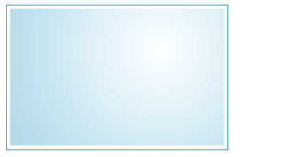
第一个参数 circle 表示圆形渐变。下面这个放射性渐变其圆心是白色,然后逐渐过渡到圆周的淡蓝色:
#div1 {

background: radial-gradient(circle, white, lightblue);

background: -ms-radial-gradient(circle, white, lightblue);

background: -webkit-linear-gradient(circle, white, lightblue);

background: -moz-linear-gradient(circle, white, lightblue);

}
如果使用 ellipse 表示把渐变拉伸成椭圆形:
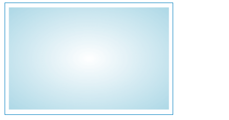
#div1 {

background: radial-gradient(ellipse, white, lightblue);

background: -ms-radial-gradient(ellipse, white, lightblue);

background: -webkit-radial-gradient(ellipse, white, lightblue);

background: -moz-radial-gradient(ellipse, white, lightblue);
}
(2)设置渐变的中心位置
下面使用 at 关键字告诉浏览器开始的位置离左边缘70%,离上边缘30%
#div1 {

background: radial-gradient(circle at 70% 30%, white, lightblue);

background: -ms-radial-gradient(circle at 70% 30%, white, lightblue);

background: -webkit-radial-gradient(circle at 70% 30%, white, lightblue);

background: -moz-radial-gradient(circle at 70% 30%, white, lightblue);

}
同线性渐变一样我们可以设置多个渐变颜色,也可以控制渐变颜色的起点
3,循环渐变
linear-gradient() 和 radial-gradient() 只能将设置的颜色渐变一次。
而 repeating-linear-gradient() 和 repeating-radial-gradient() 会以相同的颜色顺序进行不断地循环,直到颜色条纹填满元素。
循环渐变函数语法基本上与普通渐变一样。唯一不同的是,我们需要确保限制了渐变的大小(即最后一个颜色包含一个百分比或像素值),以便其可以循环。
(1)使用百分比限制渐变大小
下面样例中心颜色是白色,设置渐变淡蓝色在10%的位置就结束。然后渐变循环,又以白色开始。
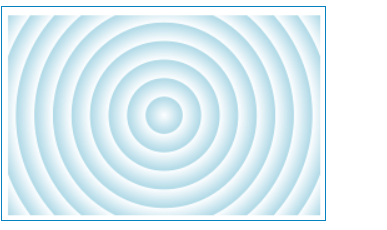
#div1 {

background: repeating-radial-gradient(circle, white, lightblue 10%);

background: -ms-repeating-radial-gradient(circle, white, lightblue 10%);

background: -webkit-repeating-radial-gradient(circle, white, lightblue 10%);

background: -moz-repeating-radial-gradient(circle, white, lightblue 10%);
}
(2)使用固定像素值限制渐变大小
下面样例不管容器大小如何变化,每个条纹都有固定一样的宽度(30px)
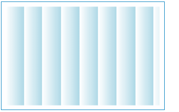
#div1 {

background: repeating-linear-gradient(left, white, lightblue 30px);

background: -ms-repeating-linear-gradient(left, white, lightblue 30px);

background: -webkit-repeating-linear-gradient(left, white, lightblue 30px);

background: -moz-repeating-linear-gradient(left, white, lightblue 30px);
}
4,对不支持的浏览器设置后备方案
上面的样例,渐变都是通过 background 属性实现的。实际上,对 background-image 属性使用同样的渐变函数也可以达到相同的目的。
它们的区别是,使用 background 属性可以使用纯色作为后备:
#div1 {

background: lightblue;

background: radial-gradient(circle, white, lightblue);

background: -ms-radial-gradient(circle, white, lightblue);

background: -webkit-linear-gradient(circle, white, lightblue);

background: -moz-linear-gradient(circle, white, lightblue);
}
使用 background-image 属性,可以创建背景图片作为后备。
(当然对于支持渐变的浏览器也是很聪明的,它不会下载后备图片。)
#div1 {

background-image: url(bg.jpg);

background-image: radial-gradient(circle, white, lightblue);

background-image: -ms-radial-gradient(circle, white, lightblue);

background-image: -webkit-linear-gradient(circle, white, lightblue);

background-image: -moz-linear-gradient(circle, white, lightblue);

}
5,在线渐变生成工具
访问地址:Ultimate CSS Gradient Generator
我们只需在网页中选择颜色,调节控制器直到渐变达到满意的效果即可。然后工具会生成所需要的代码(包括不同开发商前缀的所有代码)
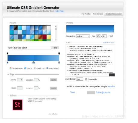
我们可以获得我们想要的渐变色
————————————————
版权声明:本文为CSDN博主「一个半路出家的人」的原创文章,遵循 CC 4.0 BY-SA 版权协议,转载请附上原文出处链接及本声明。
原文链接:https://blog.csdn.net/qq_42039281/article/details/82153805