一些最重要CSS3模块如下:
- 选择器
- 盒模型
- 背景和边框
- 文字特效
- 2D/3D转换
- 动画
- 多列布局
- 用户界面
将了解以下的边框属性:
- border-radius border-top-left-radius
- box-shadow
- border-image
box-shadow: h-shadow v-shadow blur spread color inset;
<div class="test" style="text-overflow:ellipsis;">This is some long text that will not fit in the box</div>
不换行情况下,超出部分用点表示
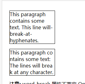
p.test1
{
    width:9em;
    border:1px solid #000000;
    word-break:keep-all;
}

p.test2
{
    width:9em;
    border:1px solid #000000;
    word-break:break-all;
}
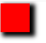
.shadow {
    width: 100px;
    height: 100px;
    box-shadow: 12px 9px 23px 6px;
    background-color: red;
}
效果
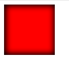
.shadow {
    width: 100px;
    height: 100px;
    box-shadow: 1px 0px 19px 3px inset;
    background-color: red;
}
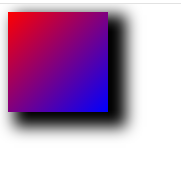
渐变色
 background: -webkit-linear-gradient(left, red , blue); /* Safari 5.1 - 6.0 */
  background: -o-linear-gradient(right, red, blue); /* Opera 11.1 - 12.0 */
  background: -moz-linear-gradient(right, red, blue); /* Firefox 3.6 - 15 */
  background: linear-gradient(to right, red , blue); /* 标准的语法 */
 height: 200px;
    background: -webkit-linear-gradient(left top, red , blue); /* Safari 5.1 - 6.0 */
    background: -o-linear-gradient(bottom right, red, blue); /* Opera 11.1 - 12.0 */
    background: -moz-linear-gradient(bottom right, red, blue); /* Firefox 3.6 - 15 */
    background: linear-gradient(to bottom right, red , blue); /* 标准的语法(必须放在最后) */
例子:
.shadow {
    width: 100px;
    height: 100px;
    box-shadow: 12px 9px 23px 6px;
    background:  linear-gradient(to bottom right,red,blue);
}
角度渐变:
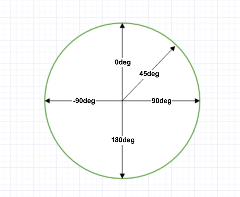
-webkit-linear-gradient(90deg, red, blue);
不填 默认为180 颜色从下到上 , 旋转90 顺时针90
多种颜色
linear-gradient(red, orange, yellow, green, blue, indigo, violet);
更多请参考https://www.runoob.com/css3/css3-gradients.html
文字属性
text-shadow: h-shadow v-shadow blur color; 比盒子阴影少一个设置宽度
例子:
.text{
    text-shadow: 2px 2px 2px red;
}

自定义字体
@font-face { font-family: myFirstFont; 名称 src: url('Sansation_Light.ttf') 字体位置 ,url('Sansation_Light.eot'); /* IE9 */ } div { font-family:myFirstFont;使用字体 }
3D效果
rotateY()方法,围绕其在一个给定度数Y轴旋转的元素。 (注意和rotate()区别)