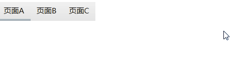
• WPF-TabControl样式(1)


    样式效果图如下,希望帮助到大家!

    图1

    图2

    图一样式文件

            <Style x:Key="TabItemStyle2" TargetType="TabItem">
                <Setter Property="FocusVisualStyle" Value="{x:Null}"/>
                <!--<Setter Property="Foreground" Value="{DynamicResource PrimaryTextBrush}"/>
                <Setter Property="Background" Value="{DynamicResource RegionBrush}"/>
                <Setter Property="BorderBrush" Value="{DynamicResource PrimaryBrush}"/>-->
                <Setter Property="Margin" Value="0"/>
                <Setter Property="Padding" Value="10,6"/>
                <Setter Property="Height" Value="30"/>
                <Setter Property="HorizontalContentAlignment" Value="Stretch"/>
                <Setter Property="VerticalContentAlignment" Value="Stretch"/>
                <Setter Property="Template">
                    <Setter.Value>
                        <ControlTemplate TargetType="TabItem">
                            <Grid x:Name="templateRoot" SnapsToDevicePixels="true">
                                <Border x:Name="mainBorder" BorderBrush="{TemplateBinding BorderBrush}" BorderThickness="0" Background="{TemplateBinding Background}" Margin="0"/>
                                <ContentPresenter x:Name="contentPresenter" TextElement.Foreground="{DynamicResource PrimaryTextBrush}" ContentSource="Header" Focusable="False" HorizontalAlignment="Center" Margin="{TemplateBinding Padding}" RecognizesAccessKey="True" SnapsToDevicePixels="{TemplateBinding SnapsToDevicePixels}" VerticalAlignment="{TemplateBinding VerticalContentAlignment}"/>
                            </Grid>
                            <ControlTemplate.Triggers>
                                <MultiDataTrigger>
                                    <MultiDataTrigger.Conditions>
                                        <Condition Binding="{Binding IsSelected, RelativeSource={RelativeSource Self}}" Value="false"/>
                                        <Condition Binding="{Binding TabStripPlacement, RelativeSource={RelativeSource AncestorType=TabControl}}" Value="Top"/>
                                    </MultiDataTrigger.Conditions>
                                    <Setter Property="BorderThickness" TargetName="mainBorder" Value="0,0,0,0"/>
                                </MultiDataTrigger>
                                <MultiDataTrigger>
                                    <MultiDataTrigger.Conditions>
                                        <Condition Binding="{Binding IsSelected, RelativeSource={RelativeSource Self}}" Value="true"/>
                                        <Condition Binding="{Binding TabStripPlacement, RelativeSource={RelativeSource AncestorType=TabControl}}" Value="Top"/>
                                    </MultiDataTrigger.Conditions>
                                    <Setter Property="Panel.ZIndex" Value="1"/>
                                    <Setter Property="TextElement.Foreground" Value="{DynamicResource PrimaryBrush}" TargetName="contentPresenter"/>
                                    <Setter Property="BorderThickness" TargetName="mainBorder" Value="0,0,0,3"/>
                                </MultiDataTrigger>
                            </ControlTemplate.Triggers>
                        </ControlTemplate>
                    </Setter.Value>
                </Setter>
            </Style>
    
            <Style x:Key="TabControlStyle2" TargetType="TabControl">
                <Setter Property="BorderBrush" Value="Blue"/>
                <Setter Property="Background" Value="Transparent"/>
                <Setter Property="BorderThickness" Value="0"/>
                <Setter Property="Foreground" Value="White"/>
                <Setter Property="ItemContainerStyle" Value="{StaticResource TabItemStyle2}"/>
                <Setter Property="Template">
                    <Setter.Value>
                        <ControlTemplate TargetType="TabControl">
                            <Border BorderThickness="{TemplateBinding BorderThickness}" BorderBrush="{TemplateBinding BorderBrush}">
                                <Grid x:Name="templateRoot" Background="{TemplateBinding Background}" ClipToBounds="true" SnapsToDevicePixels="true" KeyboardNavigation.TabNavigation="Local">
                                    <Grid.ColumnDefinitions>
                                        <ColumnDefinition x:Name="ColumnDefinition0"/>
                                        <ColumnDefinition x:Name="ColumnDefinition1" Width="0"/>
                                    </Grid.ColumnDefinitions>
                                    <Grid.RowDefinitions>
                                        <RowDefinition x:Name="RowDefinition0" Height="Auto"/>
                                        <RowDefinition x:Name="RowDefinition1" Height="*"/>
                                    </Grid.RowDefinitions>
                                    <TabPanel x:Name="headerPanel" Background="Transparent" Grid.Column="0" IsItemsHost="true" Margin="0" Grid.Row="0" KeyboardNavigation.TabIndex="1" Panel.ZIndex="1"/>
                                    <Border x:Name="contentPanel" HorizontalAlignment="Stretch" VerticalAlignment="Stretch" BorderThickness="0,1,0,0" BorderBrush="{DynamicResource BorderBrush}" Background="{TemplateBinding Background}" Grid.Column="0" KeyboardNavigation.DirectionalNavigation="Contained" Grid.Row="1" KeyboardNavigation.TabIndex="2" KeyboardNavigation.TabNavigation="Local">
                                        <ContentPresenter x:Name="PART_SelectedContentHost"  ContentSource="SelectedContent" Margin="0" SnapsToDevicePixels="{TemplateBinding SnapsToDevicePixels}"/>
                                    </Border>
                                </Grid>
                            </Border>
                        </ControlTemplate>
                    </Setter.Value>
                </Setter>
            </Style>

    图一应用如下

      <Grid>
                                    <TabControl Margin="0,0,0,0" Style="{DynamicResource TabControlStyle2}">
                                        <TabItem Header="页面A" Style="{DynamicResource TabItemStyle2}" />
                                        <TabItem Header="页面B" Style="{DynamicResource TabItemStyle2}" />
                                        <TabItem Header="页面C" Style="{DynamicResource TabItemStyle2}" />
                                    </TabControl>
                                </Grid>

    图2样式

            <Style x:Key="TabItemStyle2" TargetType="TabItem">
                <Setter Property="FocusVisualStyle" Value="{x:Null}"/>
                <Setter Property="Foreground" Value="#666666"/>
                <Setter Property="Background" Value="White"/>
                <Setter Property="BorderBrush" Value="#5E80EC"/>
                <Setter Property="Margin" Value="0"/>
                <Setter Property="Padding" Value="10,6"/>
                <Setter Property="Height" Value="30"/>
                <Setter Property="HorizontalContentAlignment" Value="Stretch"/>
                <Setter Property="VerticalContentAlignment" Value="Stretch"/>
                <Setter Property="Template">
                    <Setter.Value>
                        <ControlTemplate TargetType="TabItem">
                            <Grid x:Name="templateRoot" SnapsToDevicePixels="true" Background="Transparent">
                                <Border x:Name="mainBorder" BorderBrush="{TemplateBinding BorderBrush}" BorderThickness="0" Background="Transparent" Margin="0,0,0,-2"/>
                                <ContentPresenter x:Name="contentPresenter" TextElement.Foreground="{DynamicResource PrimaryTextBrush}" ContentSource="Header" Focusable="False" HorizontalAlignment="Center" Margin="{TemplateBinding Padding}" RecognizesAccessKey="True" SnapsToDevicePixels="{TemplateBinding SnapsToDevicePixels}" VerticalAlignment="{TemplateBinding VerticalContentAlignment}"/>
                            </Grid>
                            <ControlTemplate.Triggers>
                                <MultiDataTrigger>
                                    <MultiDataTrigger.Conditions>
                                        <Condition Binding="{Binding IsSelected, RelativeSource={RelativeSource Self}}" Value="false"/>
                                        <Condition Binding="{Binding TabStripPlacement, RelativeSource={RelativeSource AncestorType=TabControl}}" Value="Top"/>
                                    </MultiDataTrigger.Conditions>
                                    <Setter Property="BorderThickness" TargetName="mainBorder" Value="0,0,0,0"/>
                                </MultiDataTrigger>
                                <MultiDataTrigger>
                                    <MultiDataTrigger.Conditions>
                                        <Condition Binding="{Binding IsSelected, RelativeSource={RelativeSource Self}}" Value="true"/>
                                        <Condition Binding="{Binding TabStripPlacement, RelativeSource={RelativeSource AncestorType=TabControl}}" Value="Top"/>
                                    </MultiDataTrigger.Conditions>
                                    <Setter Property="Panel.ZIndex" Value="99"/>
                                    <Setter Property="TextElement.Foreground" Value="#5E80EC" />
                                    <Setter Property="BorderThickness" TargetName="mainBorder" Value="0,0,0,2"/>
                                    <Setter Property="BorderBrush" TargetName="mainBorder" Value="#5E80EC" />
                                </MultiDataTrigger>
                            </ControlTemplate.Triggers>
                        </ControlTemplate>
                    </Setter.Value>
                </Setter>
            </Style>
    
            <Style x:Key="TabControlStyle2" TargetType="TabControl">
                <Setter Property="BorderBrush" Value="Blue"/>
                <Setter Property="Background" Value="Transparent"/>
                <Setter Property="BorderThickness" Value="0,0,0,0"/>
                <Setter Property="Foreground" Value="White"/>
                <Setter Property="ItemContainerStyle" Value="{StaticResource TabItemStyle2}"/>
                <Setter Property="Template">
                    <Setter.Value>
                        <ControlTemplate TargetType="TabControl">
                            <Border BorderThickness="0" BorderBrush="{TemplateBinding BorderBrush}">
                                <Grid x:Name="templateRoot" Background="{TemplateBinding Background}" ClipToBounds="true" SnapsToDevicePixels="true" KeyboardNavigation.TabNavigation="Local">
                                    <Grid.ColumnDefinitions>
                                        <ColumnDefinition x:Name="ColumnDefinition0"/>
                                        <ColumnDefinition x:Name="ColumnDefinition1" Width="0"/>
                                    </Grid.ColumnDefinitions>
                                    <Grid.RowDefinitions>
                                        <RowDefinition x:Name="RowDefinition0" Height="Auto"/>
                                        <RowDefinition x:Name="RowDefinition1" Height="*"/>
                                    </Grid.RowDefinitions>
                                    <TabPanel x:Name="headerPanel" Background="Transparent" Grid.Column="0"  IsItemsHost="true" Margin="0" Grid.Row="0" KeyboardNavigation.TabIndex="1" Panel.ZIndex="1"/>
                                    <Border x:Name="contentPanel" HorizontalAlignment="Stretch" Panel.ZIndex="-1" VerticalAlignment="Stretch" Margin="0,0,0,0" BorderThickness="0,0,0,0" BorderBrush="Red" Background="{TemplateBinding Background}" Grid.Column="0" KeyboardNavigation.DirectionalNavigation="Contained" Grid.Row="1" KeyboardNavigation.TabIndex="2" KeyboardNavigation.TabNavigation="Local">
                                        <ContentPresenter x:Name="PART_SelectedContentHost"  ContentSource="SelectedContent" Margin="0" SnapsToDevicePixels="{TemplateBinding SnapsToDevicePixels}"/>
                                    </Border>
                                </Grid>
                            </Border>
                        </ControlTemplate>
                    </Setter.Value>
                </Setter>
            </Style>

    图2应用

               <TabControl Margin="0,0,0,0" Style="{DynamicResource TabControlStyle2}">
                                        <TabItem Header="页面A" Style="{DynamicResource TabItemStyle2}" >
                                            <Grid Background="Transparent">
                                                <Border BorderBrush="#aaaaaa" BorderThickness="0,2,0,0"></Border>
                                            </Grid>
                                        </TabItem>
                                        <TabItem Header="页面B" Style="{DynamicResource TabItemStyle2}" >
                                            <Grid Background="Transparent">
                                                <Border BorderBrush="#aaaaaa" BorderThickness="0,2,0,0"></Border>
                                            </Grid>
                                        </TabItem>
                                        <TabItem Header="页面C" Style="{DynamicResource TabItemStyle2}" >
                                            <Grid Background="Transparent">
                                                <Border BorderBrush="#aaaaaa" BorderThickness="0,2,0,0"></Border>
                                            </Grid>
                                        </TabItem>
                                    </TabControl>
  • 相关阅读:
    【LeetCode】13. Roman to Integer (2 solutions)
    【LeetCode】16. 3Sum Closest
    【LeetCode】18. 4Sum (2 solutions)
    【LeetCode】168. Excel Sheet Column Title
    如何应用性能测试常用计算公式
    系统吞吐量(TPS)、用户并发量、性能测试概念和公式
    Monkey测试3——Monkey测试结果分析
    Monkey测试2——Monkey测试策略
    Monkey测试1——Monkey的使用
    TestNG 三 测试方法
  • 原文地址:https://www.cnblogs.com/wangyinlon/p/10907017.html
Copyright © 2020-2023  润新知