一 flexbox布局
1 flex布局
flexbox是ReactNative 应用开发中必不可少的内容,也是最常用的内容。
传统的页面布局是基于盒子模型,依赖定位属性,流动属性和显示属性来解决。对于一些伸缩性的布局,处理起来很是麻烦。于是在2009年,W3C组织提出来一种新的布局方案,既flex布局。该布局可以简单快速的完成各种伸缩性的设计。
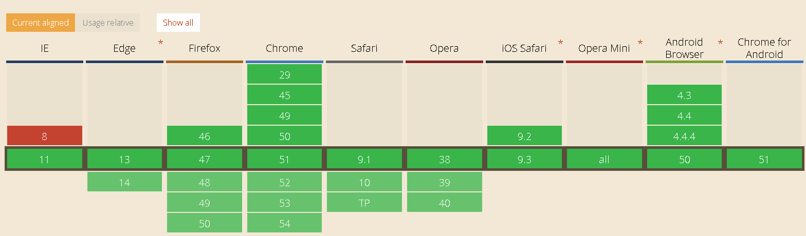
flexBox是 Flexible Box的缩写,既弹性盒子布局,可以为传统的盒子模型布局带来更大的灵活性。关于浏览器该布局的支持,参考 http://caniuse.com中显示。从图中可以看出,目前主流的浏览器都已经支持它。
2 基本概念
采用Flex布局的元素,称为Flex容器(flex container),简称"容器"。它的所有子元素自动成为容器成员,称为Flex项目(flex item),简称"项目"。
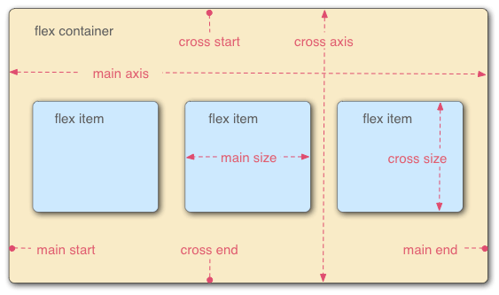
容器默认存在两根轴:水平的主轴(main axis)和垂直的交叉轴(cross axis)。主轴的开始位置(与边框的交叉点)叫做main start,结束位置叫做main end;交叉轴的开始位置叫做cross start,结束位置叫做cross end。
项目默认沿主轴排列。单个项目占据的主轴空间叫做main size,占据的交叉轴空间叫做cross size。
二 React Native中使用flexbox
React Native将Web中的flexbox布局引入进来,使得视图的布局更加合理,从官网上了解到,React Native目前主要支持flexbox的如下属性:
- alignItems
- alignSelf
- flex
- flexDirection
- flexWrap
- justifyContent
1 flexDirection 属性
flex-direction属性决定主轴的方向(即项目的排列方向)。
.box {
      flex-direction: row | row-reverse | column | column-reverse;
}
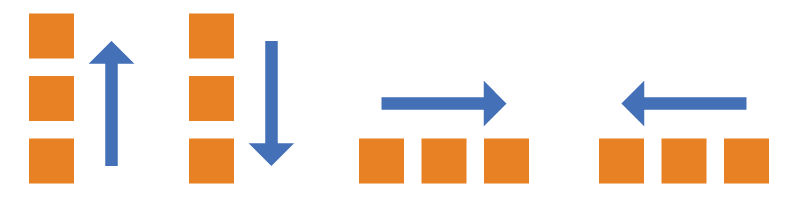
row:主轴为水平方向,起点在左端。
row-reverse:主轴为水平方向,起点在右端。
column(默认值):主轴为垂直方向,起点在上沿。
column-reverse:主轴为垂直方向,起点在下沿。
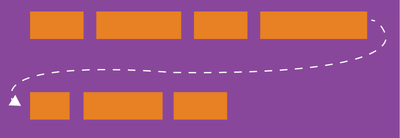
2 flexWrap 属性
默认情况下,项目都排在一条线(又称"轴线")上。flex-wrap属性定义,如果一条轴线排不下,需要如何换行。
.box{
  flex-wrap: nowrap | wrap | wrap-reverse;
}
它可能取三个值。
(1)nowrap(默认):不换行。
(2)wrap:换行,第一行在上方。
(3)wrap-reverse:换行,第一行在下方。
3 flex 属性
flex属性定义了项目的缩小比例,默认为1,即如果空间不足,该项目将缩小。
该属性的语法如下:
.item {
  flex: <number>; /* default 1 */
}
如果所有项目的flex属性都为1,当空间不足时,都将等比例缩小。如果一个项目的flex属性为0,其他项目都为1,则空间不足时,前者不缩小。负值对该属性无效。
4 justifyContent 属性
justify-content属性定义了项目在主轴上的对齐方式。
.box {
  justify-content: flex-start | flex-end | center | space-between | space-around;
}
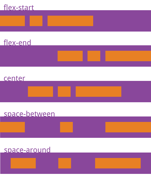
它可能取5个值,具体对齐方式与轴的方向有关。下面假设主轴为从左到右。
flex-start(默认值):左对齐
flex-end:右对齐
center: 居中
space-between:两端对齐,项目之间的间隔都相等。
space-around:每个项目两侧的间隔相等。所以,项目之间的间隔比项目与边框的间隔大一倍。
5 alignItems 属性
align-items属性定义项目在侧轴上如何对齐。
.box {
  align-items: flex-start | flex-end | center | baseline | stretch;
}
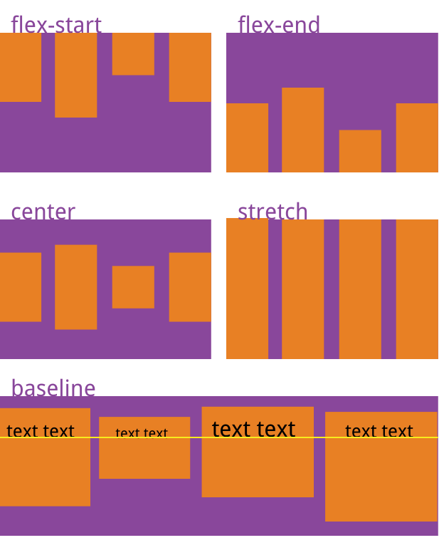
它可能取5个值。具体的对齐方式与交叉轴的方向有关,下面假设交叉轴从上到下。
flex-start:交叉轴的起点对齐。
flex-end:交叉轴的终点对齐。
center:交叉轴的中点对齐。
baseline: 项目的第一行文字的基线对齐。
stretch(默认值):如果项目未设置高度或设为auto,将占满整个容器的高度。
6 alignSelf 属性
align-self属性允许单个项目有与其他项目不一样的对齐方式,可覆盖align-items属性。默认值为auto,表示继承父元素的align-items属性,如果没有父元素,则等同于stretch。
.item {
  align-self: auto | flex-start | flex-end | center | baseline | stretch;
}
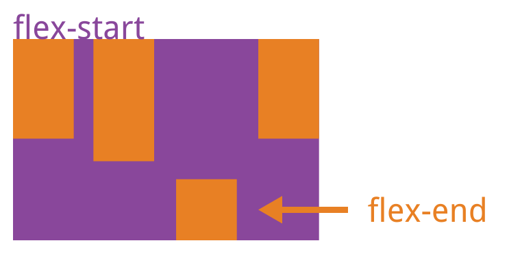
该属性可能取6个值,除了auto,其他都与align-items属性完全一致。
三 CSS和布局例子
1 基本样式例子
这里使用View和Text组件作为演示对象,首先,修改index.ios.js里面的代码,这里只需要关注StyleSheet和render里面的模板。修改后的代码如下:
import React, { Component } from 'react';
import {
AppRegistry,
StyleSheet,
Text,
View
} from 'react-native';
class demo extends Component {
render() {
return (
<View >
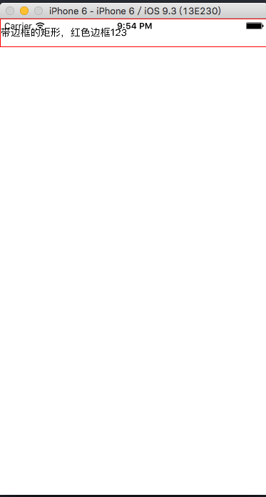
<View style={{height:40, borderWidth: 1, borderColor: 'red'}}>
<Text style={{marginTop:10}} >带边框的矩形,红色边框123</Text>
</View>
</View>
);
}
}
const styles = StyleSheet.create({
});
AppRegistry.registerComponent('demo', () => demo);
(1)增加一个带边框的矩形,红色边框
直接在组件上添加样式是这样的:style={{height:40, borderWidth: 1, borderColor: 'red'}},style是组件的一个自有属性.
在 render里默认函数里,return后 第一个{}JS执行环境或者是模板,第二个{}只是css样式对象的括号而已(慢慢体会,不难理解)
 render: function() {
        return (
            <View>
                <View style={{height:40, borderWidth: 1, borderColor: 'red'}}>
                      <Text style={{marginTop:10}} >带边框的矩形,红色边框123</Text>
                </View>
            </View>
        );
    }
修改好代码后,按住 cmd + R刷新模拟器,结果如下:
(2) 独立样式类
前面的例子是是直接在组件里写样式,也可以把样式单独抽出来放在 const styles = StyleSheet.create({ }) 里。样式类创建也很简单,只需要使用React.StyleSheet来创建类。其实创建的类就是一个js对象而已。那么在组件上引用是这样的<View style={{对象名称.对象属性}}></View>。
import React, { Component } from 'react';
import {
  AppRegistry,
  StyleSheet,
  Text,
  View
} from 'react-native';

class demo extends Component {
  render() {
    return (
      <View >
              <View  style={styles.style_1}>
                      <Text style={{marginTop:10}} >带边框的矩形,红色边框</Text>
             </View>
      </View>
    );
  }
}

const styles = StyleSheet.create({
  style_1:{
        height:40,
        borderWidth: 1,
        borderColor: 'red',
    }
});

AppRegistry.registerComponent('demo', () => demo);
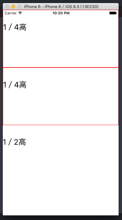
2 flex 布局例子
(1) flex属性
当一个(元素)组件,定义了flex属性时,表示该元素是可伸缩的。当然flex的属性值是大于0的时候才伸缩,其小于和等于0的时候不伸缩,例如:flex:0, flex:-1等。
import React, { Component } from 'react';
import {
  AppRegistry,
  StyleSheet,
  Text,
  View
} from 'react-native';

class demo extends Component {
  render() {
    return (
      <View style={styles.style_0}>
           <View style={styles.style_1}>
              <Text style={{marginTop:40, fontSize:25}}>1/4高</Text>
           </View>
           <View style={styles.style_1}>
             <Text style={{marginTop:40, fontSize:25}}>1/4高</Text>
           </View>
           <View style={{flex:10}}>
             <Text style={{marginTop:40, fontSize:25}}>1/2高</Text>
           </View>
       </View>
    );
  }
}

const styles = StyleSheet.create({
  style_0:{
        flex:1,
    },
    style_1:{
        flex: 5,
        height:40,
        borderWidth: 1,
        borderColor: 'red',
    }
});

AppRegistry.registerComponent('demo', () => demo);
上面的代码中,最外层的view是可伸缩的,因为没有兄弟节点和它抢占空间。里层是3个view,可以看到三个view的flex属性加起来是5+5+10=20,所以第一个view和第二个view分别占1/4伸缩空间, 最后一个view占据1/2空间.
修改好代码后,按住 cmd + R刷新模拟器,结果如下:
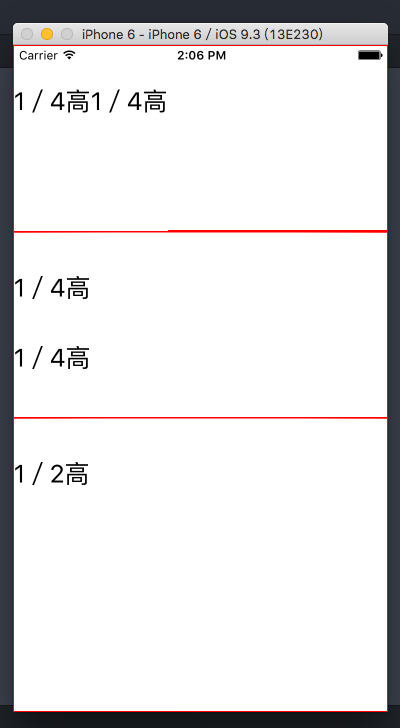
(2)flexDirection属性
flexDirection在React-Native中只有两个属性,一个是row(横向伸缩)和column(纵向伸缩).具体的效果可见如下代码:
import React, { Component } from 'react';
import {
  AppRegistry,
  StyleSheet,
  Text,
  View
} from 'react-native';

class MyApp extends Component {
  render() {
    return (
      <View style={styles.style_0}>
                   <View style={styles.style_1}>
                   <Text style={{marginTop:40, fontSize:25}}>1/4高</Text>
                   <Text style={{marginTop:40, fontSize:25}}>1/4高</Text>
               </View>
               <View style={[styles.style_1, {flexDirection: 'column'}]}>
                   <Text style={{marginTop:40, fontSize:25}}>1/4高</Text>
                   <Text style={{marginTop:40, fontSize:25}}>1/4高</Text>
               </View>
               <View style={{flex:10, borderWidth: 1, borderColor: 'red',}}>
                   <Text style={{marginTop:40, fontSize:25}}>1/2高</Text>
                   </View>
               </View>
    );
  }
}

const styles = StyleSheet.create({
      style_0:{
             flex:1,
         },
         style_1:{
             flex: 5,
             flexDirection: 'row',
             height:40,
             borderWidth: 1,
             borderColor: 'red',
         }
});

AppRegistry.registerComponent('MyApp', () => MyApp);
修改好代码后,按住 cmd + R刷新模拟器,具体的效果如下:
(3) alignSelf:对齐方式
alignSelf的对齐方式主要有四种:flex-start ,flex-end, center, auto, stretch
import React, { Component } from 'react';
import {
  AppRegistry,
  StyleSheet,
  Text,
  View
} from 'react-native';

class MyApp extends Component {
  render() {
    return (
      <View style={styles.style_0}>
                <View style={styles.view  }>
                    <Text >自由摆放</Text>
                </View>
                <View style={[styles.view ,styles.center]}>
                    <Text >居中摆放</Text>
                </View>
                <View style={[styles.view ,styles.left]}>
                    <Text >居左摆放</Text>
                </View>
                <View style={[styles.view ,styles.right]}>
                    <Text >居右摆放</Text>
                </View>
        </View>
    );
  }
}

const styles = StyleSheet.create({
   style_0 : {
        flex : 1 ,
        borderColor : 'red' ,
        borderWidth : 0.5 ,
    },
    view : {
        borderWidth: 5,
        borderColor: 'blue',
         100,
        height: 40
    },
    center : {
      alignSelf : 'center'
    },
    left : {
      alignSelf : 'flex-start'
    },
    right : {
      alignSelf : 'flex-end'
    }
});

AppRegistry.registerComponent('MyApp', () => MyApp);
修改好代码后,按住 cmd + R刷新模拟器,具体的效果如下:

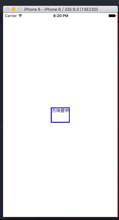
(4) 水平垂直居中
alignItems是alignSelf的变种,跟alignSelf的功能类似,可用于水平居中;justifyContent用于垂直居中
import React, { Component } from 'react';
import {
  AppRegistry,
  StyleSheet,
  Text,
  View
} from 'react-native';

class MyApp extends Component {
  render() {
    return (
      <View style={styles.style_0}>
                <View style={styles.view  }>
                    <Text >方块居中</Text>
                </View>
        </View>
    );
  }
}

const styles = StyleSheet.create({
   style_0 : {
        flex : 1 ,
        borderColor : 'red' ,
        borderWidth : 0.5 ,
        justifyContent : 'center',
        alignItems : 'center',

    },
    view : {
        borderWidth: 3,
        borderColor: 'blue',
        height: 50,
    }
});

AppRegistry.registerComponent('MyApp', () => MyApp);
修改好代码后,按住 cmd + R刷新模拟器,具体的效果如下:
资料参考:
http://www.ruanyifeng.com/blog/2015/07/flex-grammar.html?utm_source=tuicool
http://reactnative.cn/