一、HTML中的行级标签和块级标签
块级标签
常见的块级标签:div,p,h1-h6,ul,li,dl,dt,dd
1、独占一行,不和其他元素待在同一行
2、能设置宽高
3、如果不设置宽高,默认为body100%宽度
行级标签
常见的行级标签:a,span,strong,u,em
1、能和其他元素待在同一行
2、不能设置宽高
3、宽高 是内容的宽高
行内块标签
常见的行内块标签:img,input,textarea
1、能和其他元素待在一行
2、能设置宽高
span默认是不能设置宽高的,但是设置了display: block;属性之后,就可以设置宽高了
它表示 将此元素将显示为块级元素,此元素前后会带有换行符。
举例:
<!DOCTYPE html>
<html lang="en">
<head>
    <meta charset="UTF-8">
    <title>Title</title>
    <style type="text/css">
        span {
            /*设置块级元素*/
            display: block;
             100px;
            height: 100px;
            background-color: yellow;
        }
    </style>
</head>
<body>
    <span></span>
    <a href="#">11</a>
</body>
</html>
网页效果:
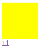
可以看到,它默认换行了。
二、高级选择器
高级选择器分为:后代选择器、子代选择器、并集选择器、交集选择器
后代选择器
使用空格表示后代选择器。顾名思义,父元素的后代(包括儿子,孙子,重孙子)
.container p{
    color: red;
}
.container .item p{
    color: yellow;
}
div里面的p
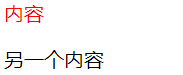
<!DOCTYPE html>
<html lang="en">
<head>
    <meta charset="UTF-8">
    <title>Title</title>
    <style type="text/css">
        /*后代选择器*/
        div p {
            color: red;
        }
    </style>
</head>
<body>
    <div>
        <p>内容</p>
    </div>
    <p>另一个内容</p>
</body>
</html>
网页效果:
class里面的p
<!DOCTYPE html>
<html lang="en">
<head>
    <meta charset="UTF-8">
    <title>Title</title>
    <style type="text/css">
        /*后代选择器*/
        .father p {
            color: red;
        }
    </style>
</head>
<body>
    <div class="father">
        <div>
            <p>内容</p>
        </div>
    </div>
    <p>另一个内容</p>
</body>
</html>
网页效果:
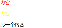
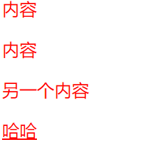
class里面的class里面的p
<!DOCTYPE html>
<html lang="en">
<head>
    <meta charset="UTF-8">
    <title>Title</title>
    <style type="text/css">
        /*后代选择器*/
        .father .a p {
            color: red;
        }
        .father p {
            color: yellow;
        }
    </style>
</head>
<body>
    <div class="father">
        <div class="item">
            <div class="a">
                <p>内容</p>
            </div>
        </div>
        <p>内容</p>
    </div>

    <div class="a">
        <p>另一个内容</p>
    </div>
</body>
</html>
网页效果:
子代选择器
使用>表示子代选择器。比如div>p,仅仅表示的是当前div元素选中的子代(不包含孙子....)元素p。
.container>p {
    color: yellowgreen;
}
举例
<!DOCTYPE html>
<html lang="en">
<head>
    <meta charset="UTF-8">
    <title>Title</title>
    <style type="text/css">
        /*后代选择器*/
        .father .a p {
            color: red;
        }
        /*子代选择器*/
        .father>p {
            color: yellow;
        }
    </style>
</head>
<body>
    <div class="father">
        <div class="item">
            <div class="a">
                <p>内容</p>
            </div>
        </div>
        <p>内容</p>
    </div>

    <div class="a">
        <p>另一个内容</p>
    </div>
</body>
</html>
网页效果:
并集选择器
多个选择器之间使用逗号隔开。表示选中的页面中的多个标签。一些共性的元素,可以使用并集选择器
/*并集选择器*/
h3,a{
    color: #008000;
    text-decoration: none;

}
比如像百度首页使用并集选择器。
body,h1,h2,h3,h4,h5,h6,hr,p,blockquote,dl,dt,dd,ul,ol,li,pre,form,fieldset,legend,button,input,textarea,th,td {
      margin: 0;
      padding: 0
   }
/*使用此并集选择器选中页面中所有的标签,页面布局的时候会使用*/
统一样式
<!DOCTYPE html>
<html lang="en">
<head>
    <meta charset="UTF-8">
    <title>Title</title>
    <style type="text/css">
        p,a{
            color: red;
            font-size: 20px;
        }
    </style>
</head>
<body>
    <div class="father">
        <div class="item">
            <div class="a">
                <p>内容</p>
            </div>
        </div>
        <p>内容</p>
    </div>
    <div class="a">
        <p>另一个内容</p>
    </div>
    <a href="#">哈哈</a>
</body>
</html>
网页效果:
交集选择器
使用.表示交集选择器。第一个标签必须是标签选择器,第二个标签必须是类选择器 语法:div.active
比如有一个<h4 class='active'></h4>这样的标签。
那么
h4{
     100px;
    font-size: 14px;
}
.active{
    color: red;
    text-decoration: underline;
}
/* 交集选择器 */
h4.active{
    background: #00BFFF;
}
它表示两者选中之后元素共有的特性。
举例:
<!DOCTYPE html>
<html lang="en">
<head>
<meta charset="UTF-8">
<title>Title</title>
<style type="text/css">
/*交集选择器*/
h4 {
background: green;
}
.active {
font-size: 14px;
}
h4.active {
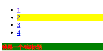
color: red;
}
li.active{
background: yellow;
}
</style>
</head>
<body>
<ul>
<li>
<a href="#">1</a>
</li>
<li class="active">
<a href="#">2</a>
</li>
<li>
<a href="#">3</a>
</li>
<li>
<a href="#">4</a>
</li>
</ul>
<h4 class="active">我是一个4级标题</h4>
</body>
</html>
网页效果:
三、属性选择器
属性选择器,字面意思就是根据标签中的属性,选中当前的标签。
语法:
/*根据属性查找*/
            /*[for]{
                color: red;
            }*/

            /*找到for属性的等于username的元素 字体颜色设为红色*/
            /*[for='username']{
                color: yellow;
            }*/

            /*以....开头  ^*/
            /*[for^='user']{
                color: #008000;
            }*/

            /*以....结尾   $*/
            /*[for$='vvip']{
                color: red;
            }*/

            /*包含某元素的标签*/
            /*[for*="vip"]{
                color: #00BFFF;
            }*/

            /**/

            /*指定单词的属性*/
            label[for~='user1']{
                color: red;
            }

            input[type='text']{
                background: red;
            }
举例:
<!DOCTYPE html>
<html lang="en">
<head>
    <meta charset="UTF-8">
    <title>Title</title>
    <style type="text/css">
        /*属性选择器*/
        [for]{
            color: red;
        }
        [type]{
            background-color: red;
        }
    </style>
</head>
<body>
    <from action="">
        <label for="username">用户名</label>
        <input type="text">
        <input type="password">
    </from>
</body>
</html>
网页效果:

<!DOCTYPE html>
<html lang="en">
<head>
    <meta charset="UTF-8">
    <title>Title</title>
    <style type="text/css">
        /*属性选择器*/
        label[for]{
            color: red;
        }
        input[type='text']{
            background-color: red;
        }
        label[for^='vi']{
            color: blue;
        }
    </style>
</head>
<body>
    <from action="">
        <label for="username">用户名</label>
        <label for="vip">vip</label>
        <label for="vivp">vvip</label>
        <input type="text">
        <input type="password">
    </from>
</body>
</html>
网页效果:

注意:属性选择器仅限于在表单控件中
四、伪类选择器
伪类选择器一般会用在超链接a标签中,使用a标签的伪类选择器,我们一定要遵循"爱恨准则" LoVe HAte
/*没有被访问的a标签的样式*/
        .box ul li.item1 a:link{

            color: #666;
        }
        /*访问过后的a标签的样式*/
        .box ul li.item2 a:visited{

            color: yellow;
        }
        /*鼠标悬停时a标签的样式*/
        .box ul li.item3 a:hover{

            color: green;
        }
        /*鼠标摁住的时候a标签的样式*/
        .box ul li.item4 a:active{

            color: yellowgreen;
        }
如果编辑器安装了Emmet插件,输入 div#box,按一下tab键,就会自动变成下面的样子
<div id="box"></div>
输入html:5也会补全代码,还有a,input,p,div...也会补全
举例:
<!DOCTYPE html>
<html lang="en">
<head>
<meta charset="UTF-8">
<title>Title</title>
<style type="text/css">
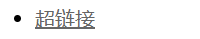
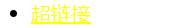
/*伪类选择器*/
/*设置a标签默认样式*/
.box ul li.item a:link{
color: #666;
}
/*a标签点击之后的样式*/
.box ul li.item a:visited{
color: yellow;
}
/*悬浮样式*/
.box ul li.item a:hover{
color: green;
font-size: 30px;
}
/*点击时效果*/
.box ul li.item a:active{
color: pink;
background-color: #fff;
}
</style>
</head>
<body>
<div id="box"></div>
<div class="box">
<ul>
<li class="item">
<a href="#">超链接</a>
</li>
</ul>
</div>
</body>
</html>
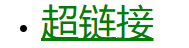
网页效果:
点击之后:
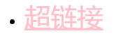
鼠标悬停效果:
鼠标点击效果:
再给大家介绍一种css3的选择器nth-child()
/*选中第一个元素*/
        div ul li:first-child{
            font-size: 20px;
            color: red;
        }
        /*选中最后一个元素*/
        div ul li:last-child{
            font-size: 20px;
            color: yellow;
        }

        /*选中当前指定的元素  数值从1开始*/
        div ul li:nth-child(3){
            font-size: 30px;
            color: purple;
        }

        /*n表示选中所有,这里面必须是n, 从0开始的  0的时候表示没有选中*/
        div ul li:nth-child(n){
            font-size: 40px;
            color: red;
        }

        /*偶数*/
        div ul li:nth-child(2n){
            font-size: 50px;
            color: gold;
        }
        /*奇数*/
        div ul li:nth-child(2n-1){
            font-size: 50px;
            color: yellow;
        }
        /*隔几换色  隔行换色
             隔4换色 就是5n+1,隔3换色就是4n+1
            */

        div ul li:nth-child(5n+1){
            font-size: 50px;
            color: red;
        }
举例:
<!DOCTYPE html>
<html lang="en">
<head>
<meta charset="UTF-8">
<title>Title</title>
<style type="text/css">
/*选中第一个元素,等同于nth-child(1)*/
ul li:first-child{
color: red;
}
/*选中最后一个元素*/
ul li:last-child{
color: green;
}
/*选中当前指定的元素 数值从1开始*/
ul li:nth-child(3){
color: purple;
}
/*偶数*/
ul li:nth-child(2n){
color: gold;
}
/*奇数*/
div ul li:nth-child(2n-1){
color: yellow;
}
</style>
</head>
<body>
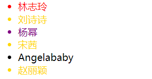
<ul>
<li>林志玲</li>
<li>刘诗诗</li>
<li>杨幂</li>
<li>宋茜</li>
<li>Angelababy</li>
<li>赵丽颖</li>
</ul>
</body>
</html>
网页效果:
五、伪元素选择器
非常重要的语法,废话不多说,直接上代码!!!
/*设置第一个首字母的样式*/
        p:first-letter{
            color: red;
            font-size: 30px;

        }

/* 在....之前 添加内容   这个属性使用不是很频繁 了解  使用此伪元素选择器一定要结合content属性*/
        p:before{
            content:'alex';
        }


/*在....之后 添加内容,使用非常频繁 通常与咱们后面要讲到布局 有很大的关联(清除浮动)*/
        p:after{
            content:'&';
            color: red;
            font-size: 40px;
        }
举例:
<!DOCTYPE html>
<html lang="en">
<head>
    <meta charset="UTF-8">
    <title>Title</title>
    <style type="text/css">
        /*设置第一个首字母的样式*/
        p:first-letter{
            color: red;
            font-size: 30px;
        }
        /* 在....之前 添加内容   这个属性使用不是很频繁 了解  使用此伪元素选择器一定要结合content属性*/
        p:before{
            content: 'CCTV';
        }
        /*这个非常重要,解决我们后面浮动产生的问题(布局)*/
        p:after{
            content: ".";
            display: block;
            height: 0;
            visibility: hidden;
            clear: both;
        }
    </style>
</head>
<body>
    <p>董卿</p>
</body>
</html>
网页效果:
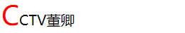
p:before添加的内容,鼠标是不能选择复制粘贴的。某些网页,会用到
六、css的继承性和层叠性
css有两大特性:继承性和层叠性
继承性
面向对象语言都会存在继承的概念,在面向对象语言中,继承的特点:继承了父类的属性和方法。那么我们现在主要研究css,css就是在设置属性的。不会牵扯到方法的层面。
继承:给父级设置一些属性,子级继承了父级的该属性,这就是我们的css中的继承。
记住:有一些属性是可以继承下来 : color 、 font-*、 text-*、line-* 。主要是文本级的标签元素。
但是像一些盒子元素属性,定位的元素(浮动,绝对定位,固定定位)不能继承。
举例:
<!DOCTYPE html>
<html lang="en">
<head>
    <meta charset="UTF-8">
    <title>Title</title>
    <style type="text/css">
        /*设置div颜色*/
        div {
            color: red;
        }
    </style>
</head>
<body>
    <div>
        <p>韩雪</p>
    </div>
</body>
</html>
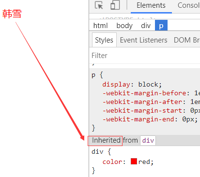
网页效果,它的颜色使继承的
出现Inherited,就表示继承。
<!DOCTYPE html>
<html lang="en">
<head>
    <meta charset="UTF-8">
    <title>Title</title>
    <style type="text/css">
        /*设置div颜色*/
        div {
            color: red;
            font-size: 20px;
            background: pink;
        }
    </style>
</head>
<body>
    <div>
        <p>韩雪</p>
    </div>
</body>
</html>
网页效果:
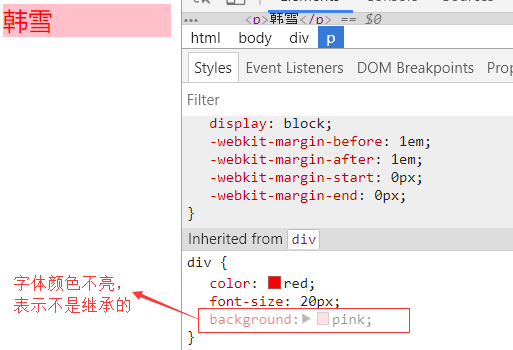
因为p标签,默认的背景色是透明的。由于div的背景色为粉红色,它盖住了透明色。所以最终显示的颜色为粉红色。
层叠性
层叠性: 权重的标签覆盖掉了权重小的标签,说白了 ,就是被干掉了
权重: 谁的权重大,浏览器就会显示谁的属性
谁的权重大? 非常简单就是小学的数数。
数:id的数量 class的数量 标签的数量,顺序不能乱。
默认为0,有就加1,没有就为0
/*1  0  0 */显示红色
#box{


    color: red;
}
/*0  1  0*/
.container{
    color: yellow;
}
/*0  0  1*/
p{
    color: purple;
}
举例:
<!DOCTYPE html>
<html lang="en">
<head>
<meta charset="UTF-8">
<title>Title</title>
<style type="text/css">
/*设置颜色*/
/*1 0 0*/
#box {
color: pink;
}
/*0 1 0*/
.container {
color: blue;
}
/*0 0 1*/
p {
color: gray;
}
</style>
</head>
<body>
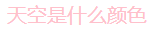
<p id="box" class="container">天空是什么颜色</p>
</body>
</html>
网页效果是粉红色,因为#box的权重最大
是不是感觉明白了呢?好的,再给大家加深点难度。
<div id='box1' class="wrap1">
<div id="box2" class="wrap2">
<div id="box3" class="wrap3">
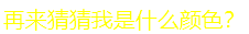
<p>再来猜猜我是什么颜色?</p>
</div>
</div>
</div>
#box1 #box2 p{
color: yellow;
}

#box2 .wrap3 p{
color: red;
}

div div #box3 p{
color: purple;
}


div.wrap1 div.wrap2 div.wrap3 p{
color: blue;
}
网页效果 :
<style type="text/css">
        /*2 0 1*/
        #box1 #box2 p{
            color: yellow;
        }
        /*1 1 1*/
        #box2 .wrap3 p{
            color: red;
        }
        /*1 0 3*/
        div div #box3 p{
            color: purple;
        }
        /*0 3 1*/
        div.wrap1 div.wrap2 div.wrap3 p{
            color: blue;
        }
    </style>

分析代码
可以看出第一个权重最大,所以是黄色。
好的。那么上面的这个案例大家是否懂了呢?那么接下来我们继续看案例
还是上面那个html结构,如果我设置以下css,会显示什么颜色呢。
#box2 .wrap3 p{
    color: yellow;
}

#box1 .wrap2 p{
    color: red;
}
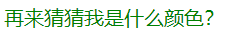
答案是红色的。结论:当权重一样的时候 是以后来设置的属性为准,前提必须权重一样 。‘后来者居上 ’。
Good,我们继续看下面的css,你来猜以下此时字什么颜色?
#box1 #box2 .wrap3{
    color: red;
}

#box2 .wrap3 p{
    color: green;
}
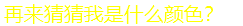
答案是绿色。哈哈,是不是感觉快懵掉了。其实大家只要记住这点特性就可以。第一条css设置的属性值,是通过继承性设置成的红色,那么继承来的属性,它的权重为0。它没有资格跟我们下面选中的标签对比。
那大家猜想一下如果都是被继承来的属性,那么字会显示什么颜色呢?
#box1 #box2 .wrap3{
    color: red;
}
.wrap1 #box2{
    color: green;
}
小案例证明:权重都是0:那么就是"就近原则" : 谁描述的近,就显示谁的属性。所谓描述的近,就是选中到最内层的距离越近。
小总结一下:
总结:
1.先看标签元素有没有被选中,如果选中了,就数数 (id,class,标签的数量) 谁的权重大 就显示谁的属性。权重一样大,后来者居上
2.如果没有被选中标签元素,权重为0。
如果属性都是被继承下来的 权重都是0 。权重都是0:"就近原则" : 谁描述的近,就显示谁的属性
七、层叠性权重相同处理
直接上代码,看效果!
第一种现象:当权重相同时,以后来设置的属性为准,前提一定要权重相同
#box2 .wrap3 p{
    color: yellow;
}

#box1 .wrap2 p{
    color: red;
}
html参数上面的。
我们会发现此时显示的是红色的。
第二种现象: 第一个选择器没有选中内层标签,那么它是通过继承来设置的属性,那么它的权重为0。第二个选择器选中了内层标签,有权重。
所以 继承来的元素 权重为0。跟选中的元素没有可比性。
#box1 #box2 .wrap3{
    color: red;
}
#box2 .wrap3 p{
    color: green;
}
我们会发现此时显示的是绿色的。
第三种现象:如果都是继承来的属性,谁描述的近,显示谁的属性。'就近原则'
#box1 #box2 .wrap3{
    color: red;
}
 .wrap1 #box2{
    color: green;
}
!important 的使用。
!important:设置权重为无限大
!important 不影响继承来的权重,只影响选中的元素。不要随便使用!important,因为使用它会影响页面的布局
举例:
<!DOCTYPE html>
<html lang="en">
<head>
    <meta charset="UTF-8">
    <title>Title</title>
    <style type="text/css">
        #box1 #box2 .wrap3{
            color: red;
        }
        .wrap1 #box2 .wrap3{
            color: green !important;
        }
    </style>
</head>
<body>
    <div id='box1' class="wrap1">
        <div id="box2" class="wrap2">
            <div id="box3" class="wrap3">
                <p>再来猜猜我是什么颜色?</p>
            </div>
        </div>
    </div>
</body>
</html>
网页输出:
如果没有!important,它会输出红色。但是加了!important之后,就会变成绿色。
那么!important和行内相比,谁的优先级更高呢?
<!DOCTYPE html>
<html lang="en">
<head>
    <meta charset="UTF-8">
    <title>Title</title>
    <style type="text/css">
        #box1 #box2 .wrap3{
            color: red;
        }
        .wrap1 #box2 .wrap3{
            color: green !important;
        }
    </style>
</head>
<body>
    <div id='box1' class="wrap1">
        <div id="box2" class="wrap2">
            <div id="box3" class="wrap3">
                <p style="color: yellow">再来猜猜我是什么颜色?</p>
            </div>
        </div>
    </div>
</body>
</html>

优先级对比
网页输出:
可以看出,行内的样式,优先级始终都是最高的。
八、盒模型
在CSS中,"box model"这一术语是用来设计和布局时使用,然后在网页中基本上都会显示一些方方正正的盒子。我们称为这种盒子叫盒模型。
盒模型有两种:标准模型和IE模型。我们在这里重点讲标准模型。
盒模型示意图

在使用谷歌浏览器的网页调试工具时,经常可以看到上图的盒子模型。
盒模型的属性
width:内容的宽度
height: 内容的高度
padding:内边距,边框到内容的距离
border: 边框,就是指的盒子的宽度
margin:外边距,盒子边框到附近最近盒子的距离
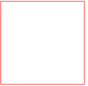
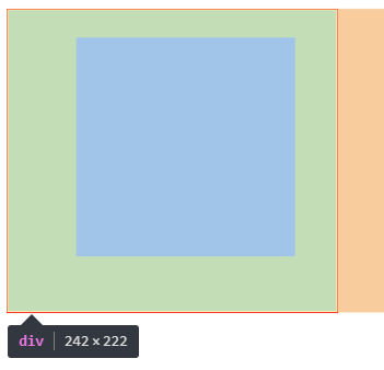
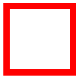
如果让你做一个宽高402*402的盒子,您如何来设计呢?
答案有上万种,甚至上一种。
<!DOCTYPE html>
<html lang="en">
<head>
    <meta charset="UTF-8">
    <title>Title</title>
    <style type="text/css">
        div {
             400px;
            height: 400px;
            border: 1px solid red;
        }
    </style>
</head>
<body>
    <!--402*402的盒子-->
    <div></div>
</body>
</html>
网页效果:
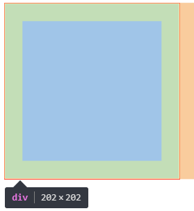
盒模型的计算
如果一个盒子设置了padding,border,width,height,margin(咱们先不要设置margin,margin有坑,后面课程会讲解)
盒子的真实宽度=width+2*padding+2*border
盒子的真实宽度=height+2*padding+2*border
那么在这里要注意看了。标准盒模型,width不等于盒子真实的宽度。
另外如果要保持盒子真实的宽度,那么加padding就一定要减width,减padding就一定要加width。真实高度一样设置。
<!DOCTYPE html>
<html lang="en">
<head>
    <meta charset="UTF-8">
    <title>Title</title>
    <style type="text/css">
        div {
             200px;
            height: 400px;
            border: 1px solid red;
            padding-left: 200px;
        }
    </style>
</head>
<body>
    <!--402*402的盒子-->
    <div></div>
</body>
</html>

第二种写法
总结:
水平方向 +padding 减width
垂直方向 +padding 减height
盒子的宽度不是真实的盒子宽度
真实盒子宽度 = width+padding+border
九、padding(内边距)
padding
padding:就是内边距的意思,它是边框到内容之间的距离
另外padding的区域是有背景颜色的。并且背景颜色和内容的颜色一样。也就是说background-color这个属性将填充所有的border以内的区域
padding的设置
padding有四个方向,分别描述4个方向的padding。
描述的方法有两种
1、写小属性,分别设置不同方向的padding
padding-top: 30px;
padding-right: 30px;
padding-bottom: 30px;
padding-left: 30px;
2、写综合属性,用空格隔开
/*上 右 下 左*/
padding: 20px 30px 40px 50px ;

/*上 左右  下*/
padding: 20px 30px 40px;

/* 上下 左右*/
padding: 20px 30px;

/*上下左右*/
padding: 20px;
加padding,要减width
<!DOCTYPE html>
<html lang="en">
<head>
    <meta charset="UTF-8">
    <title>Title</title>
    <style type="text/css">
        div {
             160px;
            height: 160px;
            border: 1px solid red;
            padding-left: 20px;
            padding-right: 20px;
            padding-bottom: 20px;
            padding-top: 20px;
        }
    </style>
</head>
<body>
    <div></div>
</body>
</html>
网页效果:
上面的4行padding代码可以缩减为一行代码
padding: 20px;
举例:
<!DOCTYPE html>
<html lang="en">
<head>
    <meta charset="UTF-8">
    <title>Title</title>
    <style type="text/css">
        div {
             160px;
            height: 160px;
            border: 1px solid red;
            /*上下*/
            /*padding: 20px 10px;*/
            /*上 左 右 下*/
            /*padding: 20px 30px 40px;*/
            /*上 右 下 左*/
            padding: 20px 30px 40px 50px;
        }
    </style>
</head>
<body>
    <div></div>
</body>
</html>
网页效果:
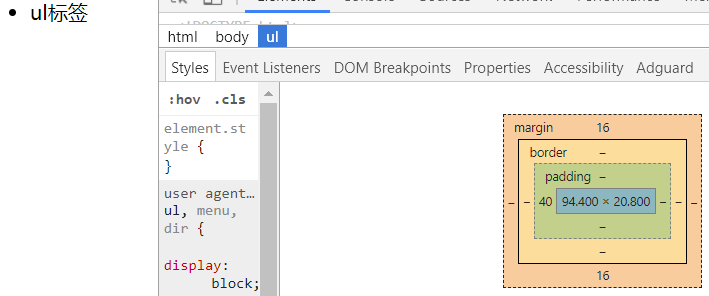
一些标签默认有padding
比如ul标签,有默认的padding-left值。
那么我们一般在做站的时候,是要清除页面标签中默认的padding和margin。以便于我们更好的去调整元素的位置。
比如ul标签,默认margin为16,padding为40
我们现在初学可以使用通配符选择器
*{
  padding:0;
  margin:0;
}
显示在最左边,maring和padding为0
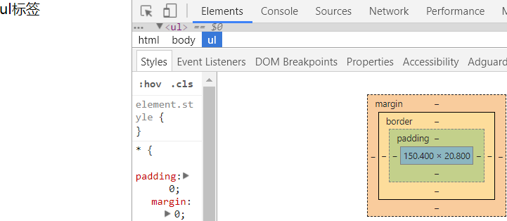
But,这种方法效率不高。
所以我们要使用并集选择器来选中页面中应有的标签(不同背,因为有人已经给咱们写好了这些清除默认的样式表,reset.css)
https://meyerweb.com/eric/tools/css/reset/
十、border(边框)
border:边框的意思,描述盒子的边框
边框有三个要素: 粗细 线性样式 颜色
border: 1px solid red;
如果颜色不写,默认是黑色。如果粗细不写,不显示边框。如果只写线性样式,默认的有上下左右 3px的宽度,实体样式,并且黑色的边框。
<!DOCTYPE html>
<html lang="en">
<head>
    <meta charset="UTF-8">
    <title>Title</title>
    <style type="text/css">
        div{
             100px;
            height: 100px;
            /*不写px*/
            border: solid red;
        }
    </style>
</head>
<body>
    <div></div>
</body>
</html>

不写px
网页效果,默认边框为3px
按照3要素来写border
border- 3px;
border-style: solid;
border-color: red;
/*
border- 5px 10px;
border-style: solid dotted double dashed;
border-color: red green yellow;
*/
按照方向划分
border-top- 10px;
border-top-color: red;
border-top-style: solid;

border-right- 10px;
border-right-color: red;
border-right-style: solid;

border-bottom- 10px;
border-bottom-color: red;
border-bottom-style: solid;

border-left- 10px;
border-left-color: red;
border-left-style:solid;
上面12条语句,相当于
border: 10px solid red;
网页效果:
另外还可以这样:
border-top: 10px solid red;
border-right: 10px solid red;
border-bottom: 10px solid red;
border-left: 10px solid red;
网页效果同上
设置圆角
<!DOCTYPE html>
<html lang="en">
<head>
    <meta charset="UTF-8">
    <title>Title</title>
    <style type="text/css">
        div{
             100px;
            height: 100px;
            border: 1px solid red;
            /*设置圆角*/
            border-radius: 5px;
        }
    </style>
</head>
<body>
    <div></div>
</body>
</html>
网页效果:
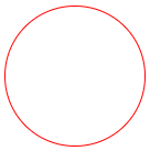
如果为50%,表示一个圆
<!DOCTYPE html>
<html lang="en">
<head>
    <meta charset="UTF-8">
    <title>Title</title>
    <style type="text/css">
        div{
             100px;
            height: 100px;
            border: 1px solid red;
            /*圆*/
            border-radius: 50%;
        }
    </style>
</head>
<body>
    <div></div>
</body>
</html>
网页效果:
border:none;
border:0;
表示border没有设置样式。
使用border来制作小三角
<!DOCTYPE html>
<html lang="en">
<head>
    <meta charset="UTF-8">
    <title>Title</title>
    <style type="text/css">
        div{
             0;
            height: 0;
            border-bottom: 20px solid red;
            border-left: 20px solid transparent;
            border-right: 20px solid transparent;
        }
    </style>
</head>
<body>
    <div></div>
</body>
</html>
小三角 箭头向上
网页效果:

<!DOCTYPE html>
<html lang="en">
<head>
    <meta charset="UTF-8">
    <title>Title</title>
    <style type="text/css">
        div{
             0;
            height: 0;
            border-top: 20px solid red;
            border-left: 20px solid transparent;
            border-right: 20px solid transparent;
        }
    </style>
</head>
<body>
    <div></div>
</body>
</html>

小三角 箭头向下
网页效果:

<!DOCTYPE html>
<html lang="en">
<head>
    <meta charset="UTF-8">
    <title>Title</title>
    <style type="text/css">
        div{
             0;
            height: 0;
            border-bottom: 20px solid transparent;
            border-right: 20px solid red;
            border-top: 20px solid transparent;
        }
    </style>
</head>
<body>
    <div></div>
</body>
</html>

箭头向左

<!DOCTYPE html>
<html lang="en">
<head>
    <meta charset="UTF-8">
    <title>Title</title>
    <style type="text/css">
        div{
             0;
            height: 0;
            border-bottom: 20px solid transparent;
            border-left: 20px solid red;
            border-top: 20px solid transparent;
        }
    </style>
</head>
<body>
    <div></div>
</body>
</html>

箭头向右
网页效果:

十一、简单认识下margin
margin
margin:外边距的意思。表示边框到最近盒子的距离。
/*表示四个方向的外边距离为20px*/
margin: 20px;
/*表示盒子向下移动了30px*/
margin-top: 30px;
/*表示盒子向右移动了50px*/
margin-left: 50px;

margin-bottom: 100px;
先来2个div
<!DOCTYPE html>
<html lang="en">
<head>
    <meta charset="UTF-8">
    <title>Title</title>
    <style type="text/css">
        div{
             100px;
            height: 100px;
        }
        .box1 {
            background: red;
        }
        .box2 {
            background: green;
        }
    </style>
</head>
<body>
    <div class="box1"></div>
    <div class="box2"></div>
</body>
</html>
网页效果:
<!DOCTYPE html>
<html lang="en">
<head>
<meta charset="UTF-8">
<title>Title</title>
<style type="text/css">
div{
100px;
height: 100px;
}
.box1 {
background: red;
margin-left: 50px;
}
.box2 {
background: green;
}
</style>
</head>
<body>
<div class="box1"></div>
<div class="box2"></div>
</body>
</html>
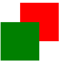
左移动50px
网页效果:
<!DOCTYPE html>
<html lang="en">
<head>
<meta charset="UTF-8">
<title>Title</title>
<style type="text/css">
div{
100px;
height: 100px;
}
.box1 {
background: red;
margin-left: 50px;
}
.box2 {
background: green;
margin-top: -50px;
}
</style>
</head>
<body>
<div class="box1"></div>
<div class="box2"></div>
</body>
</html>
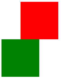
上移动-50px
网页效果:
这2个正方形,想要一排展示呢?需要用到浮动,这个是明天要讲的内容,提前观摩一下
<!DOCTYPE html>
<html lang="en">
<head>
<meta charset="UTF-8">
<title>Title</title>
<style type="text/css">
div{
100px;
height: 100px;
}
.box1 {
background: red;
float: left;
}
.box2 {
background: green;
float: left;
}
</style>
</head>
<body>
<div class="box1"></div>
<div class="box2"></div>
</body>
</html>
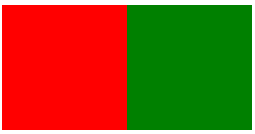
并排展示
网页效果:
下面演示,做小米官网的简单布局图
先看设计图
<!DOCTYPE html>
<html lang="en">
<head>
    <meta charset="UTF-8">
    <title>Document</title>
    <style>
        *{
            padding: 0;
            margin: 0;
        }
        ul{
            list-style: none;
        }

        /*导航栏的样式*/
        .nav{
             1226px;
            height: 40px;
            /*background-color: yellow;*/
            margin: 0 auto;
        }
        .nav .navt{
             375px;
            height: 40px;
            background-color: red;
            float: left;
        }
        .nav .car{
             120px;
            height: 40px;
            background-color: green;
            float: right;
            margin-left: 15px;
        }
        .nav .login{
             140px;
            height: 40px;
            background-color: pink;
            float: right;
        }
        .wrap{
             1226px;
            height: 110px;
            /*background: #666;*/
            margin: 0 auto;


        }
        .wrap .logo{
             62px;
            height: 55px;
            background-color: purple;
            float: left;
            margin-top: 22px;

        }
        .wrap .nav2{
             850px;
            height: 110px;
            background: pink;
            float: left;

        }
        .wrap .search{
             296px;
            height: 50px;
            float: right;
            background-color: purple;
            margin-top: 30px;
        }
        ul{
             1226px;
            height: 300px;
            margin: 0 auto;
        }
        ul li{
            float: left;
             300px;
            height: 300px;
            background-color:red;
            margin-left: 20px;
        }
    </style>
</head>
<body>

<div class="nav">
    <div class="navt"></div>
    <div class="car"></div>
    <div class="login"></div>
</div>

<div class="wrap">
    <div class="logo"></div>
    <div class="nav2"></div>
    <div class="search"></div>
</div>

<!--<ul>-->
    <!--<li>1</li>-->
    <!--<li>2</li>-->
<!--</ul>-->

</body>
</html>

导航部分代码
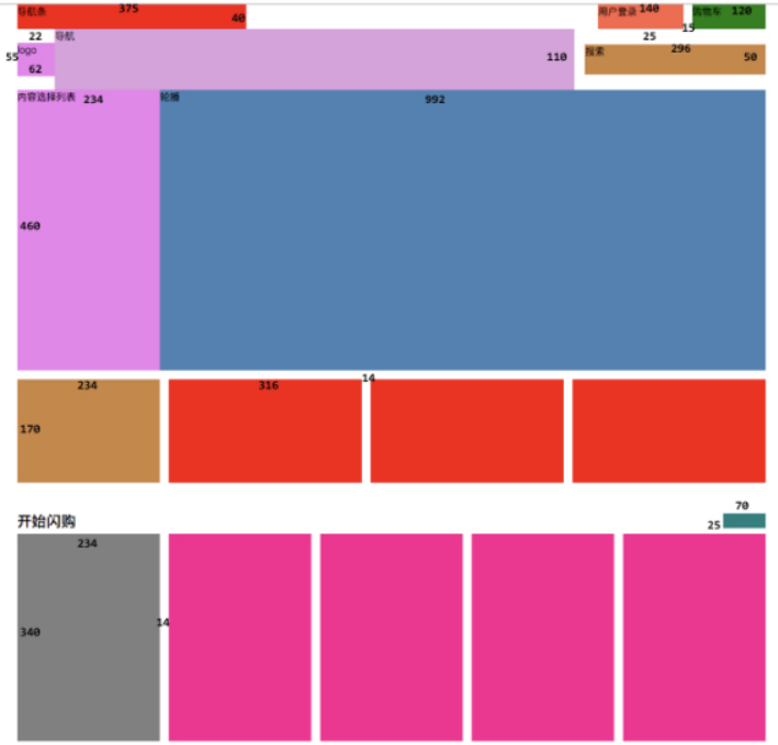
网页效果:
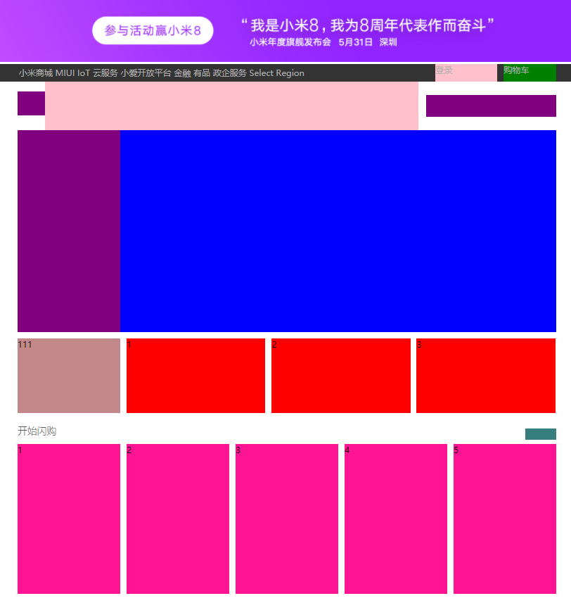
今日作业:
完成设计图剩余部分
部分代码:
<!DOCTYPE html>
<html lang="en">
<head>
    <meta charset="UTF-8">
    <title>Document</title>
    <style>
        *{
            padding: 0;
            margin: 0;
        }
        ul{
            list-style: none;
        }
        /*最顶部图片*/
        .site_bn_bar img{
             100%;
            background-repeat: no-repeat;
            background-position: center 0;
        }
        .site_topbar {
            position: relative;
            z-index: 30;
            height: 40px;
            font-size: 12px;
            color: #b0b0b0;
            background: #333;
        }
        .top_nav {
            margin: 0 auto;
             1226px;
            height: 50px;
        }
        .top_nav ul {
            font-size: 12px;
            text-align: center;
            background: #5f5750;
        }
        .top_nav ul li {
            float: left;
            padding: 0 3px;
        }
        .top_nav .top_li {
            float: left;
            line-height: 40px;
        }
        .top_nav .car{
             120px;
            height: 40px;
            background-color: green;
            float: right;
            margin-left: 15px;
        }
        .top_nav .login{
             140px;
            height: 40px;
            background-color: pink;
            float: right;
        }
        /*整体样式*/
        .integral {
            margin: 0 auto;
             1226px;
        }

        /*导航栏的样式*/
        /*.nav{*/
            /*height: 40px;*/
        /*}*/
        /*.nav .navt{*/
            /* 375px;*/
            /*height: 40px;*/
            /*background-color: red;*/
            /*float: left;*/
        /*}*/

        .wrap{
            height: 110px;
        }
        .wrap .logo{
             62px;
            height: 55px;
            background-color: purple;
            float: left;
            margin-top: 22px;
        }
        .wrap .nav2{
             850px;
            height: 110px;
            background: pink;
            float: left;
        }
        .wrap .search{
             296px;
            height: 50px;
            float: right;
            background-color: purple;
            margin-top: 30px;
        }

        .choice{
             234px;
            height: 460px;
            background-color: purple;
            float: left;
        }
        .video{
             992px;
            height: 460px;
            background-color: blue;
            float: left;
        }
        .clear {
            clear: both;
        }
        .hero {
            padding-top: 14px;
        }
        .choice_sub {
             234px;
            height: 170px;
            background-color: #c38889;
            float: left;
        }
        .best_seller {
            height: 170px;
            margin-left: 14px;
        }
        .best_seller ul{
            height: 170px;
        }
        .best_seller ul li{
            float: left;
             316px;
            height: 170px;
            background-color:red;
            margin-left: 14px;
        }
        .flicker {
            height: 70px;
        }
        .paging {
             70px;
            height: 25px;
            background-color:#377f7e;
            margin-top: 35px;
            float: right;
        }
        .flicker_text p {
            position:absolute;
            margin-top: 10px;
            font-size: 22px;
            font-weight: 200;
            line-height: 58px;
            color: #333;
        }

        .flicker_goods {
            height: 340px;
            margin-left: -14px;
        }
        .flicker_goods ul{
            list-style: none;
            height: 340px;
        }
        .flicker_goods ul li{
            float: left;
             234px;
            height: 340px;
            background-color:deeppink;
            margin-left: 14px;
        }

    </style>
</head>
<body>
<div class="site_bn_bar">
    <img src="images/cms_15270400062082_IKomG.jpg">
</div>
<div class="site_topbar">
    <div class="top_nav">
        <div class="top_li">
            <ul>
                <li>小米商城</li>
                <li>MIUI</li>
                <li>IoT</li>
                <li>云服务</li>
                <li>小爱开放平台</li>
                <li>金融</li>
                <li>有品</li>
                <li>政企服务</li>
                <li>Select Region</li>
            </ul>
        </div>
        <div class="car">购物车</div>
        <div class="login">登录</div>
    </div>
</div>
<div class="integral">
    <!--<div class="nav">-->
        <!--<div class="navt"></div>-->
    <!--</div>-->

    <div class="wrap">
        <div class="logo"></div>
        <div class="nav2"></div>
        <div class="search"></div>
    </div>
    <div class="container">
        <div class="choice"></div>
        <div class="video"></div>
    </div>

    <div class="clear"></div>
    <div class="hero">
        <div class="choice_sub">111</div>
        <div class="best_seller">
            <ul>
                <li>1</li>
                <li>2</li>
                <li>3</li>
            </ul>
        </div>
    </div>
    <div class="flicker">
        <div class="flicker_text">
            <p>开始闪购</p>
        </div>
        <div class="paging"></div>
    </div>
    <div class="clear"></div>
    <div class="flicker_goods">
        <ul>
            <li>1</li>
            <li>2</li>
            <li>3</li>
            <li>4</li>
            <li>5</li>
        </ul>
    </div>

</div>

</body>
</html>

部分代码
网页效果: