Theme
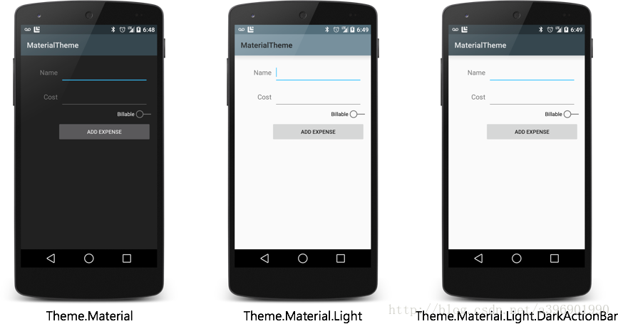
material主题可以定义为如下形式:
- @android:style/Theme.Material
- @android:style/Theme.Material.Light
- @android:style/Theme.Material.Light.DarkActionBar
我们可以在vlues-v21中的styles.xml文件中继承这些主题,然后定制一些属性。在v21中可以做如下修改
<resources>
  <!-- inherit from the material theme -->
  <style name="AppTheme" parent="android:Theme.Material">
    <!-- Main theme colors -->
    <!--   your app's branding color (for the app bar) -->
    <item name="android:colorPrimary">@color/primary</item>
    <!--   darker variant of colorPrimary (for status bar, contextual app bars) -->
    <item name="android:colorPrimaryDark">@color/primary_dark</item>
    <!--   theme UI controls like checkboxes and text fields -->
    <item name="android:colorAccent">@color/accent</item>
  </style>
</resources>
这里设置了几个主题颜色
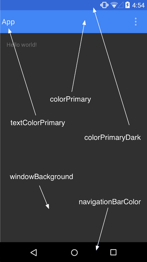
注:
<item name="android:colorAccent">#00FF00</item>
colorAccent是设置像是CheckBox的颜色
接下来,我们主要来看看在低版本中应该如何设置
color.xml
<?xml version="1.0" encoding="utf-8"?>
<resources>
    <color name="colorPrimaryDark">#3367d6</color>
    <color name="colorPrimary">#4285f4</color>
    <color name="windowBackground">#eeeeee</color>

</resources>
styles.xml
<resources xmlns:android="http://schemas.android.com/apk/res/android">

    <!--
        Base application theme, dependent on API level. This theme is replaced
        by AppBaseTheme from res/values-vXX/styles.xml on newer devices.
    -->
    <style name="AppBaseTheme" parent="Theme.AppCompat">
        <!--
            Theme customizations available in newer API levels can go in
            res/values-vXX/styles.xml, while customizations related to
            backward-compatibility can go here.

        -->
    </style>

    <!-- Application theme. -->
    <style name="AppTheme" parent="AppBaseTheme">

        <!-- All customizations that are NOT specific to a particular API-level can go here. -->
        <item name="colorPrimary">@color/colorPrimary</item>
        <item name="colorPrimaryDark">@color/primary_material_light</item>
        <item name="android:textColorPrimary">@android:color/white</item>
        <item name="android:windowNoTitle">true</item>
        <item name="windowActionBar">false</item>
    </style>

</resources>
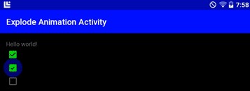
这样我们就设置好了类似于下面的效果:
现在我们终于在高版本上能改变status bar的颜色了,这个在以前是不可能的。话说4.4也支持这个。下面我们来详细看看在低版本中我们如何让自己的主题完美工作。
1.首先继承一个Compat的主题
在compat包中我们可以看到有很多主题,我们找到给activity用的,发现也就下面红框里这么几个,看名字就能知道是什么了。
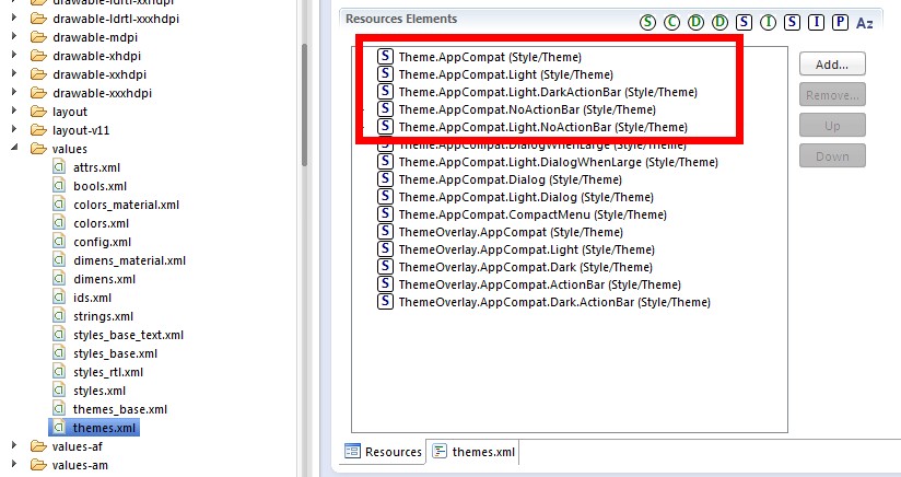
<resources>

    <!-- Themes in the "Theme.AppCompat" family will contain an action bar by default.
         If Holo themes are available on the current platform version they will be used.
         A limited Holo-styled action bar will be provided on platform versions older
         than 3.0. (API 11)

         These theme declarations contain any version-independent specification. Items
         that need to vary based on platform version should be defined in the corresponding
         "Theme.Base" theme. -->

    <!-- Platform-independent theme providing an action bar in a dark-themed activity. -->
    <style name="Theme.AppCompat" parent="Base.Theme.AppCompat" />

    <!-- Platform-independent theme providing an action bar in a light-themed activity. -->
    <style name="Theme.AppCompat.Light" parent="Base.Theme.AppCompat.Light" />

    <!-- Platform-independent theme providing an action bar in a dark-themed activity. -->
    <style name="Theme.AppCompat.Light.DarkActionBar" parent="Base.Theme.AppCompat.Light.DarkActionBar" />

    <style name="Theme.AppCompat.NoActionBar">
        <item name="windowActionBar">false</item>
        <item name="android:windowNoTitle">true</item>
    </style>

    <style name="Theme.AppCompat.Light.NoActionBar">
        <item name="windowActionBar">false</item>
        <item name="android:windowNoTitle">true</item>
    </style>
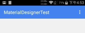
继承Theme.AppCompat,效果↓
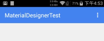
继承Theme.AppCompat.Light效果↓
继承Theme.AppCompat.Light.DarkActionBar效果↓
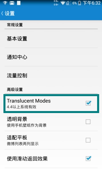
此外,在Android的4.4添加了View.SYSTEM_UI_FLAG_IMMERSIVE和View.SYSTEM_UI_FLAG_IMMERSIVE_STICKY。这两个标记可以实现所谓的沉浸式状态栏,个人感觉翻译的不好,应该叫做一种状态栏模式。这些标记的作用是在应用(比如视频)在需要全屏时抹去状态栏,但是在退出视频时又能回来。准确来说是叫:ImmersiveMode或者是Translucent Modes,总之是一种模式。
详细可以看这篇文章:http://www.tuicool.com/articles/RVRneq
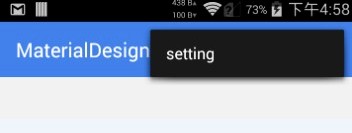
在Smooth中已经实现了4.4上的效果,具体如下:
总之呢,在之前的版本上状态栏上面还是不能由我们随意定制的,4.4除外。但也有好消息,那就是ActionBar可以被我们再一次定制了,而且可以兼容之前的设备,利用的是ToolBar这个新控件。关于Toolbar的使用,我们以后会讲到。