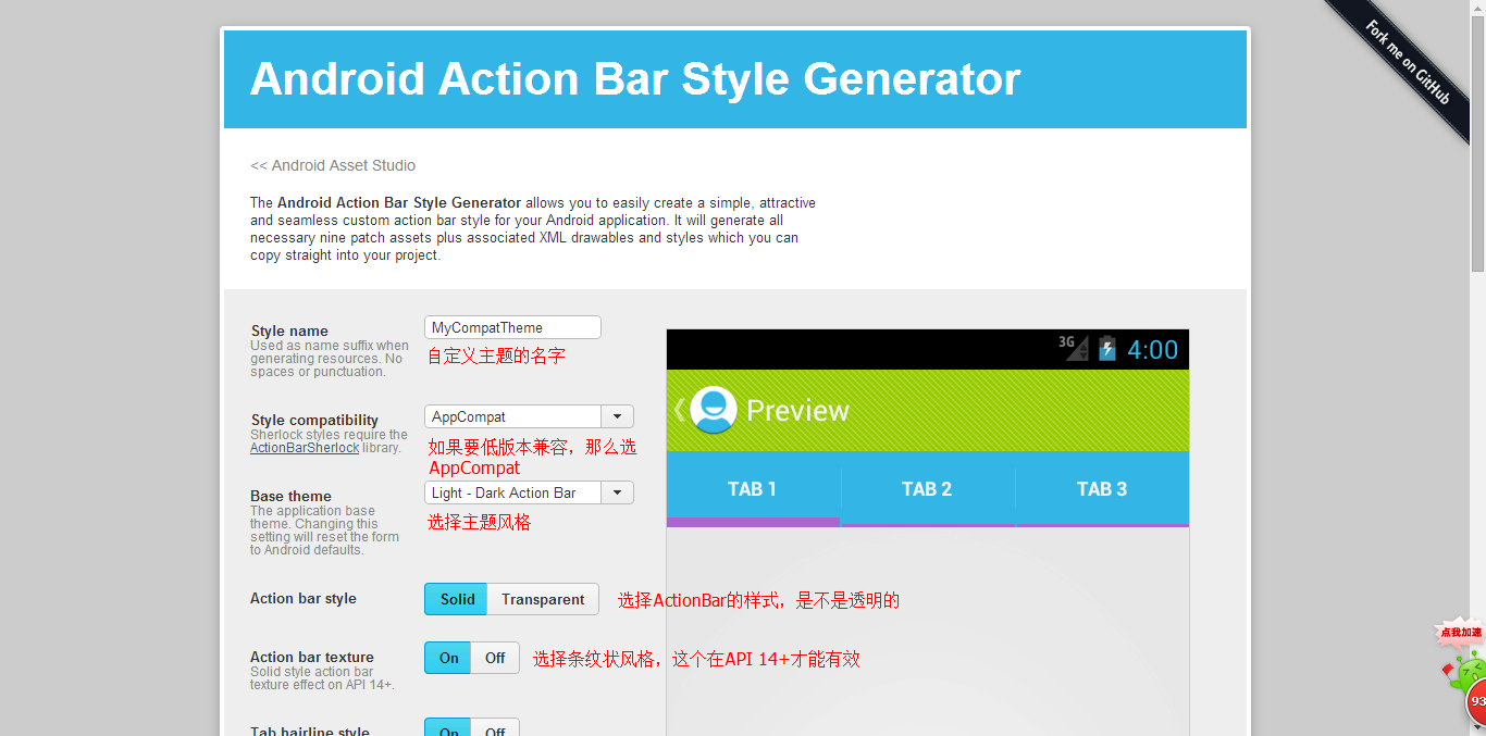
设定ActionBar的样式,是我们必须掌握的技能,在之前我们可能都需要一行一行的写代码,然后在模拟器上测试效果,但是现在我们有个一个很棒的工具来设定样式。设定ActionBar样式的工作从未如此简单过!
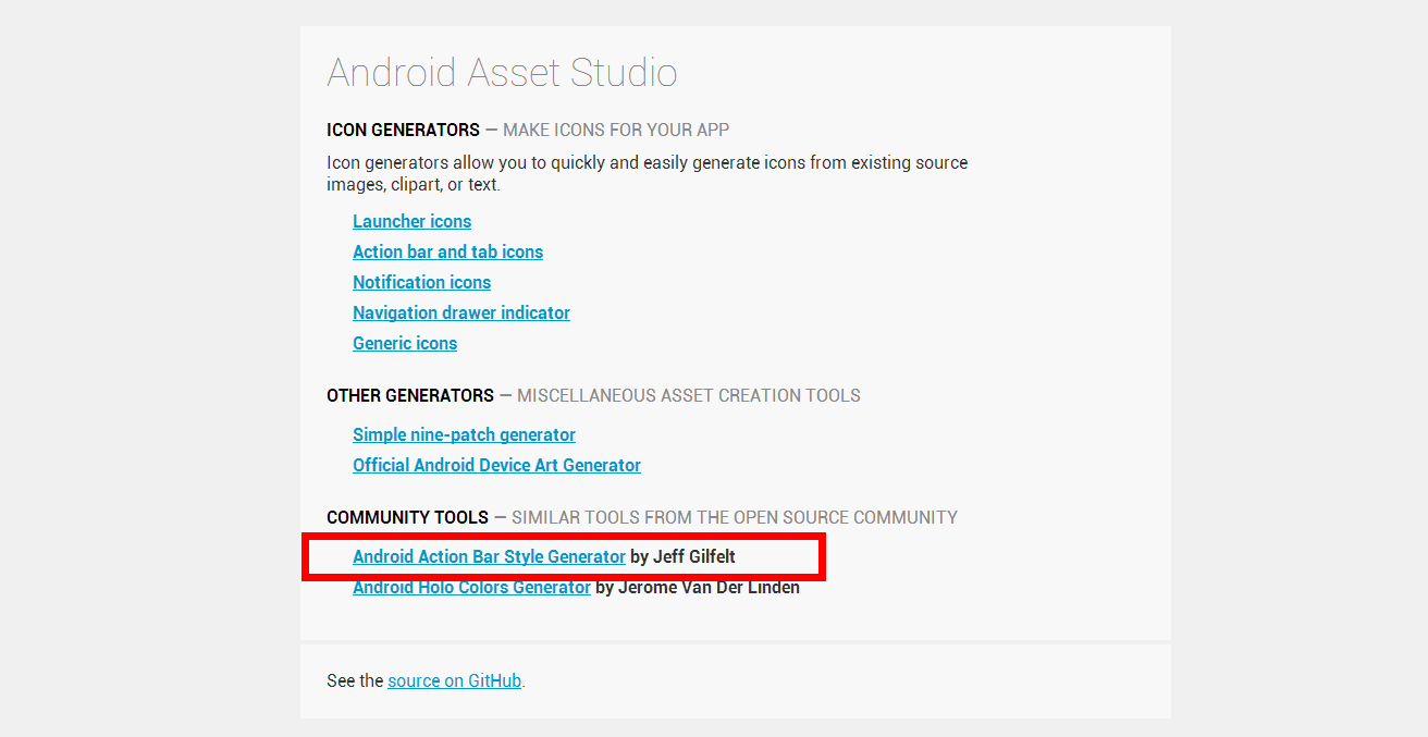
http://romannurik.github.io/AndroidAssetStudio/index.html
进入后我们就可以直接在可视化的界面中进行修改了,设定好后直接下载压缩包。复制到res目录下即可。最后要记得把Application或者Activity的主题修改为你做的主题名哦~
顺便补充一个设置ActionBar背景的方法:
getSupportActionBar().setBackgroundDrawable(getResources().getDrawable(R.id.icon));
下面是我这个主题的style:styles_mycompattheme.xml(这里的文件是V14的,详细的请下载源码)
<?xml version="1.0" encoding="utf-8"?>
<!-- File created by the Android Action Bar Style Generator

     Copyright (C) 2011 The Android Open Source Project
     Copyright (C) 2012 readyState Software Ltd

     Licensed under the Apache License, Version 2.0 (the "License");
     you may not use this file except in compliance with the License.
     You may obtain a copy of the License at

          http://www.apache.org/licenses/LICENSE-2.0

     Unless required by applicable law or agreed to in writing, software
     distributed under the License is distributed on an "AS IS" BASIS,
     WITHOUT WARRANTIES OR CONDITIONS OF ANY KIND, either express or implied.
     See the License for the specific language governing permissions and
     limitations under the License.
-->

<resources>

    <style name="Theme.Mycompattheme" parent="@style/Theme.AppCompat.Light.DarkActionBar">
        <item name="android:actionBarItemBackground">@drawable/selectable_background_mycompattheme</item>
        <item name="android:popupMenuStyle">@style/PopupMenu.Mycompattheme</item>
        <item name="android:dropDownListViewStyle">@style/DropDownListView.Mycompattheme</item>
        <item name="android:actionBarTabStyle">@style/ActionBarTabStyle.Mycompattheme</item>
        <item name="android:actionDropDownStyle">@style/DropDownNav.Mycompattheme</item>
        <item name="android:actionBarStyle">@style/ActionBar.Solid.Mycompattheme</item>
        <item name="android:actionModeBackground">@drawable/cab_background_top_mycompattheme</item>
        <item name="android:actionModeSplitBackground">@drawable/cab_background_bottom_mycompattheme</item>
        <item name="android:actionModeCloseButtonStyle">@style/ActionButton.CloseMode.Mycompattheme</item>

                <!-- Light.DarkActionBar specific -->
        <item name="android:actionBarWidgetTheme">@style/Theme.Mycompattheme.Widget</item>

    </style>

    <style name="ActionBar.Solid.Mycompattheme" parent="@style/Widget.AppCompat.Light.ActionBar.Solid.Inverse">
        <item name="android:background">@drawable/ab_background_textured_mycompattheme</item>
        <item name="android:backgroundStacked">@drawable/ab_stacked_solid_mycompattheme</item>
        <item name="android:backgroundSplit">@drawable/ab_background_textured_mycompattheme</item>
        <item name="android:progressBarStyle">@style/ProgressBar.Mycompattheme</item>
    </style>

    <style name="ActionBar.Transparent.Mycompattheme" parent="@style/Widget.AppCompat.ActionBar">
        <item name="android:background">@drawable/ab_transparent_mycompattheme</item>
        <item name="android:progressBarStyle">@style/ProgressBar.Mycompattheme</item>
    </style>

    <!-- this style is only referenced in a Light.DarkActionBar based theme -->
    <style name="Theme.Mycompattheme.Widget" parent="@style/Theme.AppCompat">
        <item name="android:popupMenuStyle">@style/PopupMenu.Mycompattheme</item>
        <item name="android:dropDownListViewStyle">@style/DropDownListView.Mycompattheme</item>
    </style>

</resources>
当然,如果你觉得你想修改Menu和Tab上面的字体,设置个颜色什么的。那么下面的设置一定可以满足你的需要。
更详细的定义可以参考:http://blog.csdn.net/gebitan505/article/details/12157027
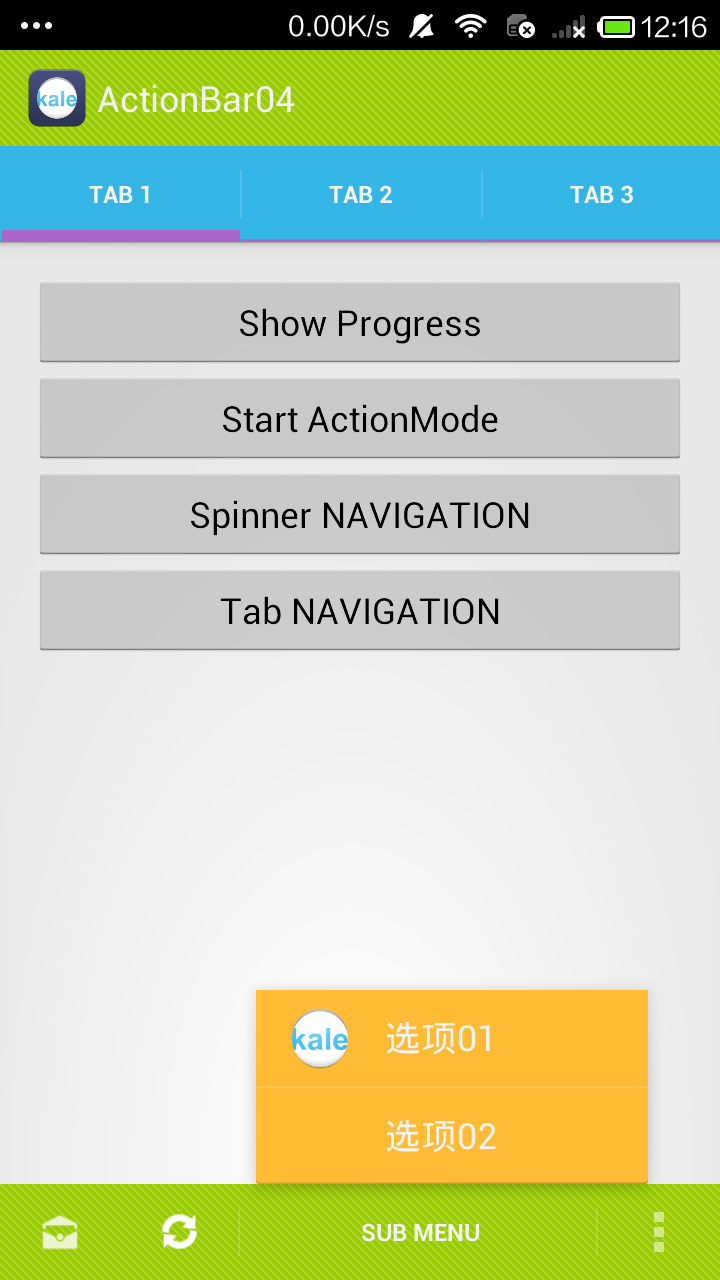
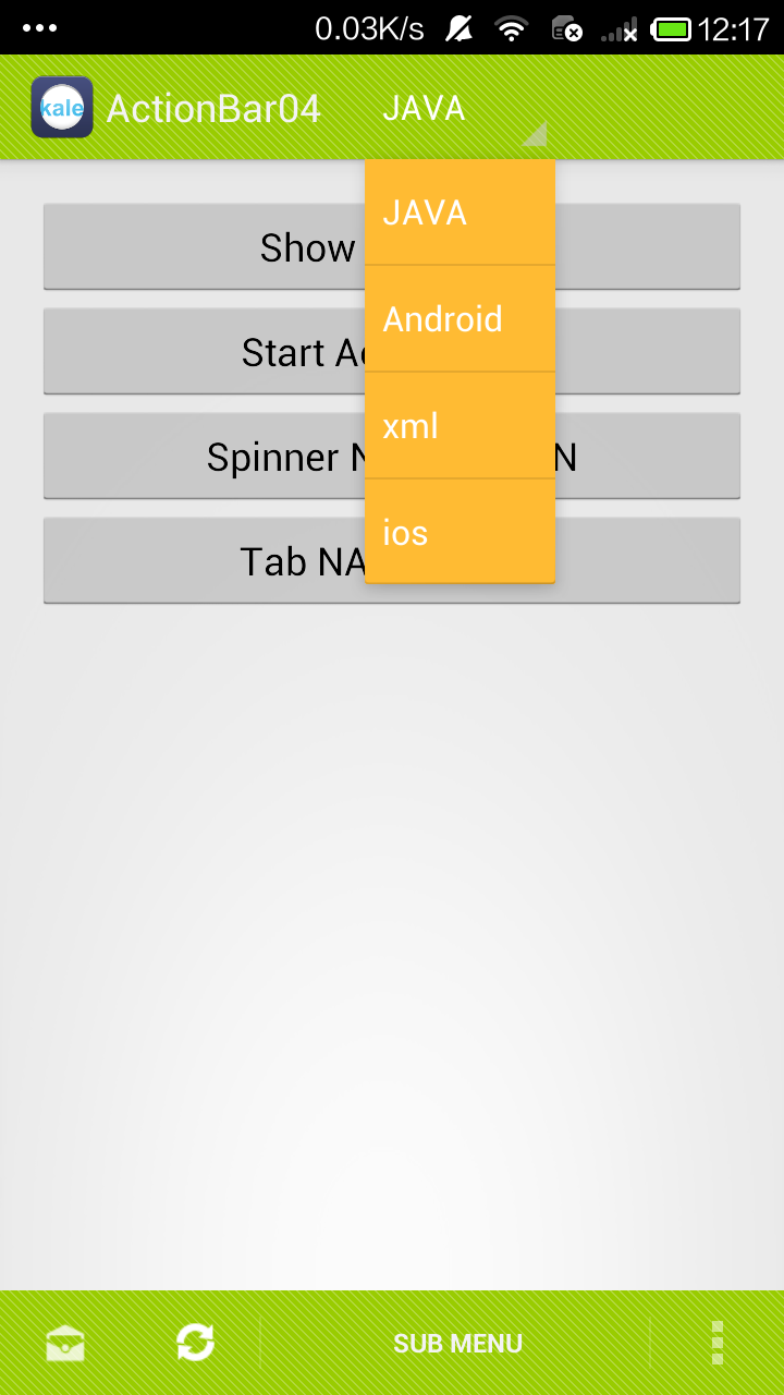
这里定义了Tab中字体的大小和颜色,定义了Menu的字体的大小和颜色,定义了返回按钮和分割栏的图片。
部分代码如下,这个是在之前的代码中修改的。
    <style name="Theme.Mycompattheme" parent="@style/Theme.AppCompat.Light.DarkActionBar">


        <!-- 定义ActionBar左边小箭头的图片 -->
        <item name="android:homeAsUpIndicator">@drawable/ic_search</item>
        <!-- 设置ActionBar的高度 -->
        <item name="android:actionBarSize">60dip</item>
        <!-- 设置Menu的颜色 -->
        <item name="android:actionMenuTextColor">#ff0000</item>
        <!-- 设置Menu的字体样式 -->
        <item name="android:actionMenuTextAppearance">@style/MyMenuTextStyle</item>
        <!-- 设置ActionBar Tab字体的样式 -->
        <item name="android:actionBarTabTextStyle">@style/MyTabTextStyle</item>
        <!-- 定义Tab之间的分割线的图片 -->
        <item name="android:actionBarDivider">@drawable/ic_search</item>

    省略了由工具生成的代码……


    </style>

    <!-- Menu的样式 -->
    <style name="MyMenuTextStyle">
        <item name="android:textSize">30sp</item>
    </style>

    <!-- Tab字体的颜色、字体等样式 -->
    <style name="MyTabTextStyle" parent="@style/Widget.AppCompat.Light.ActionBar.TabText">
        <item name="android:textColor">#0000ff</item>
        <item name="android:textSize">18sp</item>
    </style>
至于定义actionbar上面的进度条样式的可以看这篇文章:http://www.myexception.cn/mobile/1356045.html
更加详细全面的ActionBar的样式的修改可以看这里:http://blog.csdn.net/guolin_blog/article/details/25466665 (推荐)